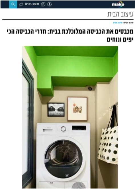
Press for Lime Laundry in Mako
This week I was excited to be featured in Mako's article on "The most beautiful and comfortable laundry rooms.”
The goal for this tiny 2-meter space was to keep it airy and enjoyable. The default for many laundry rooms is to stuff them with storage. In this apartment there was a superfluous third bathroom, so I turned that into a storage area to allow the laundry space to stay breathable and welcoming.
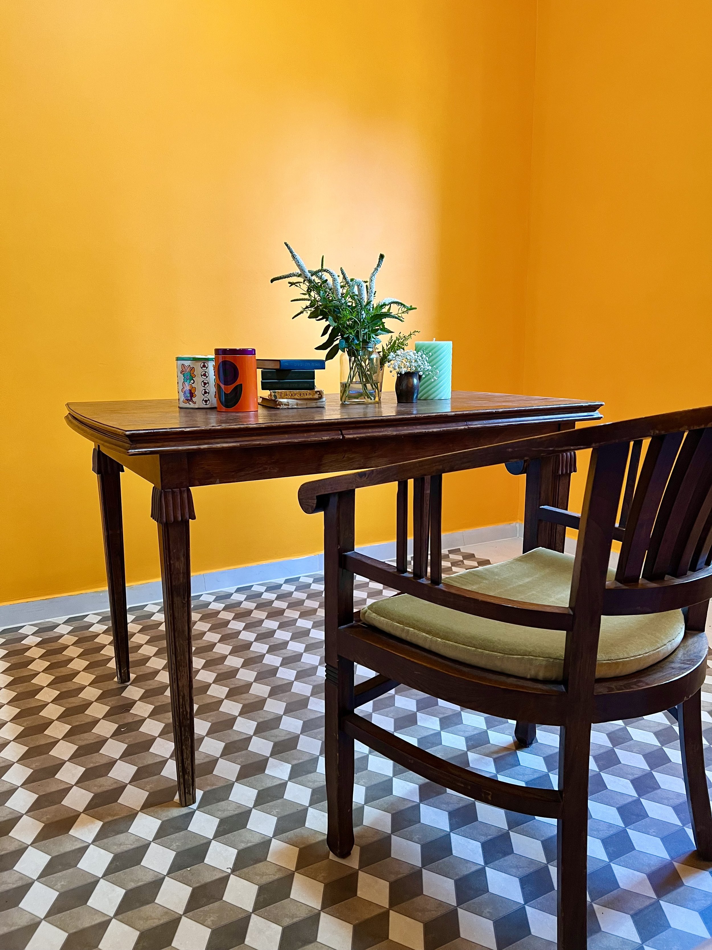
We're not usually excited to tackle laundry. To make the experience feel special and personal, I turned the room into an art gallery. A mirror above the table reflects light from the window and makes the space feel bigger. The machines take up one side and a table on the other side holds bags of clean laundry waiting to be folded. This keeps the rest of the home free from piles of laundry, and in turn every place in the home can breathe.


Citrus House: The Concept
Pomelo Room // Citrus House
Last year we moved to a new rental apartment. When house hunting, I look for good sunlight and a nice view. We were lucky to find both in a bright new construction overlooking rolling green hills on a quiet block. But on the inside new builds are often boxy and devoid of character — fresh but sterile. I wanted to extend the lush view outside the main living space into the rest of the apartment and make the white walls anything but. I also wanted to reuse as much furniture as possible from our previous apartment, spend no more than 10K NIS (~$3K) on new items in the first year (track the budget here), and have our new place look and feel different from our previous apartment.
Pomelo Room // Citrus House
I decided to give our apartment a citrus theme, to celebrate some of the most vibrant hues native to Israel and bring the outside in. I wanted it to feel energizing and playful, and I love using paint as an affordable way to give a room character. Each room is designated with its own citrus fruit, so walking into each one wakes you up with a surprise (and maybe even a cheerful chuckle).
Living room before:
Living room in progress:

Pomelo Room // Citrus House
So far, we have the Pomelo Room (living room), the Clementine Room (my office), and the Putty & Lime Laundry. In the living room, the couch from our previous apartment, which you can see below, did not fit well, but we weren’t ready to replace it yet. I remembered that the couch is built in two pieces and connected at the bottom. I separated it into its two parts and faced them toward each other, so that one half tucks nicely along the half wall by our kitchen (left side in the photo above) and the other looks out at the view. The switch makes the space feel cozy and intimate.

The living room in our previous apartment (Photo: Peled Studios \ יואב פלד צילום אדריכלות)
Splitting the couch freed up the right wall for the sideboard from Jake’s old office, below, which we couldn’t find a good home for in the other rooms of our new apartment.

The study in our previous apartment (Photo: Peled Studios \ יואב פלד צילום אדריכלות)
In our previous apartment Talia and Sol each had their own room. Because I needed a home office, and a place to store samples and other materials, I put the kids together in one of the more spacious rooms and made the smaller mamad (safe room) my office. The mamad looks out at the neighboring building, an uninspiring view. I thought I’d use the space primarily for storage and Zoom meetings and never want to spend too many hours at once in there. However, since it became the Clementine Room, I actually enjoy working in there.
Mamad office before:
Mamad office in progress:
Clementine Room // Citrus House
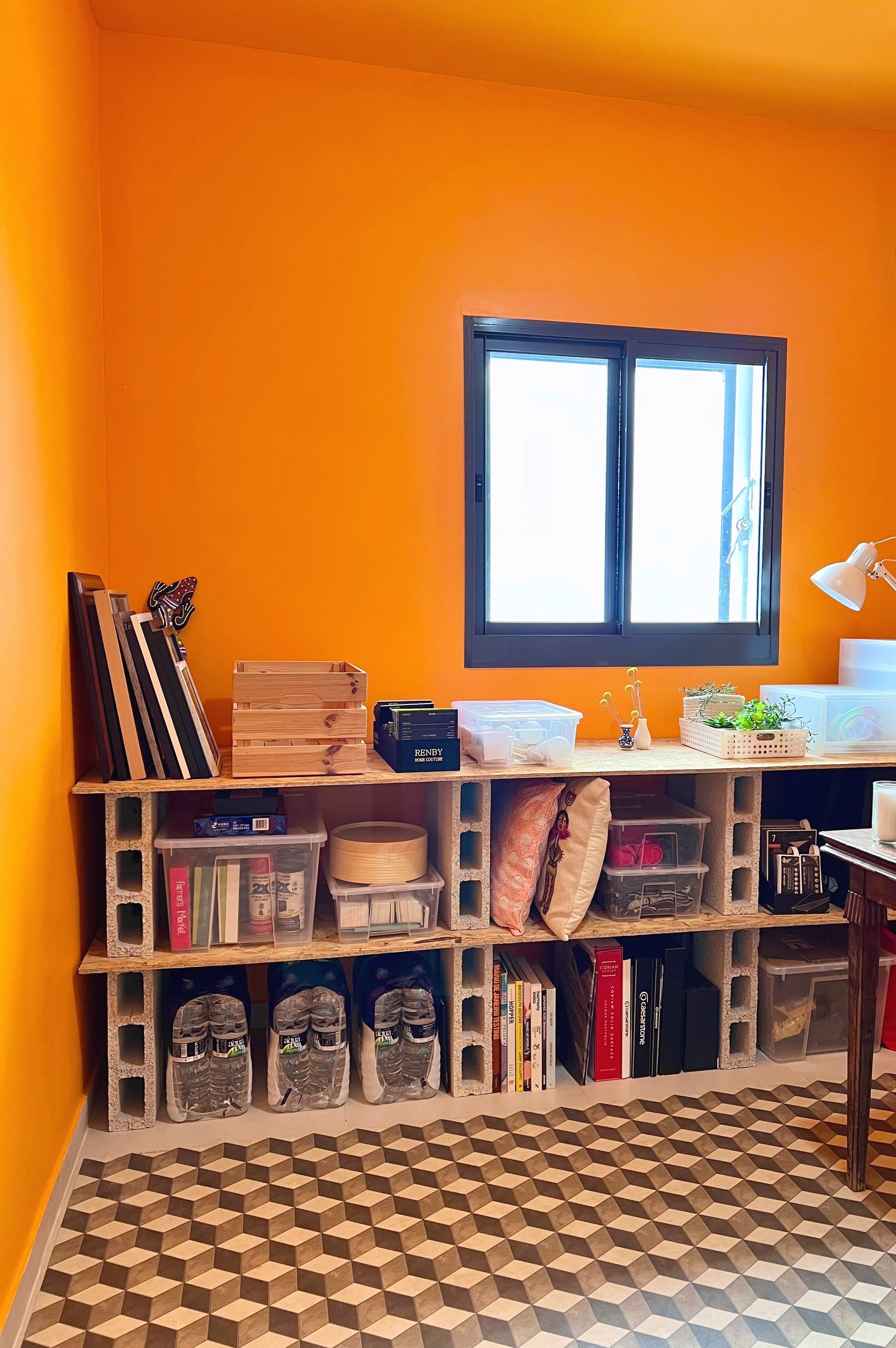

Storage so far is a simple IKEA PAX wardrobe I already had and some cinder block and plywood shelving. Though still low frills and largely pragmatic, the orange walls and slightly lighter ceiling give me the kind of get-to-work-happy slap in the face I wanted every time I walk in.
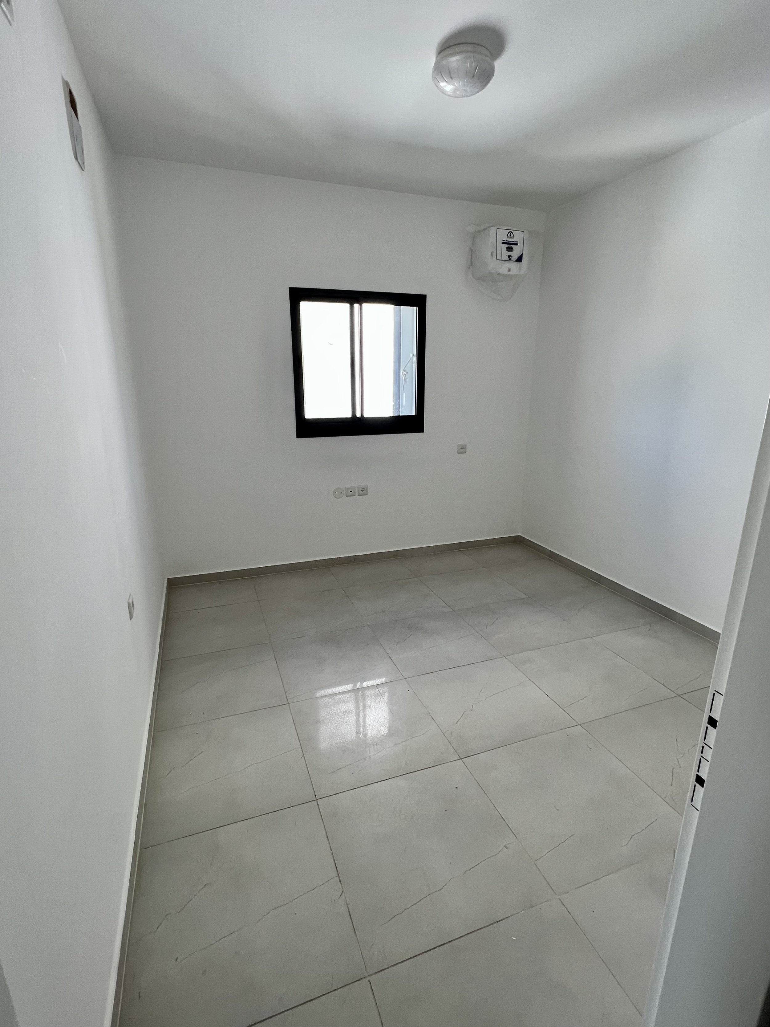
Laundry room before:
Laundry room after:

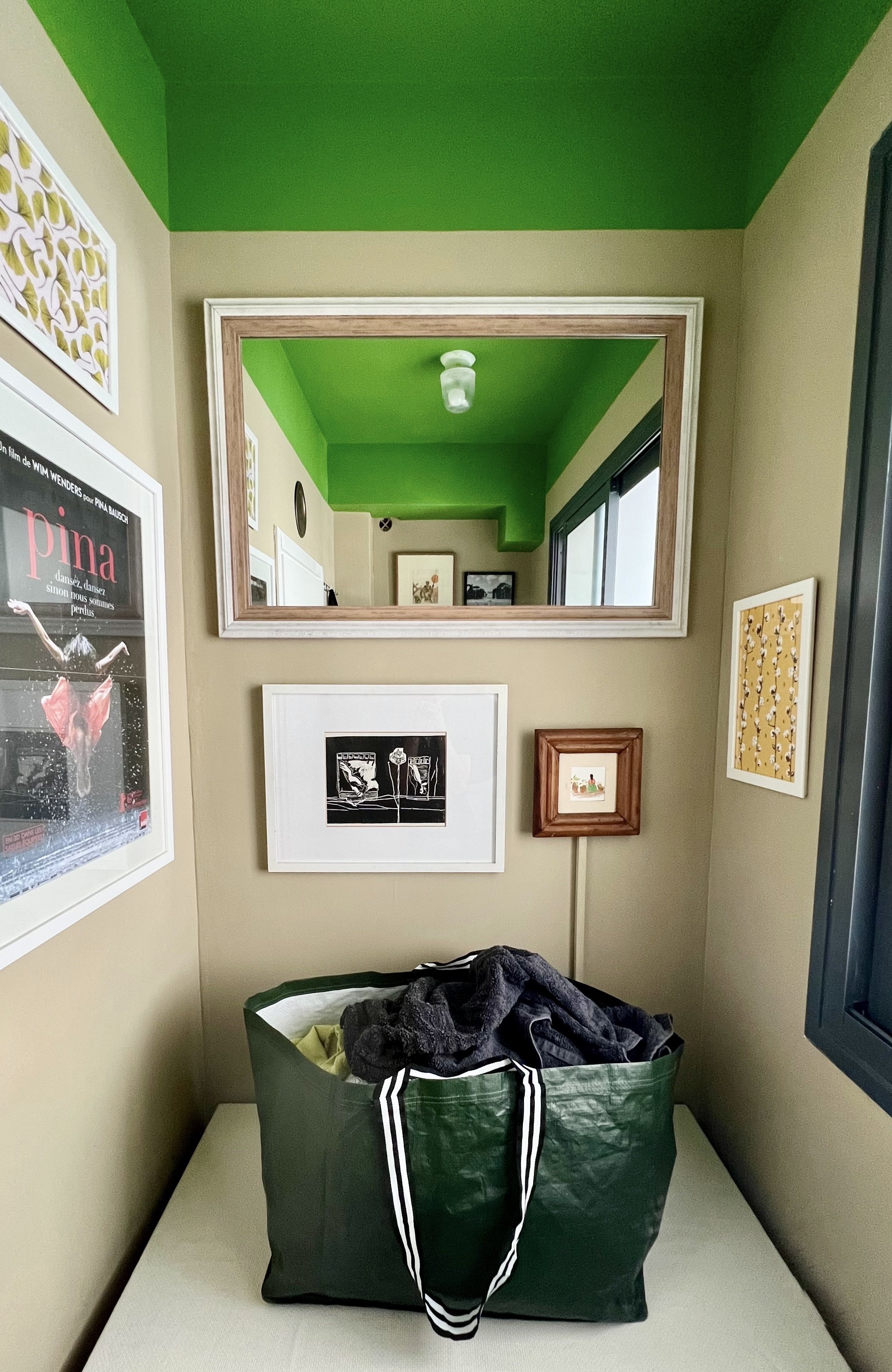
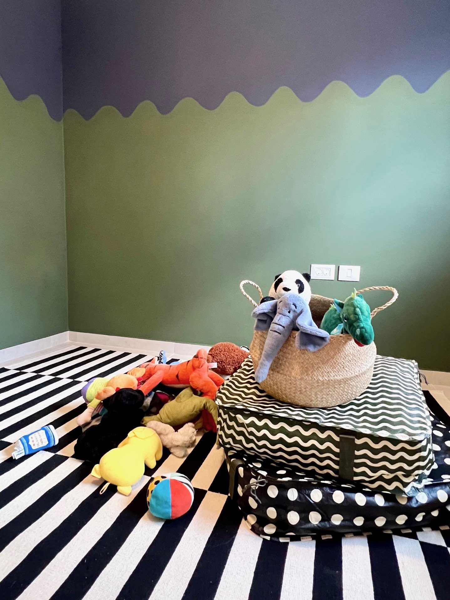
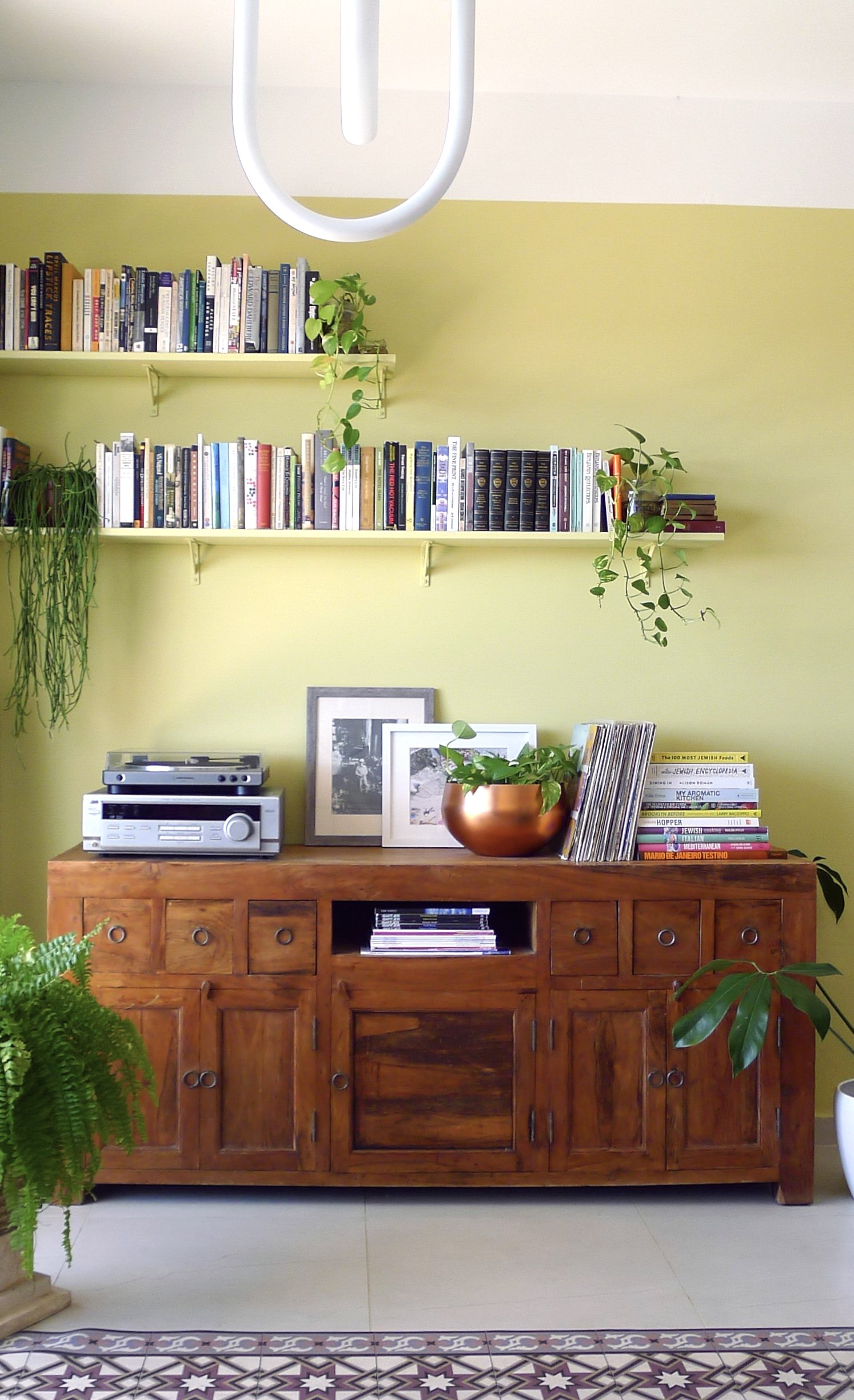
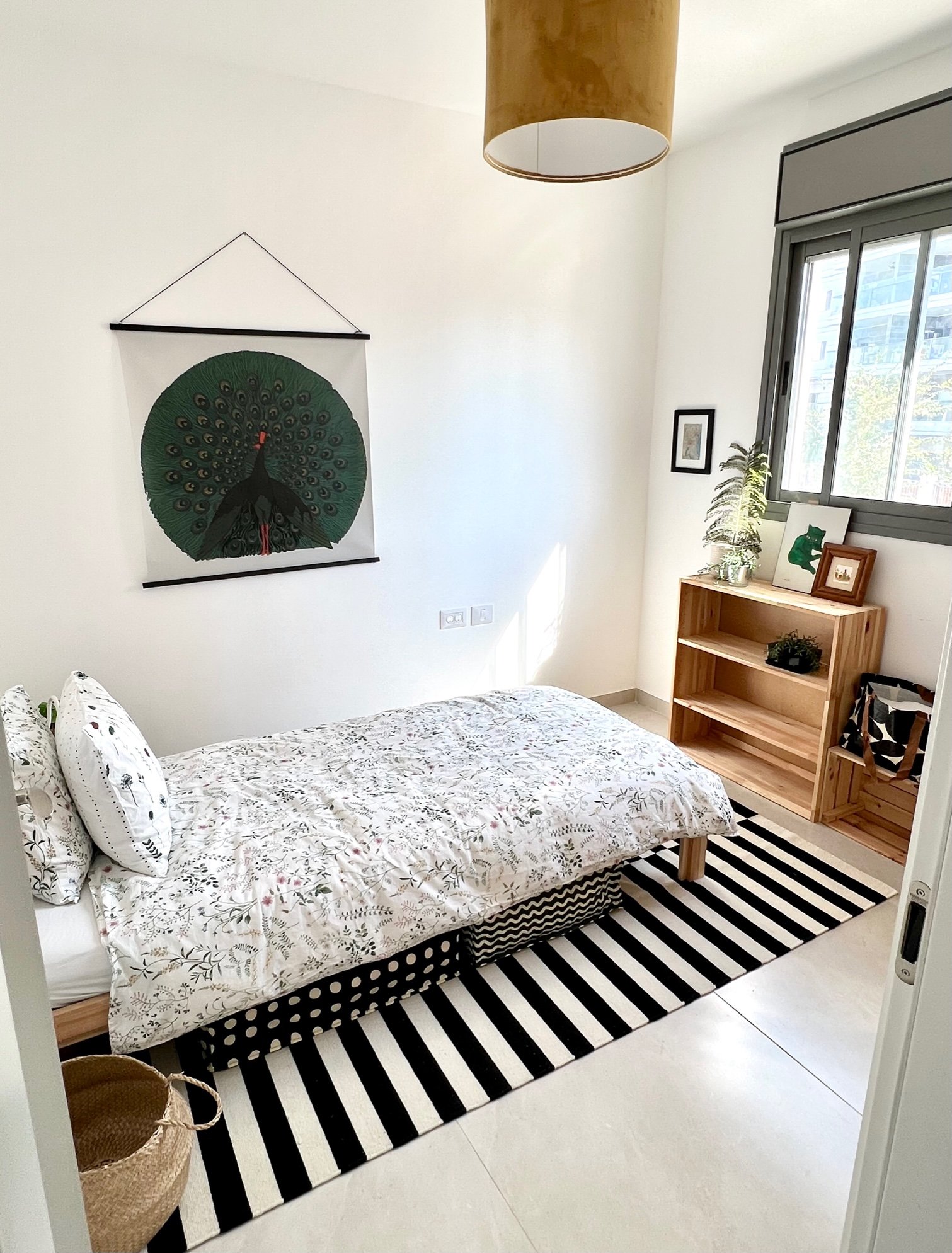
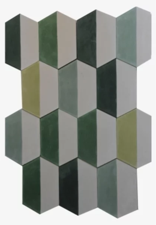
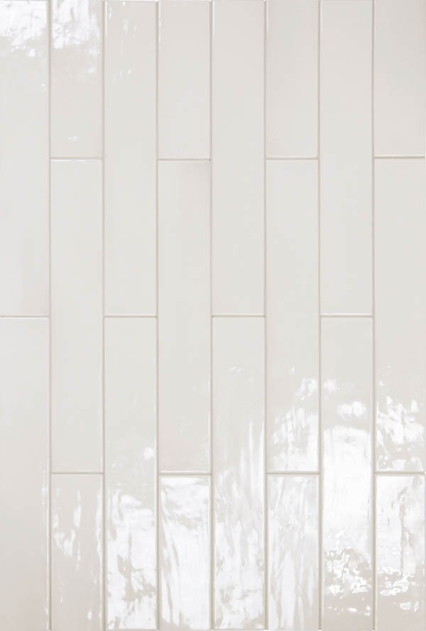
Putty & Lime Laundry // Citrus House
In our previous apartment, the standard tiny laundry room had the standard washer-drier duo on one side and a shelving unit on the other for cleaning products and the like. It drove me nuts that there was nowhere to breathe in there, but I have to admit the owner’s cancelation of the powder room (in favor of only two bathrooms instead of the standard three) was worth it for the extra space elsewhere. In our new apartment, we do have a powder room and we don’t need it, so I lined it with shelving and use it as a storage closet for all the items I used to store in our laundry room (plus more). That freed up space in our current laundry for a folding table. Though I use it more for storing yet-to-be-folded laundry than actual folding, I love having the breathing room and drop space, just as much as I love walking into a shot of lime green and artwork. My goal was to animate the tired and monotonous task of laundry and I must say — it’s still a tired and monotonous task. But I enjoy the room.

Putty & Lime Laundry // Citrus House
Next up in the Citrus House: a lemon pulp master bedroom. Stay tuned.


Master Bedroom Mood Board and Plan
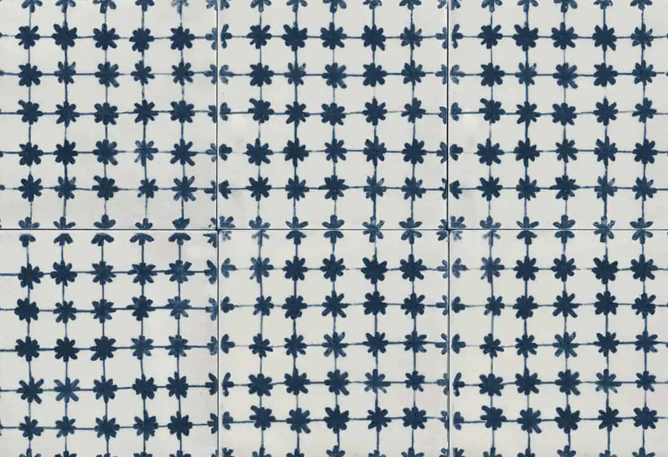
The final project for one of my interior design classes was to create a mood board and building plan for the master bedroom of a fictional client. I decided to design for a young couple buying their first apartment in Israel. This couple and I, during our fictional conversations, decided to invest in the architecture of the space and spring for a pricey Milstone tile that gives the room a unique, exotic character. It’s a busy pattern but quiet in tones, and we kept the furnishings relatively clean and minimal to maintain a feeling of calm.
The neutral furniture allows for future interchangeability. Should they find themselves, after a long gut renovation, fatigued from spending money, we could easily switch out the Tollmans Dot bed for a slightly cheaper IKEA bed; source vintage nightstands at a flea market instead of buy new (I’d actually recommend that route either way); and switch out pricier lighting for more frugal options.
A few elements here that give the room a more relaxed feel: the wall hanging, which is a kids blanket from Arket that adds playfulness; and the mixed woods, which bring out both the light and dark tones in the tile and keep things from feeling too matchy-matchy and formal.

Building plan

Furniture plan
The sleeping area at left is minimal and meant to be kept tidy and clean, though I’d recommend a few dark wood hooks on the wall for those tired moments when you want to throw something up and deal with it later. All the storage and organization happens in the wardrobe area at right, and the intention is to have some extra blank space available inside, again for those tired moments when you want to throw things in haphazardly and deal with them later. For this reason I chose a 65-cm-deep, floor-to-ceiling custom wardrobe that makes use of all the available space. However, pushing past the 60-cm standard depth makes it pricey, so if spending fatigue sets in, the couple can choose to downgrade to 60 cm.

Electrical plan
The lighting here includes two sconces around the bed, a pendant light near the foot of the bed, and recessed lighting in the wardrobe area. I do think there’s room here for a couple more sconces or recessed lights in the sleeping area — a future edit I’ll be proposing in a future fictional conversation.
Sources: Tiles // Bed // Rug // Pendant Lampshade // Nightstand // Wall Hanging // Sconces


Carmei Gat Penthouse Living Room
I’ve been decorating a penthouse in Carmei Gat, the new neighborhood in Kiryat Gat, and here’s the completed living room. They wanted a contemporary American style and to incorporate their couch and artwork. You can look back at the original mockup for the room here. Below: the before photo when the apartment was empty, and the before the before in their previous apartment.


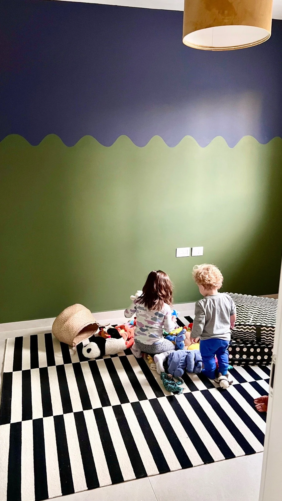
In Progress: Sol’s Room
I’m finally making Sol’s room Sol’s room. He’s been sleeping in his room for over a year but it’s also been half an office for a period and a temporary guest room multiple times. Below was its most recent iteration as a guest room (a speedy touchup purchased entirely from IKEA):

To the right of the door is a wardrobe that spans most of the wall. With one wall covered in the light oak wardrobe and another wall with a window that I want to span with light curtains, I decided to view the room as cut by a diagonal: the top left triangle will be dark and the bottom right triangle will be light.


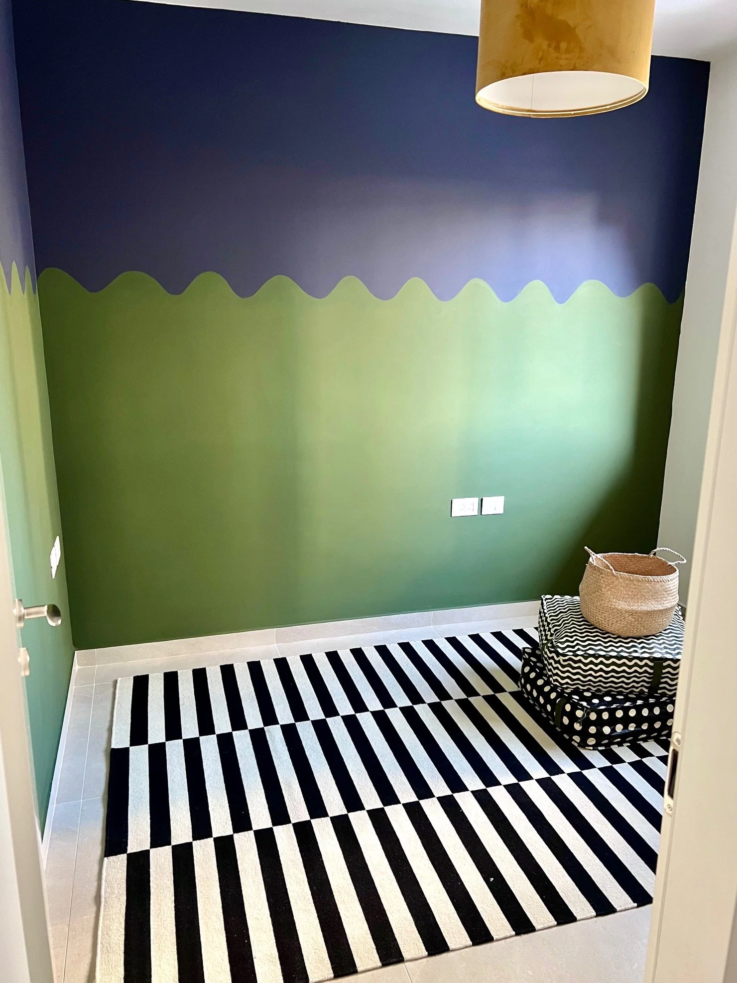
Here’s the room painted. The top is Black as Night (more navy than black) and the bottom is Garden Seat, both by Tambour. The rooms in a typical new apartment in Israel are clean and modern and … boxy. In Talia’s room I added curvature with a painted mountain mural (some updates happening in there soon), and I continued in that vein in Sol’s room with a wave pattern. Once curtains go up on the wall at right, their 3D curvature will complement the painted waves and bring some more movement and dimension to the space.
Speedy IKEA Guest Room
I put together a quick interim guest room for my mother-in-law’s visit while prepping to finally decorate the room for Sol. For a year and a half this room has had almost nothing but an IKEA PAX wardrobe and a crib. I hate the crib, which I half-unintentionally bought off Facebook Marketplace, but that’s a story for another time. Here’s the before:

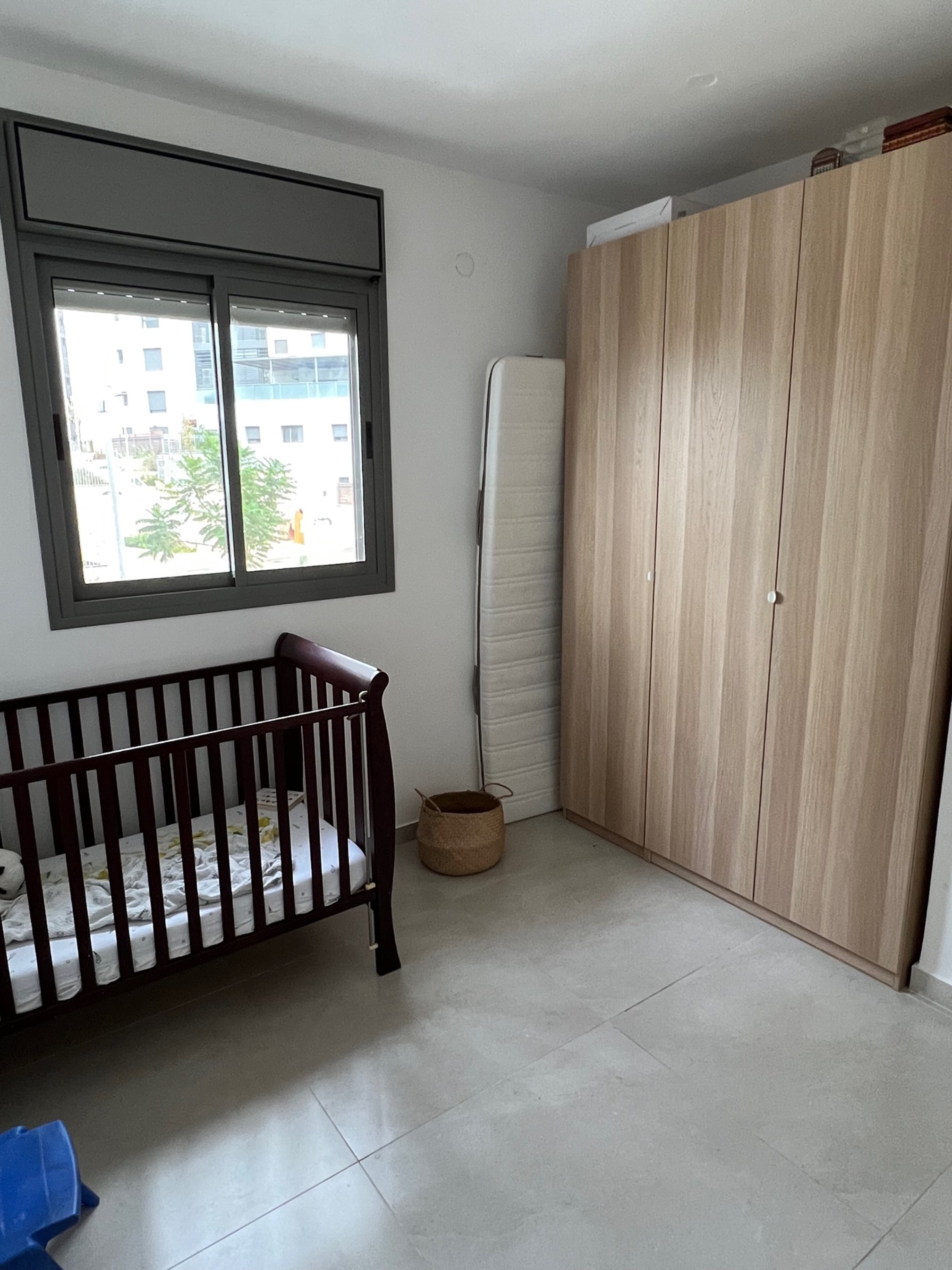
Sad state. The crib might work in a more traditional home, but it makes no sense in mine. Crib aside, whenever we have guests we move Sol to our room. Often people sleep on the floor:


The chair is now in Jake’s office and the runner is in our bedroom, so there wasn’t much left to make the room inviting. Since I was already gearing up to turn Sol’s room into something other than four walls, I decided to pick up a few extra things while at IKEA to warm up the guest room.
Rules for shopping at IKEA include:
Don’t get one of the ubiquitous geometric rugs. Instead choose a neutral one, like a LOHALS or HJORTSVANG or SVÄRDBORG.
Steer clear of the art.
I broke both of these rules in this room. I picked up the (in)famous STOCKHOLM rug for Sol because I love the black and white. This rug might be the most IKEA-screaming rug of all IKEA rugs. But it’s been around for so long I feel like it has turned a corner from cloyingly pervasive to … iconic. Surely debatable. I skipped the art section entirely on this visit, but when I backtracked to pick up something else, I spotted a giant peacock on the wall. It’s the new PÅLHULT hanging tapestry and for ₪75 ($19.99), why not.
The MOLNSKIKT lampshade has a suede-like texture and will stay in Sol’s room. The NEIDEN bed is on loan from Talia’s room and on it I put the TIMJANSMOTT bedspread with a NATTSLÄNDA pillowcase (Talia is using its comforter cover). I took the doors off the IVAR storage unit we already had to make it a bookshelf, and I picked up a bunch of the SÄCKKÄRRA bags for linen storage to clear out space in the closet for guests.

I moved one of the chairs from the kids’ LÄTT table to by the bed, stacked coffee table books on it, and clipped on the NÄVLINGE light so it can be used as a temporary bedside table. Then I added some more artwork that I had in storage: a photo I took of the Sea of Galilee, a small map of the Washington D.C. area where I’m from, a green Warhol cat, and a tiny painting from Mexico. The large leaf fell off a tree outside our building.
The result is, no doubt, very IKEA, but for two weeks it will serve its purpose.
Choosing My Kitchen Backsplash (a Fairy Tale)
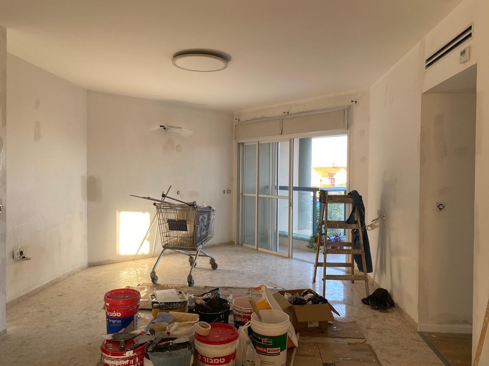
When we made Aliyah in 2021, we moved into a newly built apartment in Modiin fresh from the kablan (contractor). Because we’d been Airbnb’ing for 6 weeks already and I was 9 months pregnant, we were eager to get the keys, so the owner rushed the final to-dos and left the kitchen without a backsplash. As you can see below, this isn’t great for the wall behind the sink or the stove.
The owner is now selling the apartment and we’ll likely get the boot within a year, but I’m taking a trip down fairy tale lane to consider how I’d tile the backsplash. If we zoom out for a second you’ll see there’s already a lot going on in the living room and the surrounding areas:


If I was to do a color, a green tone could be nice, to complement the plants and contrast the red and pink hues of the living room. I’d do a vertical or square pattern to balance the horizontal cabinetry. These mint tiles from Tile Israel could work, but I’d place them side by side rather than staggered for a more streamlined modern look. I really love these colorful green and white tiles from Balatot, but they’re too busy as pictured. Choosing just one or two of the tones could be fun. And I like these deep green squares from Milstone, but they feel too dark for this kitchen.

Here’s a test using just one of the green shades from the Balatot tile set:

If the white half of the tile is actually white and not grayish like this photo from online suggests, then I like it. This one requires some in person research, so let’s move on for now.

If I was to lay off the color and get white tiles, they should be matte, because the cabinets are already glossy, and white gloss on white gloss is overkill in this context. A plain white tile could work, but something with texture would be more interesting. I found this textured white tile from Studio Ceramica that looks wonderful:
The downside is it’s probably terrible to clean and not ideal for a grease-catching kitchen backsplash. (I’d look into this further to be certain.) If we’re back to the drawing board with whites, these Milstone and Kal Vahomer rectangles are available in a matte finish and would be a simple elegant option, stacked cleanly like at left.

So that’s a workable white solution. But it’s a bit of a yawn. And while there’s nothing wrong with a good clean yawn in a good clean kitchen (I do love a white kitchen), I keep circling back to the tiles on speed, like this blue asterisk pattern from Milstone:
Testing it….

Kind of cute, no?
If I were really getting a backsplash right now, I’d visit tile showrooms in person.
Another option is to have the Caesarstone countertop continue up the wall, not have to choose a single tile, and live happily ever after.
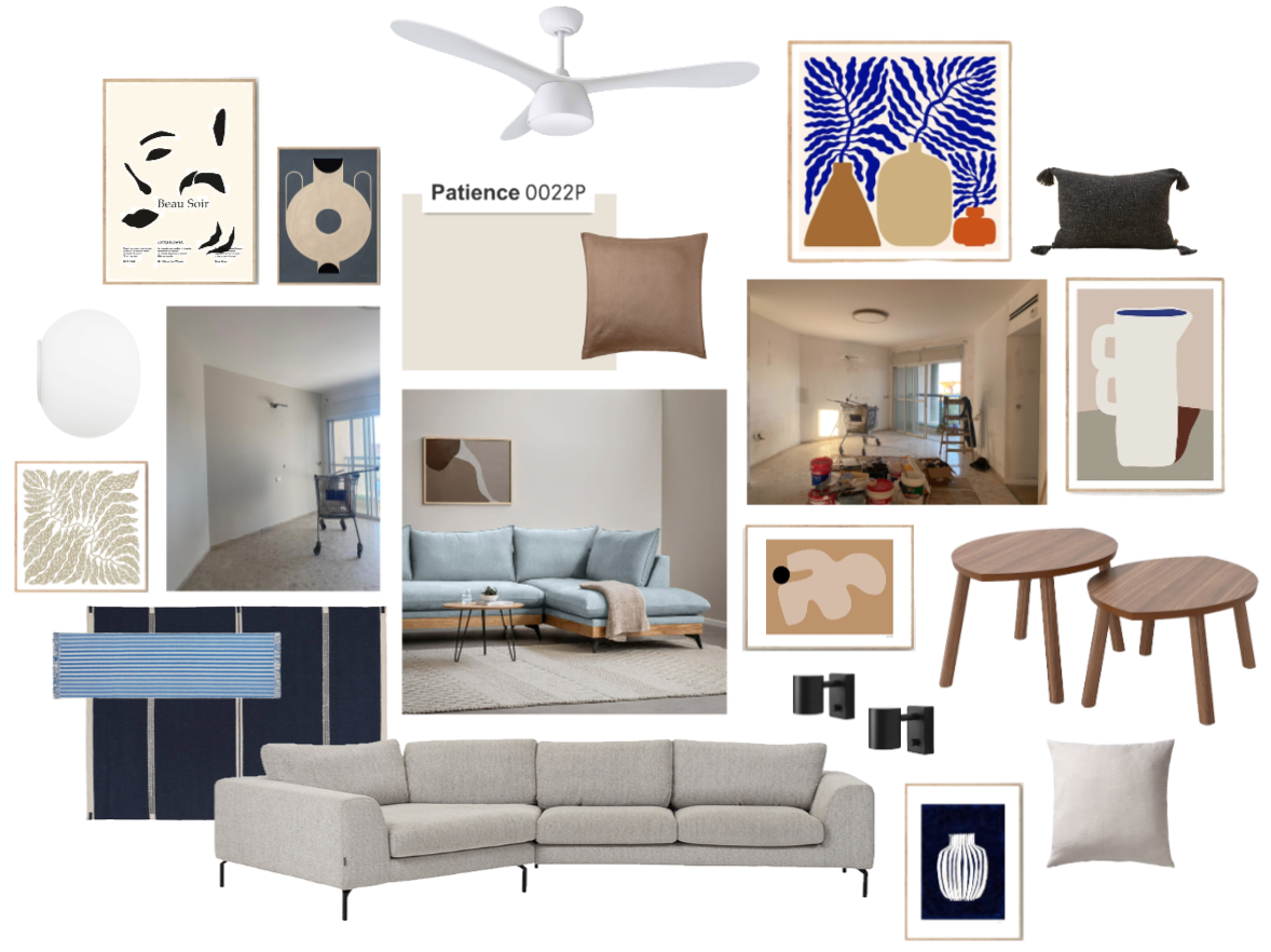
Mood Board: Calm Netanya Living Room
I’m working on a living room in Netanya for which the guiding word is: calm. My clients want modern, clean tranquility in blues and café au lait. The most important feature for them is the sofa — they’re couch people. They want a big, comfortable, enveloping couch that serves as the showpiece of the room. So we decided to invest in the perfect couch and spring for a custom-made one that fits neatly against the unusual angle in their newly purchased apartment.
The sofa will stretch across the back two walls at left and the TV will go on the wall to the right of the balcony. The floors are a cream terrazzo.

Painting in progress
My clients chose Tambour’s Patience for the walls (the left wall will also be painted). And they’re playing around with cardboard to see how the sofa will stretch across the room.

My sense is they’re leaning towards a shade of blue for the couch. Once that’s finalized we’ll have an anchor around which to decorate the rest of the room.
Sources: Art // Fan // Round Wall Light // Black Wall Lights // Coffee Table // Dark Blue Rug // Blue Striped Runner // Light Blue Couch // Beige Couch // Dark Gray Tassel Pillow // Dark Beige Pillow // White-Beige Pillow
Design Process: Carmei Gat Living Room
I did the mood boards for a penthouse apartment in Carmei Gat, which has a lot of light and great views. The unit was purchased from the original owner, so we worked with the existing finishes. Our starting point was gray tile floors and the large gray sectional that my client already owns.
BEFORE

3D MOCKUP

During our brainstorm she quickly gravitated towards a feature wall of books, and we found this rug together which she got excited about and purchased immediately to help anchor the rest of the room. After that the goal was to warm up the space with creamier tones and natural materials, plants, a curtain for the small window, and a large mirror to reflect the great view.
She was keen to paint the space the perfect off-white, instead of the bright white that comes standard in apartments and feels too hospital-y for her taste. We settled on Tambour’s Swan Lake, which turned out beautifully with zero yellow undertones. Only after the long ordeal of ruffling through paint fans did I notice that Swan Lake mirrors the designer favorite, White Dove by Benjamin Moore. If you’re looking for the perfect off-white by a more economical Israeli brand, check out Swan Lake by Tambour.

Sources: IKEA Kivik Couch // השטיח האדום Rug // United Seats (Pickup) Armchair // Betili Coffee Table // IKEA Skottorp Lamp // Pebble Storm Swingfan // Golf & Co. Ottomans (no longer available)
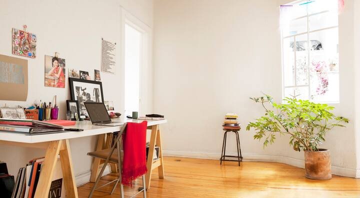
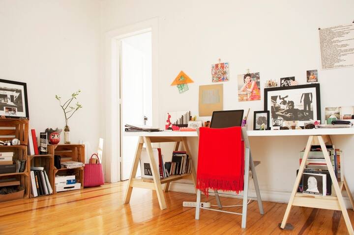
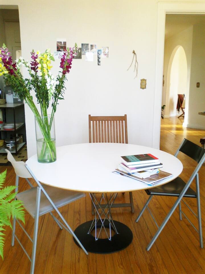
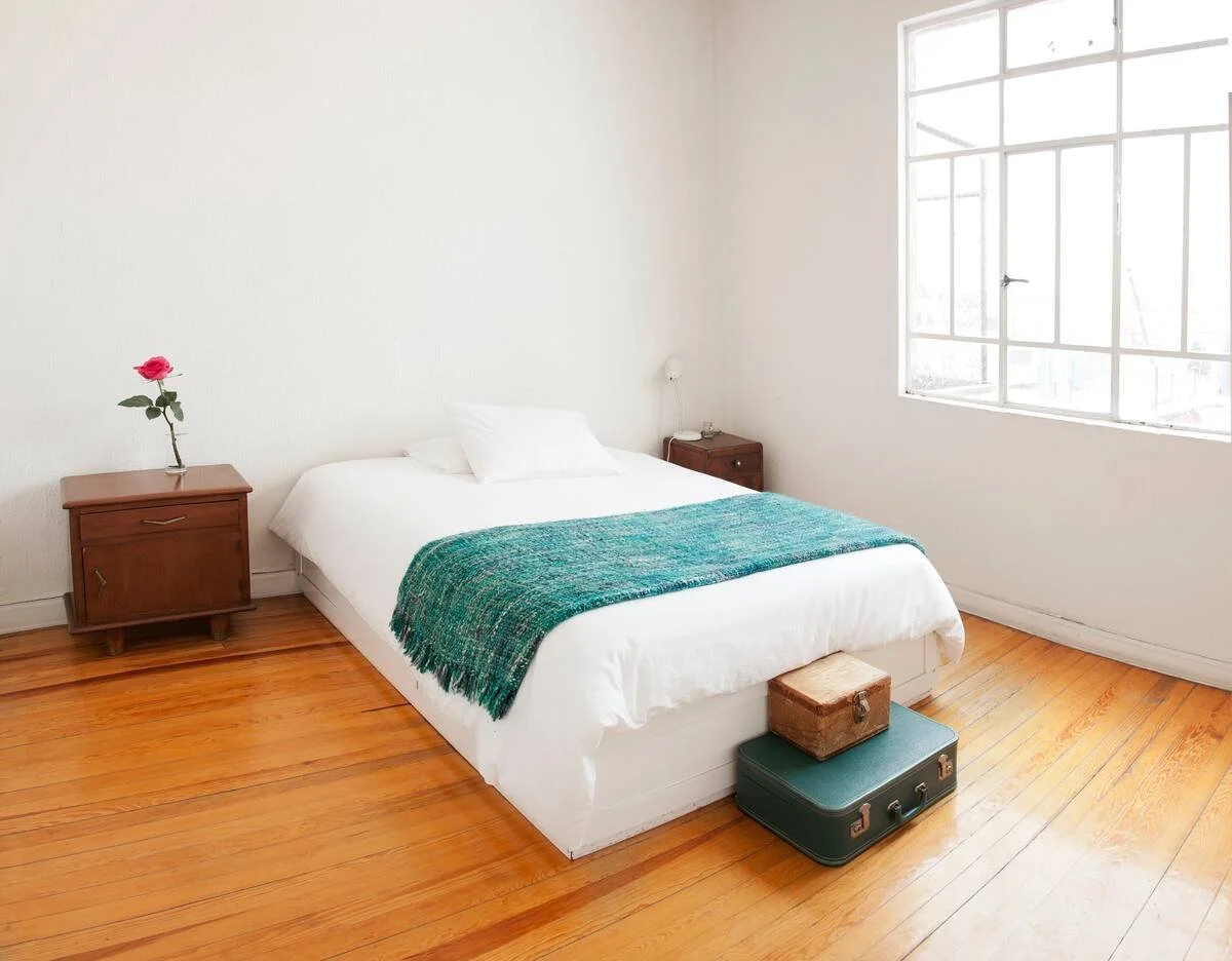
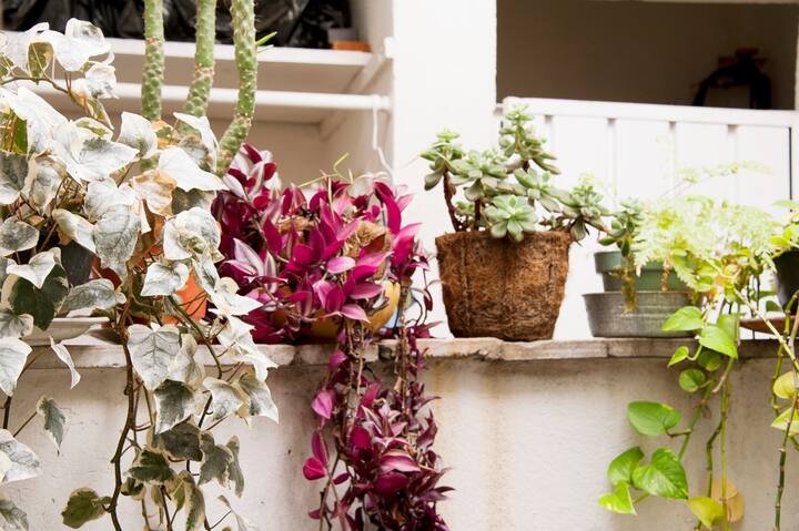
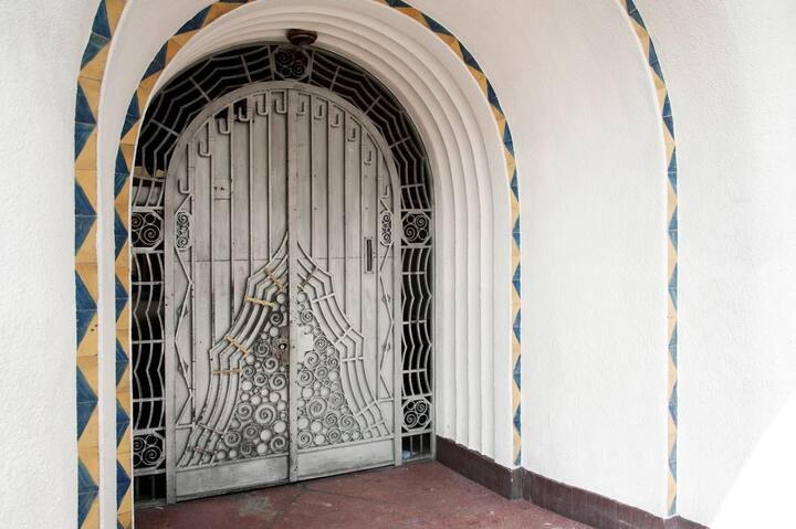
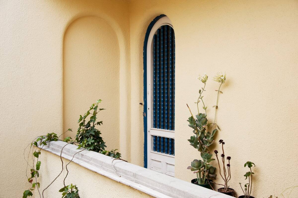
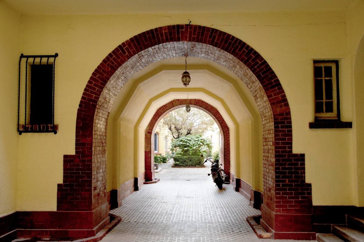
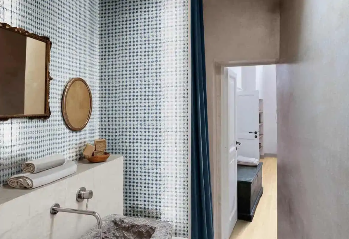
Mexico City Airbnb in Tacubaya

I still think about this Airbnb I stayed in when I visited Mexico City in 2012 (……a decade ago). The archways, the plants, the windows, the white-washed walls and pops of color…... Run by Gaby, an architect who splits her time between Mexico City and Brooklyn, it was the perfect landing pad from which to explore the city. Located in Tacubaya, it’s a block from the metro and walking distance to the beautiful neighborhoods of Condesa and Roma as well as Chapultepec Park.