
3 Office Space Efficiencies that Save Time and Money
If you're debating office spaces and feeling a bit lost...
Consider the space's bones.
You want your raw office space to be efficient.
An inefficient layout can mean unexpected build-out costs, operational issues, and growth constraints.
Before committing, check these three things to identify potential:
***********
(𝟭) 𝗖𝗼𝗿𝗲-𝘁𝗼-𝗪𝗶𝗻𝗱𝗼𝘄 𝗗𝗲𝗽𝘁𝗵 (The Natural Light Maximizer)
The distance between the building’s central service core (elevators, stairs, restrooms) and the outer windows directly impacts how much of your floor plate receives natural light — a key requirement for employee well-being.
𝗢𝗽𝘁𝗶𝗺𝗮𝗹 𝗱𝗲𝗽𝘁𝗵 𝗺𝗲𝗮𝘀𝘂𝗿𝗲𝗺𝗲𝗻𝘁: 10–14 m
𝗪𝗮𝗿𝗻𝗶𝗻𝗴 𝘀𝗶𝗴𝗻: Over 18 m
(𝟮) 𝗦𝘁𝗿𝘂𝗰𝘁𝘂𝗿𝗮𝗹 𝗖𝗼𝗹𝘂𝗺𝗻 𝗦𝗽𝗮𝗰𝗶𝗻𝗴 (The Layout Flexibility Factor)
The consistency and spacing of internal structural columns dictate how easily you can fit your required number of workstations, meeting rooms, and collaboration zones.
𝗢𝗽𝘁𝗶𝗺𝗮𝗹 𝘀𝗽𝗮𝗰𝗶𝗻𝗴 𝗰𝗼𝗻𝘀𝗶𝘀𝘁𝗲𝗻𝗰𝘆: 8–9 m
𝗪𝗮𝗿𝗻𝗶𝗻𝗴 𝘀𝗶𝗴𝗻: Irregular or very narrow spacing
(𝟯) 𝗙𝗹𝗼𝗼𝗿-𝘁𝗼-𝗖𝗲𝗶𝗹𝗶𝗻𝗴 𝗛𝗲𝗶𝗴𝗵𝘁 (The Employee Experience & Infrastructure Factor)
The finished height between the floor and the dropped ceiling affects both the perceived quality of the space and the potential for housing modern infrastructure.
𝗢𝗽𝘁𝗶𝗺𝗮𝗹 𝗳𝗶𝗻𝗶𝘀𝗵𝗲𝗱 𝗵𝗲𝗶𝗴𝗵𝘁: 3+ m
𝗪𝗮𝗿𝗻𝗶𝗻𝗴 𝘀𝗶𝗴𝗻: Low ceilings (<2.7 m)
***********
There are many other elements to consider, and we use the 𝗧𝗲𝘀𝘁 𝗙𝗶𝘁 𝗽𝗿𝗼𝗰𝗲𝘀𝘀 to formally analyze your shortlisted spaces against your specific headcount and budget goals.
Need help comparing office spaces? Book a call to see how we can assist.
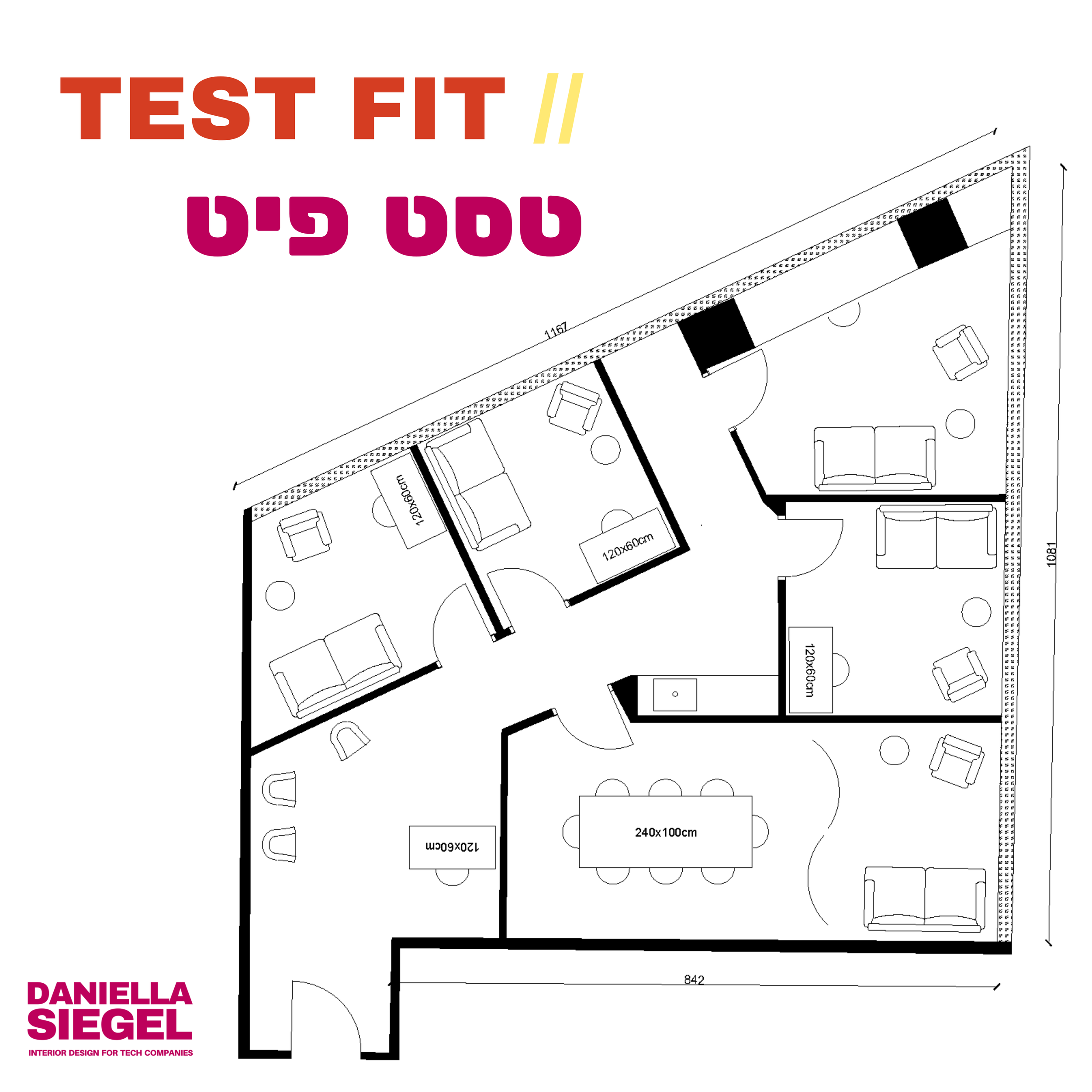


Test fit your office BEFORE you lease
How to feel confident an office space works for your team — before you lease:
איך לוודא שהמשרד יעבוד לצוות שלכם — לפני שמחתימים על השכירות:
Do a test fit. 👇 עברית למטה
A client came to me to see if this angular corner office space could work for his therapy practice.
It’s tight.
He wants four private rooms — one more spacious than the others — plus a conference room with a therapy space and a receptionist desk, waiting area, and kitchenette.
I managed to give every office a window view, but many areas are a squeeze.
Will it work?
Jury’s out on what he decides.
Every client has their own priorities.
When you do a test fit before making a final decision on a space, your final decision is made with confidence that you’re meeting your key needs.
Want to test fit an office you’re considering? Email me at dsiegelstudio@gmail.com with TEST FIT in the subject line.
---
תעשו טסט פיט.
לקוח פנה אליי לבדוק אם משרד פינתי עם קירות בזווית יכול להתאים לקליניקה שלו.
צפוף.
הוא רוצה ארבעה חדרים פרטיים — אחד קצת מרווח יותר — בנוסף לחדר ישיבות שמשמש גם לטיפולים, עמדת קבלה, אזור המתנה ומטבחון.
הצלחתי לתת לכל משרד נוף מהחלון, אבל כל אזור קצת צפוף.
זה יעבוד?
עוד לא ברור מה הוא יחליט.
כל לקוח והעדיפויות שלו.
כשעושים טסט פיט לפני שמקבלים החלטה על משרד, אפשר לבחור בביטחון — ולדעת שהמקום באמת מתאים לצרכים שלכם.
dsiegelstudio@gmail.com :"רוצים לבדוק משרד שאתם שוקלים? תכתבו לי "טסט פיט.
Avoid facing a wall


I recently did a consultation at a small office. This is the most important layout suggestion I made:
Try not to face a wall.
The space was arranged with three desks, all facing a wall (pic 1 ❌).
If I was that person at the bottom right, I would not be happy about being stuck near the bathroom and staring at a wall in a dark corner.
The CEO had the largest desk, already firmly planted near the window with five monitors on it. Let’s say we leave that as is.
I gave them a few alternatives for the other two employees, including pics 2 ✅ and 3 ✅.
In pic 2, the team is more united and the two assistants get to face the window instead of the wall. They have a solid support behind them (the closet), which gives a feeling of stability.
There’s room for plants, plus a bookshelf by the bathroom.
In pic 3, the team sits together for easy communication. I would give the assistants high-backed chairs, again for stability and comfort.
Here too there's room for plants and storage.
Which would be your preference?
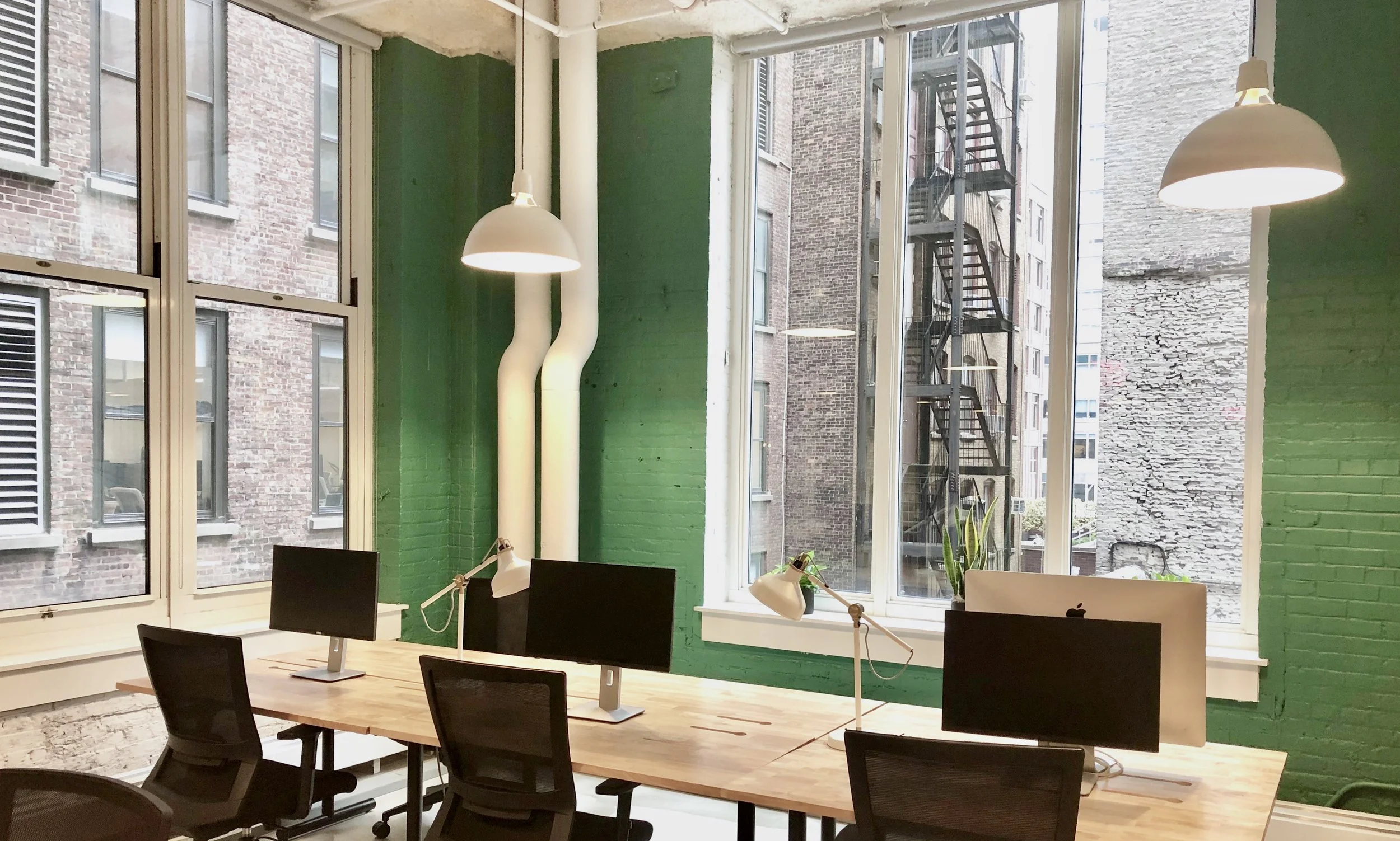
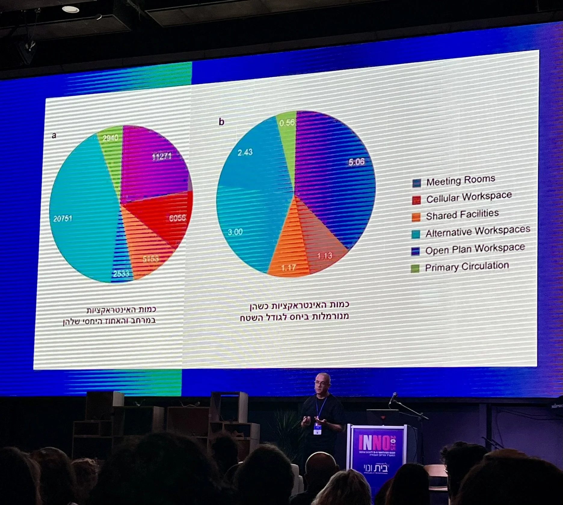
Five takeaways from INNO 2025
Five takeaways from INNO 2025, בית ונוי - Bait Venoy's international conference on innovative workspace strategies:
1. 𝗦𝗽𝗼𝗻𝘁𝗮𝗻𝗲𝗼𝘂𝘀 𝗰𝗼𝗹𝗹𝗮𝗯𝗼𝗿𝗮𝘁𝗶𝗼𝗻 𝗱𝗼𝗲𝘀𝗻’𝘁 𝗵𝗮𝗽𝗽𝗲𝗻 𝗶𝗻 𝗼𝗽𝗲𝗻 𝘀𝗽𝗮𝗰𝗲 (𝗼𝗽𝗲𝗻 𝗽𝗹𝗮𝗻), 𝗶𝘁 𝗵𝗮𝗽𝗽𝗲𝗻𝘀 𝗶𝗻 מעברים (𝗰𝗶𝗿𝗰𝘂𝗹𝗮𝘁𝗶𝗼𝗻 𝗮𝗿𝗲𝗮𝘀). Incorporate amenities like seating and white boards in these in-between spaces to capitalize on these interactions.
2. 𝗪𝗲𝗮𝘃𝗲 𝗲𝗺𝗽𝗹𝗼𝘆𝗲𝗲 𝗲𝗺𝗽𝗼𝘄𝗲𝗿𝗺𝗲𝗻𝘁 𝗮𝗻𝗱 𝗮𝘂𝘁𝗼𝗻𝗼𝗺𝘆 𝗶𝗻𝘁𝗼 𝘆𝗼𝘂𝗿 𝗼𝗳𝗳𝗶𝗰𝗲 𝗱𝗲𝘀𝗶𝗴𝗻. For a smaller team, this can look like surveying employees before designing your office to incorporate their feedback and ideas. For a large company, this could mean creating neighborhoods in which each team decides for themselves how they want the space to function (e.g., assigned seats, no assigned seats, assigned only to those who come daily, etc.)
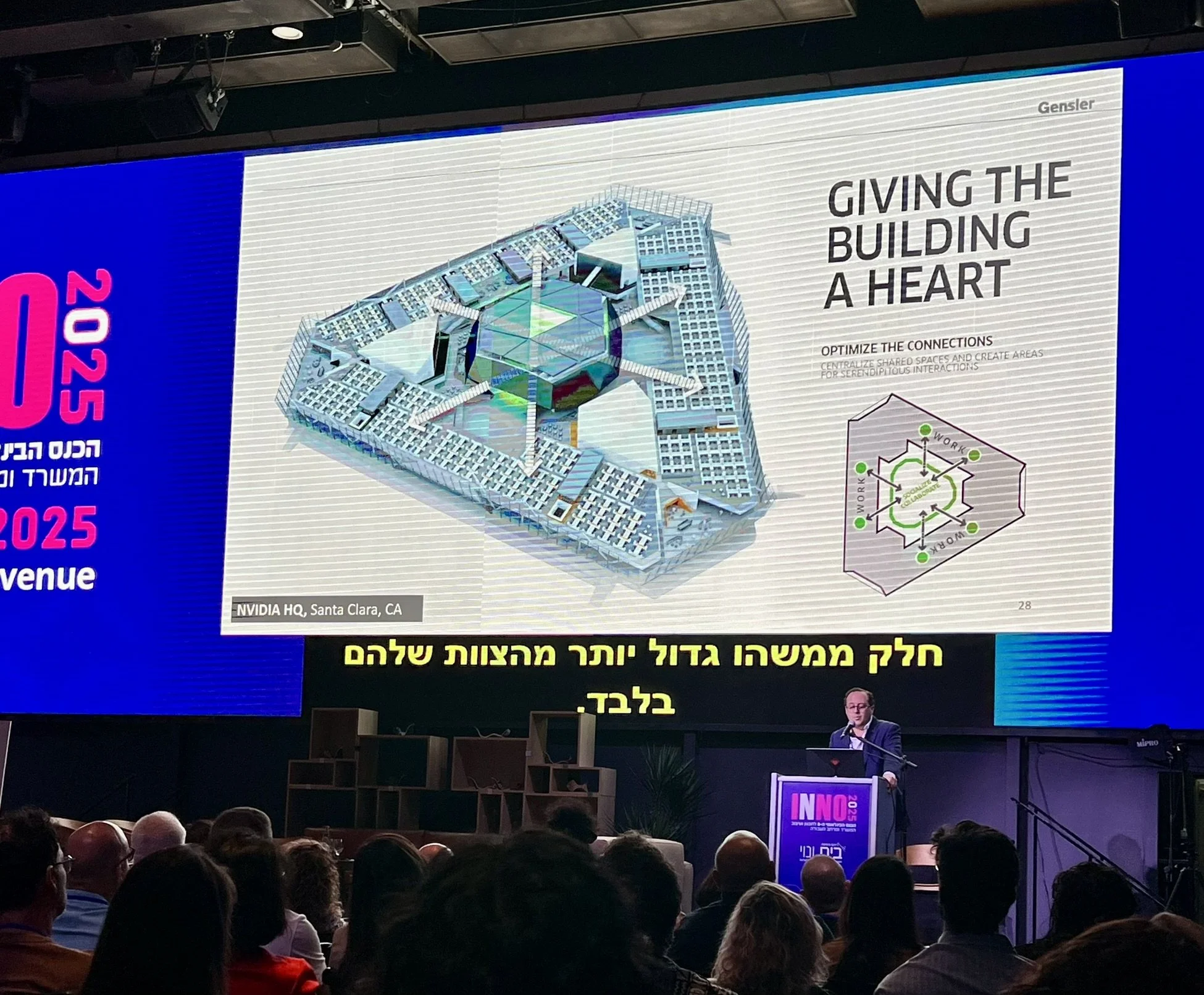
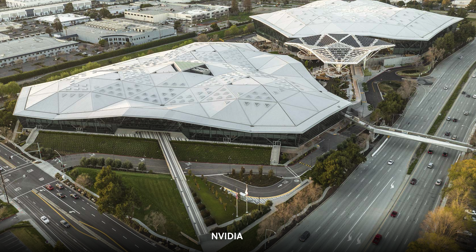
3. 𝗗𝗼𝗻’𝘁 𝘂𝗻𝗱𝗲𝗿𝗲𝘀𝘁𝗶𝗺𝗮𝘁𝗲 𝘁𝗵𝗲 𝗰𝗼𝗻𝗰𝗲𝗽𝘁𝘂𝗮𝗹 𝗿𝗼𝗼𝘁𝘀 𝗼𝗳 𝗮 𝗱𝗲𝘀𝗶𝗴𝗻 𝗽𝗿𝗼𝗷𝗲𝗰𝘁. Whether it’s the Olympics logo that inspired 3XN/GXN's spiral staircase for Olympic House in Switzerland or a beating heart that became the blueprint for Gensler’s NVIDIA headquarters in California, drawing on meaningful symbols and narratives leads to spaces with soul that speak to the specific needs and values of a company. Thoughtful, story-driven spaces fuel people and company culture.
4. 𝗧𝗵𝗲 𝗶𝗺𝗽𝗼𝗿𝘁𝗮𝗻𝗰𝗲 𝗼𝗳 𝗻𝗮𝘁𝘂𝗿𝗮𝗹 𝗹𝗶𝗴𝗵𝘁 𝗰𝗮𝗺𝗲 𝘂𝗽 𝘁𝗶𝗺𝗲 𝗮𝗻𝗱 𝗮𝗴𝗮𝗶𝗻. Don’t overlook daylight when you’re office hunting or building one from scratch. Outdoor space is another plus. (What was exhausting about a full day of lectures? Not the interesting lectures! Rather it’s the sitting in a dark windowless room for hours on end.)
5. 𝗧𝗵𝗲 𝘃𝗮𝘀𝘁 𝗺𝗮𝗷𝗼𝗿𝗶𝘁𝘆 𝗼𝗳 𝗮 𝗰𝗼𝗺𝗽𝗮𝗻𝘆’𝘀 𝗲𝘅𝗽𝗲𝗻𝘀𝗲𝘀 𝗶𝘀 𝗶𝘁𝘀 𝗽𝗲𝗼𝗽𝗹𝗲, 𝗻𝗼𝘁 𝗶𝘁𝘀 𝗲𝗻𝗲𝗿𝗴𝘆 𝗯𝗶𝗹𝗹 — 𝘢𝘯𝘥 𝘺𝘦𝘵, 𝘄𝗼𝗿𝗸𝗶𝗻𝗴 𝗶𝗻 𝗮 𝗴𝗿𝗲𝗲𝗻 𝗯𝘂𝗶𝗹𝗱𝗶𝗻𝗴 𝗰𝗮𝗻 𝗶𝗺𝗽𝗿𝗼𝘃𝗲 𝘆𝗼𝘂𝗿 𝗽𝗲𝗼𝗽𝗹𝗲’𝘀 𝗰𝗼𝗴𝗻𝗶𝘁𝗶𝘃𝗲 𝗳𝘂𝗻𝗰𝘁𝗶𝗼𝗻 𝗯𝘆 𝟮𝟲%. Optimizing air quality, thermal conditions, lighting, and acoustics isn’t just trendy or earth-friendly; it impacts how your people work, and office design in 2025+ is always people-centered.
Your office should empower creativity, build belonging, support teams, and reflect your company’s shared values. Then the focus isn’t on coercing employees back to the office, rather about attracting people, fostering connection, and driving innovation and purpose.
That’s a lot of buzz words for a Sunday, but baby, it’s true.

Open Space: Yay or Nay?
The open-plan or “open space” office trend has been around for decades. Is it right for you?
It depends on the goal of your office. Do you want to optimize:
Productivity?
Collaboration?
Employee satisfaction?
Retention?
If your teams are working at home most of the time and they come into the office for meetings, teamwork, and social cohesion, open space with a hot-desk arrangement combined with meeting rooms and pods could work great.
If you need people’s heads down for focused work for long periods, an open-space setup may be too noisy and distracting (and drive people nuts).
Ideally you can de-densify enough to offer options for both quiet focused work and more collaborative and social interaction.
If space is limited, make sure you don’t blindly follow a trend that hurts the bottom-line goal of your office.
?מגמת המשרדים האופן ספייס קיימת כבר עשרות שנים. האם היא מתאימה לכם
:זה תלוי במטרה של המשרד שלכם. האם אתם רוצים למקסם
?פרודוקטיביות
?שיתוף פעולה
?שביעות רצון העובדים
?שמירה על עובדים
אם הצוותים שלכם עובדים מהבית רוב הזמן והם מגיעים למשרד לפגישות, עבודת צוות וחיזוק הקשרים החברתיים, משרדים פתוחים עם ארגון הוט-דסקינג בשילוב חדרי פגישות ופודס יכולים לעבוד מצוין.
.אם אתם צריכים שהעובדים יתמקדו בעבודה שקטה לאורך זמן, סידור פתוח עשוי להיות רועש ומסיח דעת (ולגרום לעובדים לאבד סבלנות)
.באופן אידיאלי, אפשר להפחית צפיפות מספיק כדי להציע גם אפשרויות לעבודה ממוקדת ושקטה וגם לאינטראקציה שיתופית וחברתית
.אם המרחב מוגבל, ודאו שאתם לא עוקבים בעיוורון אחרי טרנד שפוגע במטרות העיקריות של המשרד שלכם
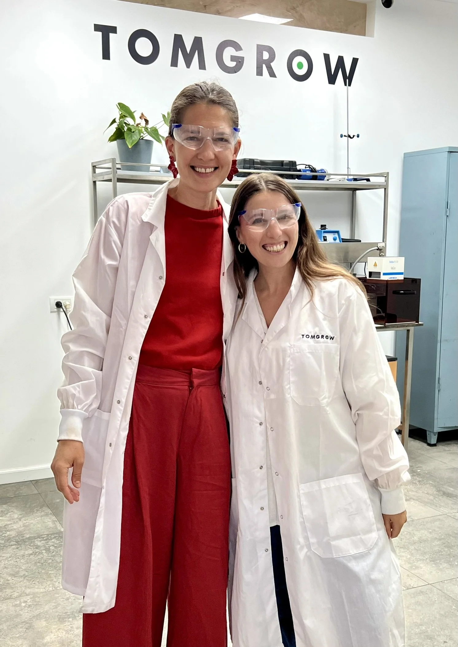
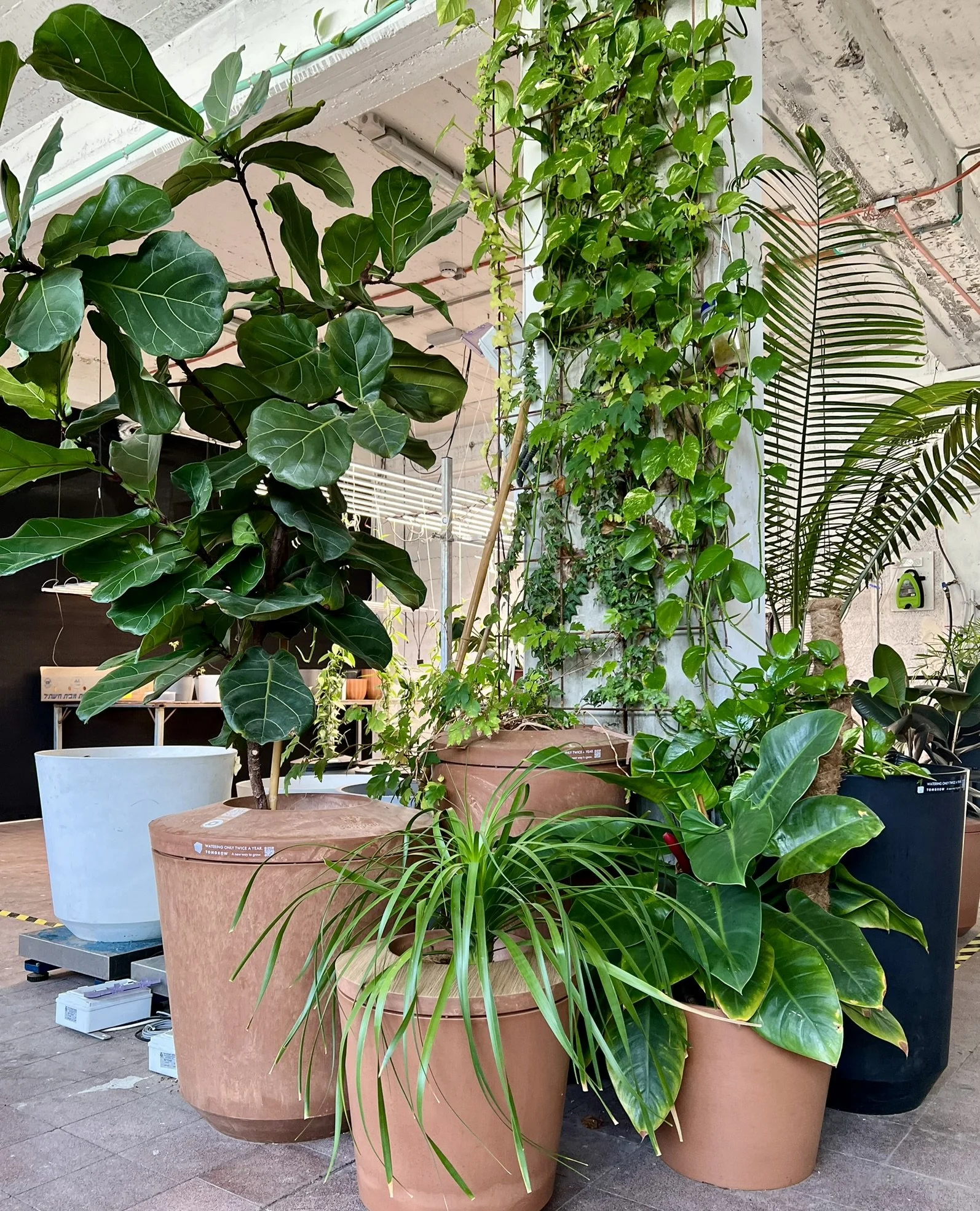
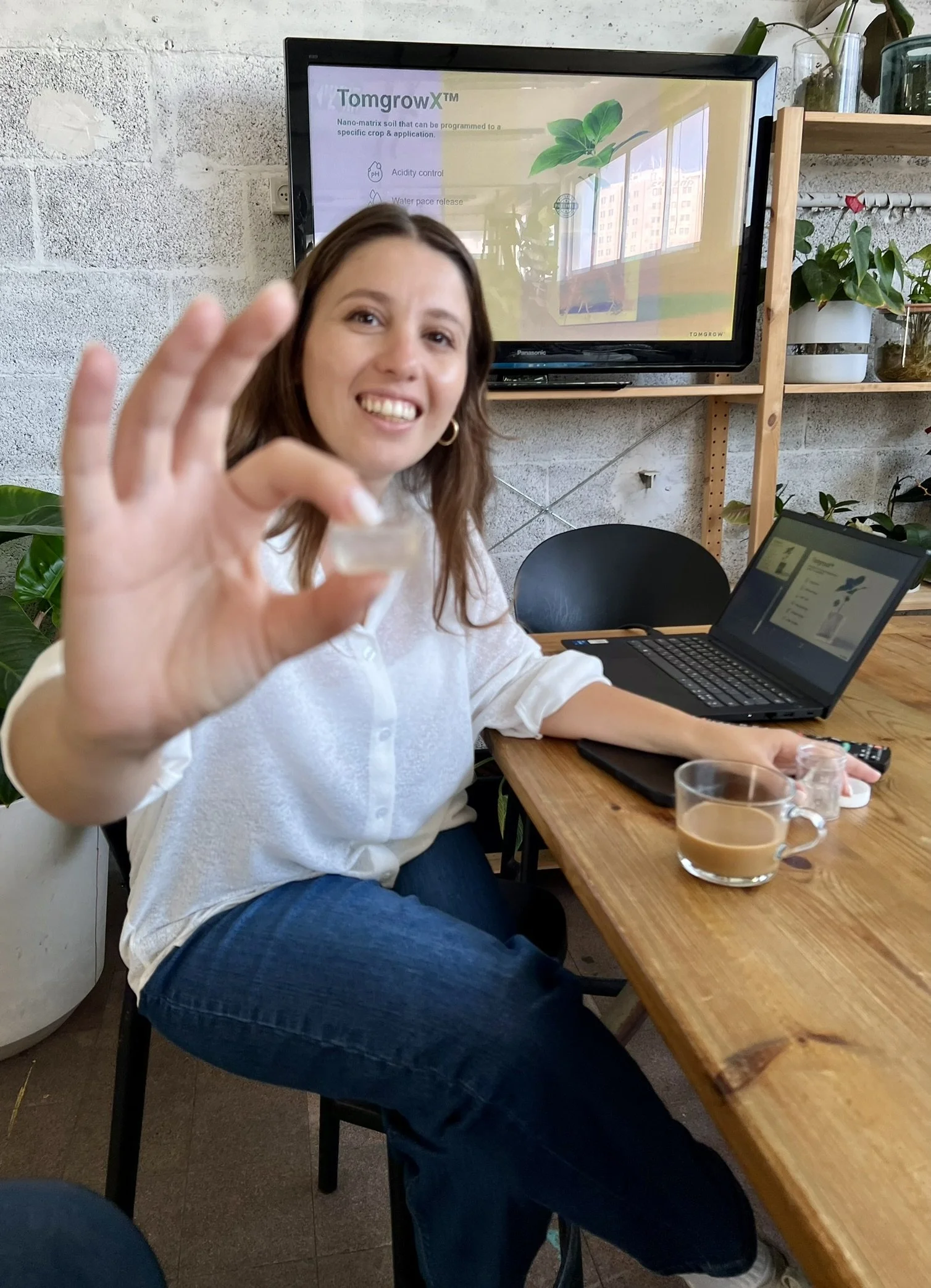
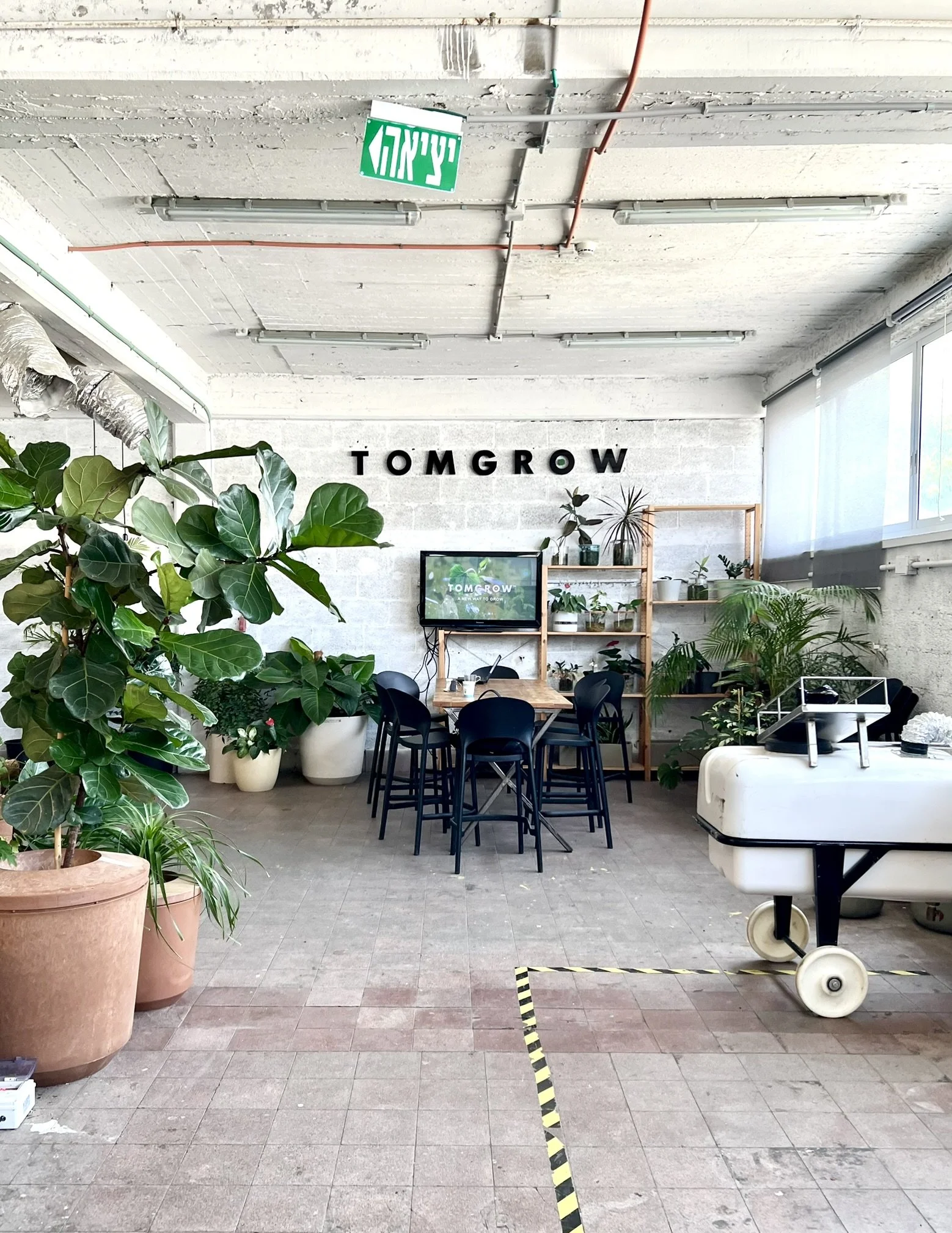
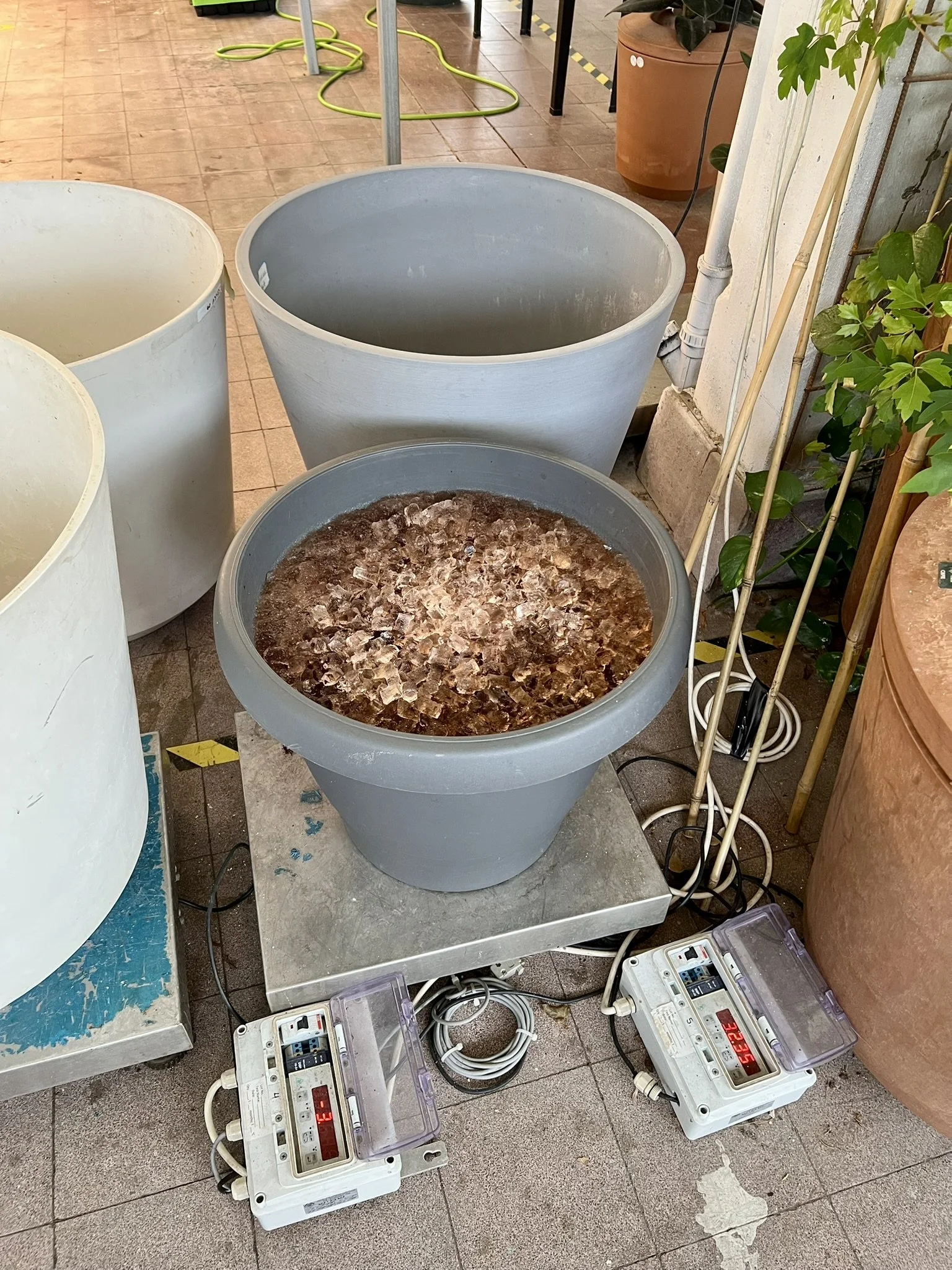
Ingenious innovation in indoor plants
Last month I had a fascinating visit and lab tour of Tomgrow. They’re an Israeli agri-tech company with a patented dirt-free, low-water solution for indoor plants: a nutrient-rich gel that keeps the plants hydrated and thriving (even in artificial light).
Growing plants in Tomgrow’s gel means you skip the mess and hassle of dirt and water your plants only once or twice a year (!). The easy upkeep makes designing greenery into the office a breeze, and it also means plants can be near computers and tech without risk, making for endless design options.
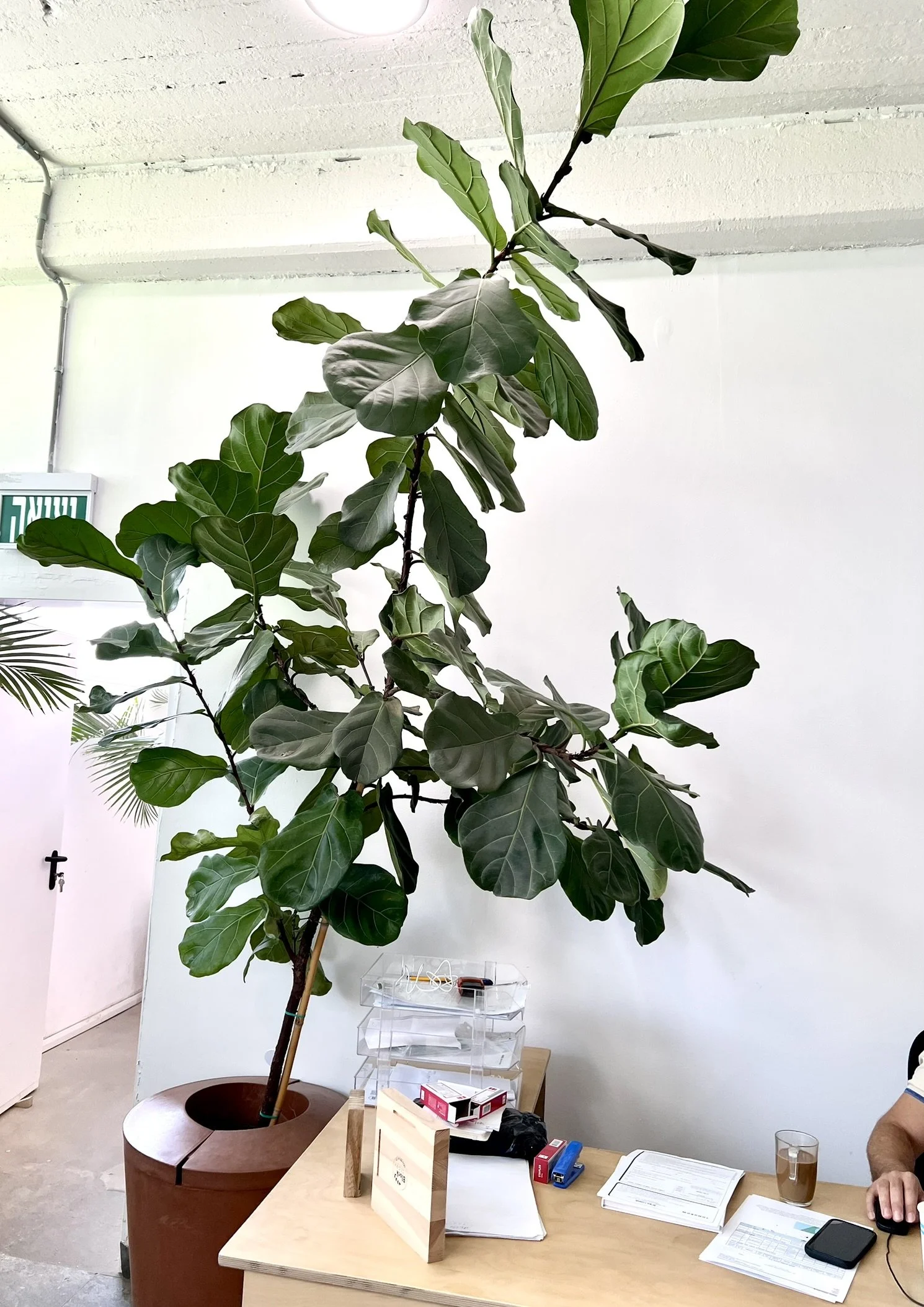
Bringing plant life and natural elements into the office improves employee well-being and makes the office a place people enjoy spending time in.
A big thank you to Tali Osadon, who showed me how Tomgrow’s gel is made and the experiments they’re doing to continuously optimize its performance and expand the line of plants they can grow, from flowers to produce.
Love seeing Israel take the lead in green and efficient solutions in biophilic design!

5 Signs your office is falling short (and limiting your potential)
𝟭) 𝗘𝗺𝗽𝘁𝘆 𝗱𝗲𝘀𝗸𝘀 𝗲𝘃𝗲𝗿𝘆𝘄𝗵𝗲𝗿𝗲 – Hybrid is here to stay, but if no one wants to come in, that's a red flag. A well-designed space should draw people in and make the office the 𝘣𝘦𝘵𝘵𝘦𝘳 place to work.
𝟮) 𝗧𝗼𝗼 𝗹𝗼𝘂𝗱 / 𝘁𝗼𝗼 𝗾𝘂𝗶𝗲𝘁 – Open concept chaos or eerily silent cubicles? Both extremes kill productivity. Balance is key and people need choice: collaborative zones 𝘢𝘯𝘥 focused areas.
𝟯) 𝗣𝗲𝗼𝗽𝗹𝗲 𝗯𝗼𝗼𝗸 𝗺𝗲𝗲𝘁𝗶𝗻𝗴 𝗿𝗼𝗼𝗺𝘀 𝗷𝘂𝘀𝘁 𝘁𝗼 𝘄𝗼𝗿𝗸 𝗮𝗹𝗼𝗻𝗲 – This often means they’re craving privacy and can’t find it elsewhere. If your meeting rooms are full of solo workers, it’s time to rethink your layout.
𝟰) 𝗡𝗼𝗯𝗼𝗱𝘆 𝗸𝗻𝗼𝘄𝘀 𝘄𝗵𝗲𝗿𝗲 𝘁𝗼 𝗴𝗼 – Confusing layouts, no clear zones for different work styles, or poor signage can make even the most beautiful office frustrating to use.
𝟱) 𝗜𝘁 𝗱𝗼𝗲𝘀𝗻’𝘁 𝗿𝗲𝗳𝗹𝗲𝗰𝘁 𝘆𝗼𝘂𝗿 𝗰𝘂𝗹𝘁𝘂𝗿𝗲 – If your space doesn’t 𝘭𝘰𝘰𝘬 𝘢𝘯𝘥 𝘧𝘦𝘦𝘭 like your brand, it’s a missed opportunity. Your office should reinforce your values the moment someone walks in — instead of feeling like it could be any other company in the world.
Office design is about functionality, flexibility, brand identity, and giving people a reason to 𝘸𝘢𝘯𝘵 to be there.
Does your office show signs it needs reimagining? Book a call with me and we’ll discuss it.

Anatomy of a Kitchen 101
(Because Python won’t program your mug storage for you)

𝗣𝗿𝗼𝗯𝗹𝗲𝗺: Pillars in the middle of the space
𝗦𝗼𝗹𝘂𝘁𝗶𝗼𝗻: Wrap island around pillar and adjust cabinet depths
𝗣𝗿𝗼𝗯𝗹𝗲𝗺: Beams running through the ceiling
𝗦𝗼𝗹𝘂𝘁𝗶𝗼𝗻: Tuck lighting neatly behind to conceal and wrap carpentry
𝗣𝗿𝗼𝗯𝗹𝗲𝗺: Client wants to store Passover items nearby but there’s no space
𝗦𝗼𝗹𝘂𝘁𝗶𝗼𝗻: Blow out a boydem/attic overhead to create ladder-accessible storage
𝗣𝗿𝗼𝗯𝗹𝗲𝗺: Pillars need to be indestructible
𝗦𝗼𝗹𝘂𝘁𝗶𝗼𝗻: Cover in stain-resistant porcelain tiles that mimic Jerusalem stone
𝗣𝗿𝗼𝗯𝗹𝗲𝗺: Many appliances to store, some that get used often
𝗦𝗼𝗹𝘂𝘁𝗶𝗼𝗻: Appliance garage with built-in outlets
𝗣𝗿𝗼𝗯𝗹𝗲𝗺: Client wants a second fridge, but building a new kitchen around two separate fridges is inelegant
𝗦𝗼𝗹𝘂𝘁𝗶𝗼𝗻: Get one large 120cm double fridge instead
𝗣𝗿𝗼𝗯𝗹𝗲𝗺: Client visits appliance store and thinks the freezer section is too narrow
𝗦𝗼𝗹𝘂𝘁𝗶𝗼𝗻: Rework plans to accommodate a 140cm fridge with a better freezer
𝗣𝗿𝗼𝗯𝗹𝗲𝗺: Client has tons of stuff
𝗦𝗼𝗹𝘂𝘁𝗶𝗼𝗻: Build extra cabinetry under the bar
𝗣𝗿𝗼𝗯𝗹𝗲𝗺: Client also wants vertical pan storage, pull-out garbage, built-in drying racks, towel holders, display shelving, corner storage, a netilat yadayim, cold water, a large island, onion and potato drawers, two ovens, two dishwashers, three separate utensil areas, and custom storage for oversized and unusually shaped items
𝗦𝗼𝗹𝘂𝘁𝗶𝗼𝗻: Plan it baby.


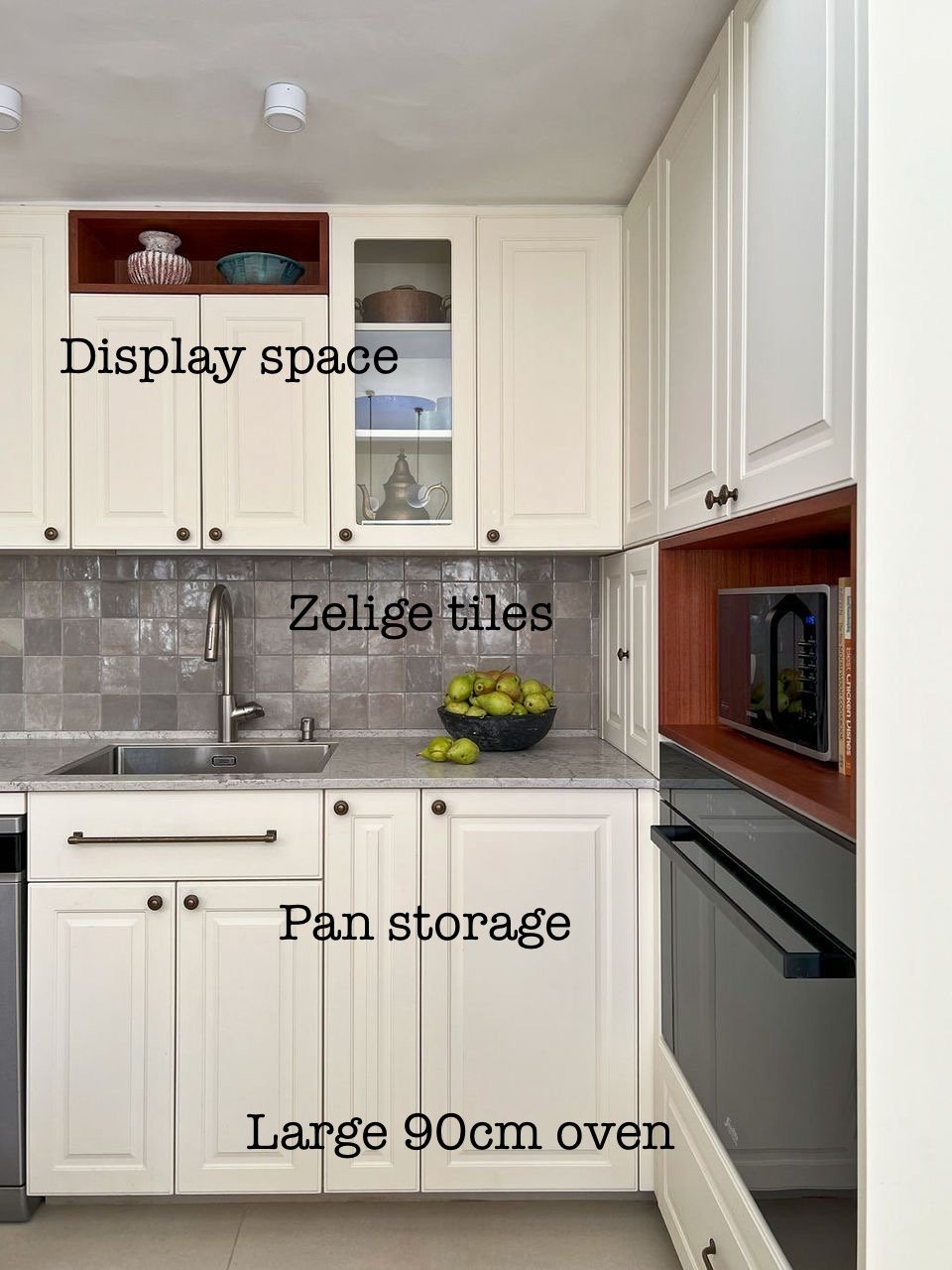


Every client is different. Every space is different. And for every client and space there are unique solutions.
Float your desk


Many people instinctively push their desks against a wall.
Try the Feng Shui 𝗰𝗼𝗺𝗺𝗮𝗻𝗱 𝗽𝗼𝘀𝗶𝘁𝗶𝗼𝗻 instead.
You should face outward with a clear view of the door and your back to a solid wall for a sense of security, control, and leadership (CEO). This setup minimizes distractions and helps you feel more at ease.
Desk tips:
✅ 𝗙𝗮𝗰𝗲 𝘁𝗵𝗲 𝗱𝗼𝗼𝗿, 𝗯𝘂𝘁 𝗻𝗼𝘁 𝗱𝗶𝗿𝗲𝗰𝘁𝗹𝘆 𝗶𝗻 𝗹𝗶𝗻𝗲
Position your desk to see the entrance without sitting directly in front of it, for better awareness and energy flow.
✅ 𝗦𝗼𝗹𝗶𝗱 𝘀𝘂𝗽𝗽𝗼𝗿𝘁 𝗯𝗲𝗵𝗶𝗻𝗱 𝘆𝗼𝘂
Place a solid wall or high-backed chair behind you for stability. Avoid sitting with your back to a window unless covered with curtains (backlighting can turn you into a silhouette on Zoom).
✅ 𝗕𝗮𝗹𝗮𝗻𝗰𝗲𝗱 𝘀𝗽𝗮𝗰𝗲 𝗼𝗻 𝗯𝗼𝘁𝗵 𝘀𝗶𝗱𝗲𝘀
Avoid placing your desk too close to a wall; keep both sides open or supported by furniture for balance.
✅ 𝗗𝗼𝗻'𝘁 𝗳𝗮𝗰𝗲 𝗮 𝘄𝗮𝗹𝗹
If necessary, use mirrors or artwork to create a more open, inspiring space.
✅ 𝗚𝗼𝗼𝗱 𝗻𝗮𝘁𝘂𝗿𝗮𝗹 𝗹𝗶𝗴𝗵𝘁 𝗮𝗻𝗱 𝗮𝗶𝗿 𝗳𝗹𝗼𝘄
Sit near (but not in front of) a window if you can.
Experiment with floating your desk and see how it transforms your workflow and mindset.


Private office vs coworking: Which one fits your business?
Once I went to sign a lease on an apartment and met the realtor duo at a coworking office. They had a meeting room booked and the space looked professional and nicely designed. I felt well taken care of.
Would I have felt the same if I were signing to purchase a multi-million-dollar penthouse? Maybe not.
Some businesses need a space that reflects their brand and their offer, gives them full control over their environment, and fosters productivity. Other businesses value flexibility, networking, and cost savings.
A breakdown:
🏢 Private Office
✅ Pros:
• Custom branding and design that reflect your company culture
• Personalized layout to enhance productivity
• Full privacy and control over the space
• Long-term stability for growing teams
❌ Cons:
• Higher costs and longer lease commitments
• Fewer organic networking opportunities
☕ Coworking Space
✅ Pros:
• Can be more cost-effective
• Lease flexibility
• Great for networking and spontaneous collaborations
• Amenities and perks built in
❌ Cons:
• Less privacy and control over design, as well as potential for noise and distractions
• Inconsistent availability for desks and meeting rooms
• Less rooted, more transient atmosphere for your employees and guests
Both options have their perks, and the best choice depends on your business needs.
Have you ever been 𝘵𝘩𝘳𝘰𝘸𝘯 𝘰𝘧𝘧 by someone’s office? How about pleasantly surprised? Why? I would love to hear about it.👇
—
Need help designing your new office so your employees love coming to work? Send me a WhatsApp message to schedule a discovery call: 053-892-6032