
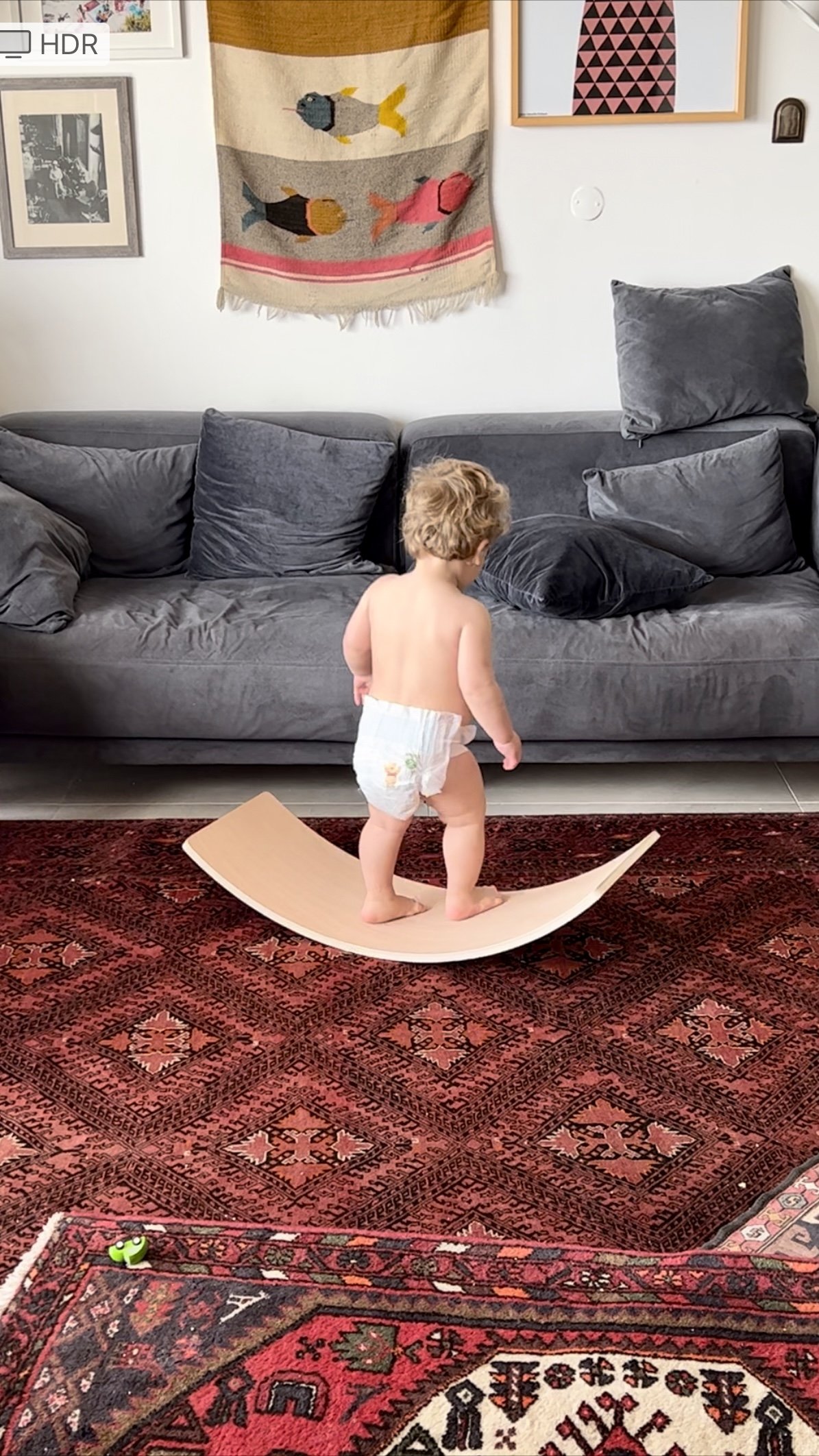
Distributed Play
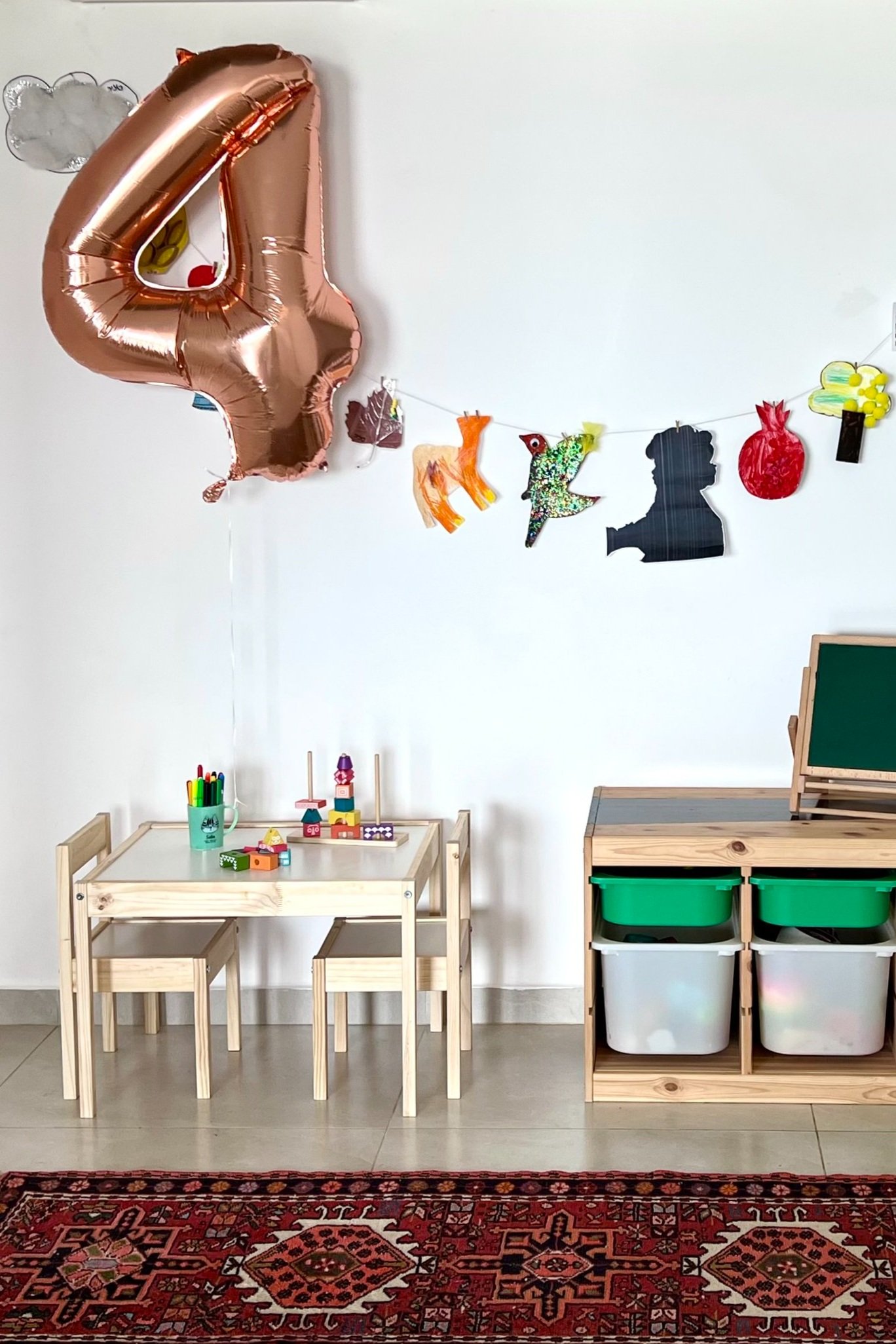

I set up our apartment to accommodate the mayhem of two toddlers at play who sometimes need a change of scene. Toys and activities are spread throughout the home, from living room to dining room to hallway to kids rooms. When movement is part of the design, everything feels a little less crazy.

Photo: Peled Studios \ יואב פלד צילום אדריכלות
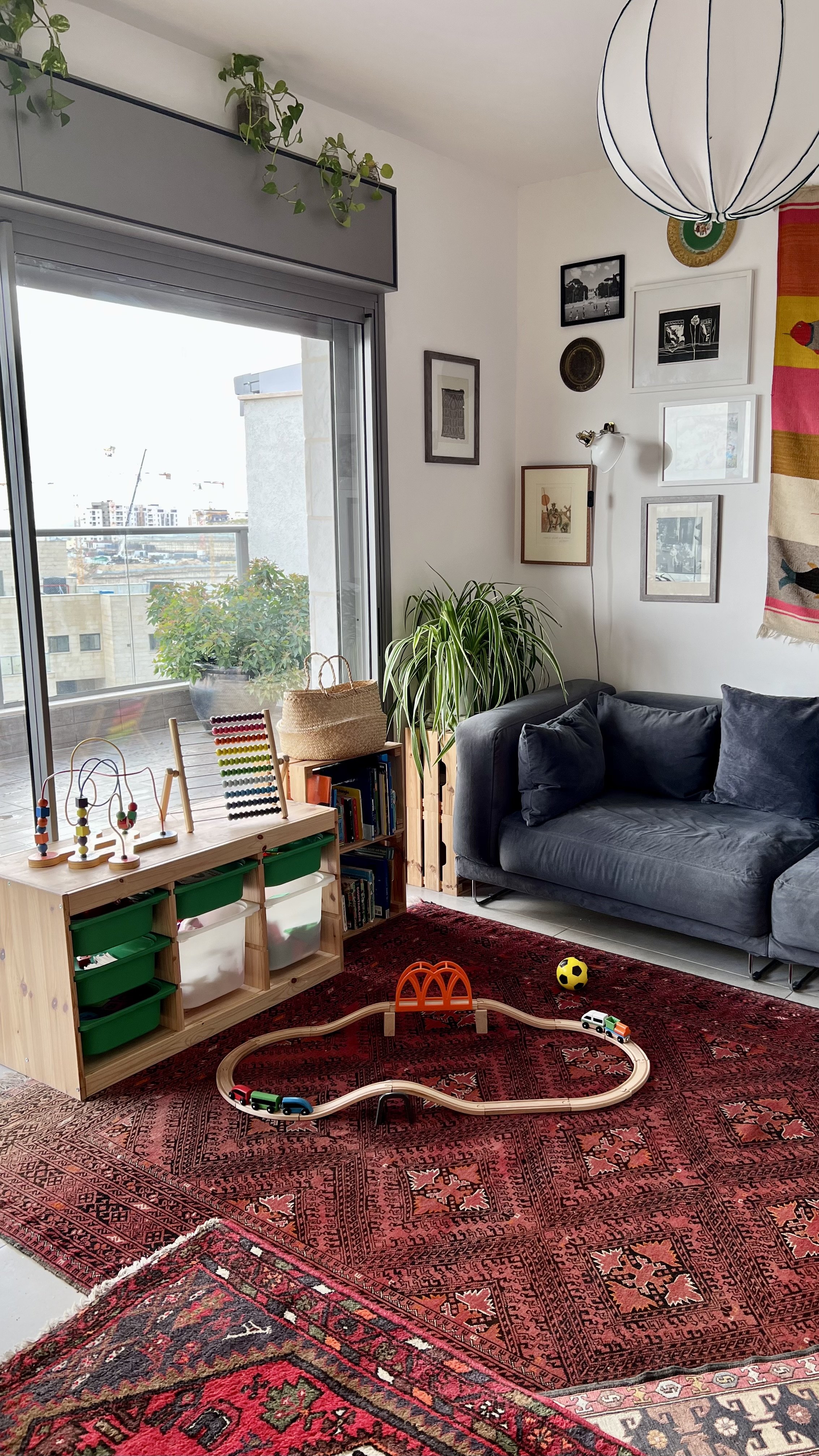
We have an IKEA Trofast storage unit in the living room as well as by the dining table leading to the hallway. It’s easy for kids to pull out toys and for us to switch out bins with different toys from time to time to keep things fresh. I have found that removing a few bins at the top (unlike in these photos) makes for easier cleanup because you don’t need to pull out every bin to dump toys back in. Generally, having fewer toys available helps kids focus.

Photo: Peled Studios \ יואב פלד צילום אדריכלות

Photo: Peled Studios \ יואב פלד צילום אדריכלות
The kids can hop seamlessly from the living room floor to the dining room table to the play corner. Defining areas by type of activity (e.g., building, arts and crafts, make believe, reading) helps create sanity.


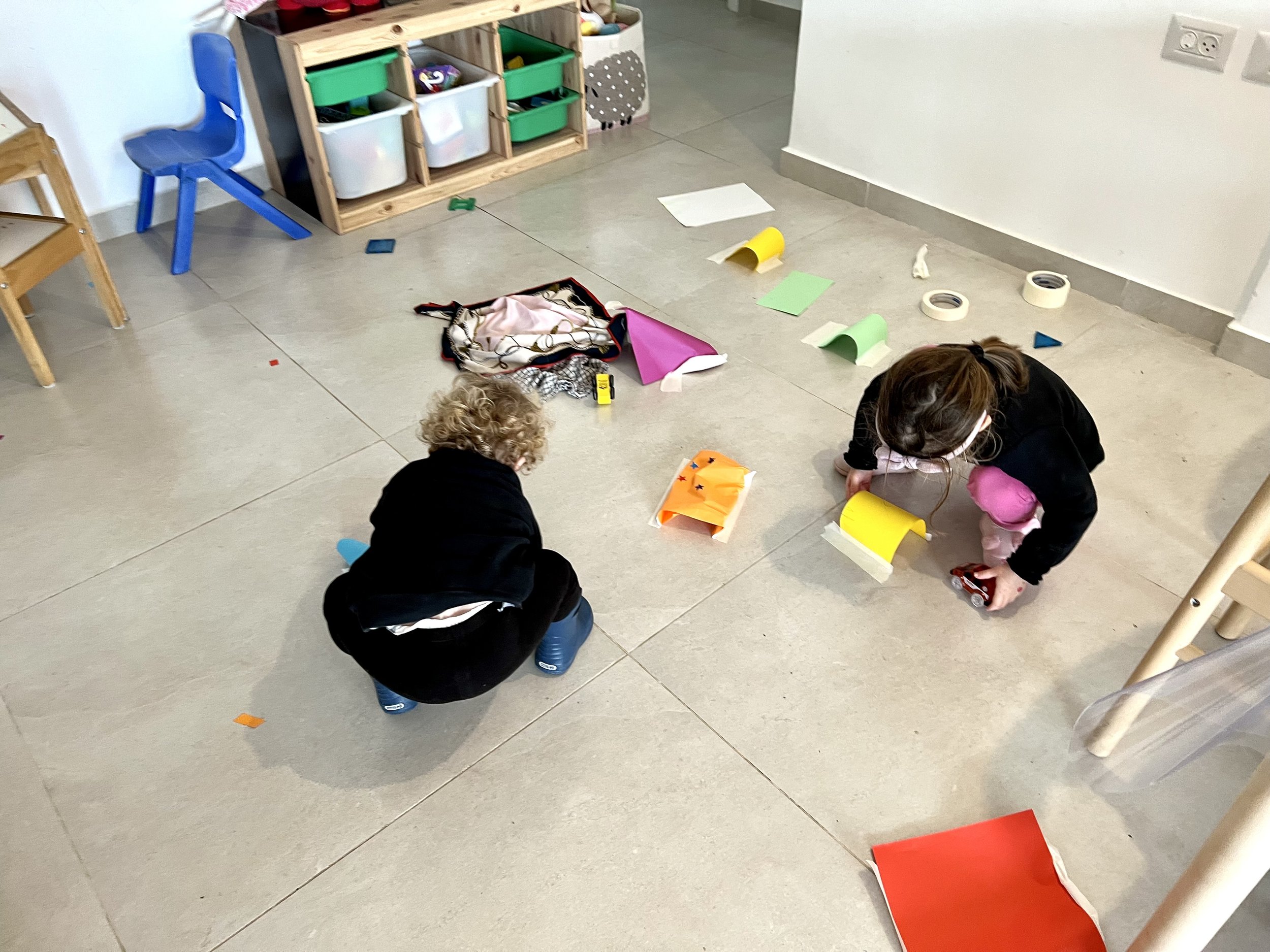

Photo: Peled Studios \ יואב פלד צילום אדריכלות
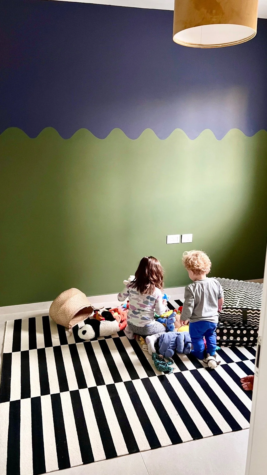
Immediately after putting the round rug down in Sol’s room, the kids started running around it in circles and laying dolls and stuffed animals around its periphery. It’s great to have for any activity where you want to gather around (pass the balloon, story time, etc.).
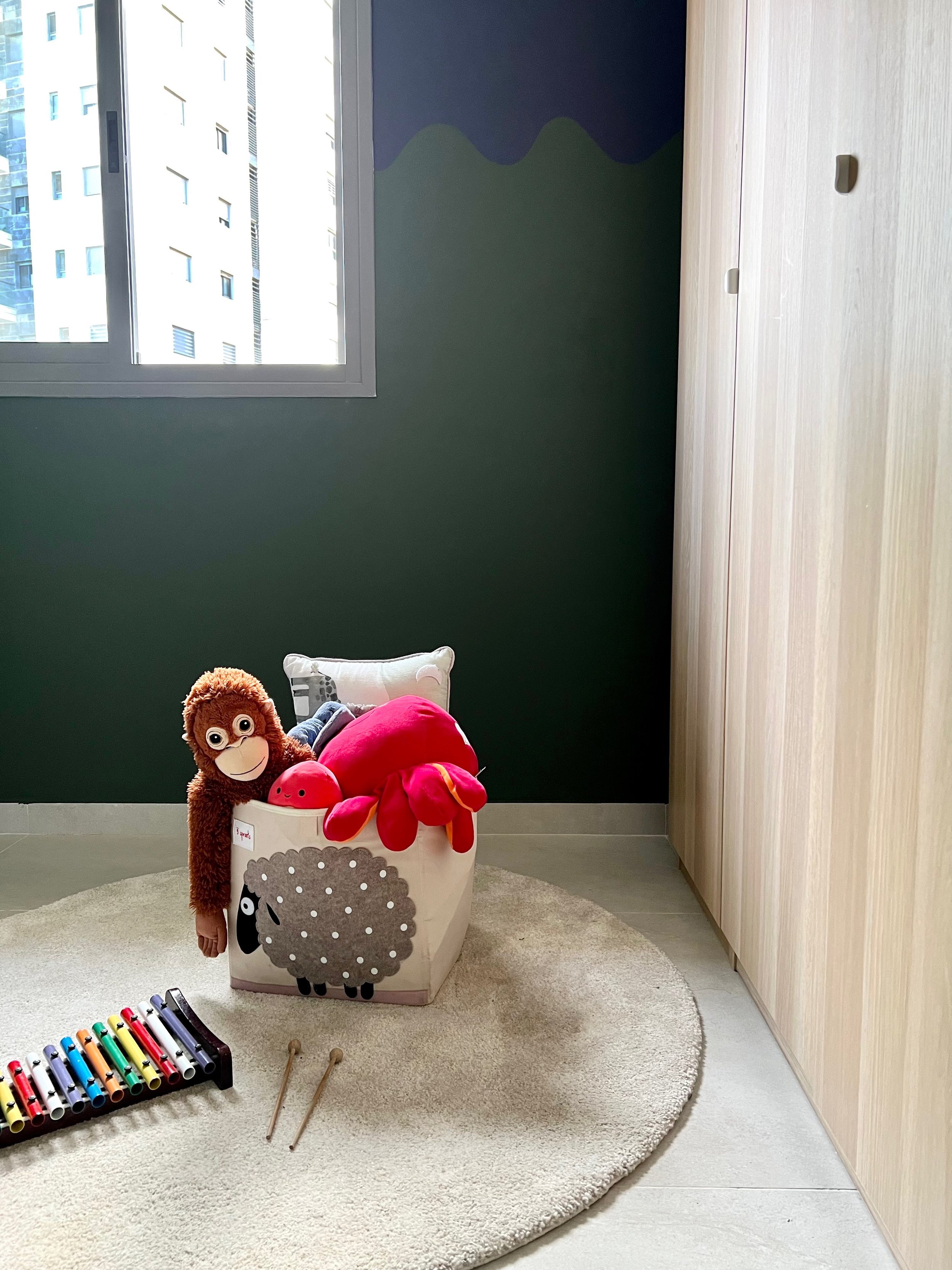


Photo: Peled Studios \ יואב פלד צילום אדריכלות

Photo: Peled Studios \ יואב פלד צילום אדריכלות
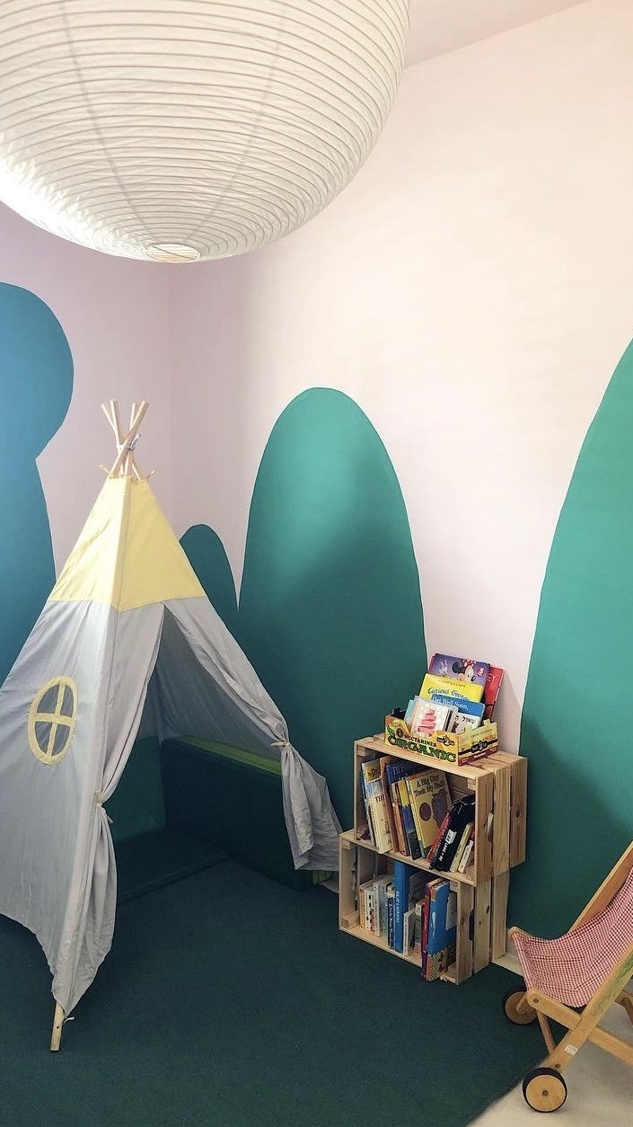
In Talia’s room, the teepee and book corner work just as well for intimate reading time as they do for going nuts with the floor mats.

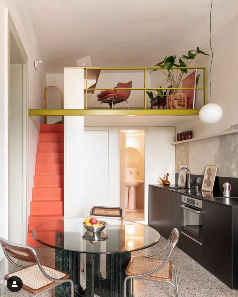
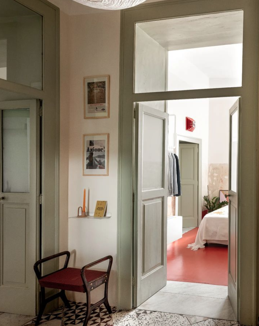
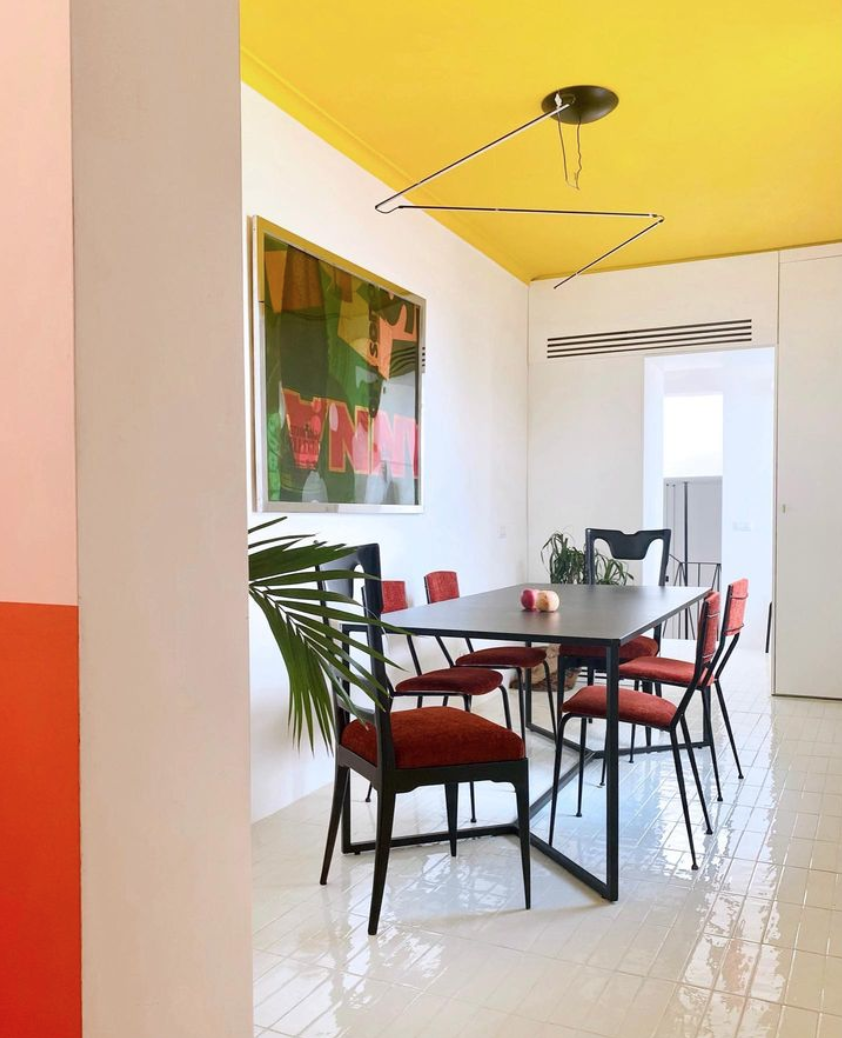
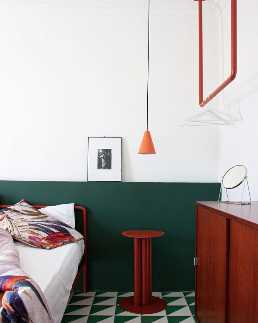
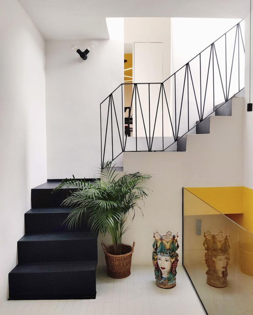
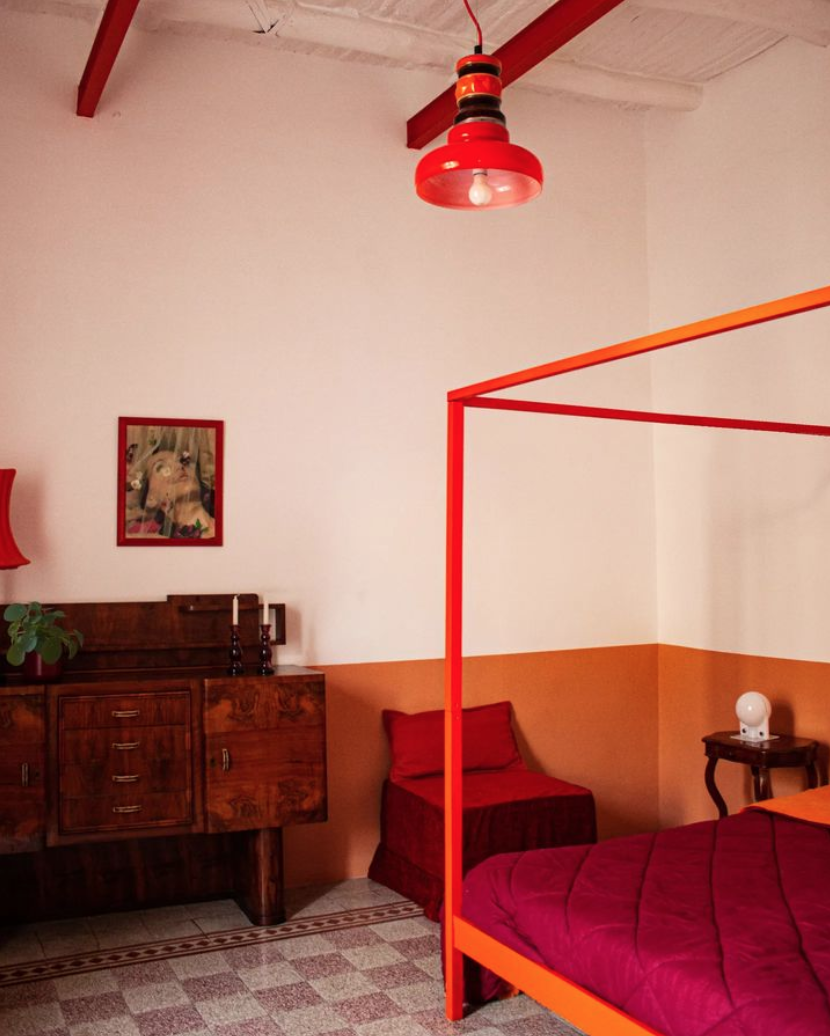
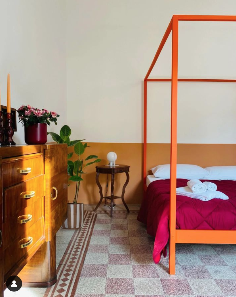
La Fotosintesi, Naples & Paris
It’s not every day I add a designer to my favorites list but it’s one of those days with La Fotosintesi. Architect duo Julie Nebout and Giuseppe Punzo, a couple both in work and life, meld the modern with the local and ancient in bold primary colors. They dig through the layers of the walls and floors to resurface what was once there, and they have made me completely rethink the half-painted wall.
Paradisiello:


Quartieri:
Cavour:

Other designers I find especially exciting: Beata Heuman, Masquespacio, and Nook Architects.


Smallable Decor Picks
Smallable, an online family concept store based in Paris, sells a beautiful collection of home decor. They ship fast — a lamp I bought for Talia’s room (#2 below) arrived at my door three days after I ordered it — and refund customs fees. Hard to believe. If you want to shop in Paris sans plane ticket and the looming threat of mysterious import and handling fees (that often pile much higher than 17%), I recommend their lighting selection to start.

(1) Affiche Anthurium Flowers Print by Carla Llanos
(3) Hatter Pendant Lamp + Handwoven Lantern
(4) Crave Table Lamp by Hübsch
(6) Radieuse Lampshade by Maison Sarah Lavoine
(7) Skirt Lamp by Broste Copenhagen
(8) Matisse Mohair Throw by Mantas Ezcaray
(9) Flower #13 Print by Carla Llanos
(10) Maison Deux Woolen Lemon Rug
(11) Objet Evasion Pendant Lamp
(12) Chelsea Circus Box
(13) Dolores Bar Stool by Honoré
(14) Dinosaur Felt Garland by Meri Meri
(15) Hübsch Wall Light


Master Bedroom Mood Board and Plan
The final project for one of my interior design classes was to create a mood board and building plan for the master bedroom of a fictional client. I decided to design for a young couple buying their first apartment in Israel. This couple and I, during our fictional conversations, decided to invest in the architecture of the space and spring for a pricey Milstone tile that gives the room a unique, exotic character. It’s a busy pattern but quiet in tones, and we kept the furnishings relatively clean and minimal to maintain a feeling of calm.
The neutral furniture allows for future interchangeability. Should they find themselves, after a long gut renovation, fatigued from spending money, we could easily switch out the Tollmans Dot bed for a slightly cheaper IKEA bed; source vintage nightstands at a flea market instead of buy new (I’d actually recommend that route either way); and switch out pricier lighting for more frugal options.
A few elements here that give the room a more relaxed feel: the wall hanging, which is a kids blanket from Arket that adds playfulness; and the mixed woods, which bring out both the light and dark tones in the tile and keep things from feeling too matchy-matchy and formal.

Building plan

Furniture plan
The sleeping area at left is minimal and meant to be kept tidy and clean, though I’d recommend a few dark wood hooks on the wall for those tired moments when you want to throw something up and deal with it later. All the storage and organization happens in the wardrobe area at right, and the intention is to have some extra blank space available inside, again for those tired moments when you want to throw things in haphazardly and deal with them later. For this reason I chose a 65-cm-deep, floor-to-ceiling custom wardrobe that makes use of all the available space. However, pushing past the 60-cm standard depth makes it pricey, so if spending fatigue sets in, the couple can choose to downgrade to 60 cm.

Electrical plan
The lighting here includes two sconces around the bed, a pendant light near the foot of the bed, and recessed lighting in the wardrobe area. I do think there’s room here for a couple more sconces or recessed lights in the sleeping area — a future edit I’ll be proposing in a future fictional conversation.
Sources: Tiles // Bed // Rug // Pendant Lampshade // Nightstand // Wall Hanging // Sconces


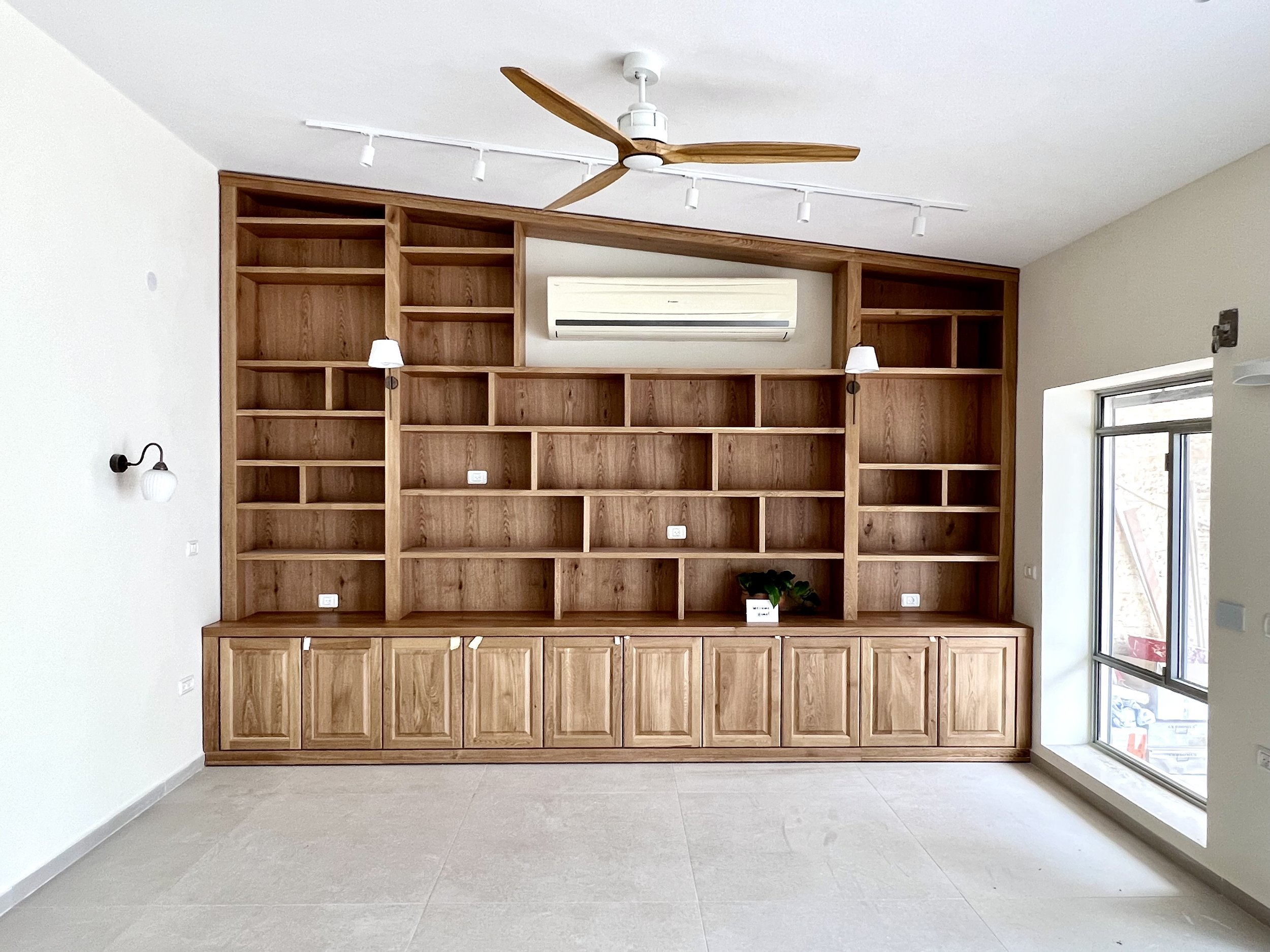

Carmei Gat Penthouse Living Room
I’ve been decorating a penthouse in Carmei Gat, the new neighborhood in Kiryat Gat, and here’s the completed living room. They wanted a contemporary American style and to incorporate their couch and artwork. You can look back at the original mockup for the room here. Below: the before photo when the apartment was empty, and the before the before in their previous apartment.


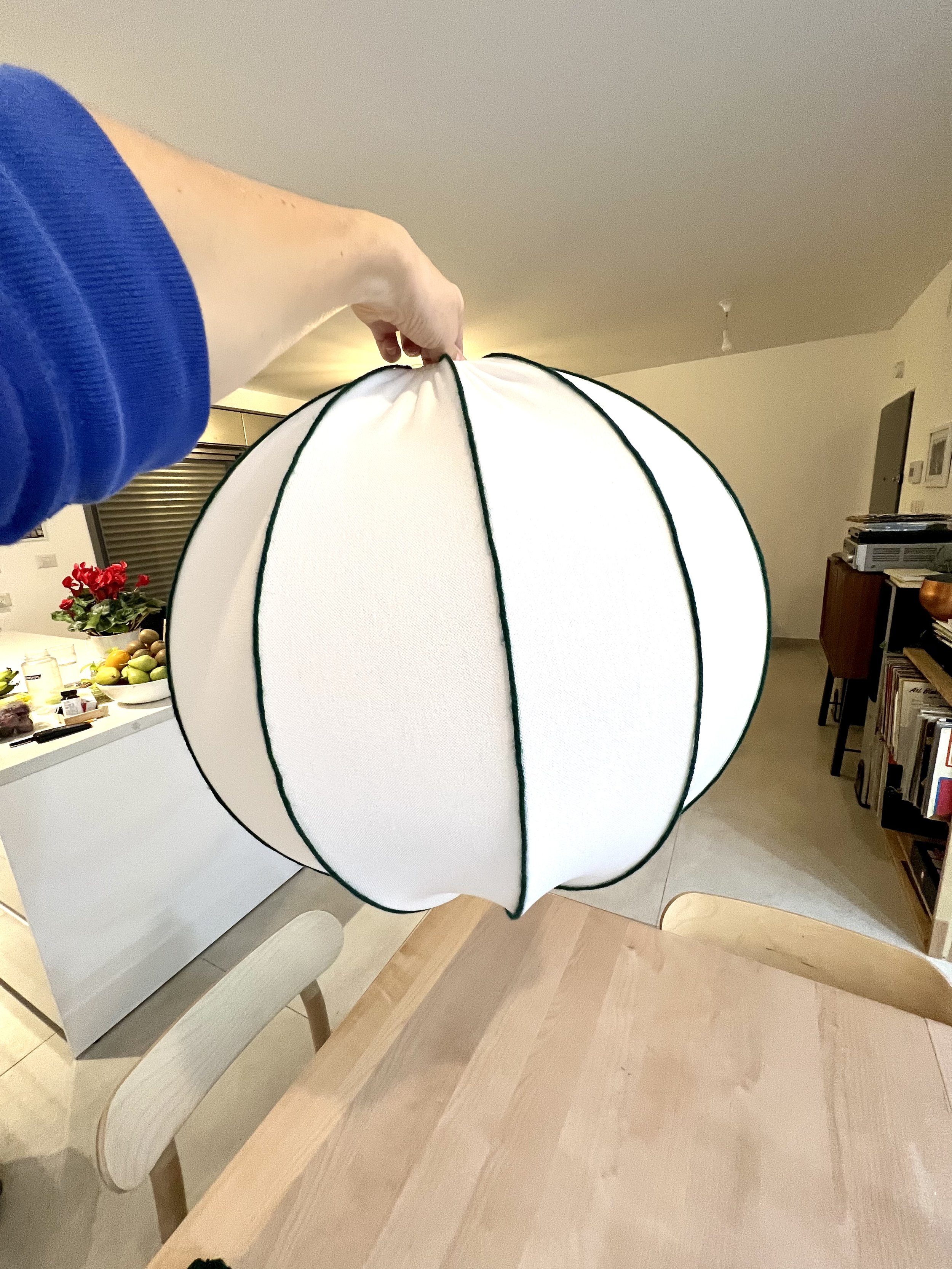
Master Bedroom: DIY Lampshade

I’m working on our bedroom and bought the IKEA REGNSKUR lampshade for above the bed. When my grandmother in Israel passed away, she left behind several bags of yarn that she used to use for knitting years ago. I brought a few spools home for future craft projects with the kids and decided to use some myself to make our lampshade more personal.

As you can see the bedroom is still sparse. After we moved in a year and a half ago I gave birth to Sol a month later, and I haven’t had time to give the room much attention.
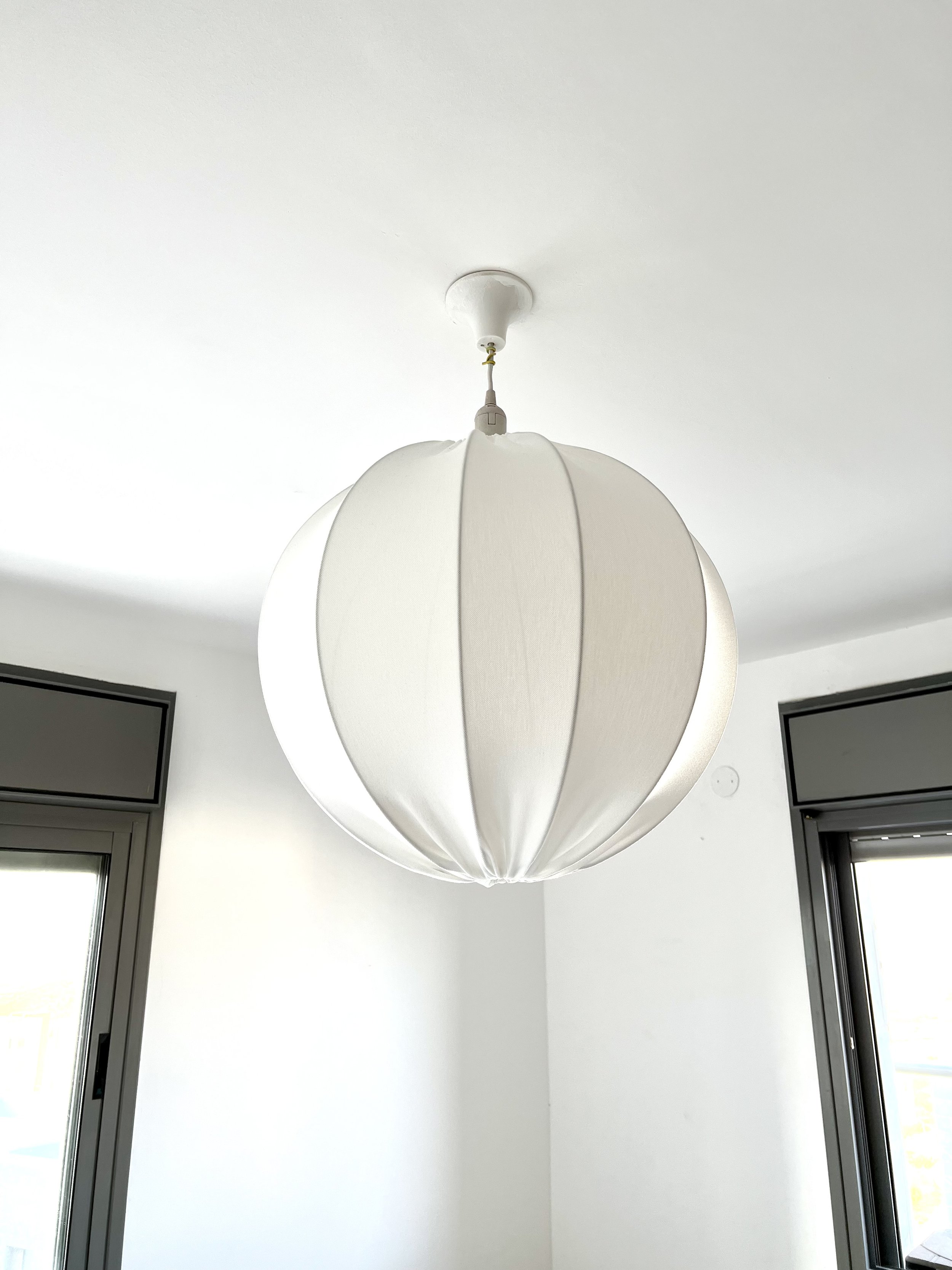
If we owned this apartment I’d switch out the light fixture itself to fit the shade better, but since our move-out date is on the horizon I’m leaving it a bit janky.
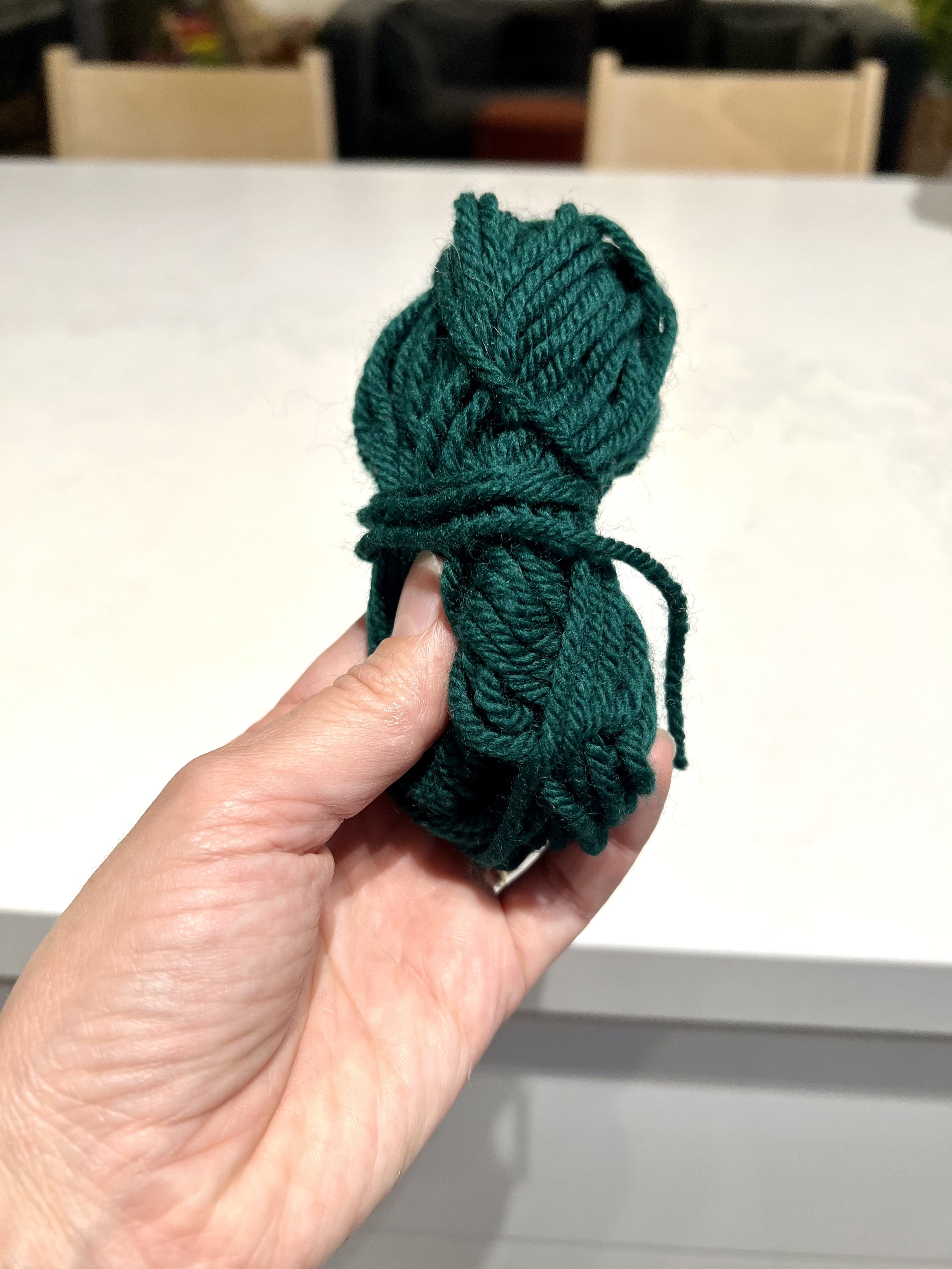
I chose a dark green yarn and applied fabric glue from the Hobby store in Modi’in.


More bedroom updates to come with the new lampshade installed.
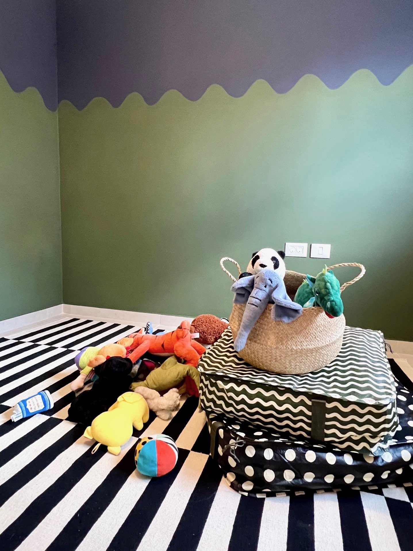
In Progress: Sol’s Room
I’m finally making Sol’s room Sol’s room. He’s been sleeping in his room for over a year but it’s also been half an office for a period and a temporary guest room multiple times. Below was its most recent iteration as a guest room (a speedy touchup purchased entirely from IKEA):

To the right of the door is a wardrobe that spans most of the wall. With one wall covered in the light oak wardrobe and another wall with a window that I want to span with light curtains, I decided to view the room as cut by a diagonal: the top left triangle will be dark and the bottom right triangle will be light.


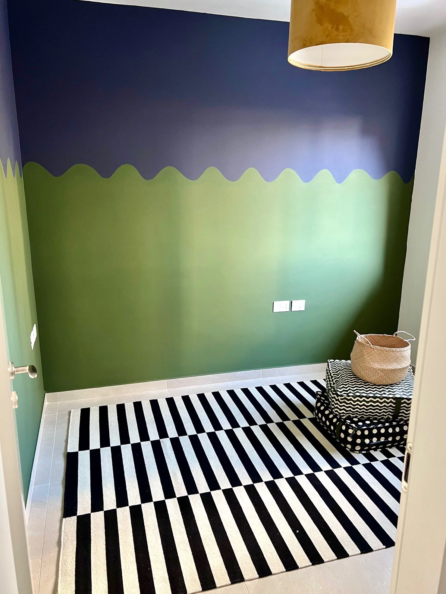
Here’s the room painted. The top is Black as Night (more navy than black) and the bottom is Garden Seat, both by Tambour. The rooms in a typical new apartment in Israel are clean and modern and … boxy. In Talia’s room I added curvature with a painted mountain mural (some updates happening in there soon), and I continued in that vein in Sol’s room with a wave pattern. Once curtains go up on the wall at right, their 3D curvature will complement the painted waves and bring some more movement and dimension to the space.
New Balcony Plants in the Rain
Jake’s been eager to get some greenery on our balcony for a year and a half, so I got these plants for his birthday. Some lavender, rosemary, and sage, and in the black pot a eucalyptus. I spent hours picking pots and ended up with two that had been in use for a while at the nursery. This way they’re pre-aged and already have with some character. Tip: Break the odd number rule to keep things casual. Sometimes three is too perfect.

Speedy IKEA Guest Room
I put together a quick interim guest room for my mother-in-law’s visit while prepping to finally decorate the room for Sol. For a year and a half this room has had almost nothing but an IKEA PAX wardrobe and a crib. I hate the crib, which I half-unintentionally bought off Facebook Marketplace, but that’s a story for another time. Here’s the before:

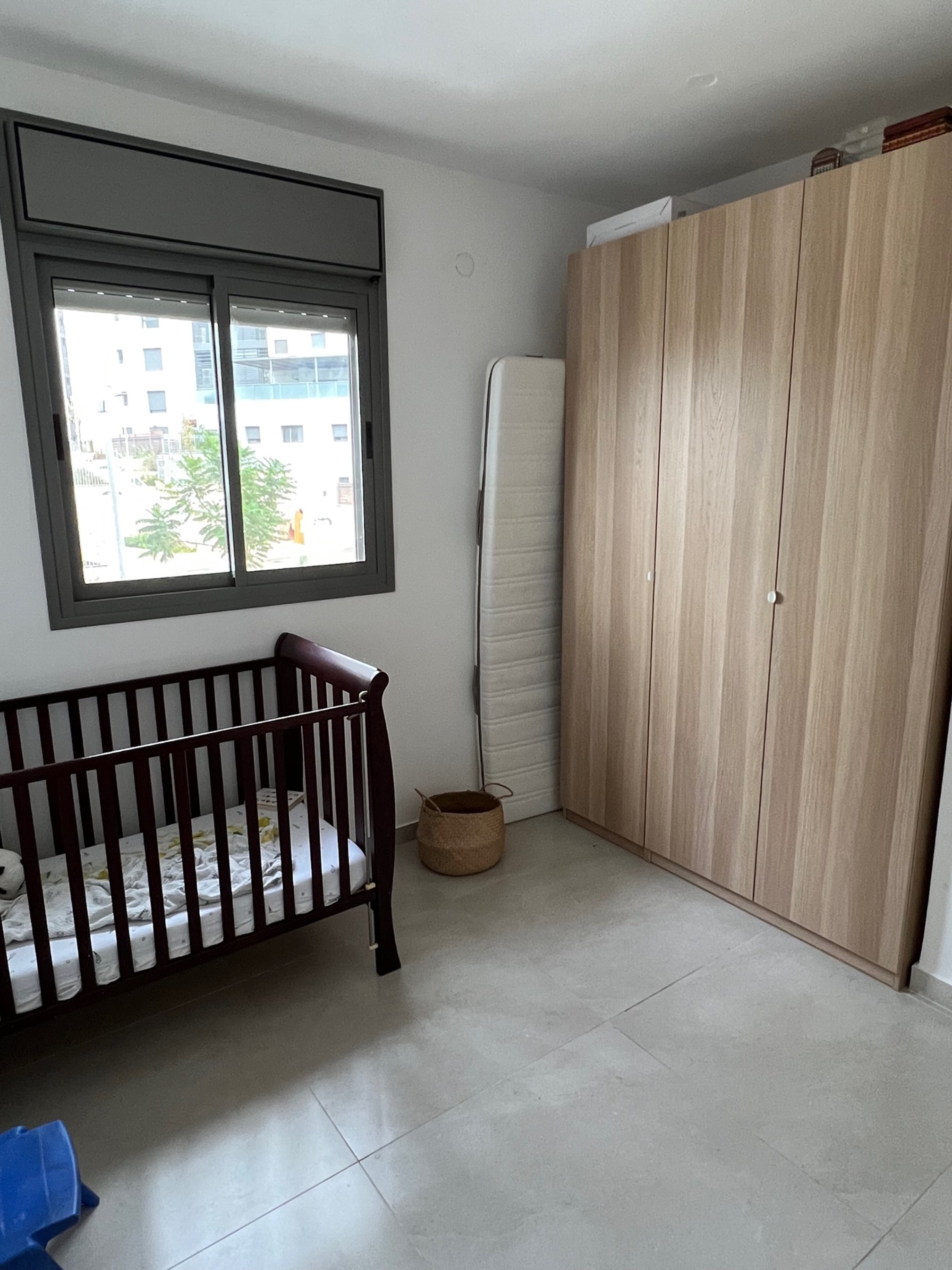
Sad state. The crib might work in a more traditional home, but it makes no sense in mine. Crib aside, whenever we have guests we move Sol to our room. Often people sleep on the floor:


The chair is now in Jake’s office and the runner is in our bedroom, so there wasn’t much left to make the room inviting. Since I was already gearing up to turn Sol’s room into something other than four walls, I decided to pick up a few extra things while at IKEA to warm up the guest room.
Rules for shopping at IKEA include:
Don’t get one of the ubiquitous geometric rugs. Instead choose a neutral one, like a LOHALS or HJORTSVANG or SVÄRDBORG.
Steer clear of the art.
I broke both of these rules in this room. I picked up the (in)famous STOCKHOLM rug for Sol because I love the black and white. This rug might be the most IKEA-screaming rug of all IKEA rugs. But it’s been around for so long I feel like it has turned a corner from cloyingly pervasive to … iconic. Surely debatable. I skipped the art section entirely on this visit, but when I backtracked to pick up something else, I spotted a giant peacock on the wall. It’s the new PÅLHULT hanging tapestry and for ₪75 ($19.99), why not.
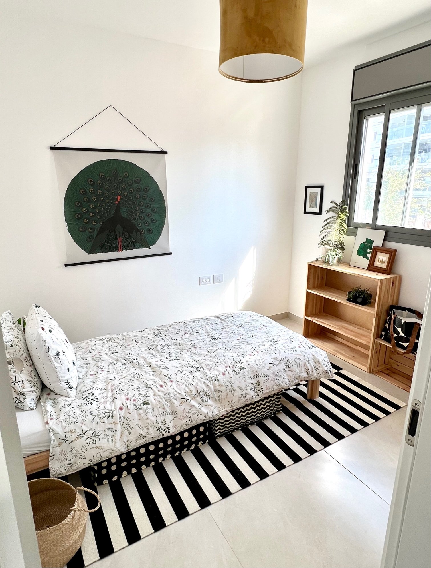
The MOLNSKIKT lampshade has a suede-like texture and will stay in Sol’s room. The NEIDEN bed is on loan from Talia’s room and on it I put the TIMJANSMOTT bedspread with a NATTSLÄNDA pillowcase (Talia is using its comforter cover). I took the doors off the IVAR storage unit we already had to make it a bookshelf, and I picked up a bunch of the SÄCKKÄRRA bags for linen storage to clear out space in the closet for guests.

I moved one of the chairs from the kids’ LÄTT table to by the bed, stacked coffee table books on it, and clipped on the NÄVLINGE light so it can be used as a temporary bedside table. Then I added some more artwork that I had in storage: a photo I took of the Sea of Galilee, a small map of the Washington D.C. area where I’m from, a green Warhol cat, and a tiny painting from Mexico. The large leaf fell off a tree outside our building.
The result is, no doubt, very IKEA, but for two weeks it will serve its purpose.
Color Exercise

I’m in Yael Steinberger’s interior design program (read about it here and here) and one of her introductory assignments was to add color to this black and white room. To me it looks like a seating area in the upstairs corner of a hotel or conference center, so I considered it as a commercial space. If I could edit some of the items, I’d replace the standing lamp with something grander or with sconces, switch out the artwork, add more variety in the types of seating, etc. But sticking with what was given, here’s how I colored it in in Photoshop:

I started with the flooring because I didn’t like the dark glossy floors and in general it’s helpful to work upwards. I’ve always loved these Barcelona cube tiles (especially in this apartment) and they felt appropriate for the Spanish–Italian-style seating. Normally I wouldn’t make every seat in a grouping a different color — and probably not turquoise — but the sameness and largeness of all three called for some differentiation. I added a velvet texture to tame the original pleathery look. I didn’t love the large panels by the curtains, so instead of accenting that feature with solid blocks of color, I made them wood to add warmth to the modern space. The cement adds a contrasting texture to the back wall. About three quarters of the way through, the turquoise couch was feeling a little lonely, so I added the blue-hued rug and leafy wallpaper to tie all the tones together.