Anatomy of a Kitchen 101
(Because Python won’t program your mug storage for you)
𝗣𝗿𝗼𝗯𝗹𝗲𝗺: Pillars in the middle of the space
𝗦𝗼𝗹𝘂𝘁𝗶𝗼𝗻: Wrap island around pillar and adjust cabinet depths
𝗣𝗿𝗼𝗯𝗹𝗲𝗺: Beams running through the ceiling
𝗦𝗼𝗹𝘂𝘁𝗶𝗼𝗻: Tuck lighting neatly behind to conceal and wrap carpentry
𝗣𝗿𝗼𝗯𝗹𝗲𝗺: Client wants to store Passover items nearby but there’s no space
𝗦𝗼𝗹𝘂𝘁𝗶𝗼𝗻: Blow out a boydem/attic overhead to create ladder-accessible storage
𝗣𝗿𝗼𝗯𝗹𝗲𝗺: Pillars need to be indestructible
𝗦𝗼𝗹𝘂𝘁𝗶𝗼𝗻: Cover in stain-resistant porcelain tiles that mimic Jerusalem stone
𝗣𝗿𝗼𝗯𝗹𝗲𝗺: Many appliances to store, some that get used often
𝗦𝗼𝗹𝘂𝘁𝗶𝗼𝗻: Appliance garage with built-in outlets
𝗣𝗿𝗼𝗯𝗹𝗲𝗺: Client wants a second fridge, but building a new kitchen around two separate fridges is inelegant
𝗦𝗼𝗹𝘂𝘁𝗶𝗼𝗻: Get one large 120cm double fridge instead
𝗣𝗿𝗼𝗯𝗹𝗲𝗺: Client visits appliance store and thinks the freezer section is too narrow
𝗦𝗼𝗹𝘂𝘁𝗶𝗼𝗻: Rework plans to accommodate a 140cm fridge with a better freezer
𝗣𝗿𝗼𝗯𝗹𝗲𝗺: Client has tons of stuff
𝗦𝗼𝗹𝘂𝘁𝗶𝗼𝗻: Build extra cabinetry under the bar
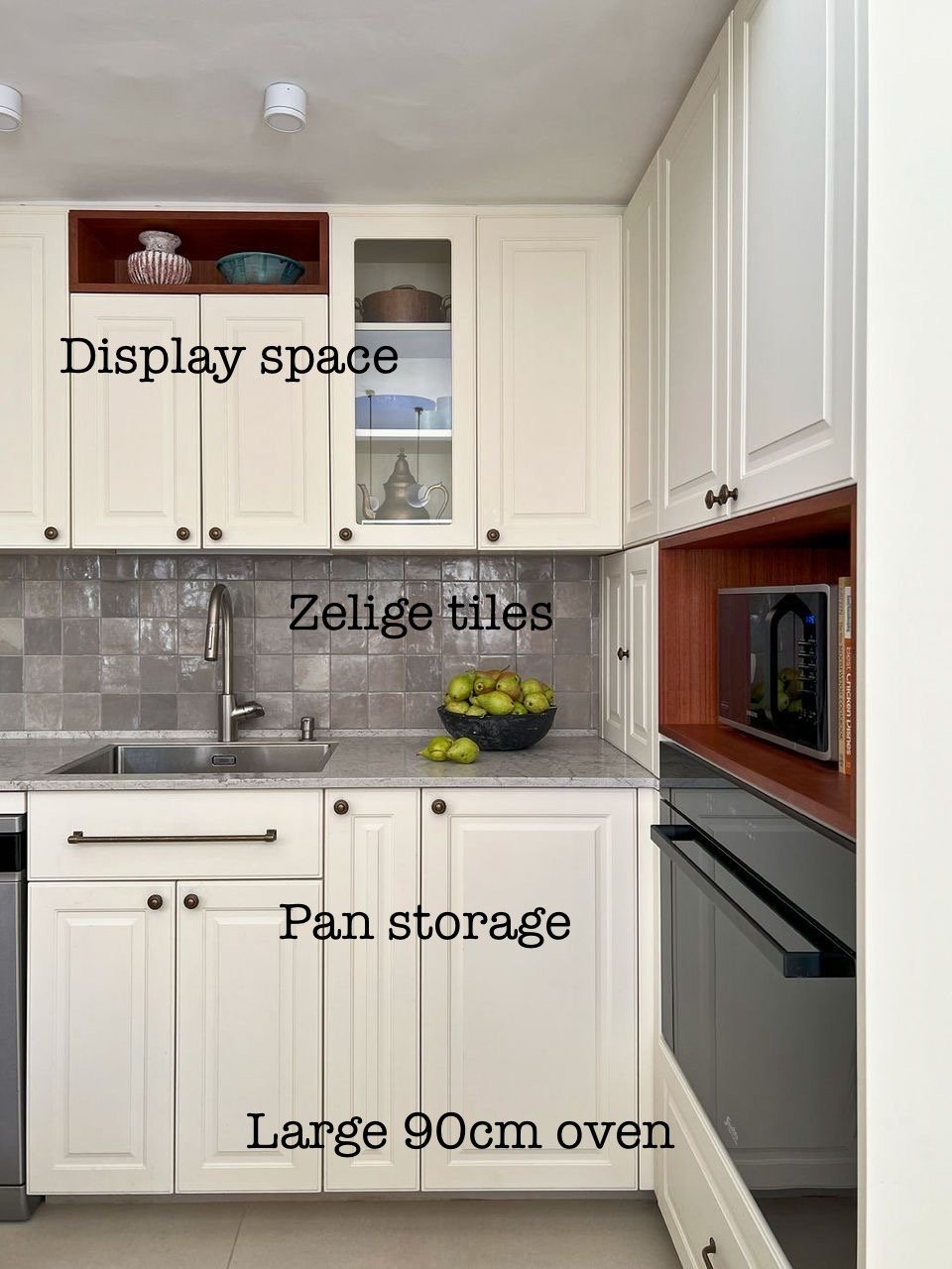
𝗣𝗿𝗼𝗯𝗹𝗲𝗺: Client also wants vertical pan storage, pull-out garbage, built-in drying racks, towel holders, display shelving, corner storage, a netilat yadayim, cold water, a large island, onion and potato drawers, two ovens, two dishwashers, three separate utensil areas, and custom storage for oversized and unusually shaped items
𝗦𝗼𝗹𝘂𝘁𝗶𝗼𝗻: Plan it baby.
Every client is different. Every space is different. And for every client and space there are unique solutions.
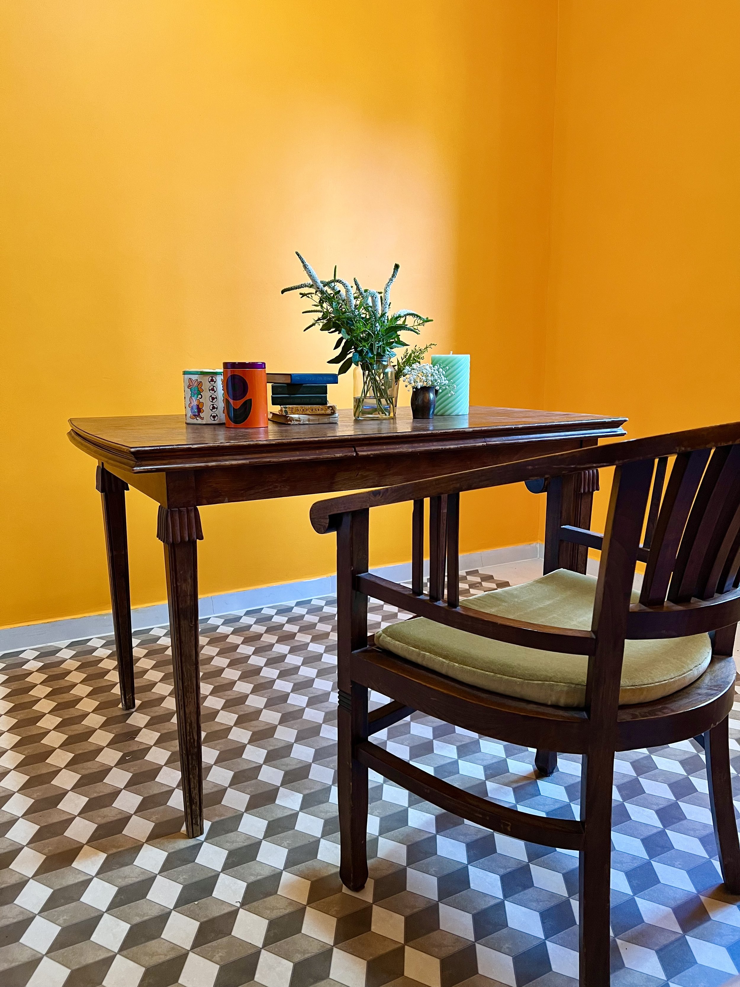
Float your desk
Many people instinctively push their desks against a wall.
Try the Feng Shui 𝗰𝗼𝗺𝗺𝗮𝗻𝗱 𝗽𝗼𝘀𝗶𝘁𝗶𝗼𝗻 instead.
You should face outward with a clear view of the door and your back to a solid wall for a sense of security, control, and leadership (CEO). This setup minimizes distractions and helps you feel more at ease.
Desk tips:
✅ 𝗙𝗮𝗰𝗲 𝘁𝗵𝗲 𝗱𝗼𝗼𝗿, 𝗯𝘂𝘁 𝗻𝗼𝘁 𝗱𝗶𝗿𝗲𝗰𝘁𝗹𝘆 𝗶𝗻 𝗹𝗶𝗻𝗲
Position your desk to see the entrance without sitting directly in front of it, for better awareness and energy flow.
✅ 𝗦𝗼𝗹𝗶𝗱 𝘀𝘂𝗽𝗽𝗼𝗿𝘁 𝗯𝗲𝗵𝗶𝗻𝗱 𝘆𝗼𝘂
Place a solid wall or high-backed chair behind you for stability. Avoid sitting with your back to a window unless covered with curtains (backlighting can turn you into a silhouette on Zoom).
✅ 𝗕𝗮𝗹𝗮𝗻𝗰𝗲𝗱 𝘀𝗽𝗮𝗰𝗲 𝗼𝗻 𝗯𝗼𝘁𝗵 𝘀𝗶𝗱𝗲𝘀
Avoid placing your desk too close to a wall; keep both sides open or supported by furniture for balance.
✅ 𝗗𝗼𝗻'𝘁 𝗳𝗮𝗰𝗲 𝗮 𝘄𝗮𝗹𝗹
If necessary, use mirrors or artwork to create a more open, inspiring space.
✅ 𝗚𝗼𝗼𝗱 𝗻𝗮𝘁𝘂𝗿𝗮𝗹 𝗹𝗶𝗴𝗵𝘁 𝗮𝗻𝗱 𝗮𝗶𝗿 𝗳𝗹𝗼𝘄
Sit near (but not in front of) a window if you can.
Experiment with floating your desk and see how it transforms your workflow and mindset.
Private office vs coworking: Which one fits your business?
Once I went to sign a lease on an apartment and met the realtor duo at a coworking office. They had a meeting room booked and the space looked professional and nicely designed. I felt well taken care of.
Would I have felt the same if I were signing to purchase a multi-million-dollar penthouse? Maybe not.
Some businesses need a space that reflects their brand and their offer, gives them full control over their environment, and fosters productivity. Other businesses value flexibility, networking, and cost savings.
A breakdown:
🏢 Private Office
✅ Pros:
• Custom branding and design that reflect your company culture
• Personalized layout to enhance productivity
• Full privacy and control over the space
• Long-term stability for growing teams
❌ Cons:
• Higher costs and longer lease commitments
• Fewer organic networking opportunities
☕ Coworking Space
✅ Pros:
• Can be more cost-effective
• Lease flexibility
• Great for networking and spontaneous collaborations
• Amenities and perks built in
❌ Cons:
• Less privacy and control over design, as well as potential for noise and distractions
• Inconsistent availability for desks and meeting rooms
• Less rooted, more transient atmosphere for your employees and guests
Both options have their perks, and the best choice depends on your business needs.
Have you ever been 𝘵𝘩𝘳𝘰𝘸𝘯 𝘰𝘧𝘧 by someone’s office? How about pleasantly surprised? Why? I would love to hear about it.👇
—
Need help designing your new office so your employees love coming to work? Send me a WhatsApp message to schedule a discovery call: 053-892-6032
WeWork Office, Flatiron, Manhattan
Before I designed this WeWork office, it was sitting on the market, unsold. I gave the space a refresh with new furnishings and fixtures, textiles, fresh paint, artwork, and plants, while taking advantage of local sales and vintage finds. Not long after, the office successfully sold along with my decor.
The “Quiet Room,” WeWork Flatiron
I divided the office area into zones and gave each zone new life and character. In the open workspace there were many windows, but buildings on all sides prevented sunshine from flowing in. The space felt dim and clinical. I gave the back wall a coat of bright green paint to bring a feeling of freshness and nature into the urban view.
In the gathering space at the entrance, I combined several textures to create depth and warmth: textiles like the woven rug and throw pillows, harder materials like the metal table and mirror side table, as well as ceramics and a basket with blankets.
This WeWork had three private offices, the tiniest of which felt like a sad closet in its original hospital white. I pulled out the desk, added comfortable seating, and painted it black to convert it into a moody “quiet room” meant for individual phone calls or one-on-one conversations. The depressing tiny office became an enticing, cozy spot dedicated to specific tasks.
The “Quiet Room,” WeWork Flatiron, NYC
From Spreadsheet to Bookshelf
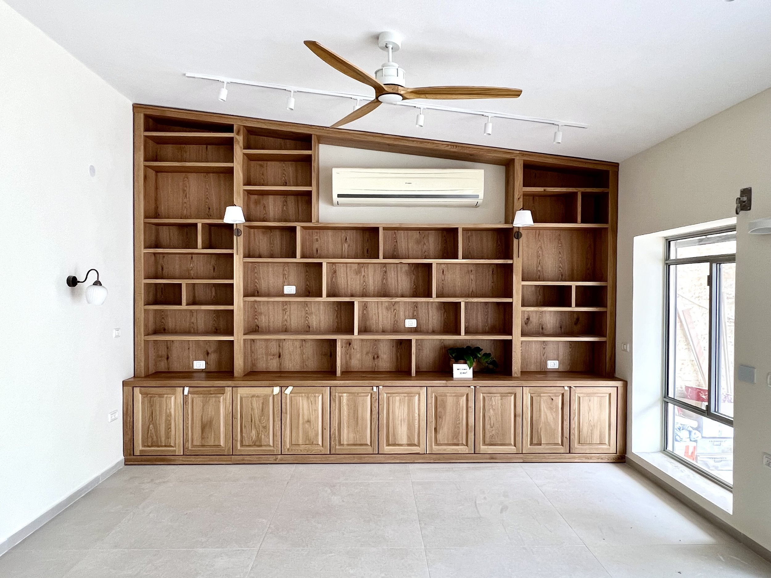
In the #beershevatraditional project, my clients wanted a wall-to-wall, floor-to-ceiling bookshelf to accommodate their library. Their library included books of all shapes and sizes, from kids books accessed daily to various sets of Jewish sefarim to tall megillot used once a year. My clients wanted each type of book to have a clear home, with little space wasted above and around the books. That meant that a set of short 17-cm books needed a different size shelf than a 32-cm-tall set, and a 41-cm-wide set and 90-cm-wide set needed different neighbors. Out the window went the symmetrical bookshelf, in came the spreadsheet:
I ran a few trials to figure out how and where on the bookshelf each type of book could be placed. Once we landed on an arrangement that felt good to them, I tweaked surrounding shelves to make the asymmetry cohesive. Below is where we landed. Since they wanted to keep the existing AC units throughout the home, we worked around the living room AC. And because we needed a tall space high up to accommodate the infrequently used megillot, at left, I balanced this out with a tall space at lower right, in keeping with the overall asymmetry of the piece.
Below you can see the living room when the previous owners still lived there. We removed the old light fixtures as well as the drywall-plus-lighting piece jutting out at top right.
My clients also wanted electrical outlets within the bookshelf, and we included two sconces on the bookshelf for atmospheric lighting. When you want electrical points all over a concrete wall, this is what it looks like to make that happen:
And here’s the bookshelf during installation:
It’s been a while since my clients moved in. I’m looking forward to taking final photos before 2024 wraps.
Press for Lime Laundry in Mako
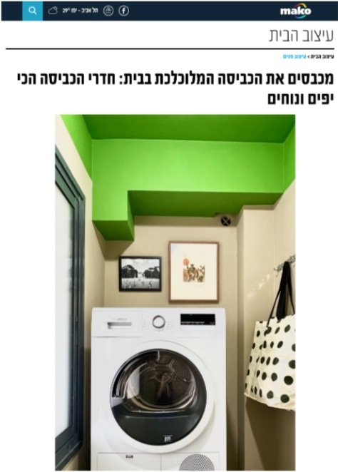
This week I was excited to be featured in Mako's article on "The most beautiful and comfortable laundry rooms.”
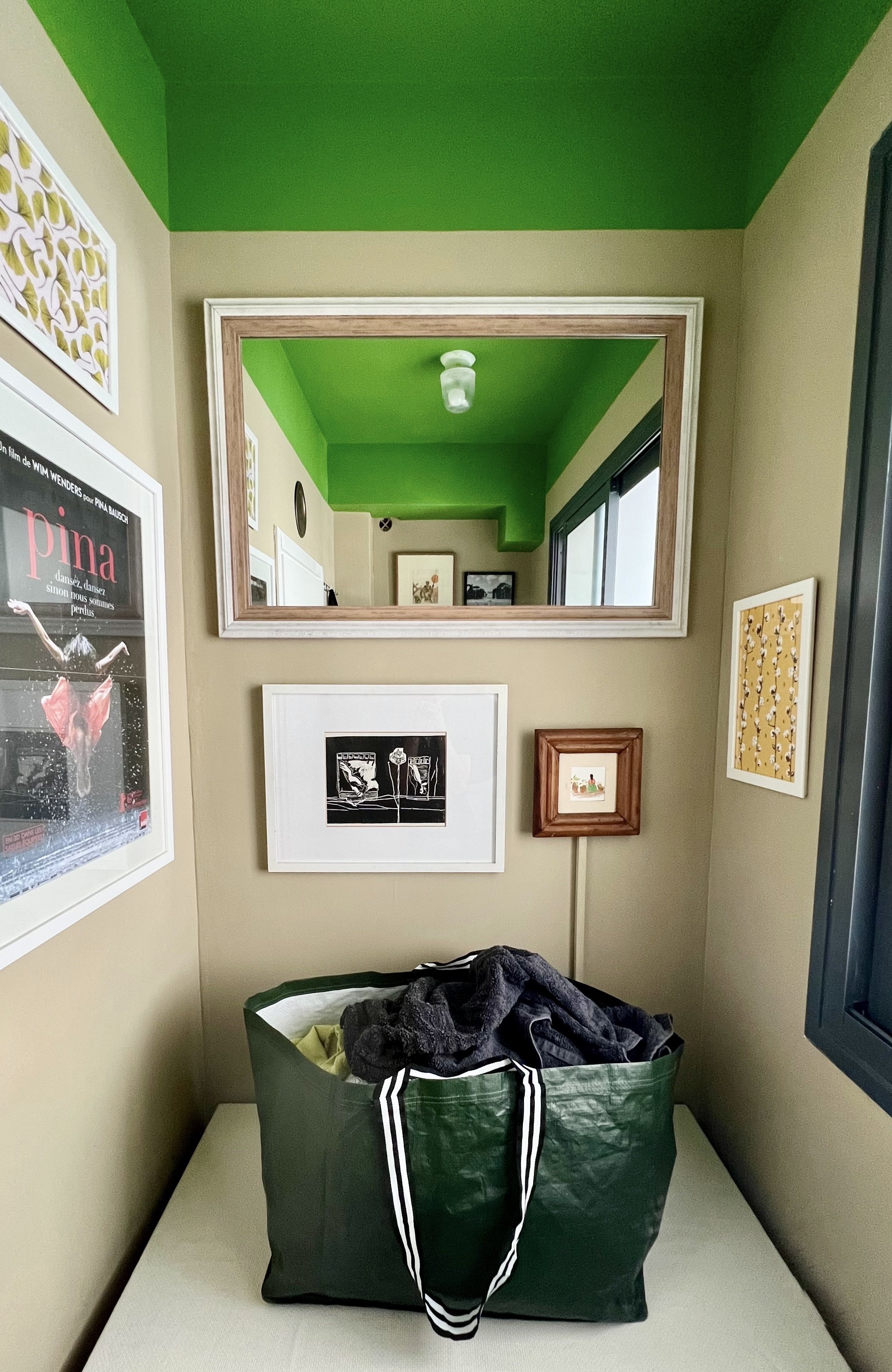
The goal for this tiny 2-meter space was to keep it airy and enjoyable. The default for many laundry rooms is to stuff them with storage. In this apartment there was a superfluous third bathroom, so I turned that into a storage area to allow the laundry space to stay breathable and welcoming.
We're not usually excited to tackle laundry. To make the experience feel special and personal, I turned the room into an art gallery. A mirror above the table reflects light from the window and makes the space feel bigger. The machines take up one side and a table on the other side holds bags of clean laundry waiting to be folded. This keeps the rest of the home free from piles of laundry, and in turn every place in the home can breathe.
Citrus House: The Concept
Pomelo Room // Citrus House
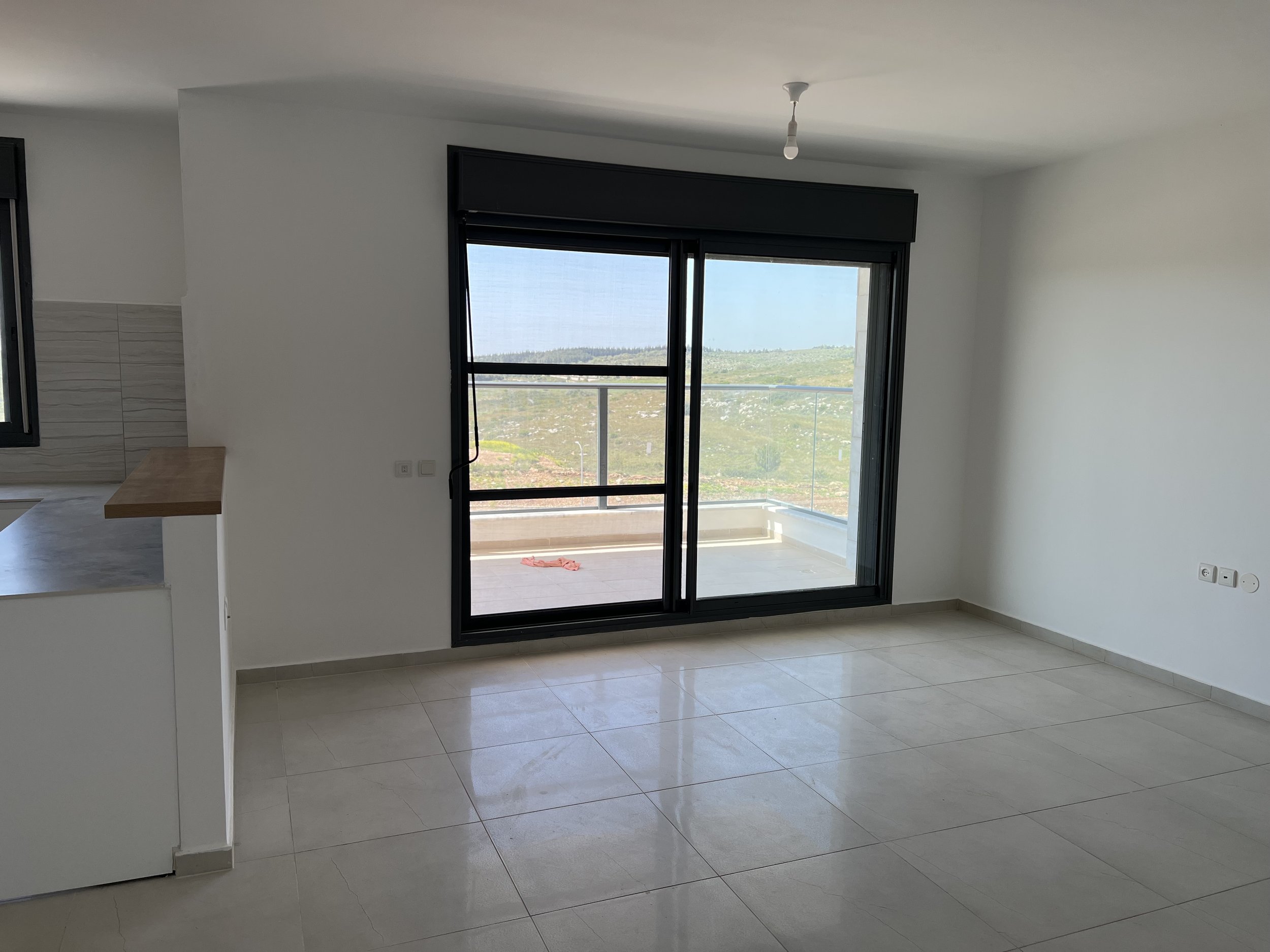
Last year we moved to a new rental apartment. When house hunting, I look for good sunlight and a nice view. We were lucky to find both in a bright new construction overlooking rolling green hills on a quiet block. But on the inside new builds are often boxy and devoid of character — fresh but sterile. I wanted to extend the lush view outside the main living space into the rest of the apartment and make the white walls anything but. I also wanted to reuse as much furniture as possible from our previous apartment, spend no more than 10K NIS (~$3K) on new items in the first year (track the budget here), and have our new place look and feel different from our previous apartment.
Pomelo Room // Citrus House
I decided to give our apartment a citrus theme, to celebrate some of the most vibrant hues native to Israel and bring the outside in. I wanted it to feel energizing and playful, and I love using paint as an affordable way to give a room character. Each room is designated with its own citrus fruit, so walking into each one wakes you up with a surprise (and maybe even a cheerful chuckle).
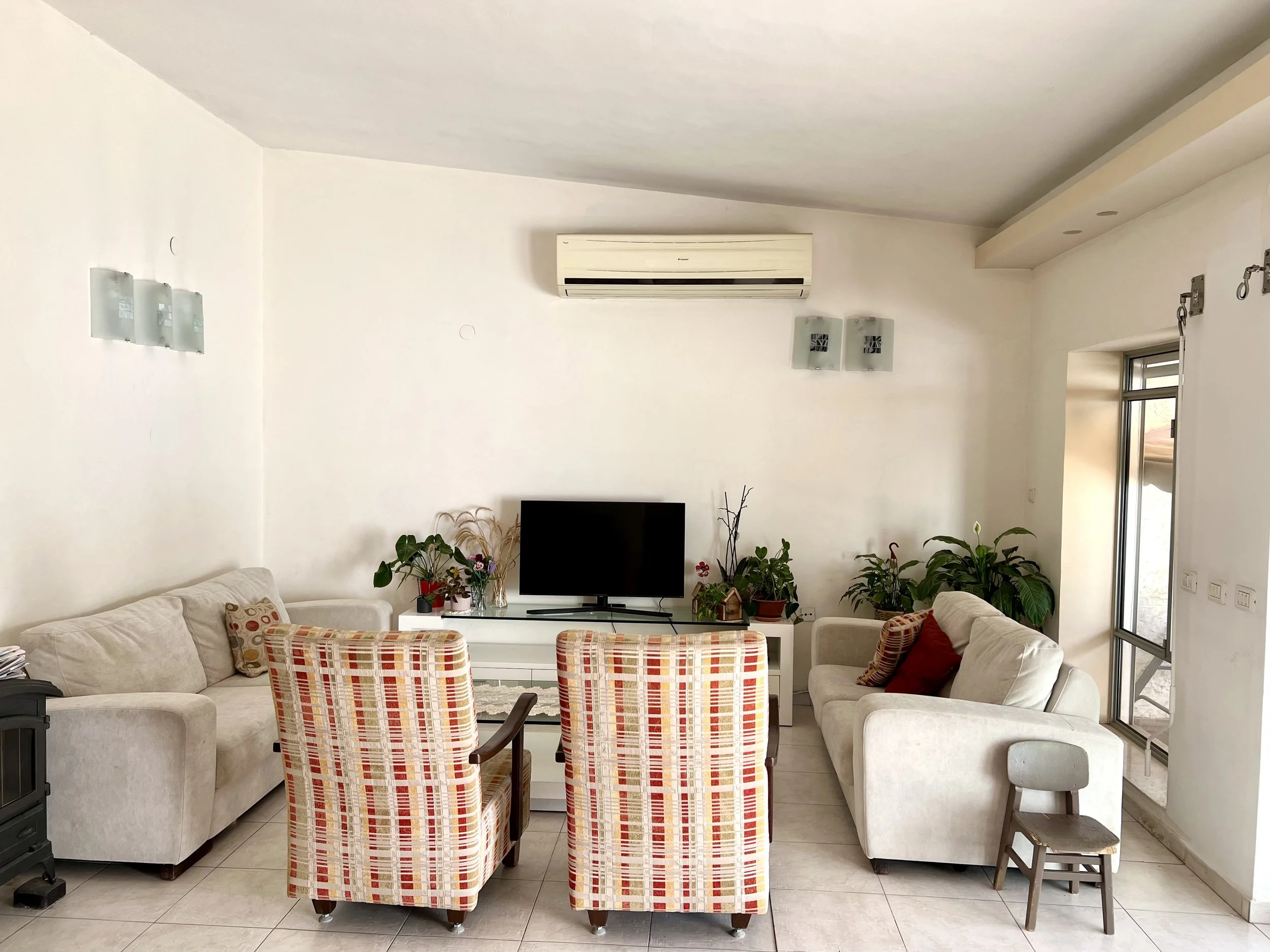
Living room before:
Living room in progress:
Pomelo Room // Citrus House
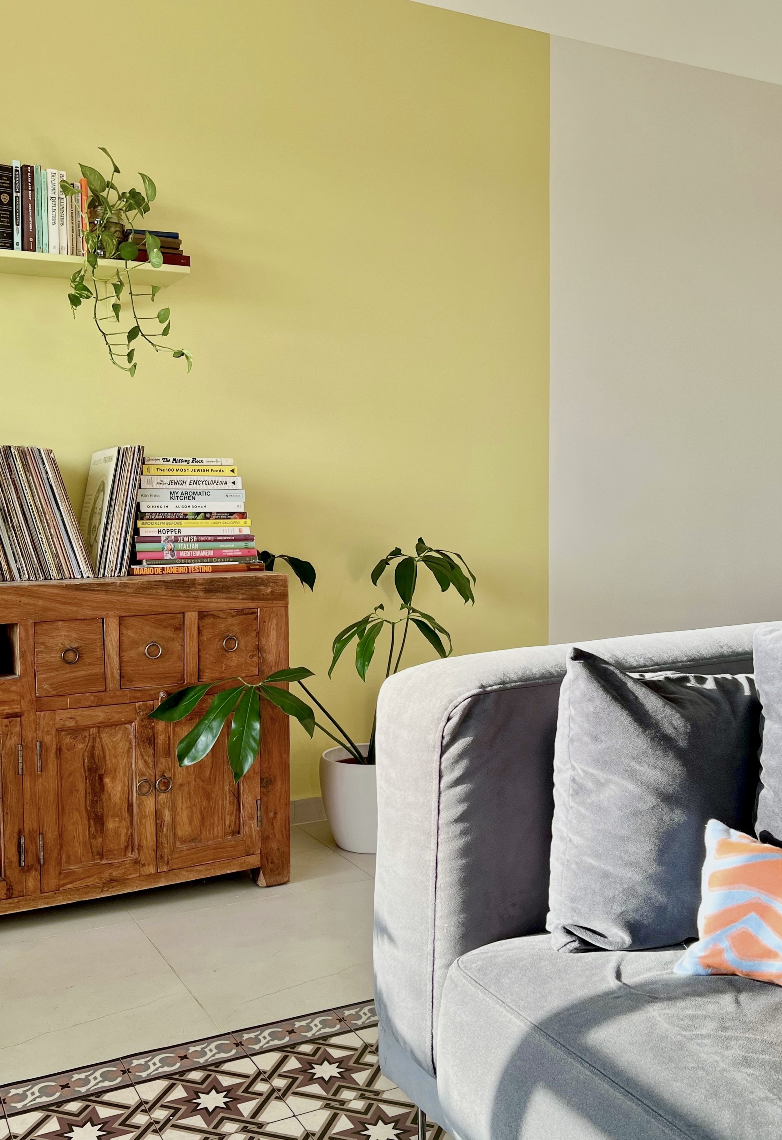
So far, we have the Pomelo Room (living room), the Clementine Room (my office), and the Putty & Lime Laundry. In the living room, the couch from our previous apartment, which you can see below, did not fit well, but we weren’t ready to replace it yet. I remembered that the couch is built in two pieces and connected at the bottom. I separated it into its two parts and faced them toward each other, so that one half tucks nicely along the half wall by our kitchen (left side in the photo above) and the other looks out at the view. The switch makes the space feel cozy and intimate.
The living room in our previous apartment (Photo: Peled Studios \ יואב פלד צילום אדריכלות)
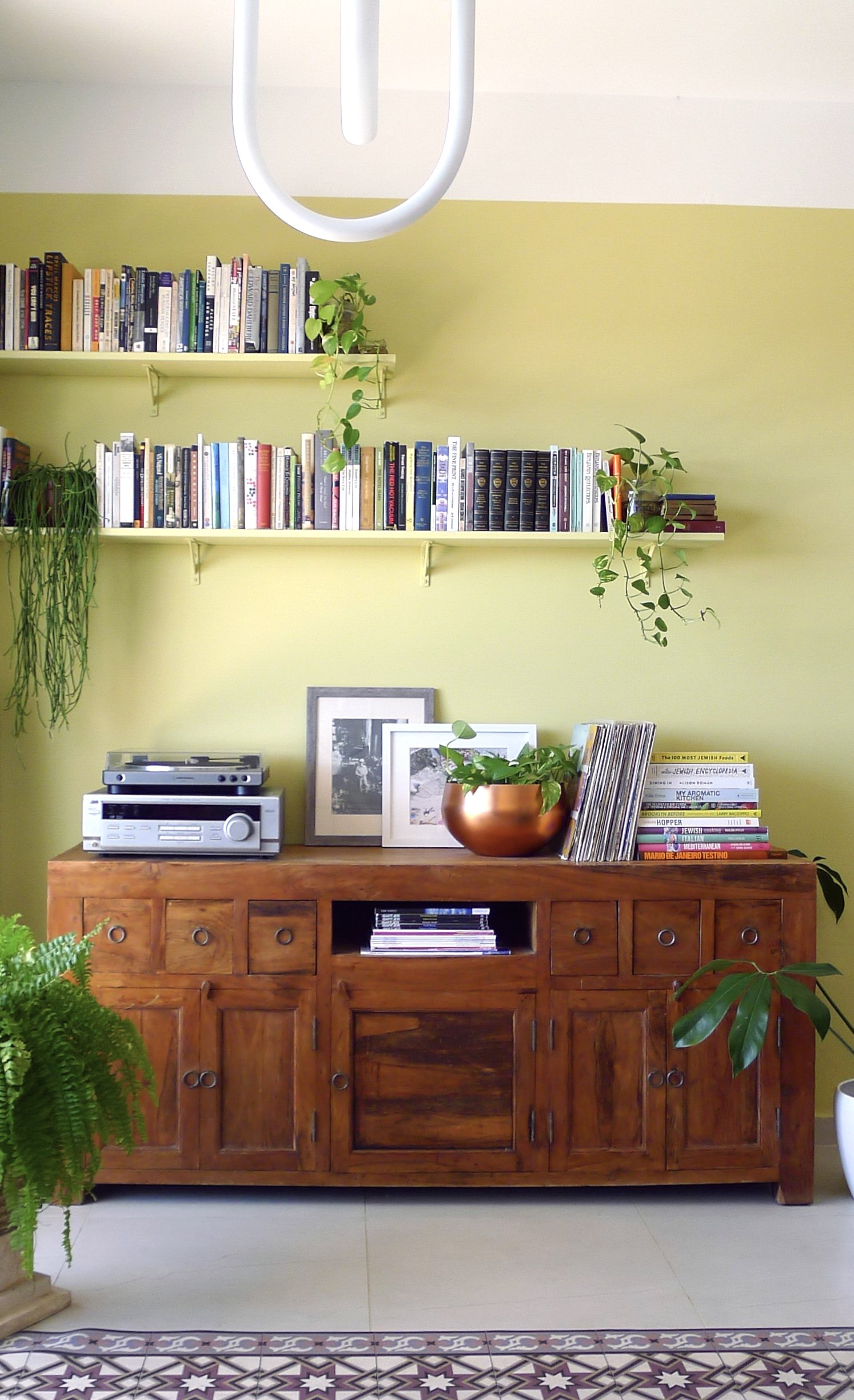
Splitting the couch freed up the right wall for the sideboard from Jake’s old office, below, which we couldn’t find a good home for in the other rooms of our new apartment.
The study in our previous apartment (Photo: Peled Studios \ יואב פלד צילום אדריכלות)
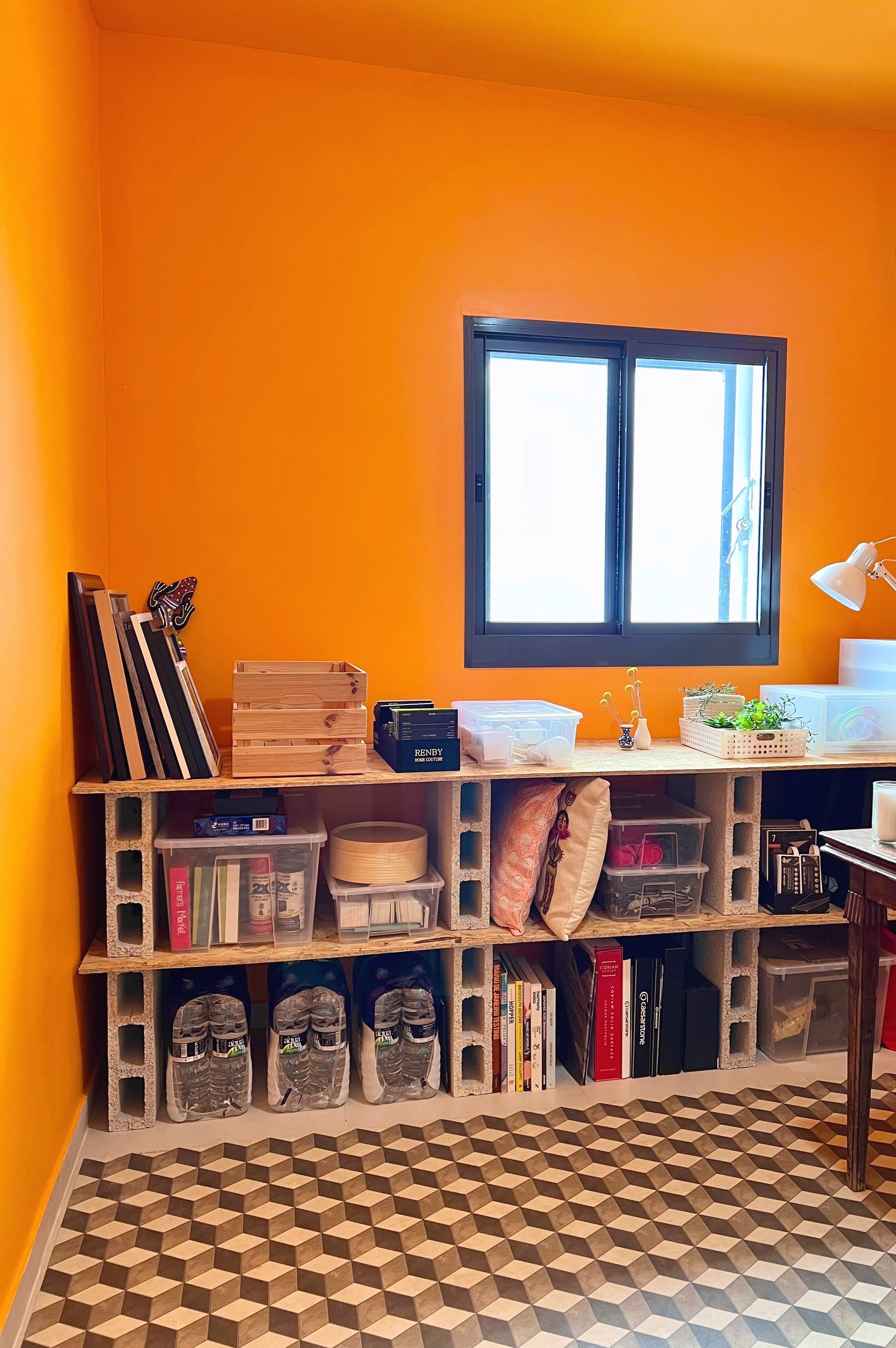
In our previous apartment Talia and Sol each had their own room. Because I needed a home office, and a place to store samples and other materials, I put the kids together in one of the more spacious rooms and made the smaller mamad (safe room) my office. The mamad looks out at the neighboring building, an uninspiring view. I thought I’d use the space primarily for storage and Zoom meetings and never want to spend too many hours at once in there. However, since it became the Clementine Room, I actually enjoy working in there.
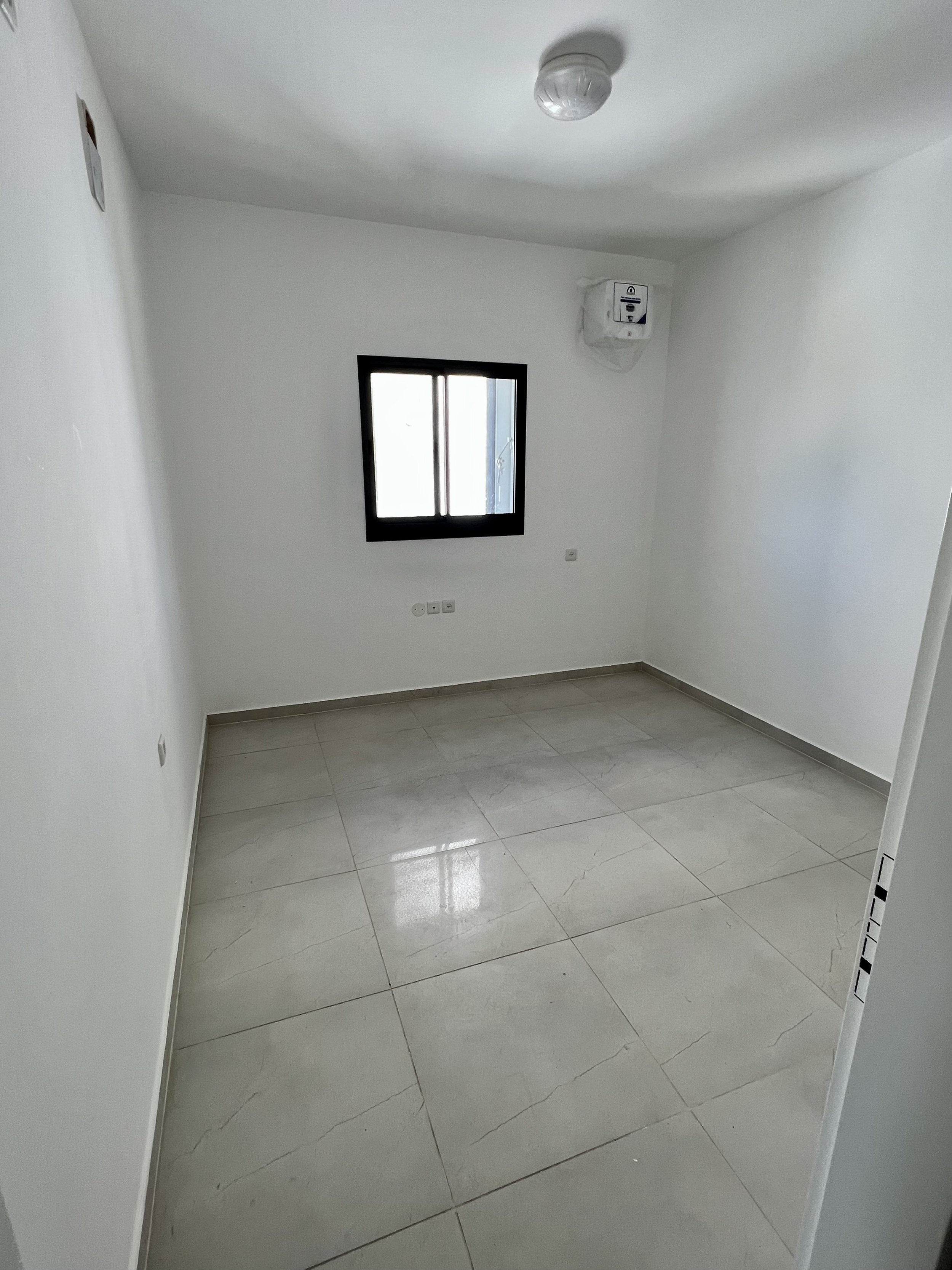
Mamad office before:
Mamad office in progress:
Clementine Room // Citrus House
Storage so far is a simple IKEA PAX wardrobe I already had and some cinder block and plywood shelving. Though still low frills and largely pragmatic, the orange walls and slightly lighter ceiling give me the kind of get-to-work-happy slap in the face I wanted every time I walk in.
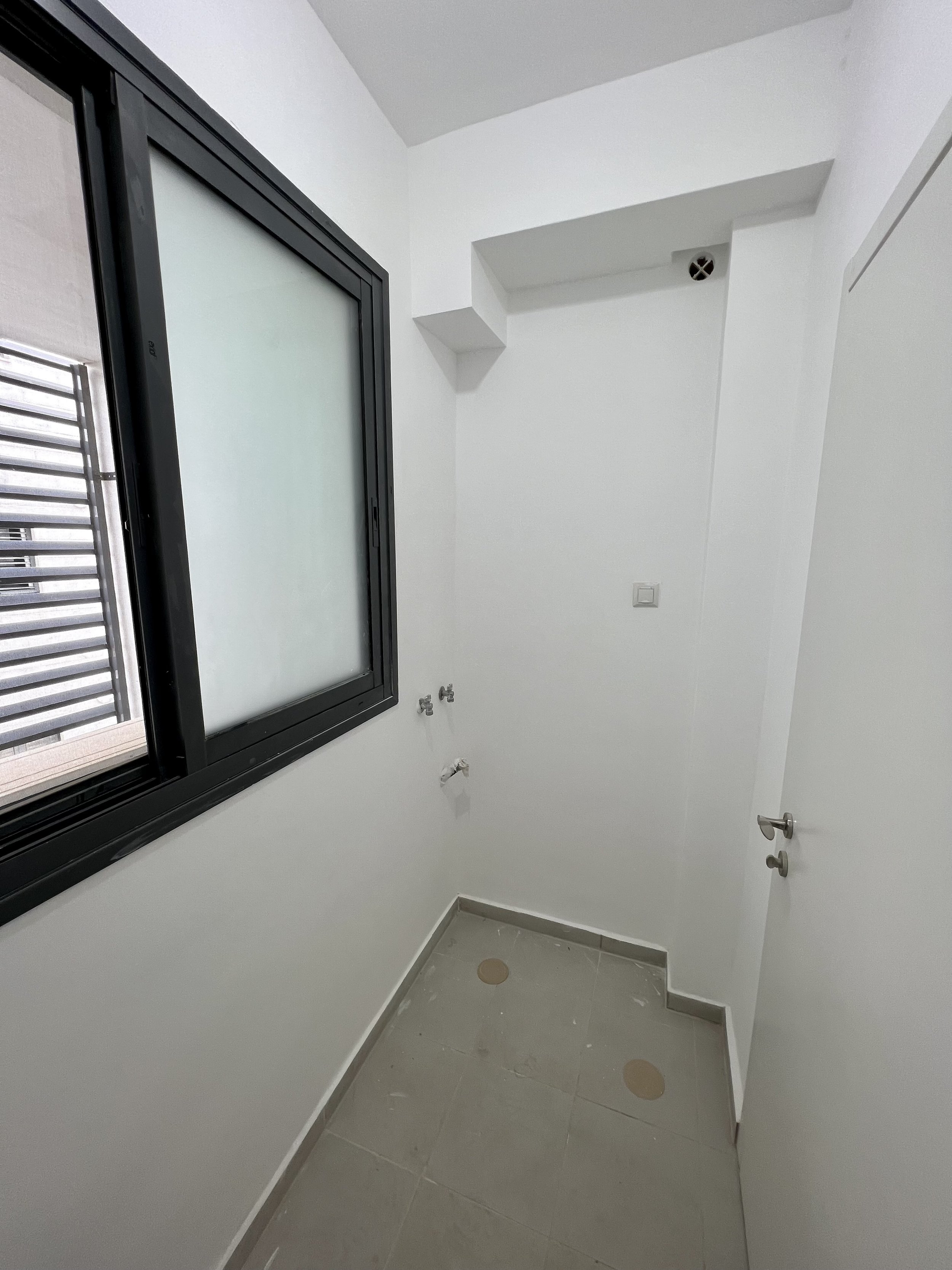
Laundry room before:
Laundry room after:
Putty & Lime Laundry // Citrus House
In our previous apartment, the standard tiny laundry room had the standard washer-drier duo on one side and a shelving unit on the other for cleaning products and the like. It drove me nuts that there was nowhere to breathe in there, but I have to admit the owner’s cancelation of the powder room (in favor of only two bathrooms instead of the standard three) was worth it for the extra space elsewhere. In our new apartment, we do have a powder room and we don’t need it, so I lined it with shelving and use it as a storage closet for all the items I used to store in our laundry room (plus more). That freed up space in our current laundry for a folding table. Though I use it more for storing yet-to-be-folded laundry than actual folding, I love having the breathing room and drop space, just as much as I love walking into a shot of lime green and artwork. My goal was to animate the tired and monotonous task of laundry and I must say — it’s still a tired and monotonous task. But I enjoy the room.
Putty & Lime Laundry // Citrus House
Next up in the Citrus House: a lemon pulp master bedroom. Stay tuned.
Features of Israeli Design: Patterned Tiles
Uri Lifshitz Building; Photo: Liat Albling
One of my favorite design elements in a space is a beautiful patterned tile. Patterned tiles appear throughout Spanish, Italian, and Mexican interiors (the three countries I turn to most for global inspiration), and to my delight they are incredibly popular in Israel and also distinctly Israeli. Israeli homes come standard with tiles; they are resilient in the hot climate and, with no local lumber industry, they offer both a more attainable and more functional solution than real hardwood. You can find ancient colorful tiles in centuries-old buildings in Jaffa and Jerusalem, retro orange and brown tiles from the ‘60s and ‘70s in apartments in Tel Aviv, and modern tiles in every shape and color in renovated homes across Israel.
Cafeteria inside HaMiffal at Lorenzo House Cultural Center; Photo: Tzachi Ostrovsky via NYTimes
HaMiffal, Jerusalem; Photo: Mallory Serebrin
Terrazzo tiles, like below, were ubiquitous in Israel and made of concrete with bits of stone throughout. When renovating a home in Israel, people often remove this old terrazzo, even to replace it with a more modern terrazzo tile (which is trending worldwide). On walls you can uncover wonderful vintage tiles, which I would love to salvage and repurpose in a home, instead of completely discard. This particular Italian tile shows up everywhere:
Via Romy Silber Benit, uncovered during a renovation
Via Maya Linenberg, uncovered during a renovation
Via MaDeux, found at the Haifa flea market
These Israeli homes showcase beautifully preserved tiles in renovated spaces designed for the 2020’s:
Design: Meital Mayorchik Sarid; Photo: Shai Epstein
Design: Yael Friedlander; Photo: Nimrod Levy
Design: Emily Shkedi; Photo: Dor Kedmi
Design and Photo: MaDeux
If you have an old apartment covered in old tiles, consider giving them new life instead of throwing them all away.
Distributed Play
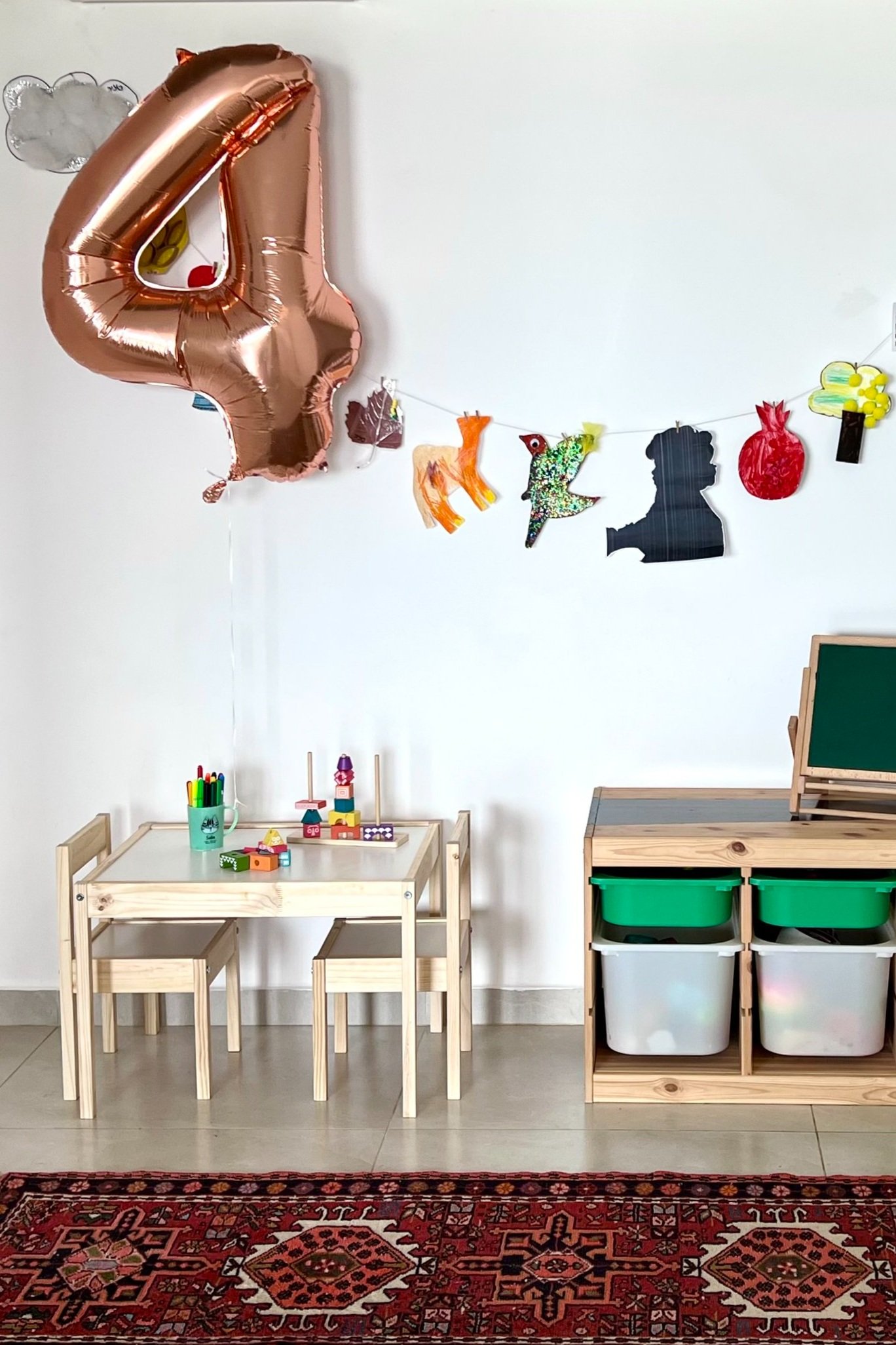
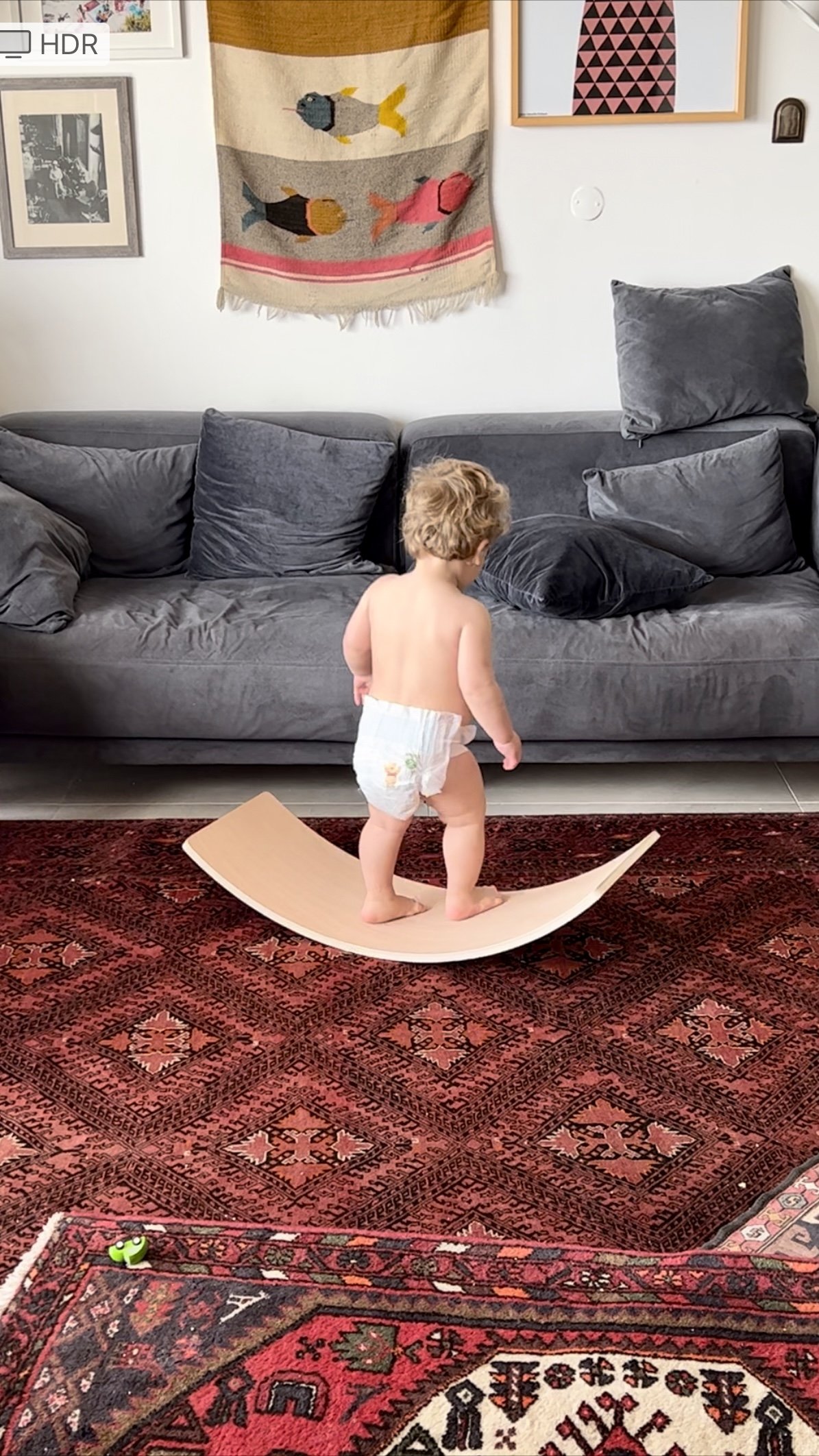
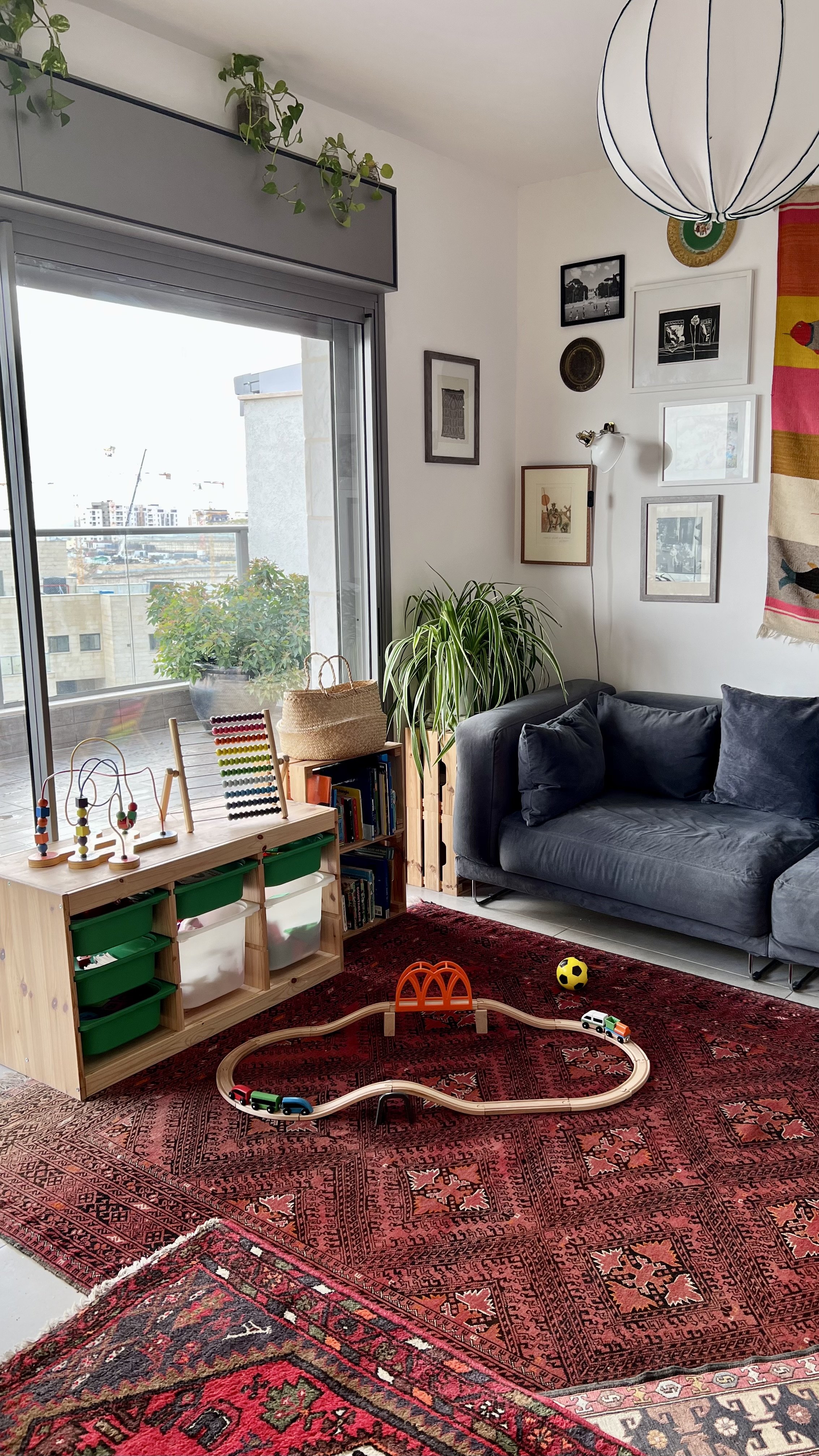
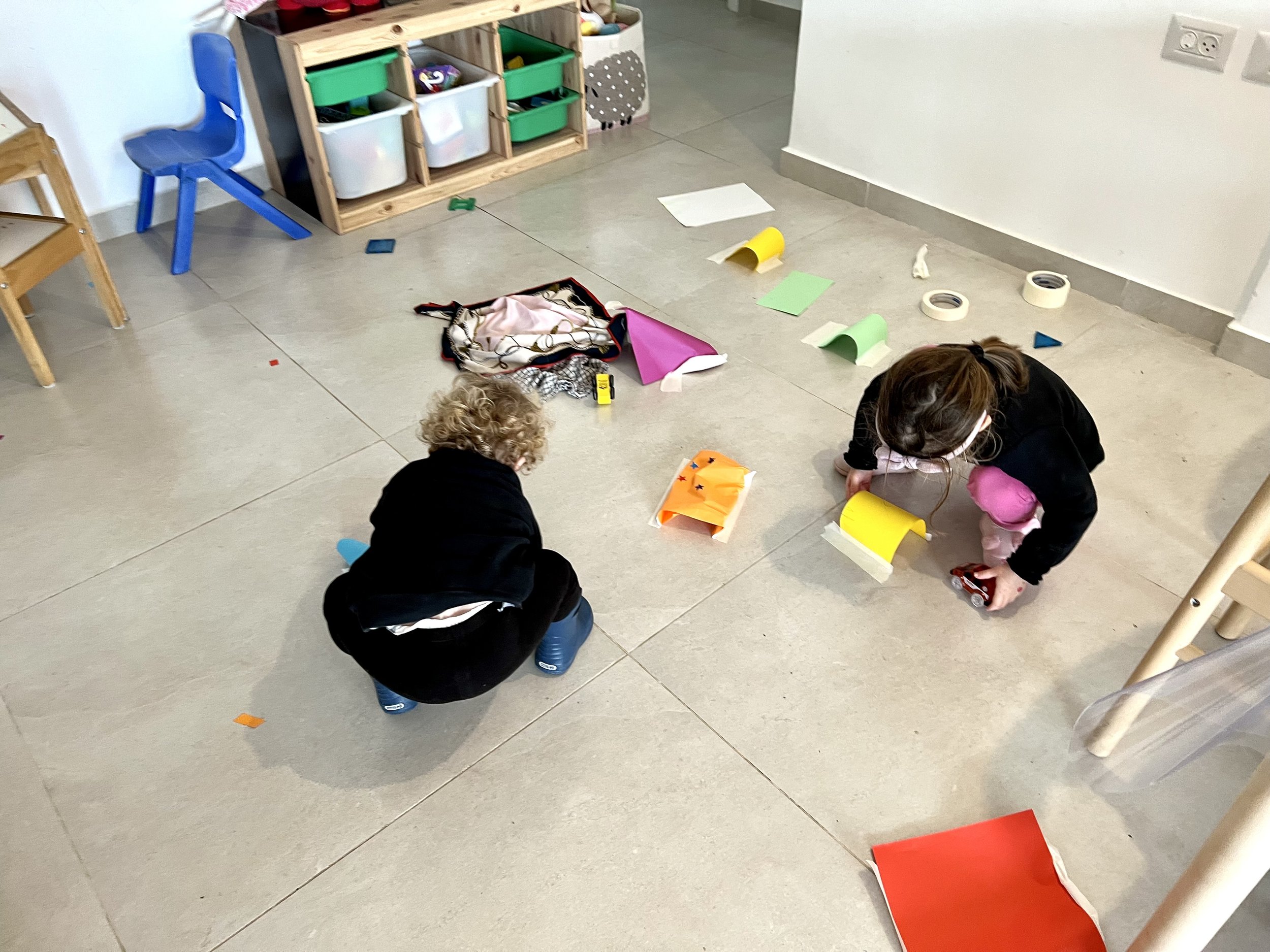
I set up our apartment to accommodate the mayhem of two toddlers at play who sometimes need a change of scene. Toys and activities are spread throughout the home, from living room to dining room to hallway to kids rooms. When movement is part of the design, everything feels a little less crazy.
Photo: Peled Studios \ יואב פלד צילום אדריכלות
We have an IKEA Trofast storage unit in the living room as well as by the dining table leading to the hallway. It’s easy for kids to pull out toys and for us to switch out bins with different toys from time to time to keep things fresh. I have found that removing a few bins at the top (unlike in these photos) makes for easier cleanup because you don’t need to pull out every bin to dump toys back in. Generally, having fewer toys available helps kids focus.
Photo: Peled Studios \ יואב פלד צילום אדריכלות
Photo: Peled Studios \ יואב פלד צילום אדריכלות
The kids can hop seamlessly from the living room floor to the dining room table to the play corner. Defining areas by type of activity (e.g., building, arts and crafts, make believe, reading) helps create sanity.
Photo: Peled Studios \ יואב פלד צילום אדריכלות
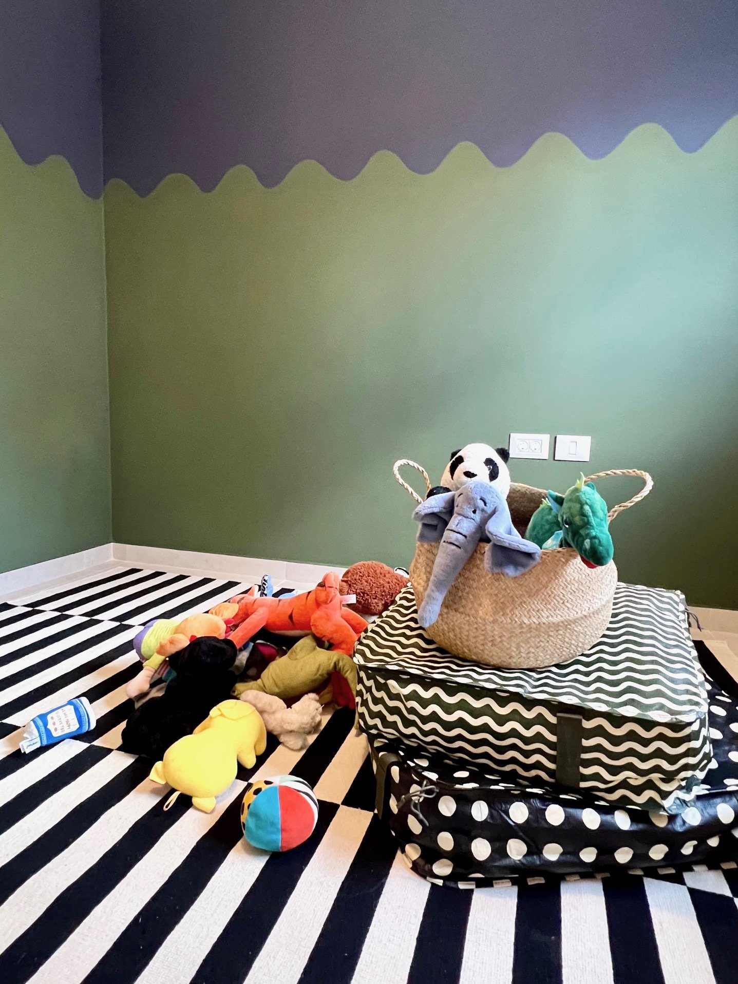
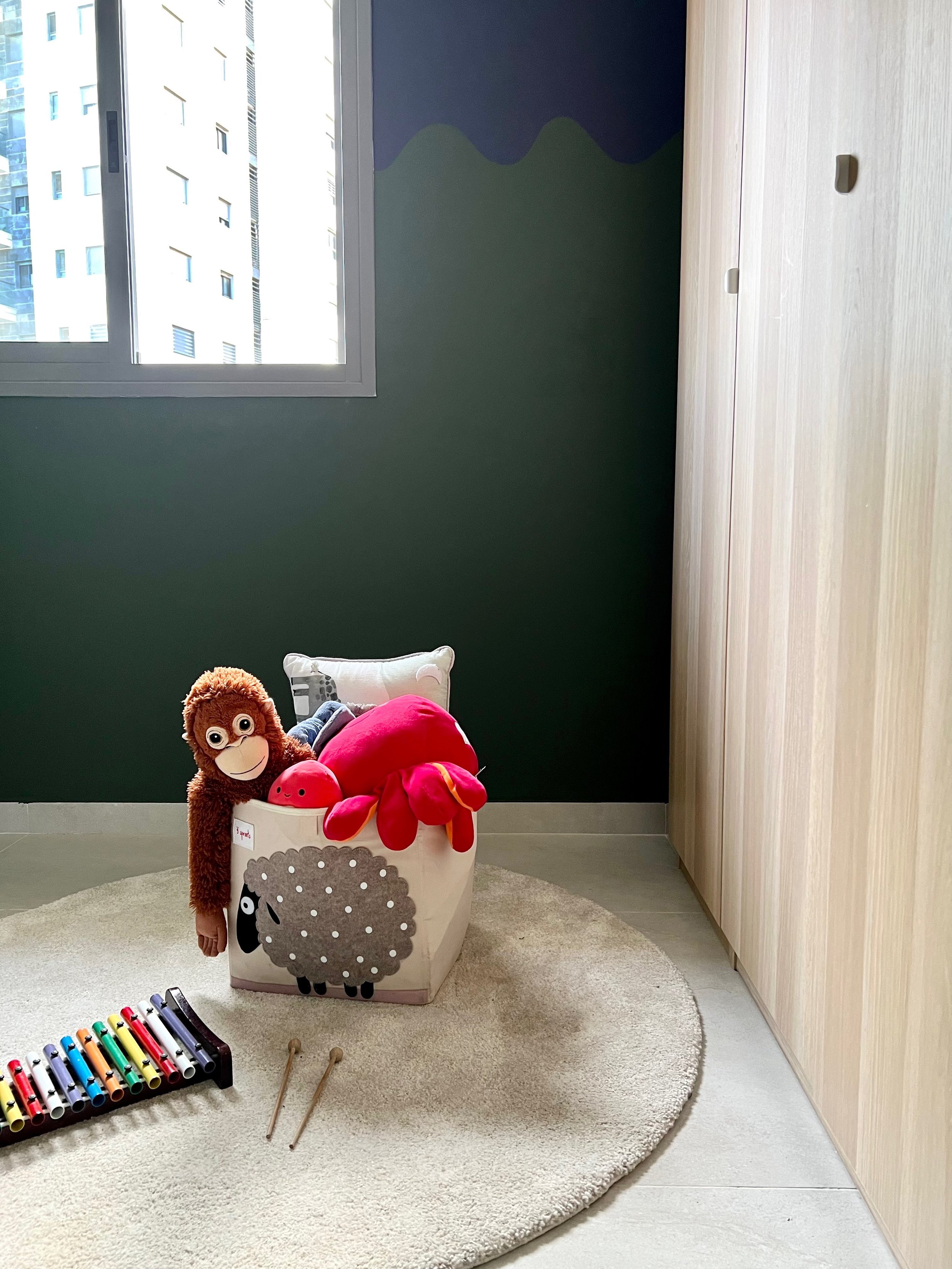
Immediately after putting the round rug down in Sol’s room, the kids started running around it in circles and laying dolls and stuffed animals around its periphery. It’s great to have for any activity where you want to gather around (pass the balloon, story time, etc.).
Photo: Peled Studios \ יואב פלד צילום אדריכלות
Photo: Peled Studios \ יואב פלד צילום אדריכלות
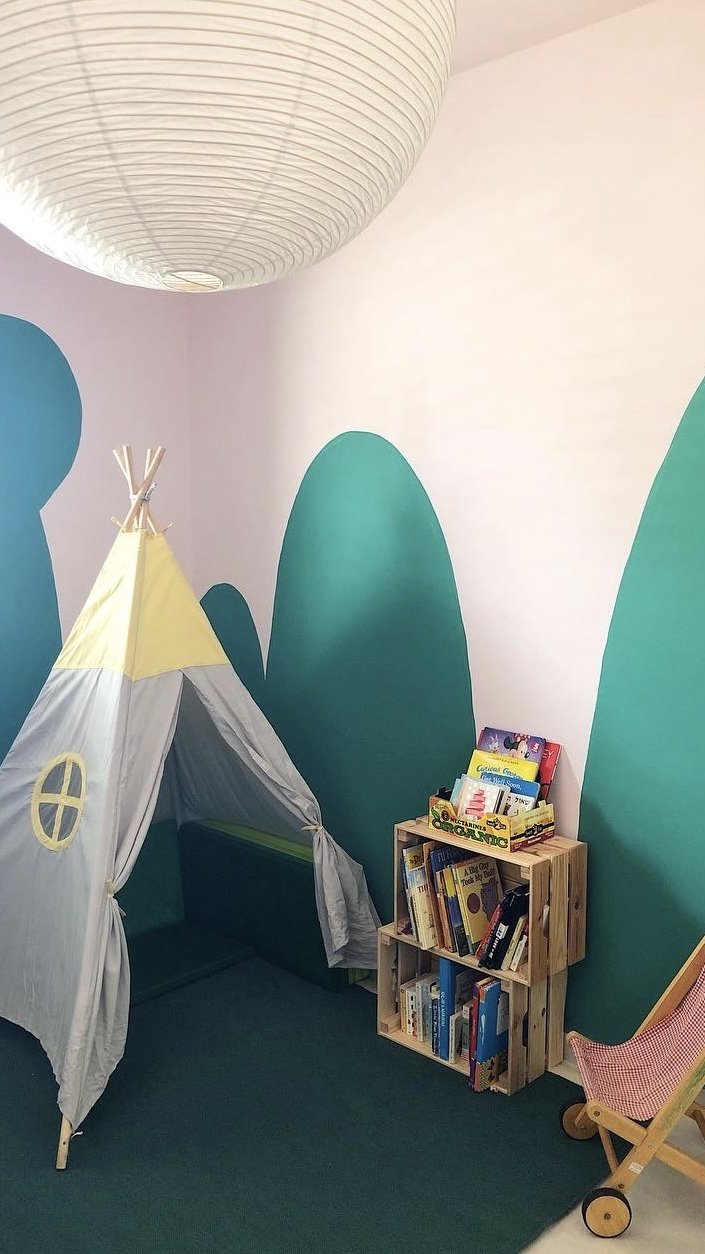
In Talia’s room, the teepee and book corner work just as well for intimate reading time as they do for going nuts with the floor mats.
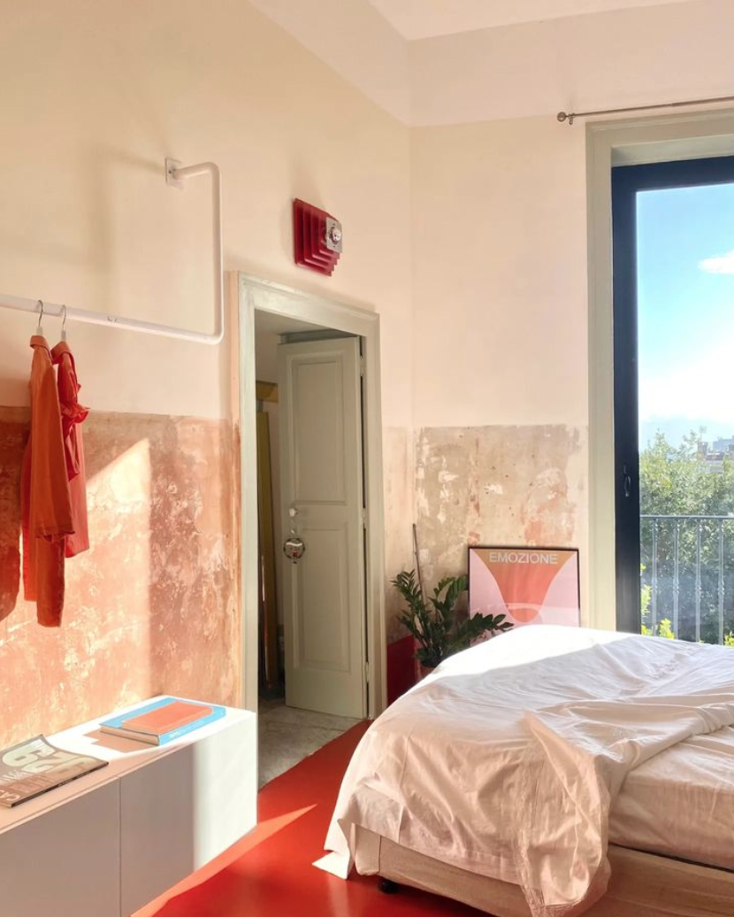
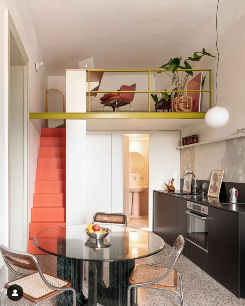
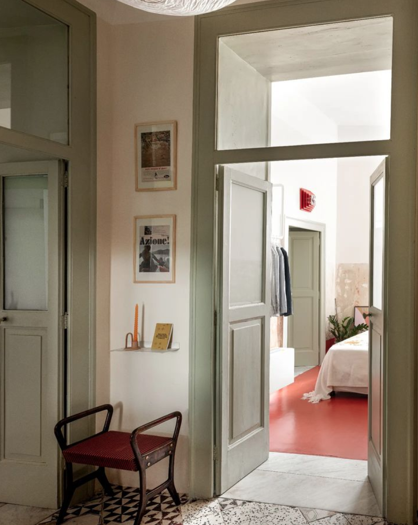
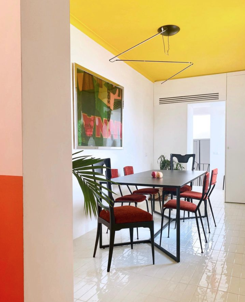
La Fotosintesi, Naples & Paris
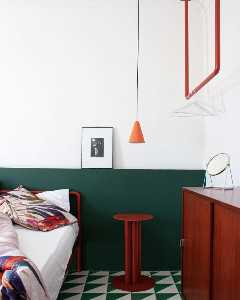
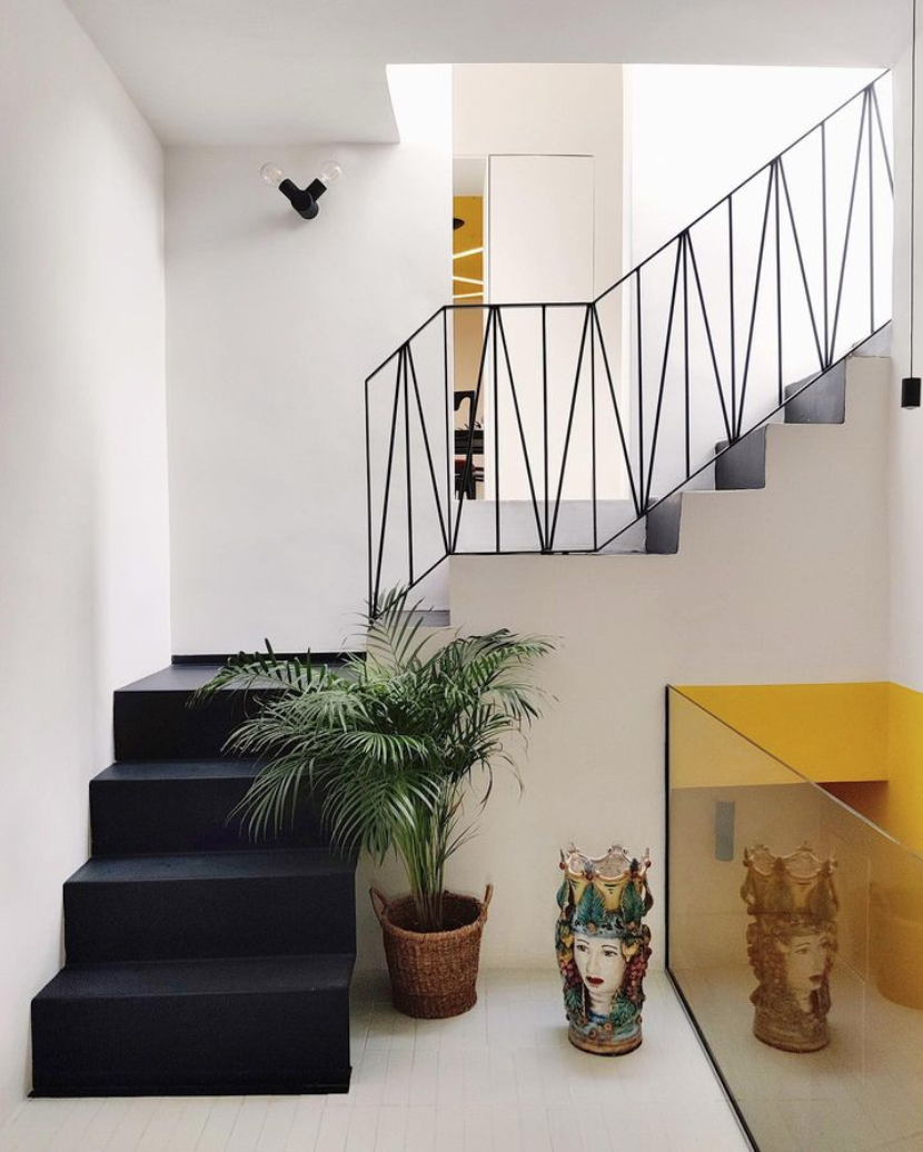
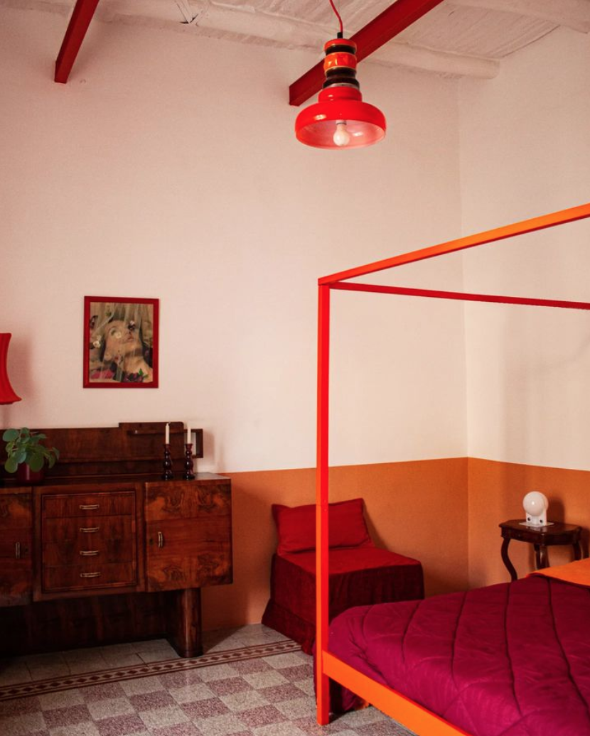
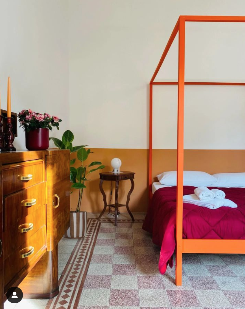
It’s not every day I add a designer to my favorites list but it’s one of those days with La Fotosintesi. Architect duo Julie Nebout and Giuseppe Punzo, a couple both in work and life, meld the modern with the local and ancient in bold primary colors. They dig through the layers of the walls and floors to resurface what was once there, and they have made me completely rethink the half-painted wall.
Paradisiello:
Quartieri:
Cavour:
Other designers I find especially exciting: Beata Heuman, Masquespacio, and Nook Architects.


