Ingenious innovation in indoor plants
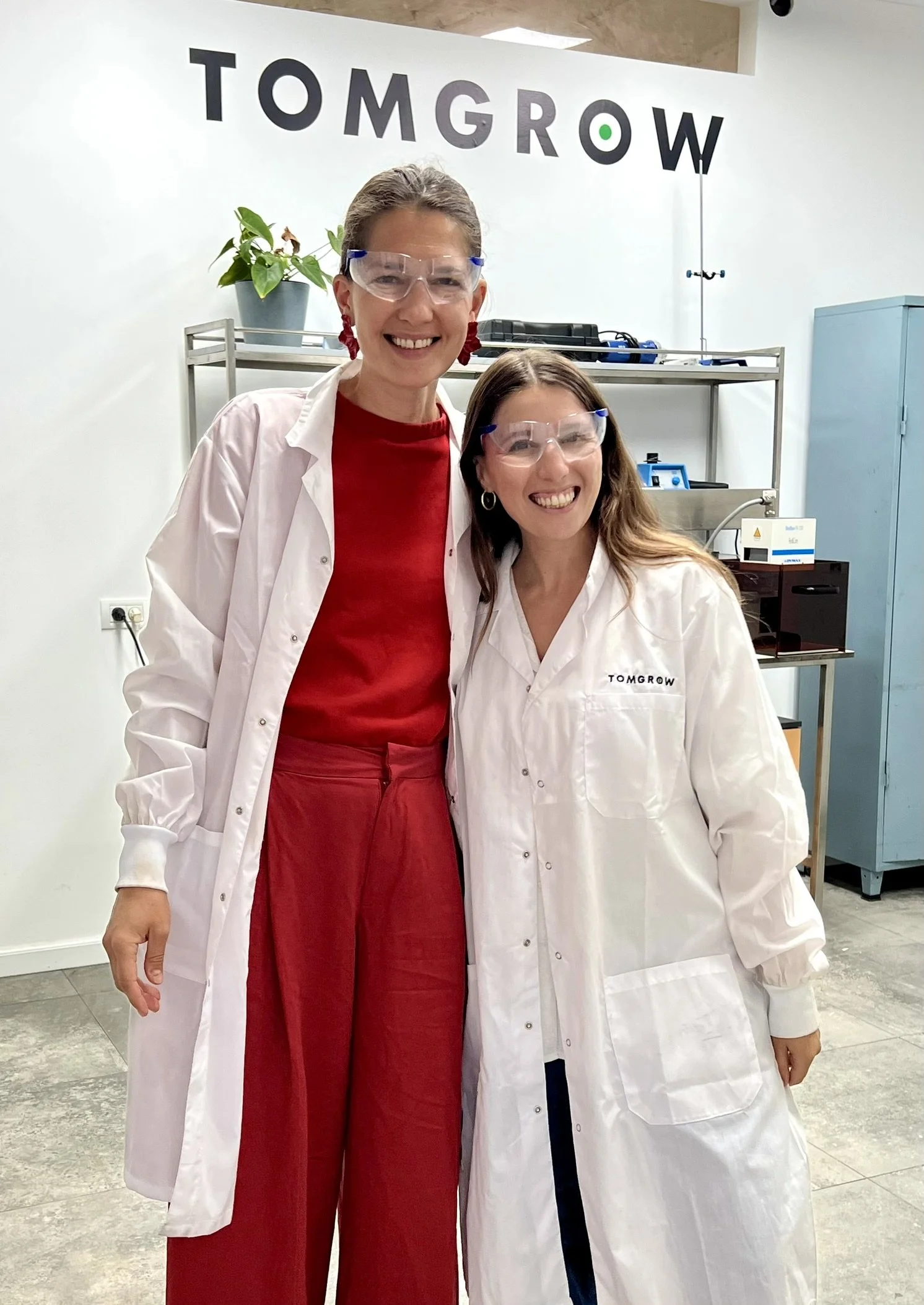
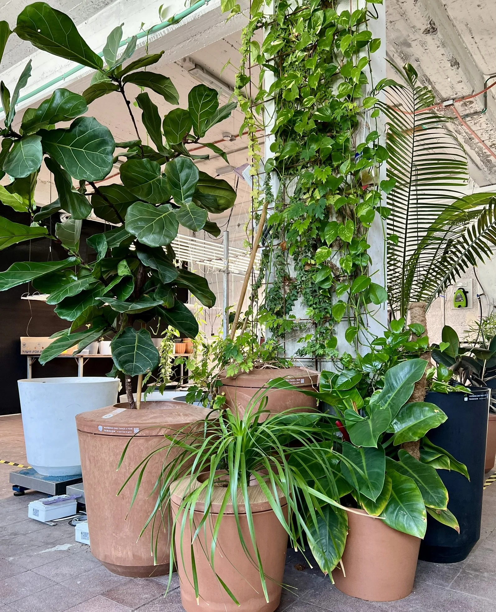
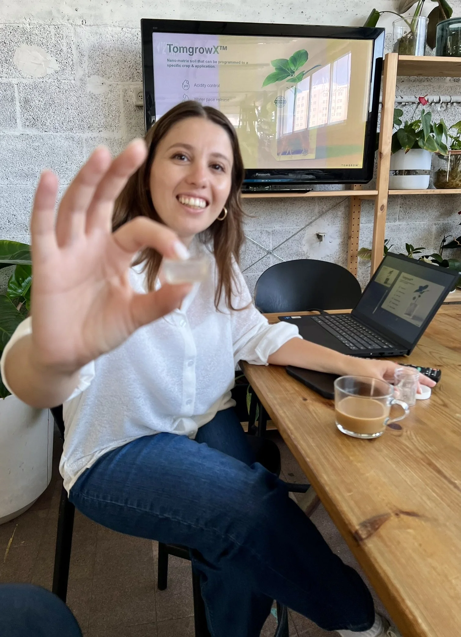
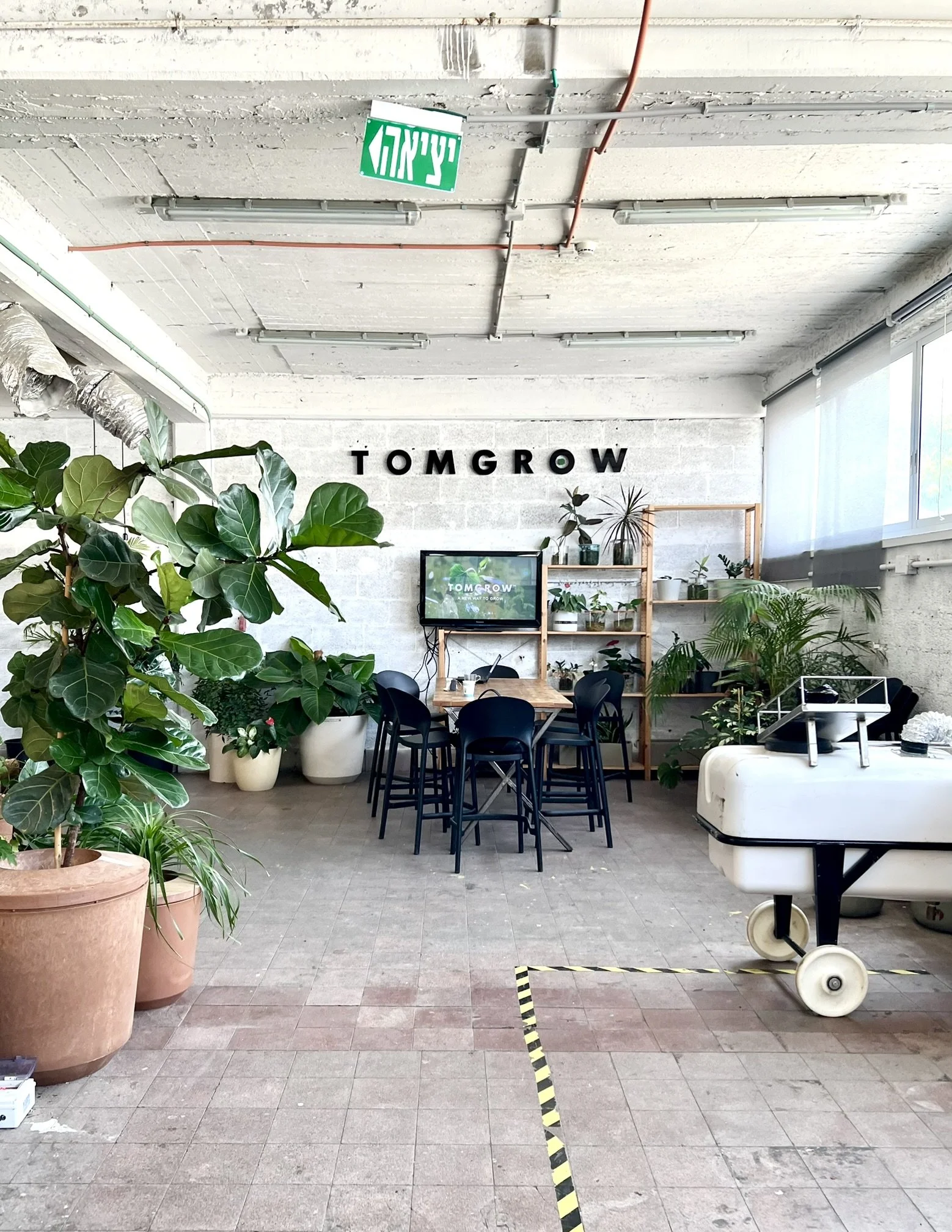
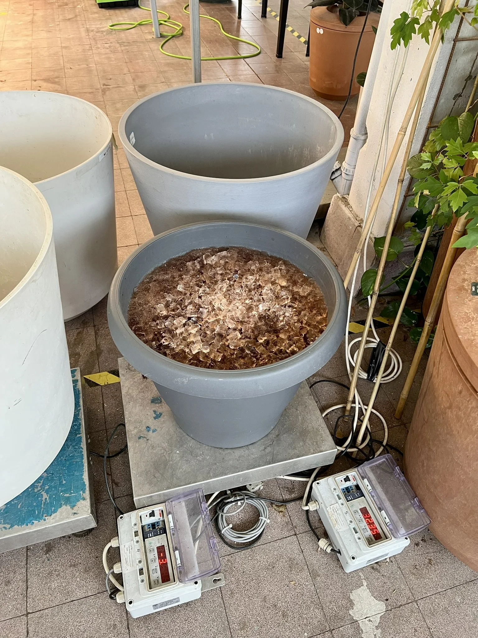
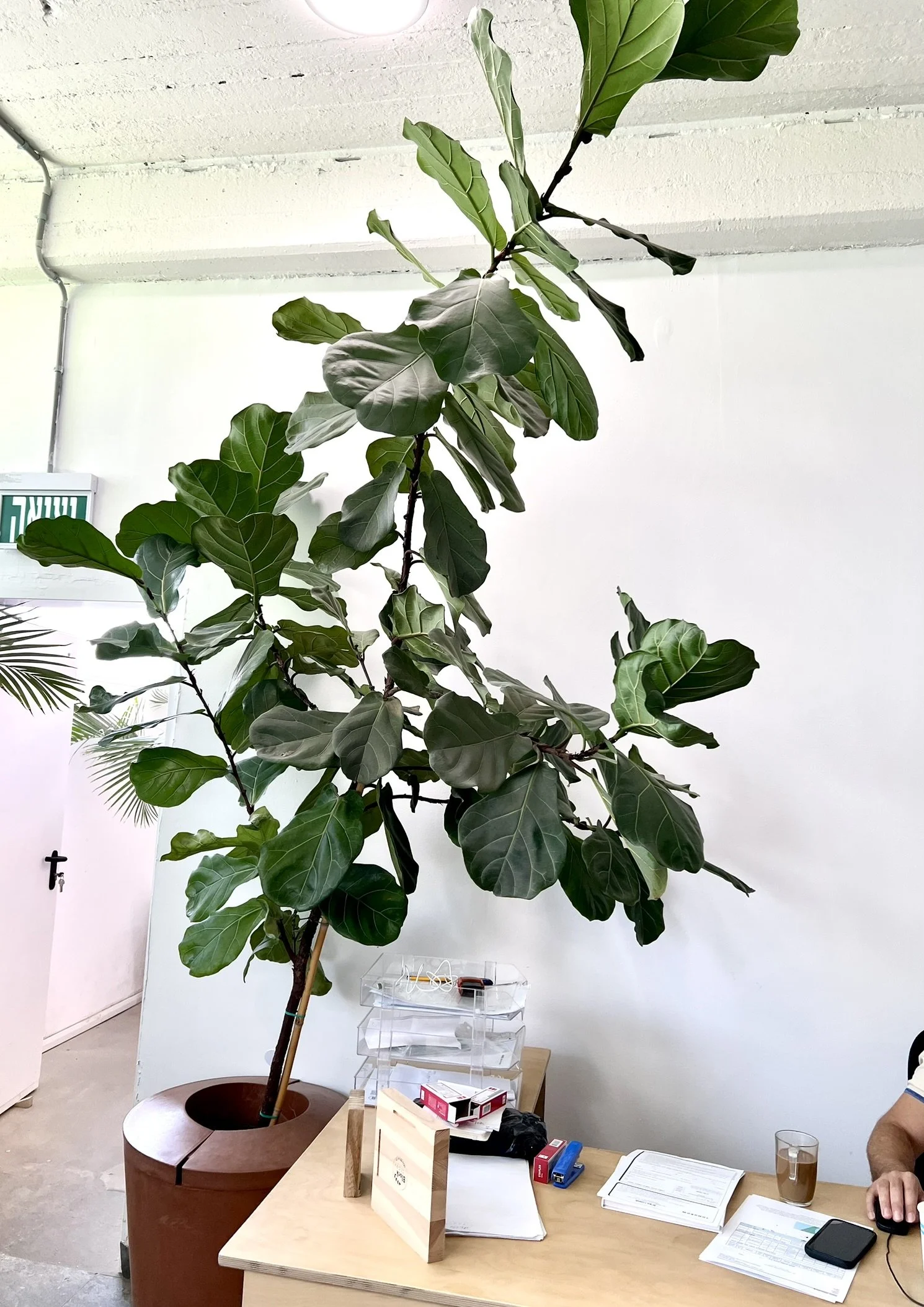
Last month I had a fascinating visit and lab tour of Tomgrow. They’re an Israeli agri-tech company with a patented dirt-free, low-water solution for indoor plants: a nutrient-rich gel that keeps the plants hydrated and thriving (even in artificial light).
Growing plants in Tomgrow’s gel means you skip the mess and hassle of dirt and water your plants only once or twice a year (!). The easy upkeep makes designing greenery into the office a breeze, and it also means plants can be near computers and tech without risk, making for endless design options.
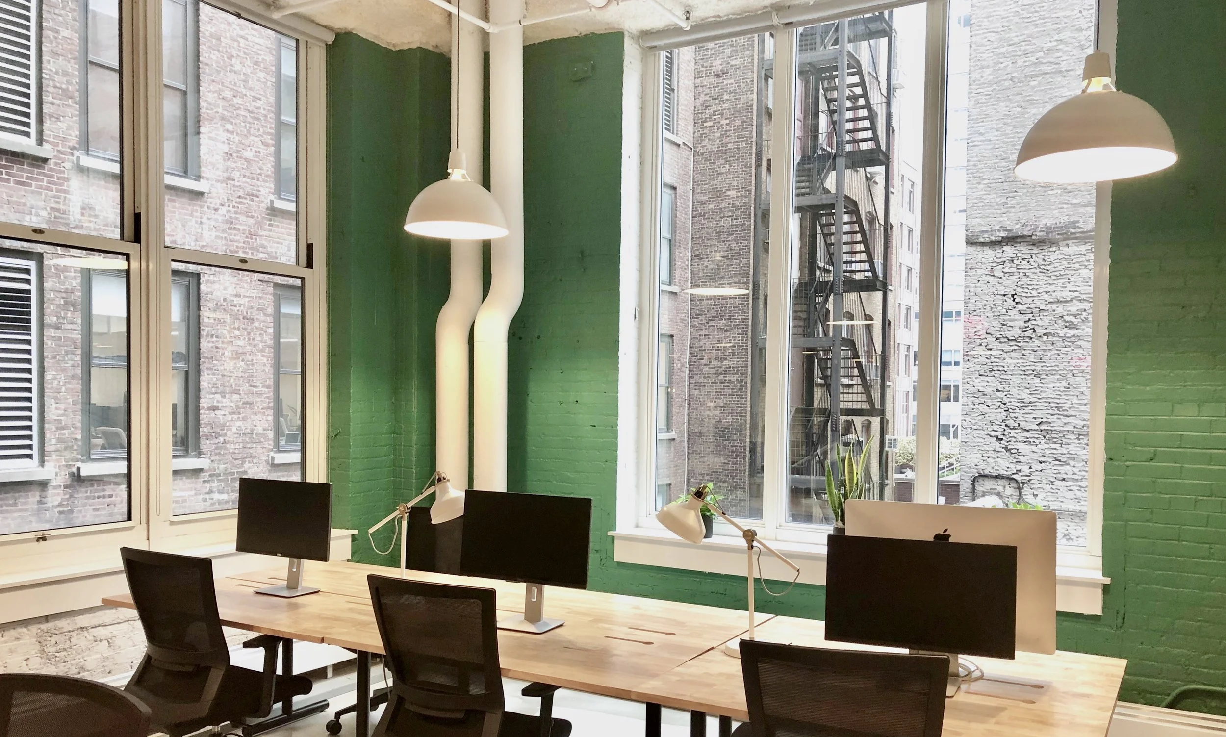
Bringing plant life and natural elements into the office improves employee well-being and makes the office a place people enjoy spending time in.
A big thank you to Tali Osadon, who showed me how Tomgrow’s gel is made and the experiments they’re doing to continuously optimize its performance and expand the line of plants they can grow, from flowers to produce.
Love seeing Israel take the lead in green and efficient solutions in biophilic design!
5 Signs your office is falling short (and limiting your potential)
𝟭) 𝗘𝗺𝗽𝘁𝘆 𝗱𝗲𝘀𝗸𝘀 𝗲𝘃𝗲𝗿𝘆𝘄𝗵𝗲𝗿𝗲 – Hybrid is here to stay, but if no one wants to come in, that's a red flag. A well-designed space should draw people in and make the office the 𝘣𝘦𝘵𝘵𝘦𝘳 place to work.
𝟮) 𝗧𝗼𝗼 𝗹𝗼𝘂𝗱 / 𝘁𝗼𝗼 𝗾𝘂𝗶𝗲𝘁 – Open concept chaos or eerily silent cubicles? Both extremes kill productivity. Balance is key and people need choice: collaborative zones 𝘢𝘯𝘥 focused areas.
𝟯) 𝗣𝗲𝗼𝗽𝗹𝗲 𝗯𝗼𝗼𝗸 𝗺𝗲𝗲𝘁𝗶𝗻𝗴 𝗿𝗼𝗼𝗺𝘀 𝗷𝘂𝘀𝘁 𝘁𝗼 𝘄𝗼𝗿𝗸 𝗮𝗹𝗼𝗻𝗲 – This often means they’re craving privacy and can’t find it elsewhere. If your meeting rooms are full of solo workers, it’s time to rethink your layout.
𝟰) 𝗡𝗼𝗯𝗼𝗱𝘆 𝗸𝗻𝗼𝘄𝘀 𝘄𝗵𝗲𝗿𝗲 𝘁𝗼 𝗴𝗼 – Confusing layouts, no clear zones for different work styles, or poor signage can make even the most beautiful office frustrating to use.
𝟱) 𝗜𝘁 𝗱𝗼𝗲𝘀𝗻’𝘁 𝗿𝗲𝗳𝗹𝗲𝗰𝘁 𝘆𝗼𝘂𝗿 𝗰𝘂𝗹𝘁𝘂𝗿𝗲 – If your space doesn’t 𝘭𝘰𝘰𝘬 𝘢𝘯𝘥 𝘧𝘦𝘦𝘭 like your brand, it’s a missed opportunity. Your office should reinforce your values the moment someone walks in — instead of feeling like it could be any other company in the world.
Office design is about functionality, flexibility, brand identity, and giving people a reason to 𝘸𝘢𝘯𝘵 to be there.
Does your office show signs it needs reimagining? Book a call with me and we’ll discuss it.
Float your desk
Many people instinctively push their desks against a wall.
Try the Feng Shui 𝗰𝗼𝗺𝗺𝗮𝗻𝗱 𝗽𝗼𝘀𝗶𝘁𝗶𝗼𝗻 instead.
You should face outward with a clear view of the door and your back to a solid wall for a sense of security, control, and leadership (CEO). This setup minimizes distractions and helps you feel more at ease.
Desk tips:
✅ 𝗙𝗮𝗰𝗲 𝘁𝗵𝗲 𝗱𝗼𝗼𝗿, 𝗯𝘂𝘁 𝗻𝗼𝘁 𝗱𝗶𝗿𝗲𝗰𝘁𝗹𝘆 𝗶𝗻 𝗹𝗶𝗻𝗲
Position your desk to see the entrance without sitting directly in front of it, for better awareness and energy flow.
✅ 𝗦𝗼𝗹𝗶𝗱 𝘀𝘂𝗽𝗽𝗼𝗿𝘁 𝗯𝗲𝗵𝗶𝗻𝗱 𝘆𝗼𝘂
Place a solid wall or high-backed chair behind you for stability. Avoid sitting with your back to a window unless covered with curtains (backlighting can turn you into a silhouette on Zoom).
✅ 𝗕𝗮𝗹𝗮𝗻𝗰𝗲𝗱 𝘀𝗽𝗮𝗰𝗲 𝗼𝗻 𝗯𝗼𝘁𝗵 𝘀𝗶𝗱𝗲𝘀
Avoid placing your desk too close to a wall; keep both sides open or supported by furniture for balance.
✅ 𝗗𝗼𝗻'𝘁 𝗳𝗮𝗰𝗲 𝗮 𝘄𝗮𝗹𝗹
If necessary, use mirrors or artwork to create a more open, inspiring space.
✅ 𝗚𝗼𝗼𝗱 𝗻𝗮𝘁𝘂𝗿𝗮𝗹 𝗹𝗶𝗴𝗵𝘁 𝗮𝗻𝗱 𝗮𝗶𝗿 𝗳𝗹𝗼𝘄
Sit near (but not in front of) a window if you can.
Experiment with floating your desk and see how it transforms your workflow and mindset.
Private office vs coworking: Which one fits your business?
Once I went to sign a lease on an apartment and met the realtor duo at a coworking office. They had a meeting room booked and the space looked professional and nicely designed. I felt well taken care of.
Would I have felt the same if I were signing to purchase a multi-million-dollar penthouse? Maybe not.
Some businesses need a space that reflects their brand and their offer, gives them full control over their environment, and fosters productivity. Other businesses value flexibility, networking, and cost savings.
A breakdown:
🏢 Private Office
✅ Pros:
• Custom branding and design that reflect your company culture
• Personalized layout to enhance productivity
• Full privacy and control over the space
• Long-term stability for growing teams
❌ Cons:
• Higher costs and longer lease commitments
• Fewer organic networking opportunities
☕ Coworking Space
✅ Pros:
• Can be more cost-effective
• Lease flexibility
• Great for networking and spontaneous collaborations
• Amenities and perks built in
❌ Cons:
• Less privacy and control over design, as well as potential for noise and distractions
• Inconsistent availability for desks and meeting rooms
• Less rooted, more transient atmosphere for your employees and guests
Both options have their perks, and the best choice depends on your business needs.
Have you ever been 𝘵𝘩𝘳𝘰𝘸𝘯 𝘰𝘧𝘧 by someone’s office? How about pleasantly surprised? Why? I would love to hear about it.👇
—
Need help designing your new office so your employees love coming to work? Send me a WhatsApp message to schedule a discovery call: 053-892-6032
Color Exercise
I’m in Yael Steinberger’s interior design program (read about it here and here) and one of her introductory assignments was to add color to this black and white room. To me it looks like a seating area in the upstairs corner of a hotel or conference center, so I considered it as a commercial space. If I could edit some of the items, I’d replace the standing lamp with something grander or with sconces, switch out the artwork, add more variety in the types of seating, etc. But sticking with what was given, here’s how I colored it in in Photoshop:
I started with the flooring because I didn’t like the dark glossy floors and in general it’s helpful to work upwards. I’ve always loved these Barcelona cube tiles (especially in this apartment) and they felt appropriate for the Spanish–Italian-style seating. Normally I wouldn’t make every seat in a grouping a different color — and probably not turquoise — but the sameness and largeness of all three called for some differentiation. I added a velvet texture to tame the original pleathery look. I didn’t love the large panels by the curtains, so instead of accenting that feature with solid blocks of color, I made them wood to add warmth to the modern space. The cement adds a contrasting texture to the back wall. About three quarters of the way through, the turquoise couch was feeling a little lonely, so I added the blue-hued rug and leafy wallpaper to tie all the tones together.

