In Progress: Sol’s Room
I’m finally making Sol’s room Sol’s room. He’s been sleeping in his room for over a year but it’s also been half an office for a period and a temporary guest room multiple times. Below was its most recent iteration as a guest room (a speedy touchup purchased entirely from IKEA):
To the right of the door is a wardrobe that spans most of the wall. With one wall covered in the light oak wardrobe and another wall with a window that I want to span with light curtains, I decided to view the room as cut by a diagonal: the top left triangle will be dark and the bottom right triangle will be light.
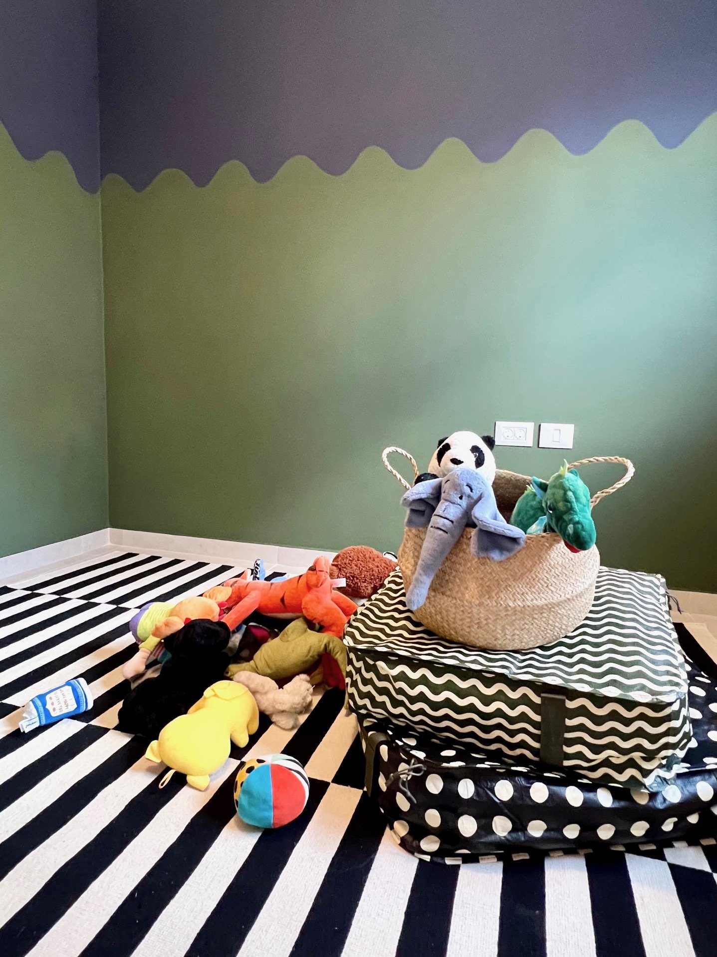
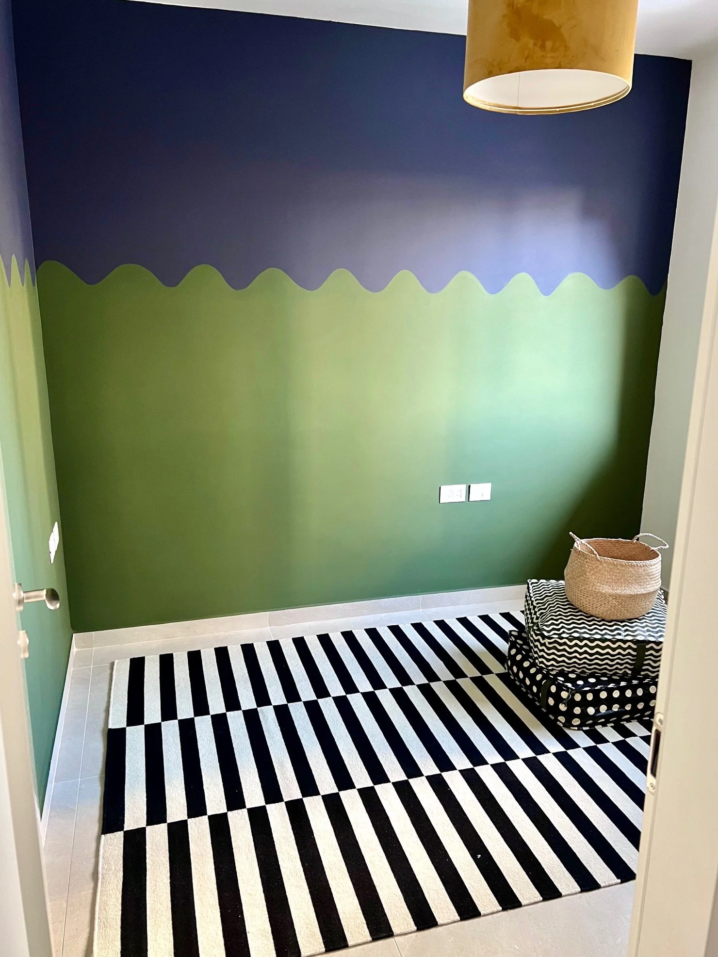
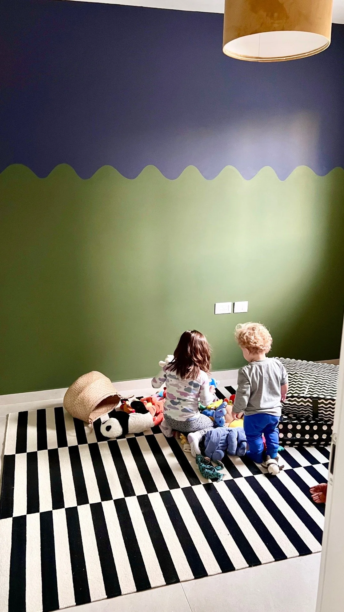
Here’s the room painted. The top is Black as Night (more navy than black) and the bottom is Garden Seat, both by Tambour. The rooms in a typical new apartment in Israel are clean and modern and … boxy. In Talia’s room I added curvature with a painted mountain mural (some updates happening in there soon), and I continued in that vein in Sol’s room with a wave pattern. Once curtains go up on the wall at right, their 3D curvature will complement the painted waves and bring some more movement and dimension to the space.
New Balcony Plants in the Rain
Jake’s been eager to get some greenery on our balcony for a year and a half, so I got these plants for his birthday. Some lavender, rosemary, and sage, and in the black pot a eucalyptus. I spent hours picking pots and ended up with two that had been in use for a while at the nursery. This way they’re pre-aged and already have with some character. Tip: Break the odd number rule to keep things casual. Sometimes three is too perfect.
Speedy IKEA Guest Room
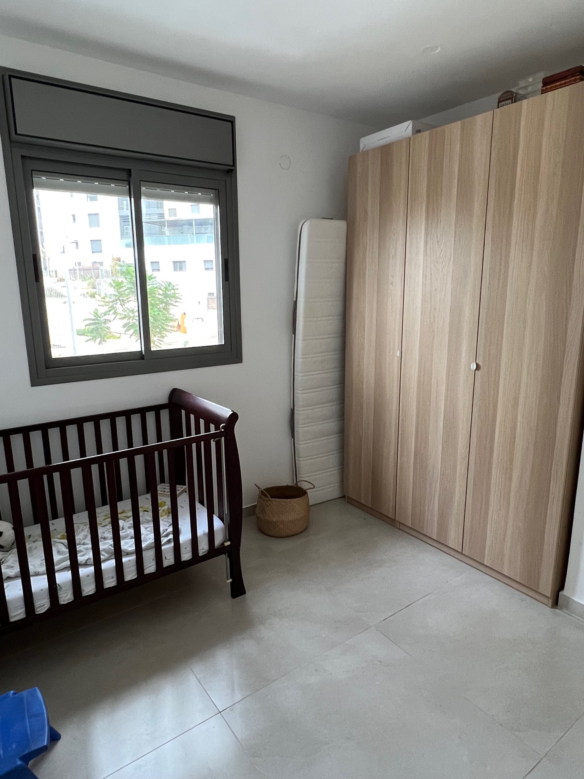
I put together a quick interim guest room for my mother-in-law’s visit while prepping to finally decorate the room for Sol. For a year and a half this room has had almost nothing but an IKEA PAX wardrobe and a crib. I hate the crib, which I half-unintentionally bought off Facebook Marketplace, but that’s a story for another time. Here’s the before:
Sad state. The crib might work in a more traditional home, but it makes no sense in mine. Crib aside, whenever we have guests we move Sol to our room. Often people sleep on the floor:
The chair is now in Jake’s office and the runner is in our bedroom, so there wasn’t much left to make the room inviting. Since I was already gearing up to turn Sol’s room into something other than four walls, I decided to pick up a few extra things while at IKEA to warm up the guest room.
Rules for shopping at IKEA include:
Don’t get one of the ubiquitous geometric rugs. Instead choose a neutral one, like a LOHALS or HJORTSVANG or SVÄRDBORG.
Steer clear of the art.
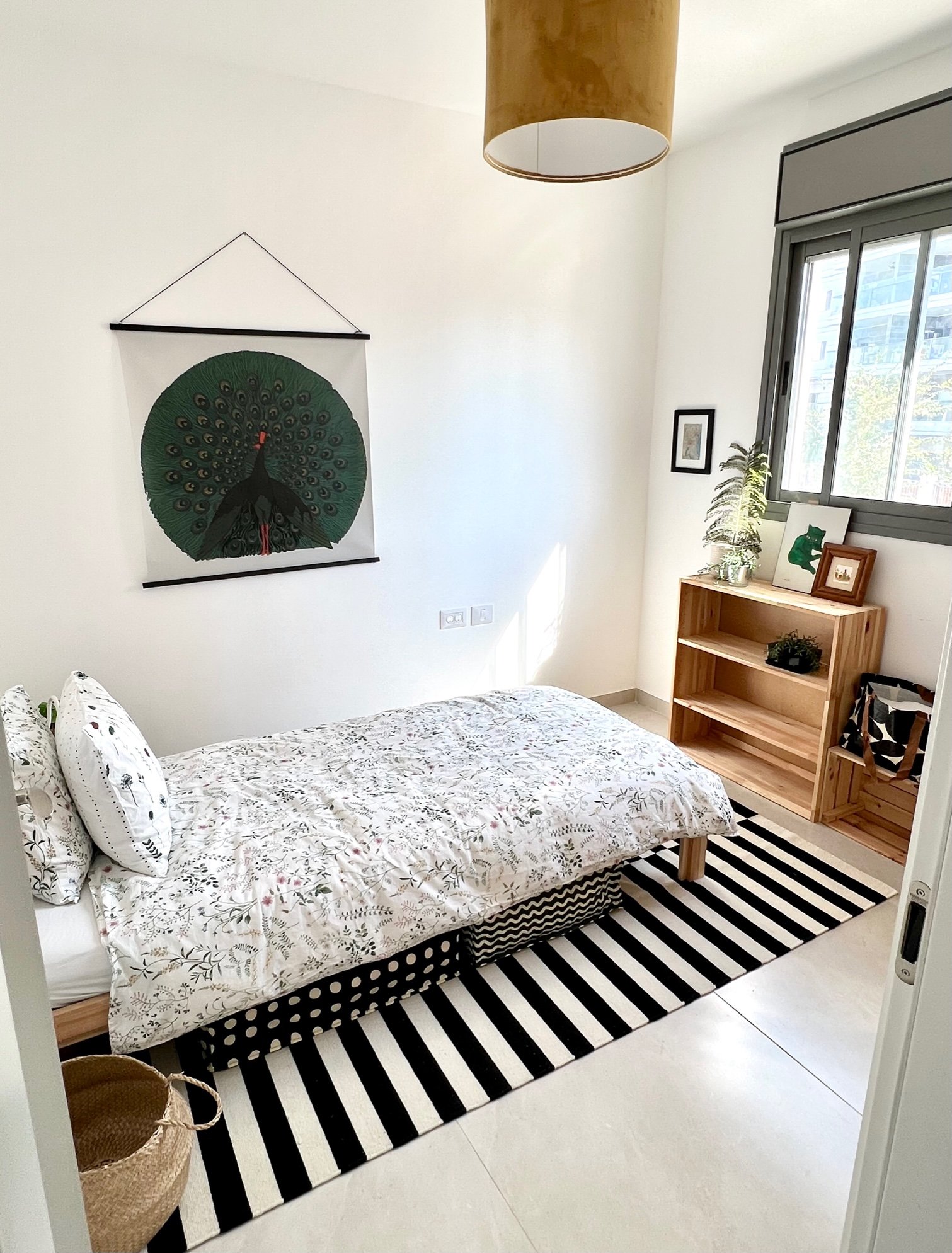
I broke both of these rules in this room. I picked up the (in)famous STOCKHOLM rug for Sol because I love the black and white. This rug might be the most IKEA-screaming rug of all IKEA rugs. But it’s been around for so long I feel like it has turned a corner from cloyingly pervasive to … iconic. Surely debatable. I skipped the art section entirely on this visit, but when I backtracked to pick up something else, I spotted a giant peacock on the wall. It’s the new PÅLHULT hanging tapestry and for ₪75 ($19.99), why not.
The MOLNSKIKT lampshade has a suede-like texture and will stay in Sol’s room. The NEIDEN bed is on loan from Talia’s room and on it I put the TIMJANSMOTT bedspread with a NATTSLÄNDA pillowcase (Talia is using its comforter cover). I took the doors off the IVAR storage unit we already had to make it a bookshelf, and I picked up a bunch of the SÄCKKÄRRA bags for linen storage to clear out space in the closet for guests.
I moved one of the chairs from the kids’ LÄTT table to by the bed, stacked coffee table books on it, and clipped on the NÄVLINGE light so it can be used as a temporary bedside table. Then I added some more artwork that I had in storage: a photo I took of the Sea of Galilee, a small map of the Washington D.C. area where I’m from, a green Warhol cat, and a tiny painting from Mexico. The large leaf fell off a tree outside our building.
The result is, no doubt, very IKEA, but for two weeks it will serve its purpose.
Color Exercise
I’m in Yael Steinberger’s interior design program (read about it here and here) and one of her introductory assignments was to add color to this black and white room. To me it looks like a seating area in the upstairs corner of a hotel or conference center, so I considered it as a commercial space. If I could edit some of the items, I’d replace the standing lamp with something grander or with sconces, switch out the artwork, add more variety in the types of seating, etc. But sticking with what was given, here’s how I colored it in in Photoshop:
I started with the flooring because I didn’t like the dark glossy floors and in general it’s helpful to work upwards. I’ve always loved these Barcelona cube tiles (especially in this apartment) and they felt appropriate for the Spanish–Italian-style seating. Normally I wouldn’t make every seat in a grouping a different color — and probably not turquoise — but the sameness and largeness of all three called for some differentiation. I added a velvet texture to tame the original pleathery look. I didn’t love the large panels by the curtains, so instead of accenting that feature with solid blocks of color, I made them wood to add warmth to the modern space. The cement adds a contrasting texture to the back wall. About three quarters of the way through, the turquoise couch was feeling a little lonely, so I added the blue-hued rug and leafy wallpaper to tie all the tones together.
AliExpress Decor Picks
AliExpress was the Amazon of Israel before Amazon started shipping to Israel. Still a popular place for home decor, I finally sat down and browsed the Chinese rival’s artwork, curtains, and lighting selection. Here are some favorites:
(1) Woman with Palms Tapestry - I love this. It reminded me of a tapestry I saw in a Beata Heuman space, and then I realized — it is that tapestry. I can’t believe it. And I can’t believe it’s sold out. It was on my to-buy list.
(2) Rattan Chandelier - I’ve seen this in Israeli homes and it looks great. It adds nice texture and warmth to the boxy concrete rooms of newly built apartment buildings.
(3) Green Forest Poster - This is a great way to add leafy green shades to a room without having to water anything. Nice pattern from the leaf detail. And a playful take on man-marveling-at-nature.
(4) Matisse Poster - Can’t go wrong.
(5) Matsumoto Hoji Toad Poster - Maybe in a kitchen? Ha!
(6) Leafy Green Curtains - These are fun. I may swap out the forest bedding in Talia’s room and put these curtains there instead. Because then I can use the bedding in my room. ;)
(7) Green Floral Curtains - I have a thing for green… but they also come in yellow.
(8) Doorway Curtain - I’d love to find a use case for this. Maybe a playroom doorway, to give the illusion of privacy but still be able to hear everything.
(9) Rattan Flower Pendant Lamp - So cute. I like the understated size.
(10) Retro Pleated Table Lamp - Again, this reminds me of Beata Heuman, who always includes whimsical, vintage-inspired objects in her spaces.
(11) Psychedelic Goldfish Tapestry - This feels so random and fun.
(12) Hare Poster - Why not.
(13) The Roses of Heliogabalus Poster - This is so over-the-top, great for adding humor to a room.
(14) Medieval Wood Side Table - I like how this adds a lot of curvature to a space with a very slim profile. Perfect for a drink rest in a small living room.
(15) Pleated Umbrella Floor Lamp - I like the white best, with the shade angled so you don’t see the bulb underneath.
There’s a lot more to be found aboard the great AliExpress, for anyone who is comfortable explicitly shopping in China, as opposed to implicitly shopping there.
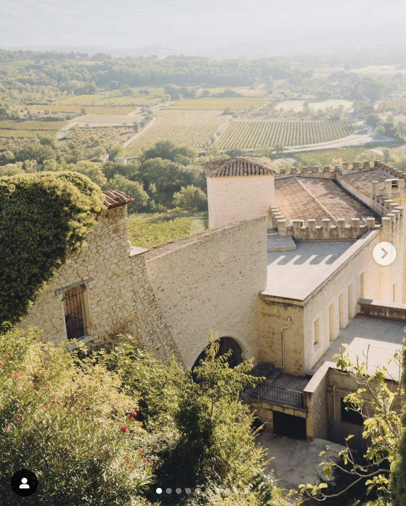
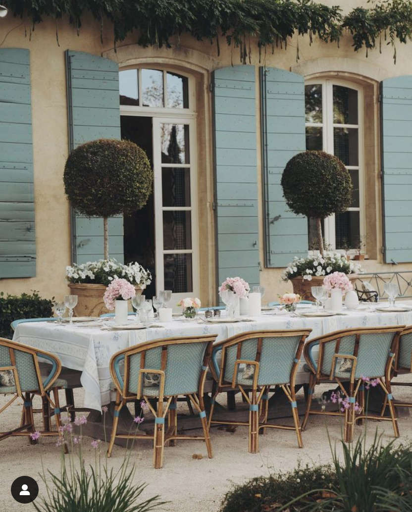
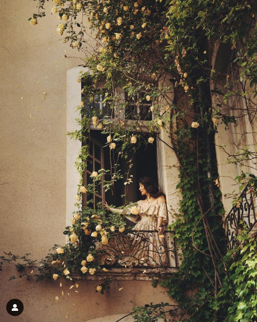
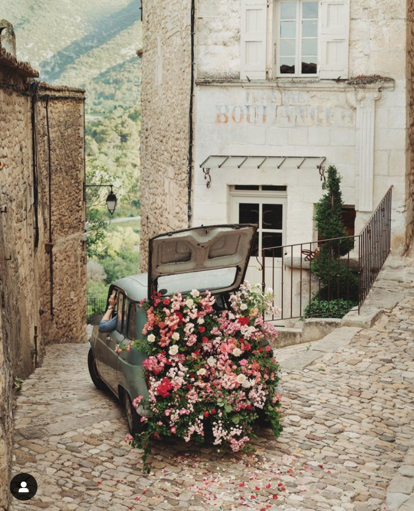
Photographer Jamie Beck
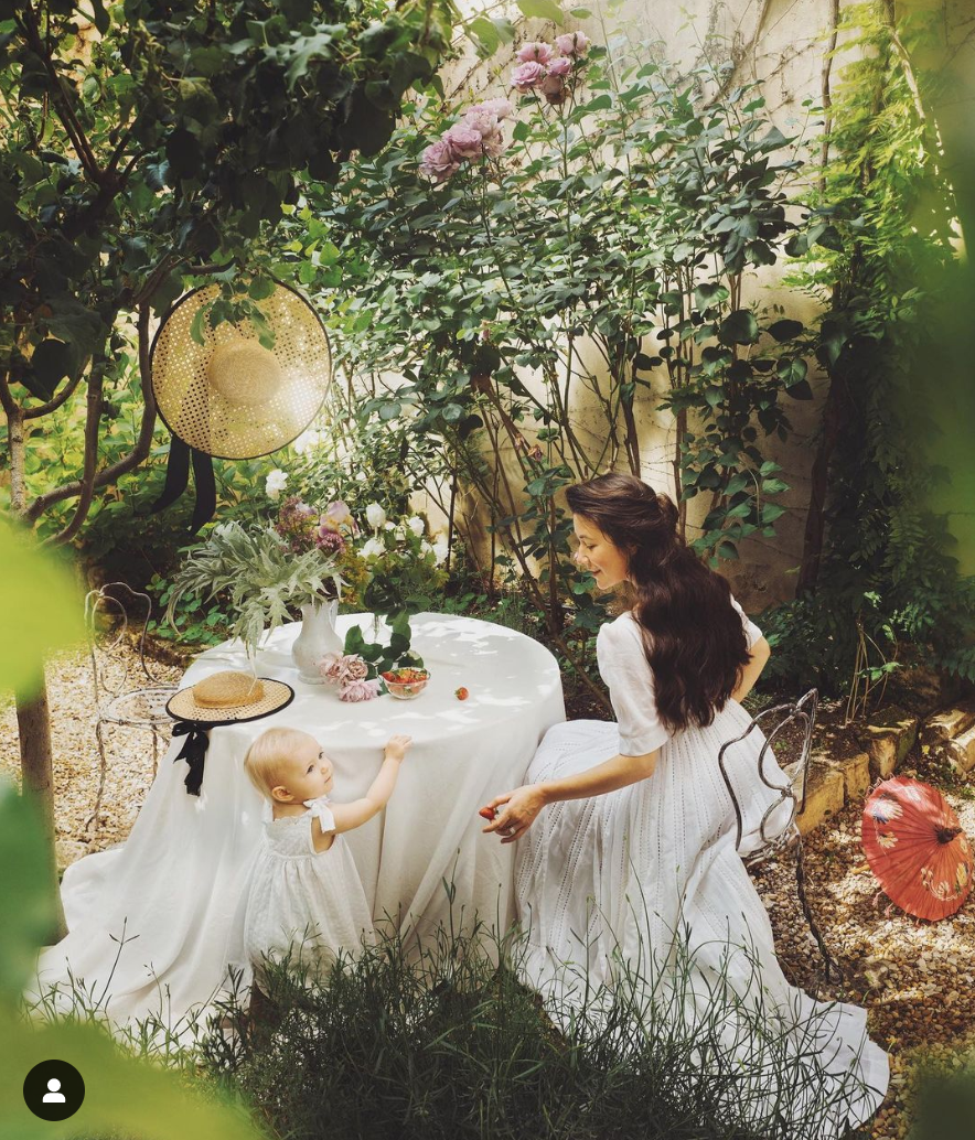
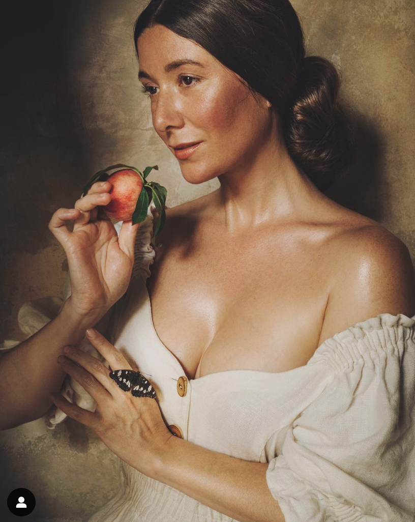
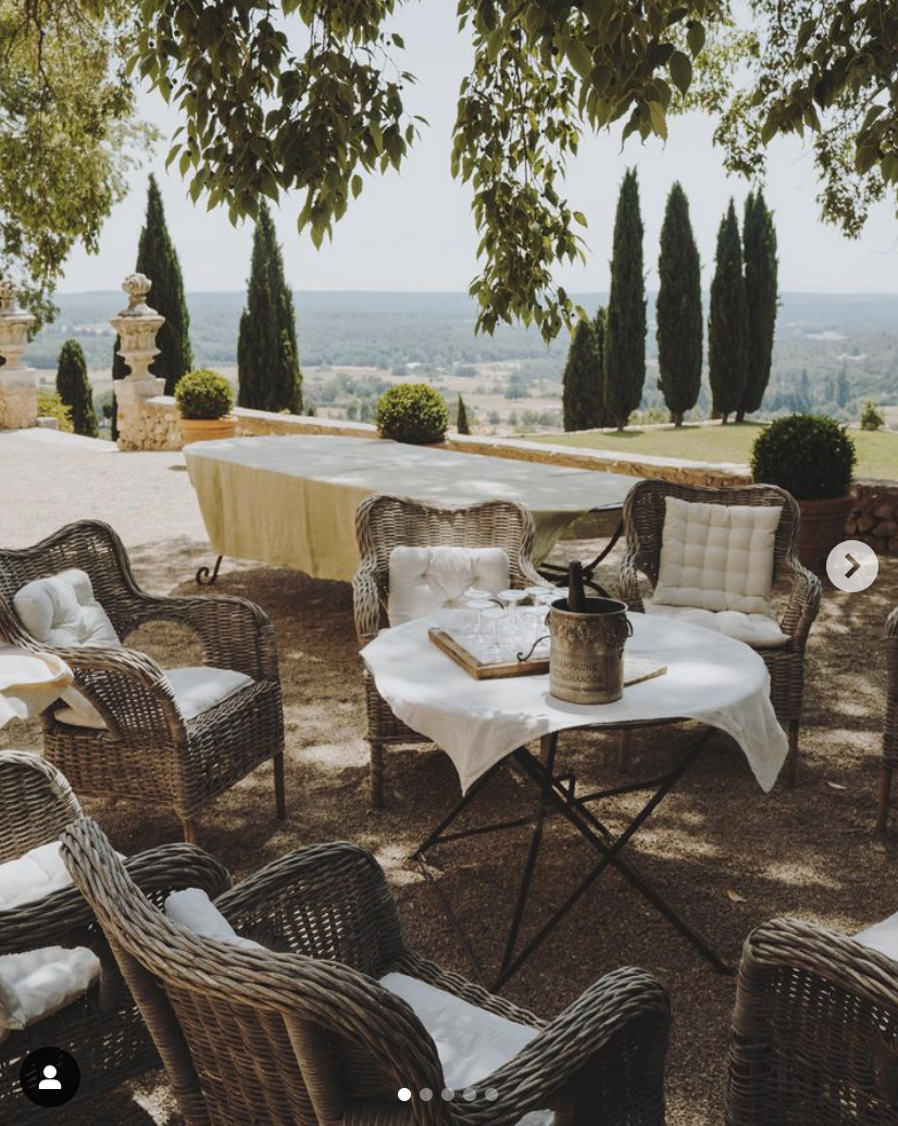
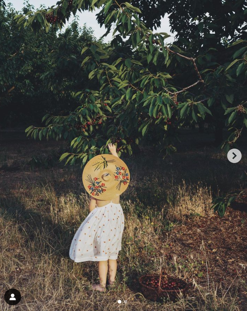
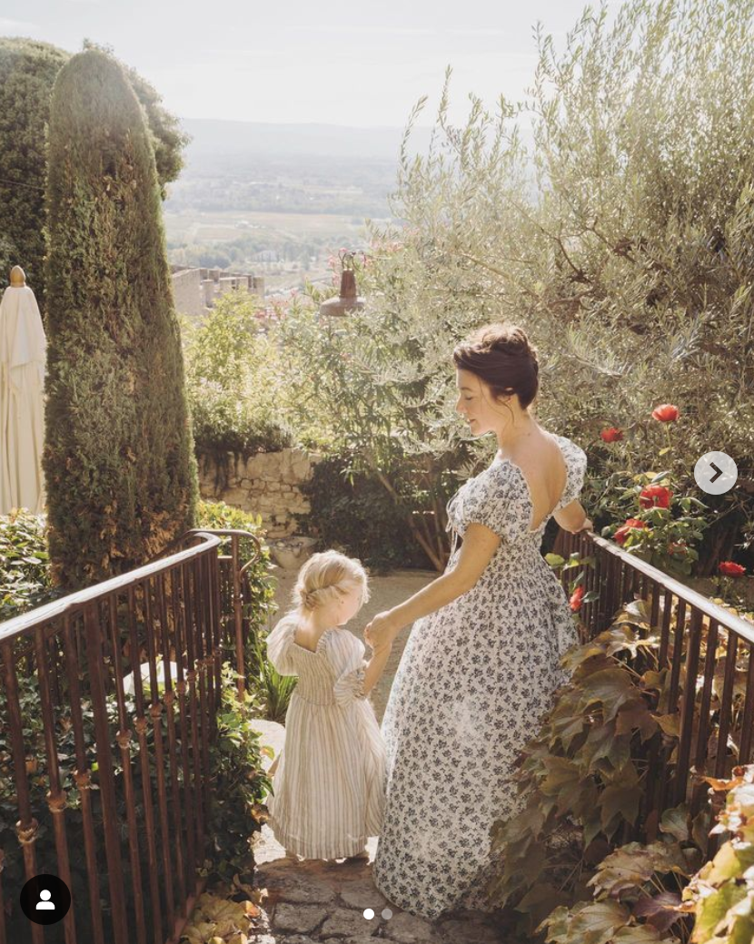
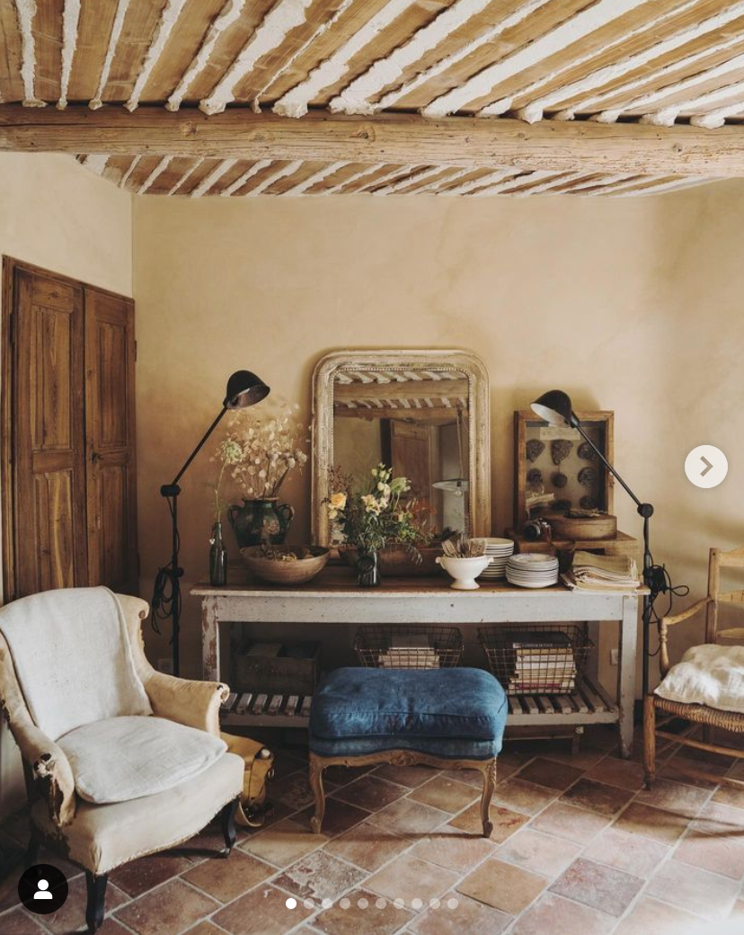
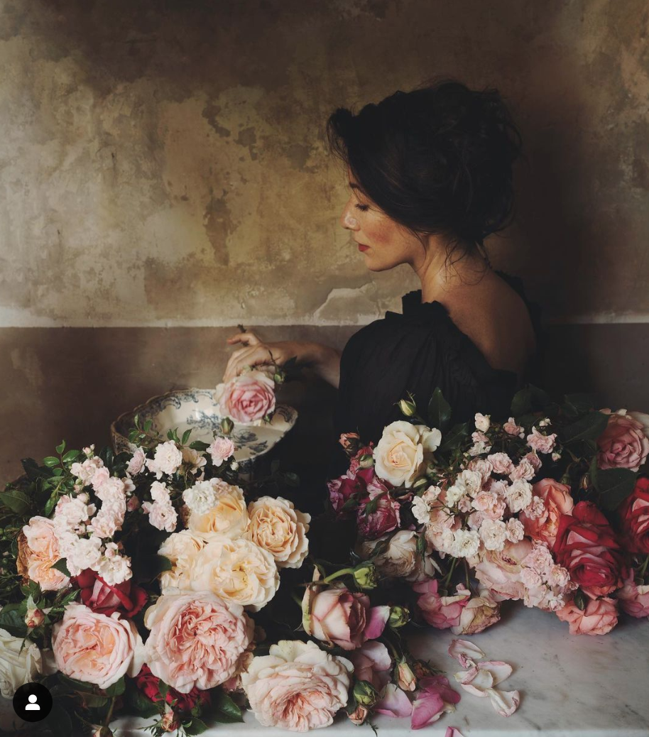
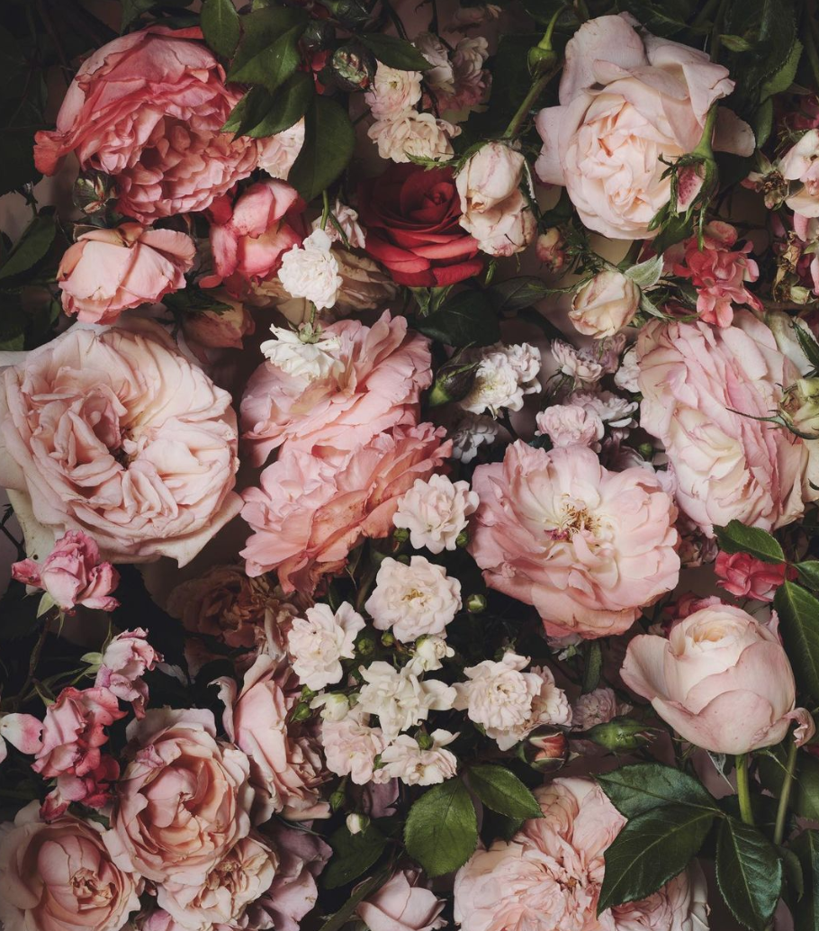
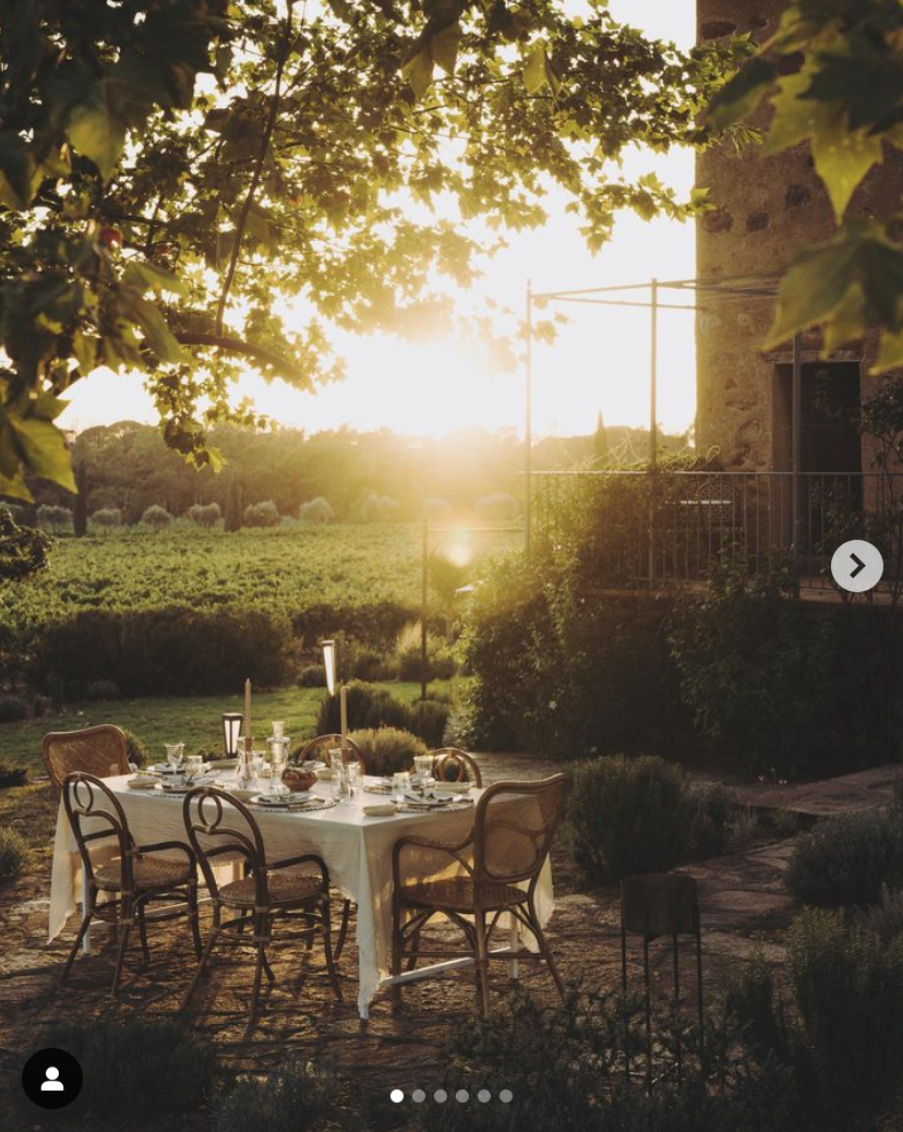
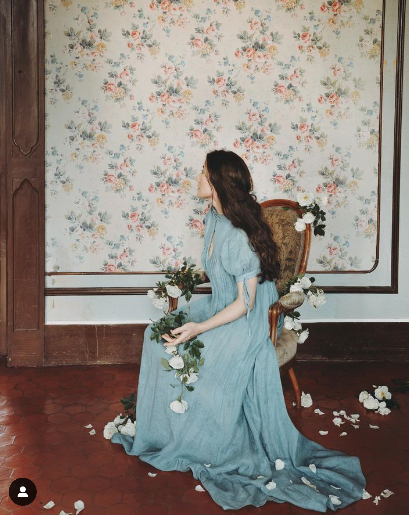
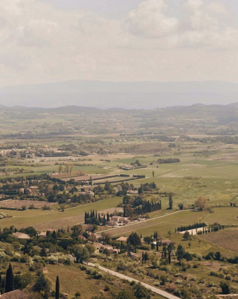
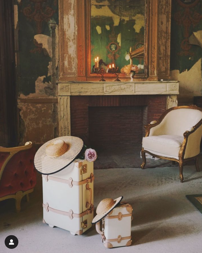
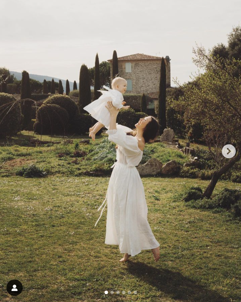
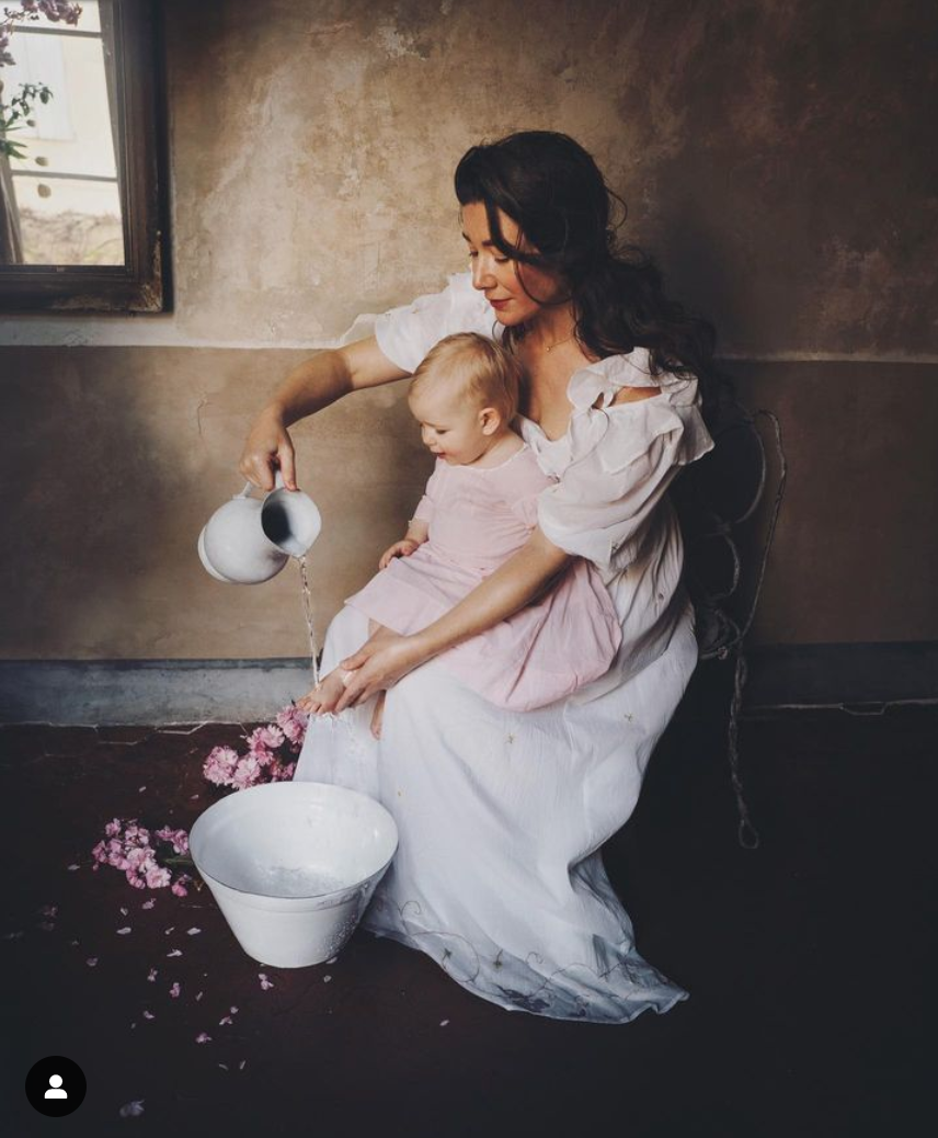
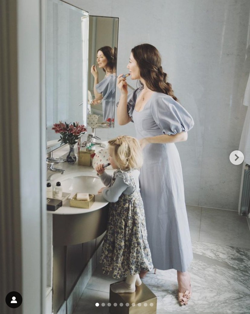
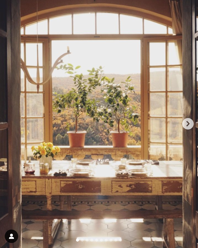
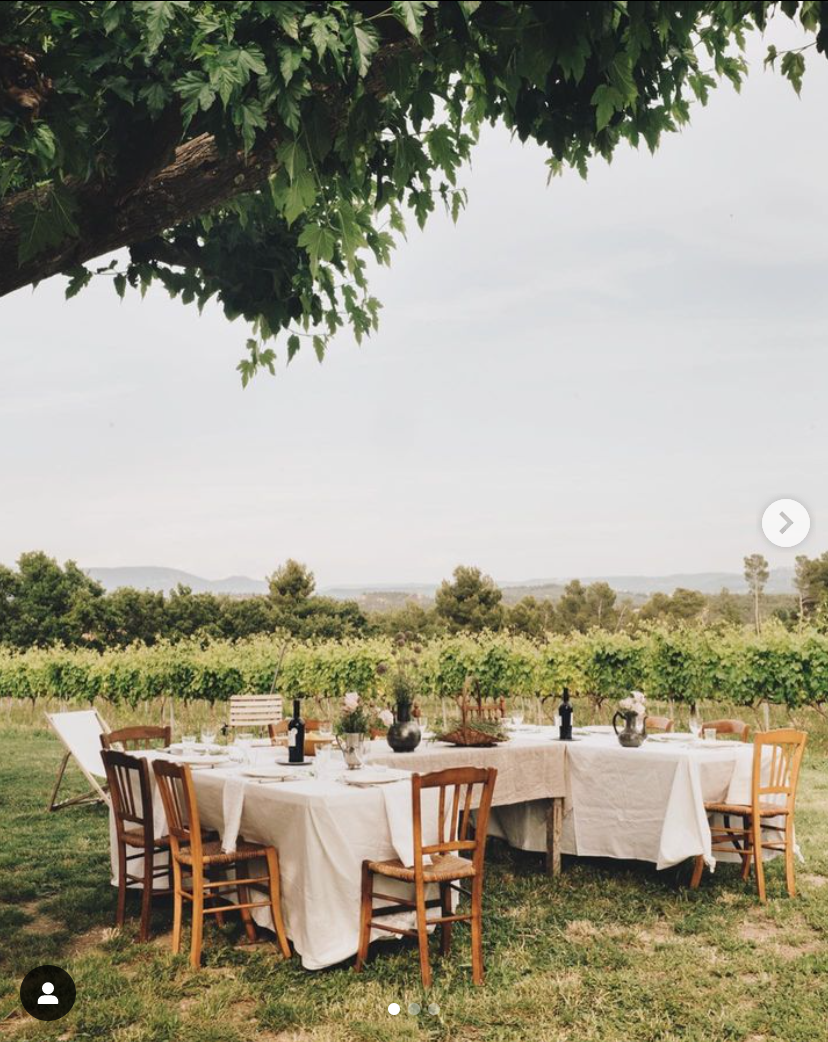
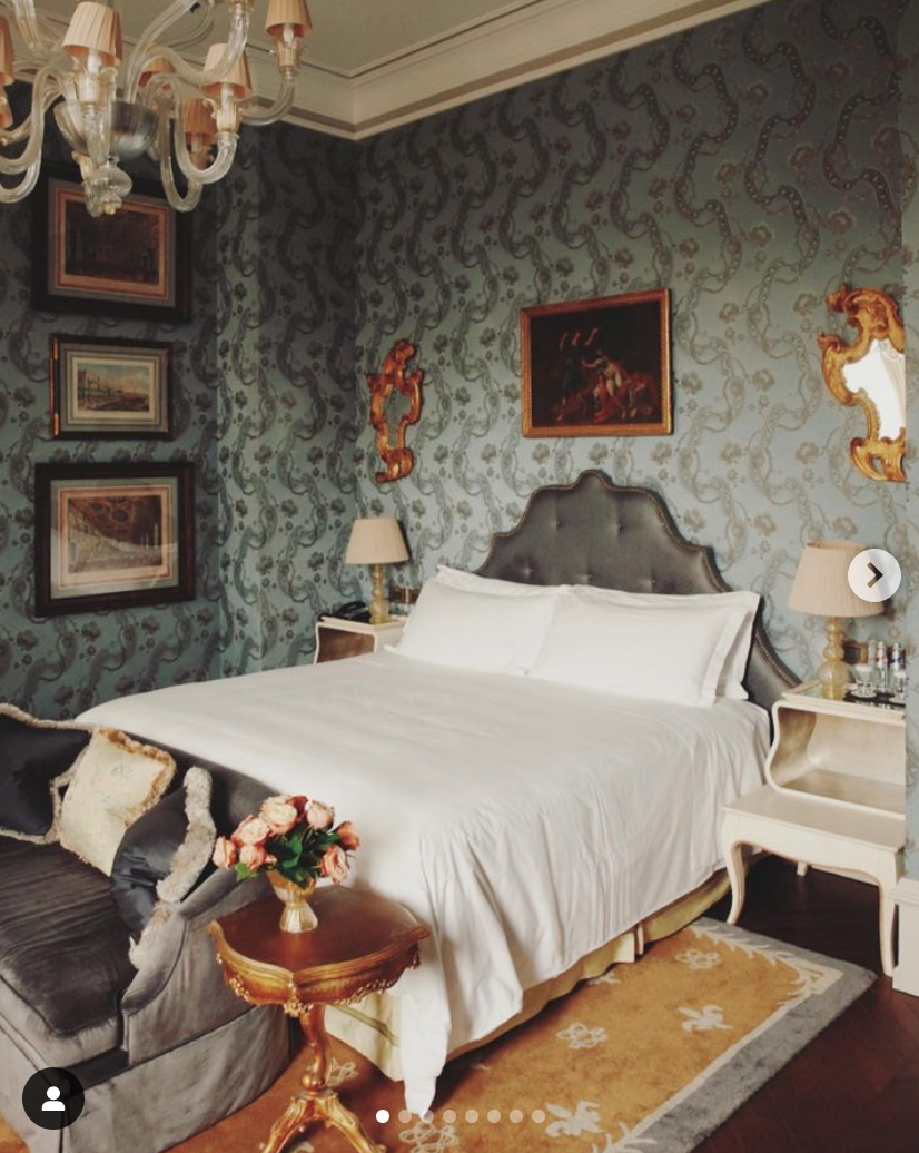
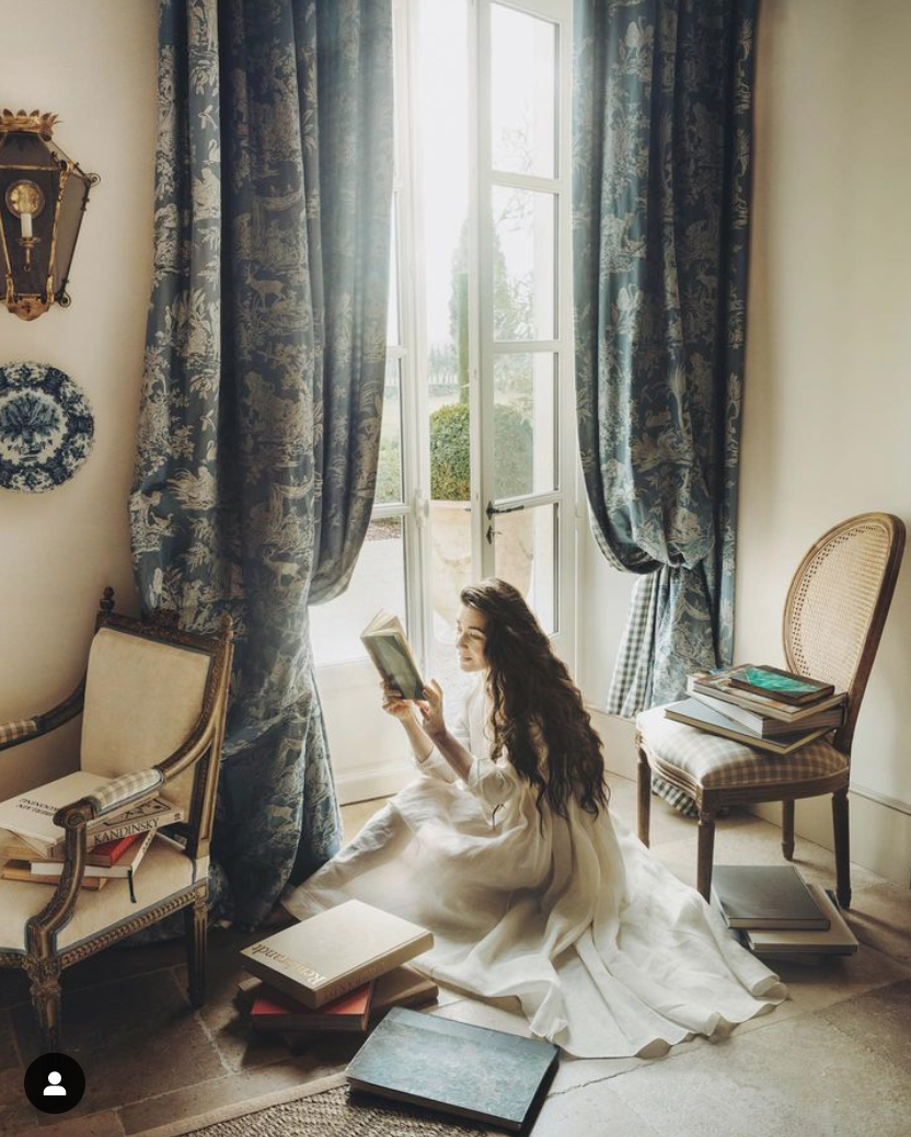
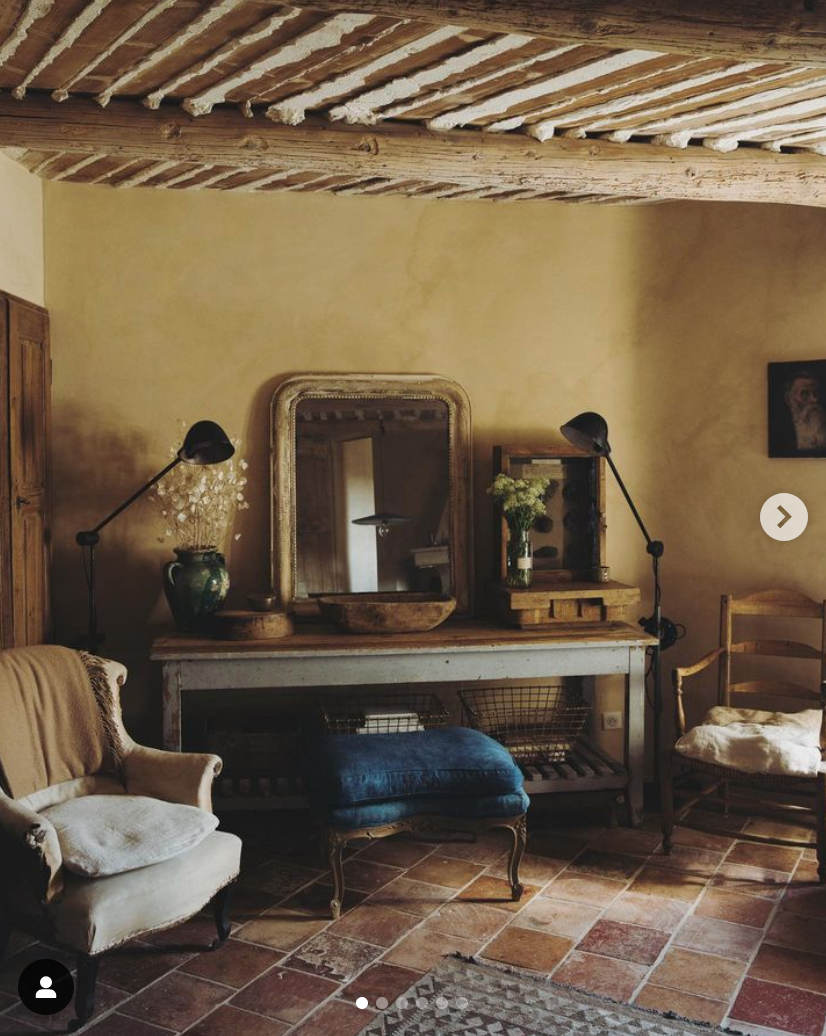
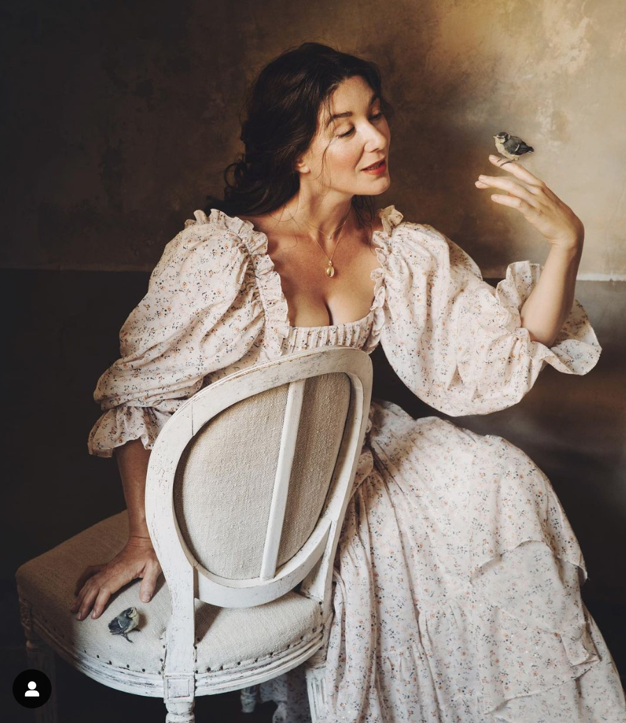
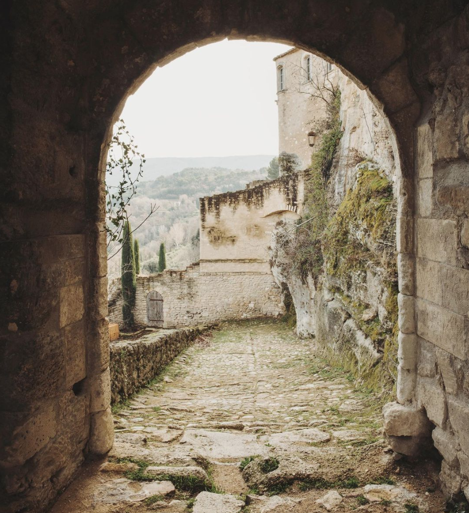
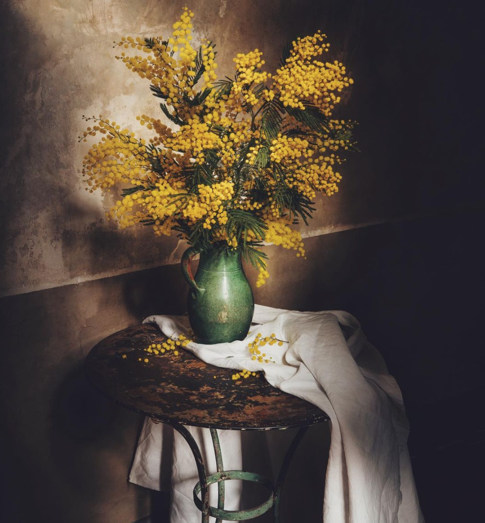
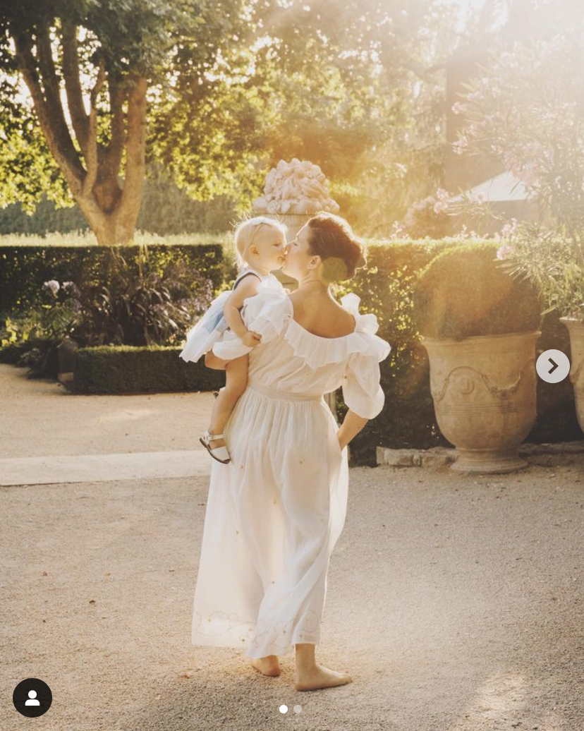
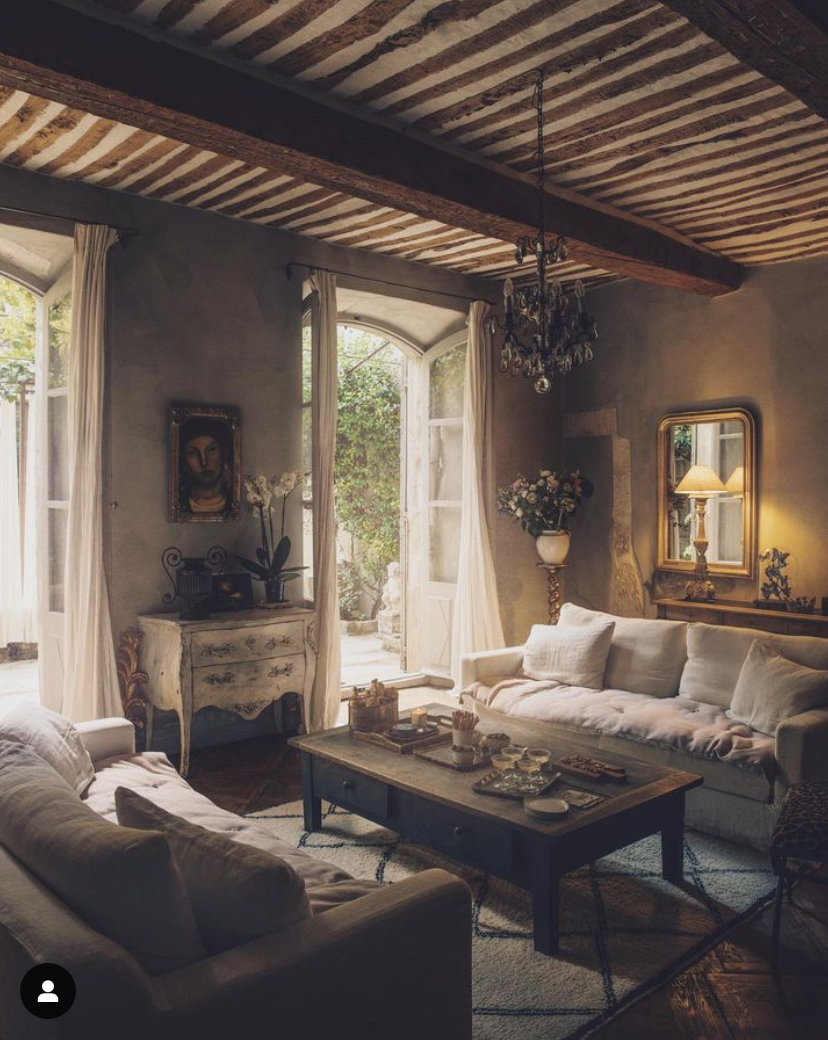
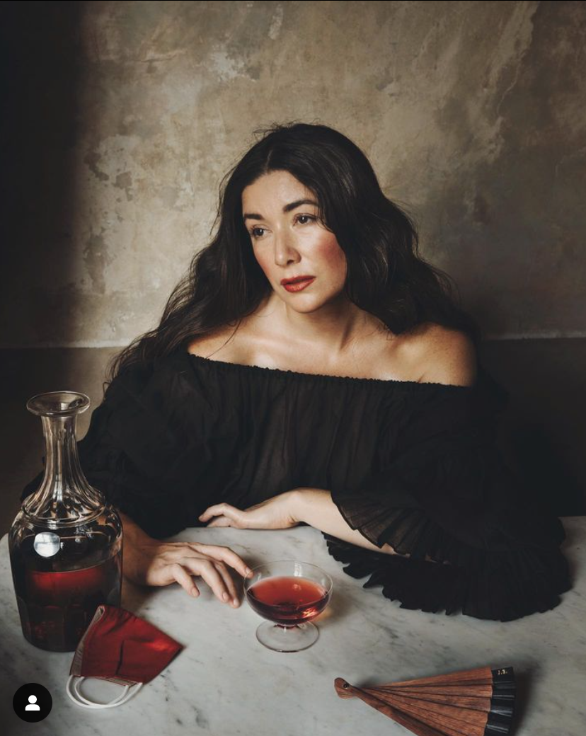
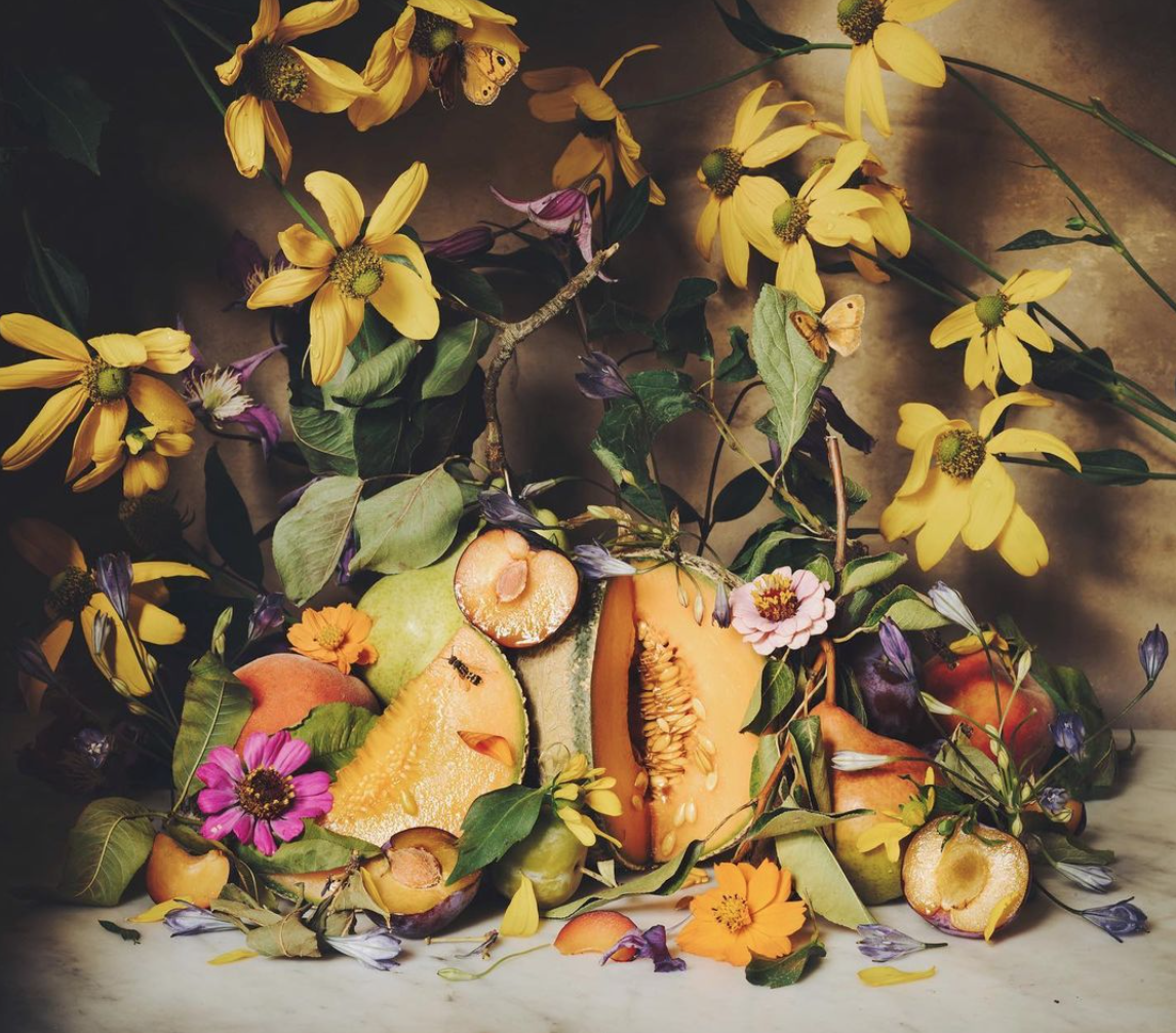
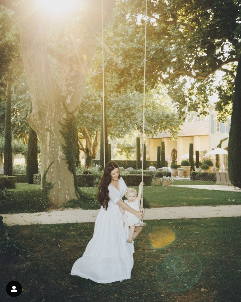
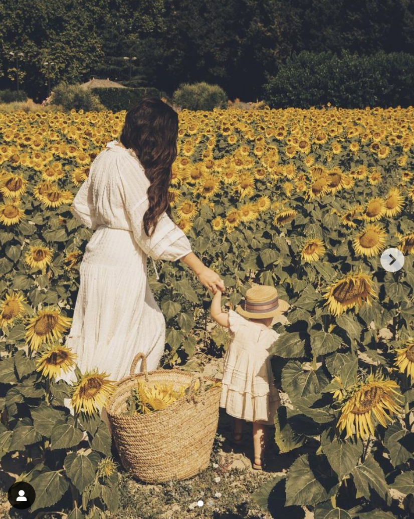
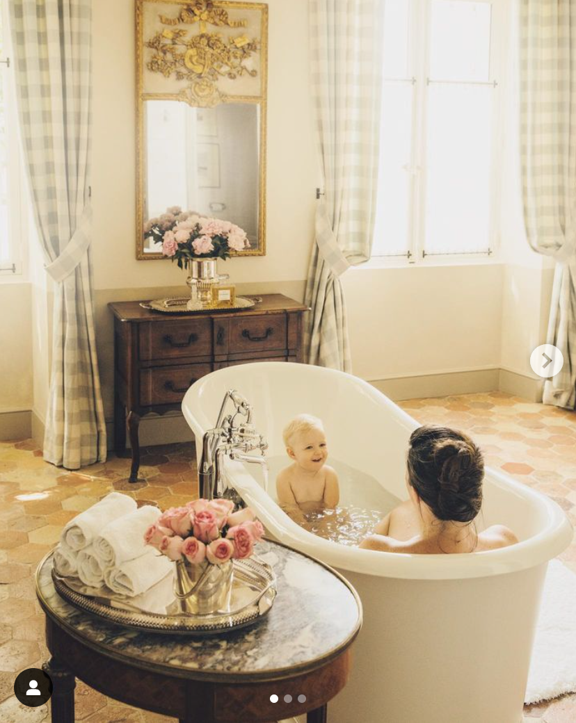
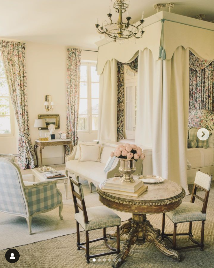
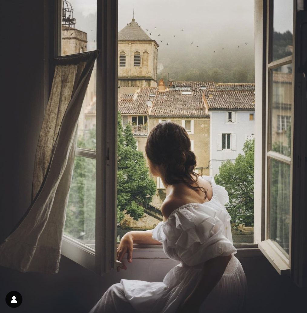
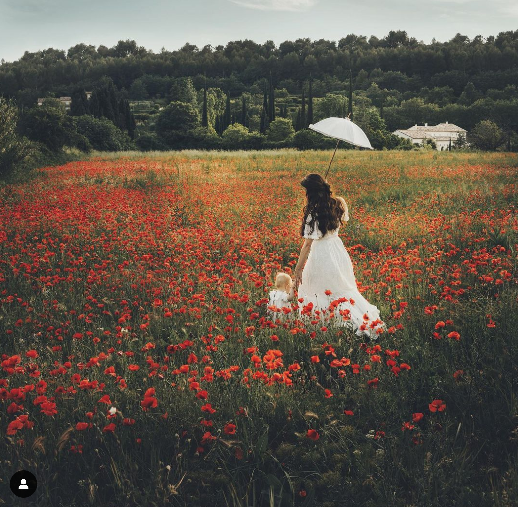
If you’re looking to escape to the south of France but don’t have the time or budget, visit photographer Jamie Beck’s Instagram to take a virtual trip. After a planned year sabbatical in Provence, the Manhattanite liked it so much she stayed. She’s been sharing otherworldly photos of the area ever since, in the most Provence-y aesthetic you’ll ever see.
Choosing My Kitchen Backsplash (a Fairy Tale)
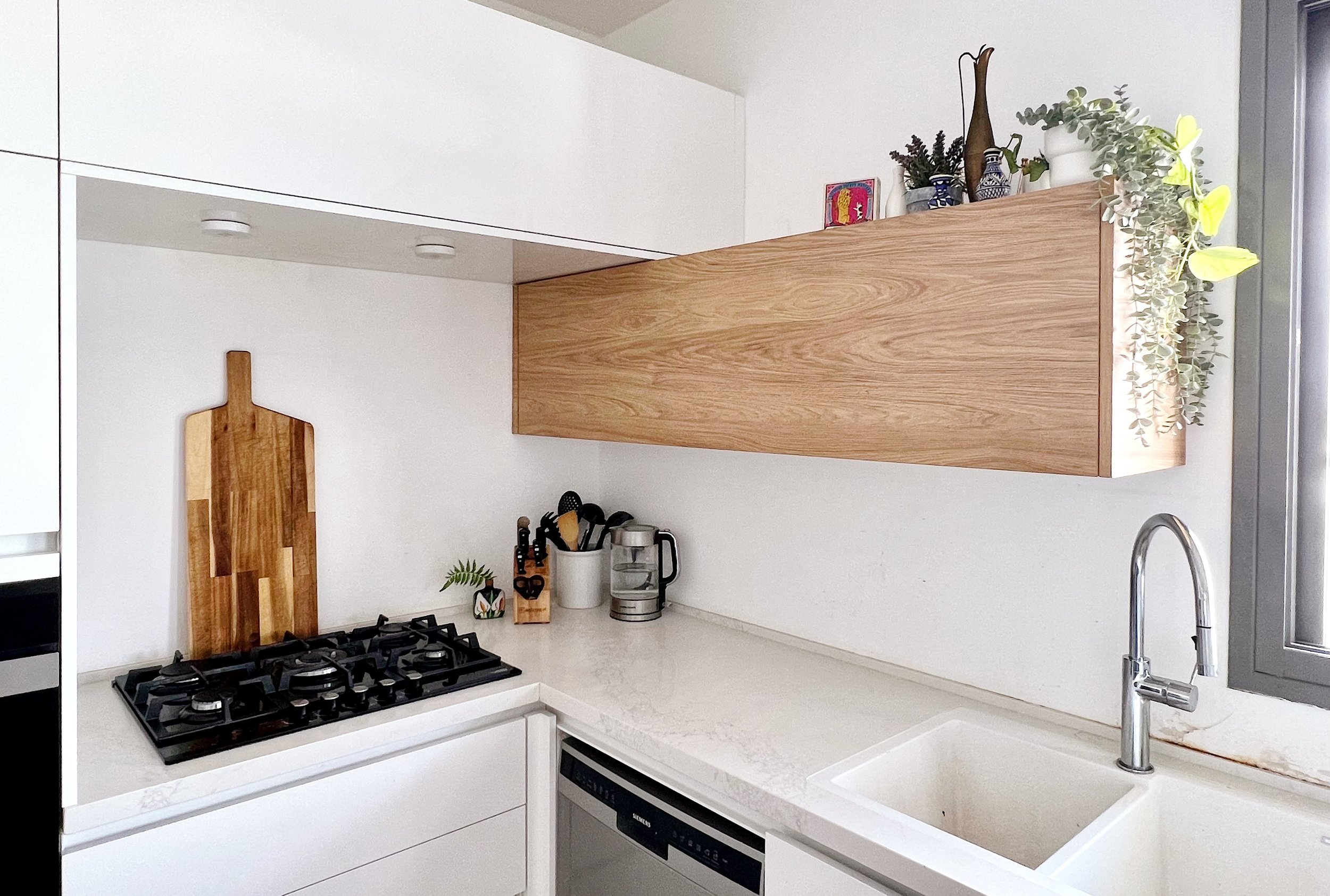
When we made Aliyah in 2021, we moved into a newly built apartment in Modiin fresh from the kablan (contractor). Because we’d been Airbnb’ing for 6 weeks already and I was 9 months pregnant, we were eager to get the keys, so the owner rushed the final to-dos and left the kitchen without a backsplash. As you can see below, this isn’t great for the wall behind the sink or the stove.
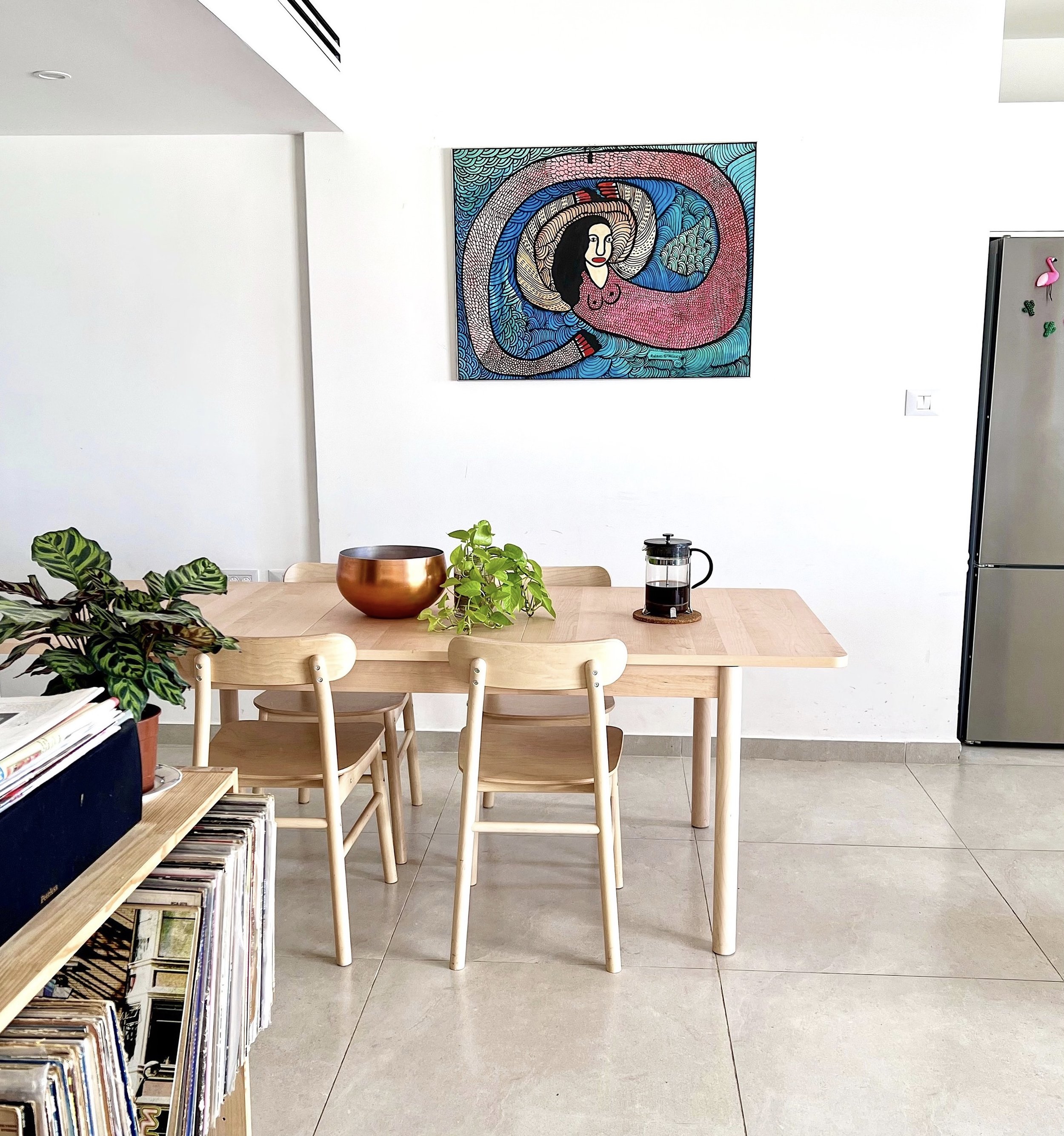
The owner is now selling the apartment and we’ll likely get the boot within a year, but I’m taking a trip down fairy tale lane to consider how I’d tile the backsplash. If we zoom out for a second you’ll see there’s already a lot going on in the living room and the surrounding areas:
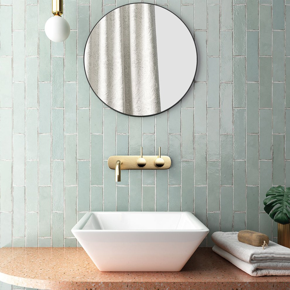
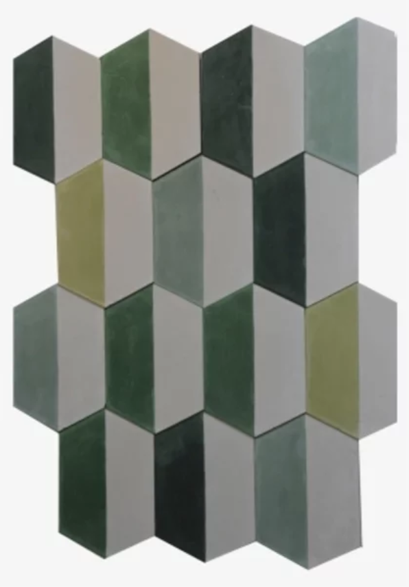
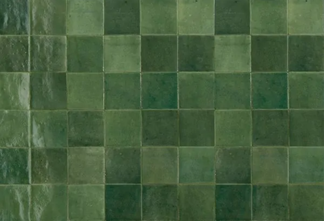
If I was to do a color, a green tone could be nice, to complement the plants and contrast the red and pink hues of the living room. I’d do a vertical or square pattern to balance the horizontal cabinetry. These mint tiles from Tile Israel could work, but I’d place them side by side rather than staggered for a more streamlined modern look. I really love these colorful green and white tiles from Balatot, but they’re too busy as pictured. Choosing just one or two of the tones could be fun. And I like these deep green squares from Milstone, but they feel too dark for this kitchen.
Here’s a test using just one of the green shades from the Balatot tile set:
If the white half of the tile is actually white and not grayish like this photo from online suggests, then I like it. This one requires some in person research, so let’s move on for now.
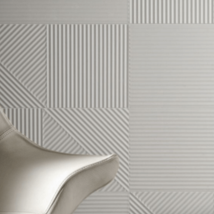
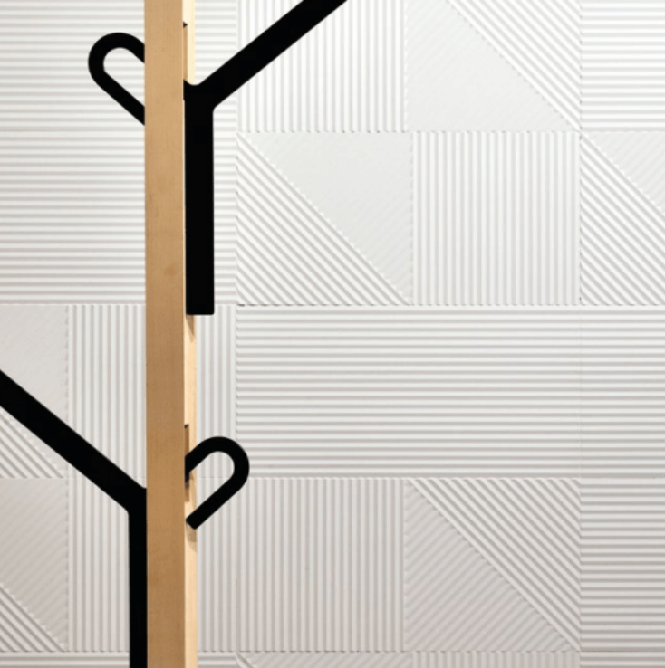
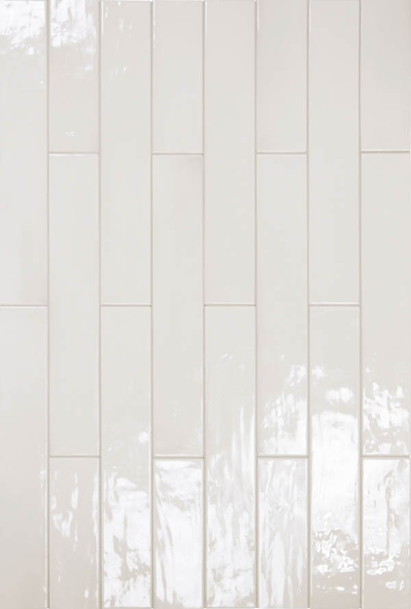
If I was to lay off the color and get white tiles, they should be matte, because the cabinets are already glossy, and white gloss on white gloss is overkill in this context. A plain white tile could work, but something with texture would be more interesting. I found this textured white tile from Studio Ceramica that looks wonderful:
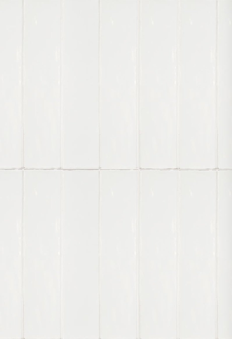
The downside is it’s probably terrible to clean and not ideal for a grease-catching kitchen backsplash. (I’d look into this further to be certain.) If we’re back to the drawing board with whites, these Milstone and Kal Vahomer rectangles are available in a matte finish and would be a simple elegant option, stacked cleanly like at left.
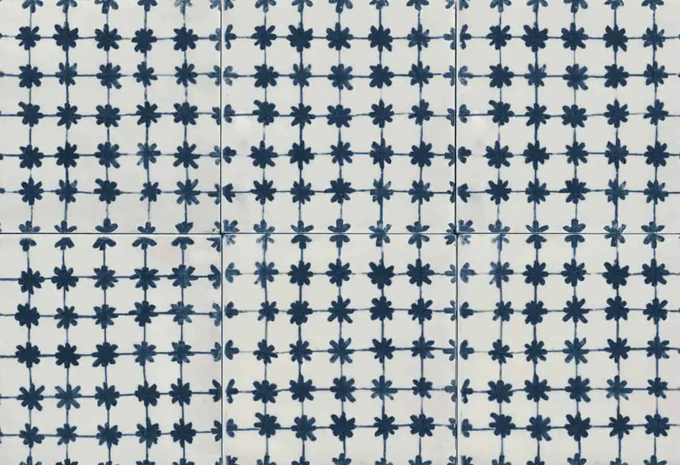
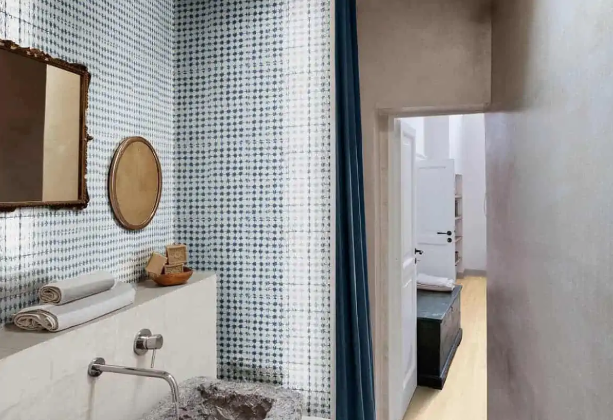
So that’s a workable white solution. But it’s a bit of a yawn. And while there’s nothing wrong with a good clean yawn in a good clean kitchen (I do love a white kitchen), I keep circling back to the tiles on speed, like this blue asterisk pattern from Milstone:
Testing it….
Kind of cute, no?
If I were really getting a backsplash right now, I’d visit tile showrooms in person.
Another option is to have the Caesarstone countertop continue up the wall, not have to choose a single tile, and live happily ever after.
Korean Countryside Living
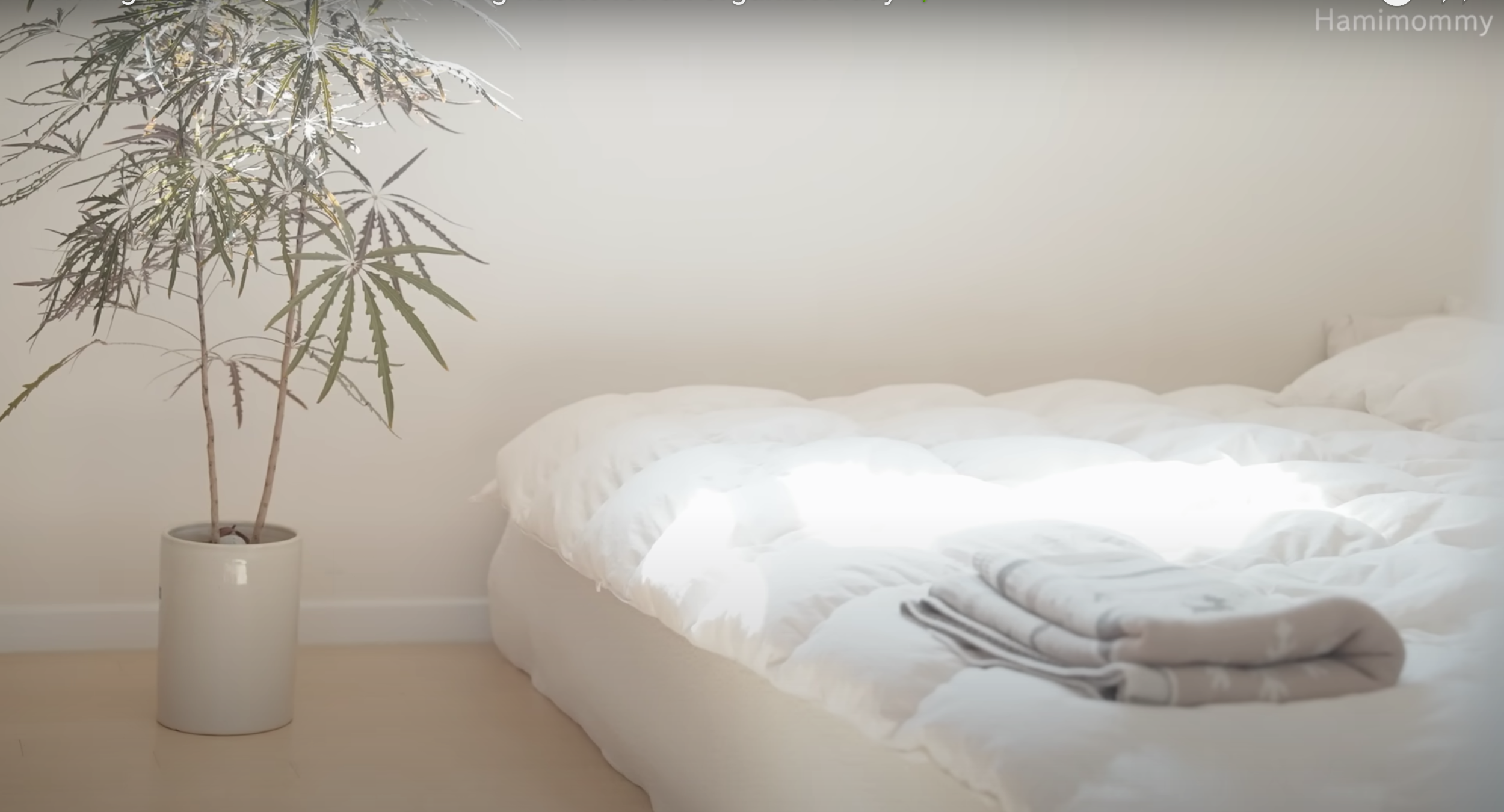
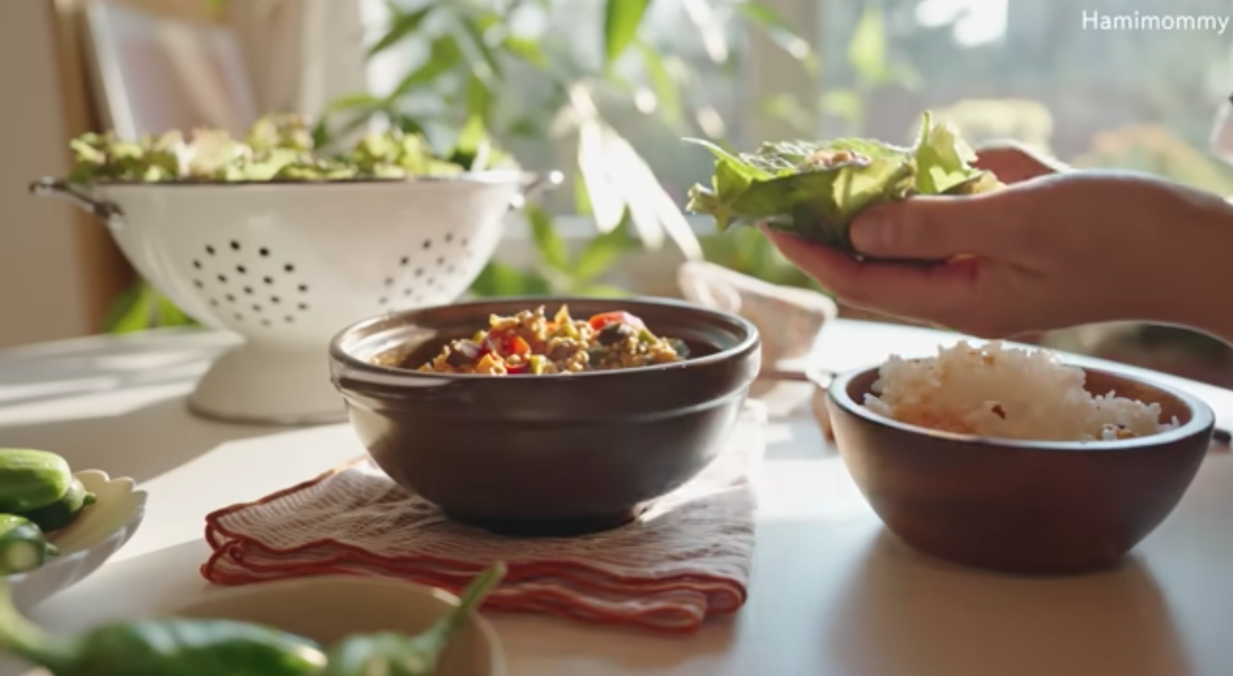
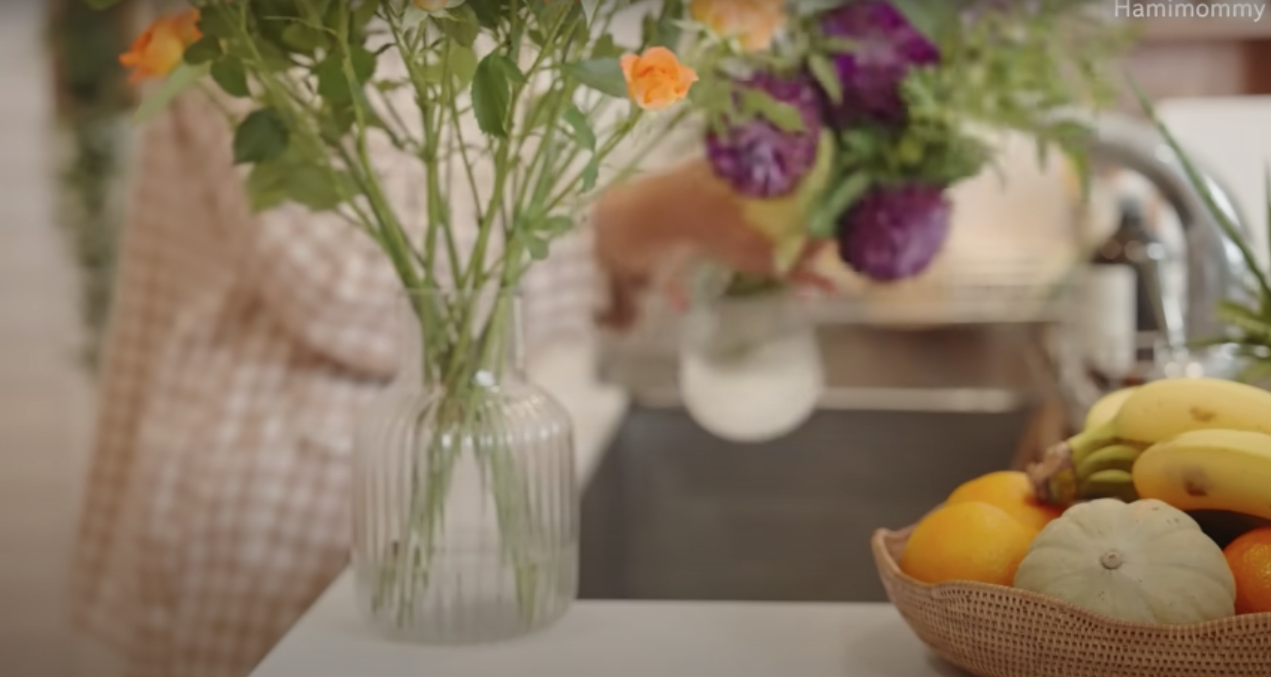
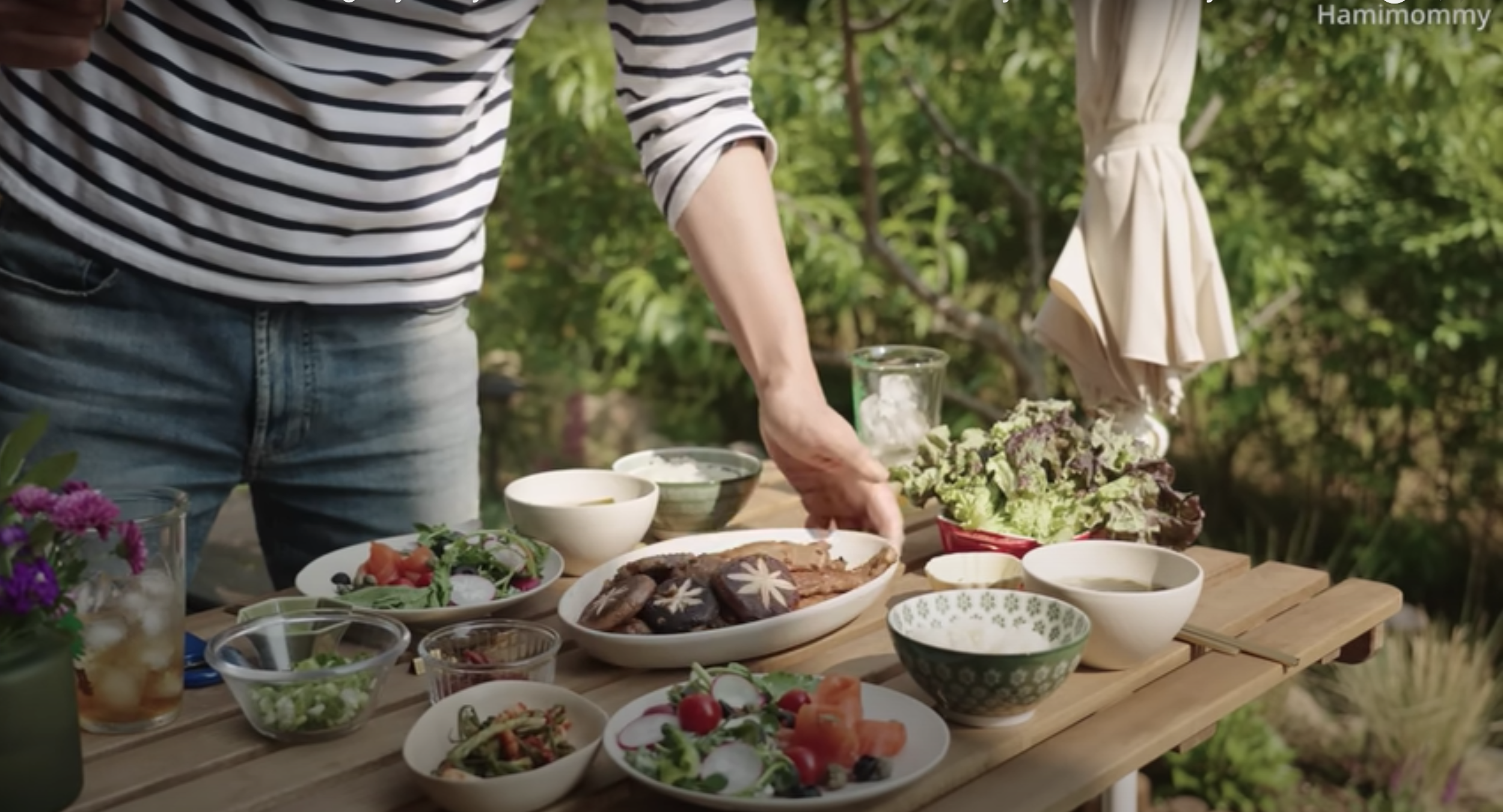
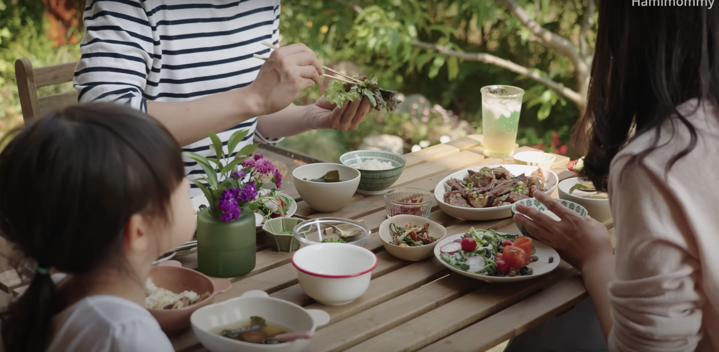
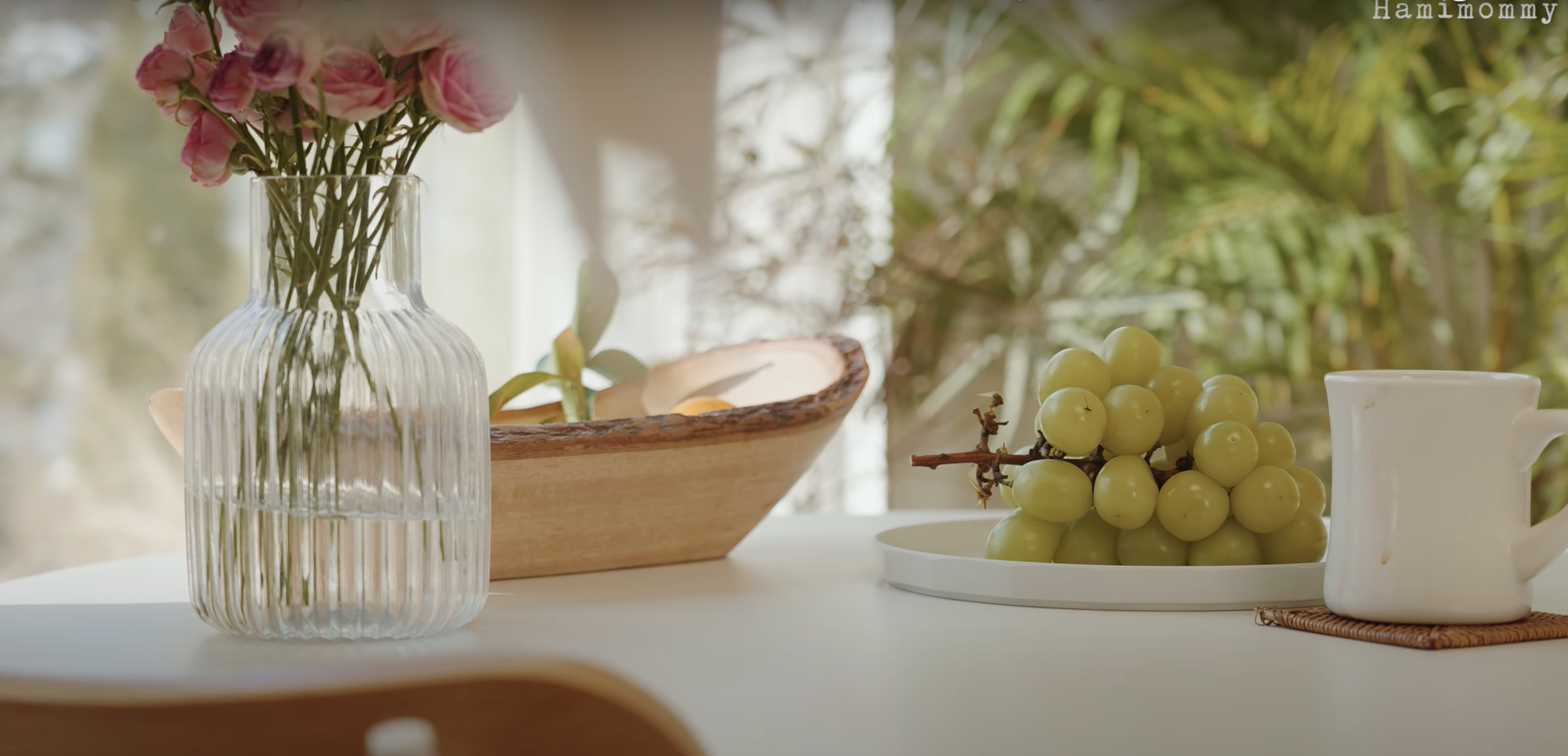
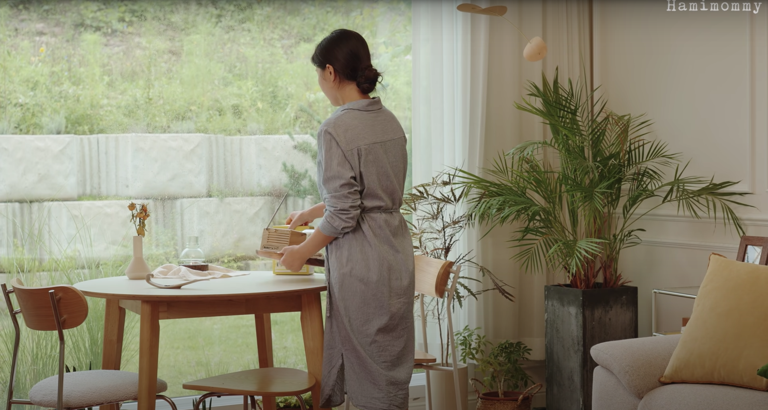
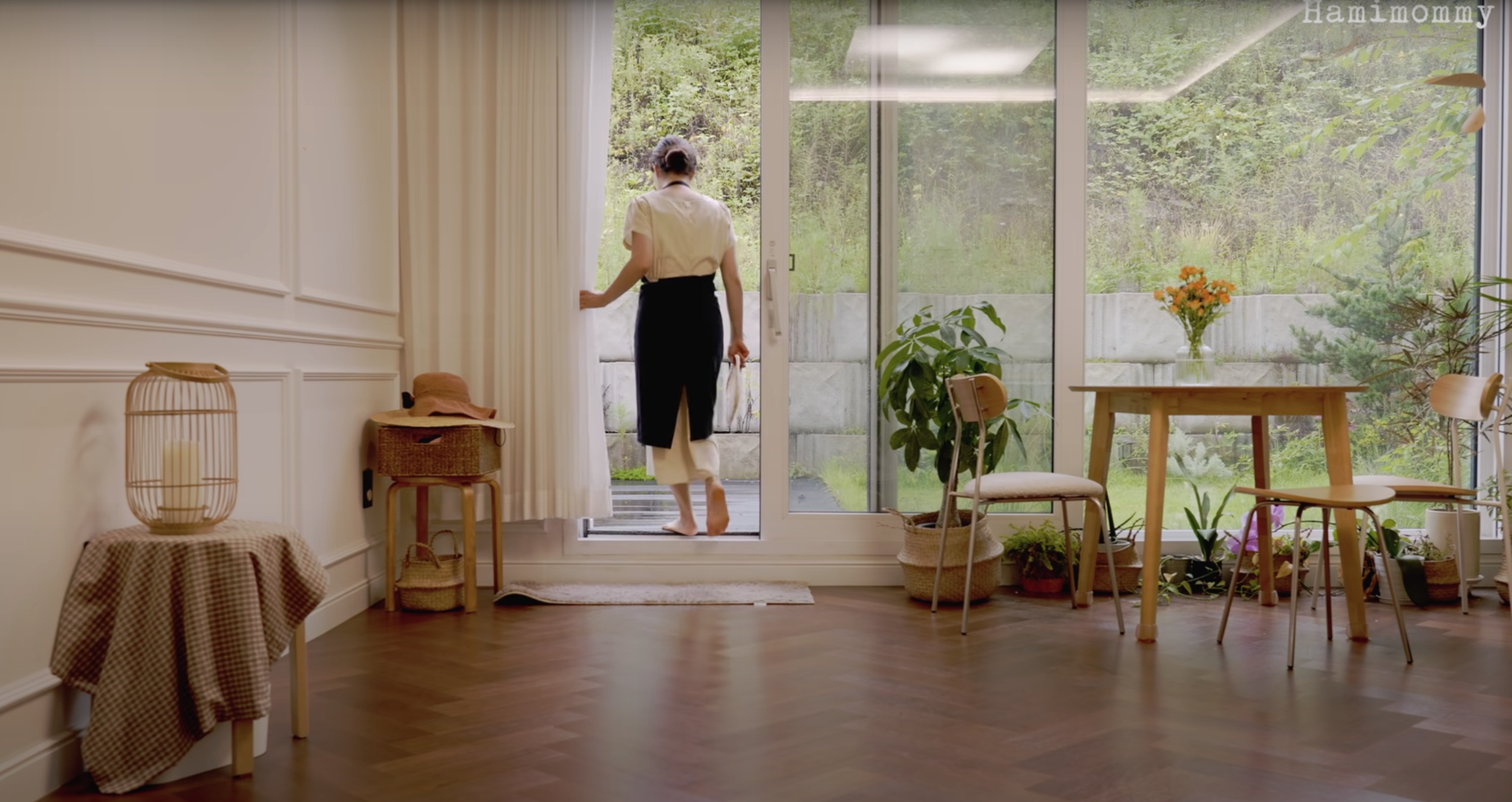
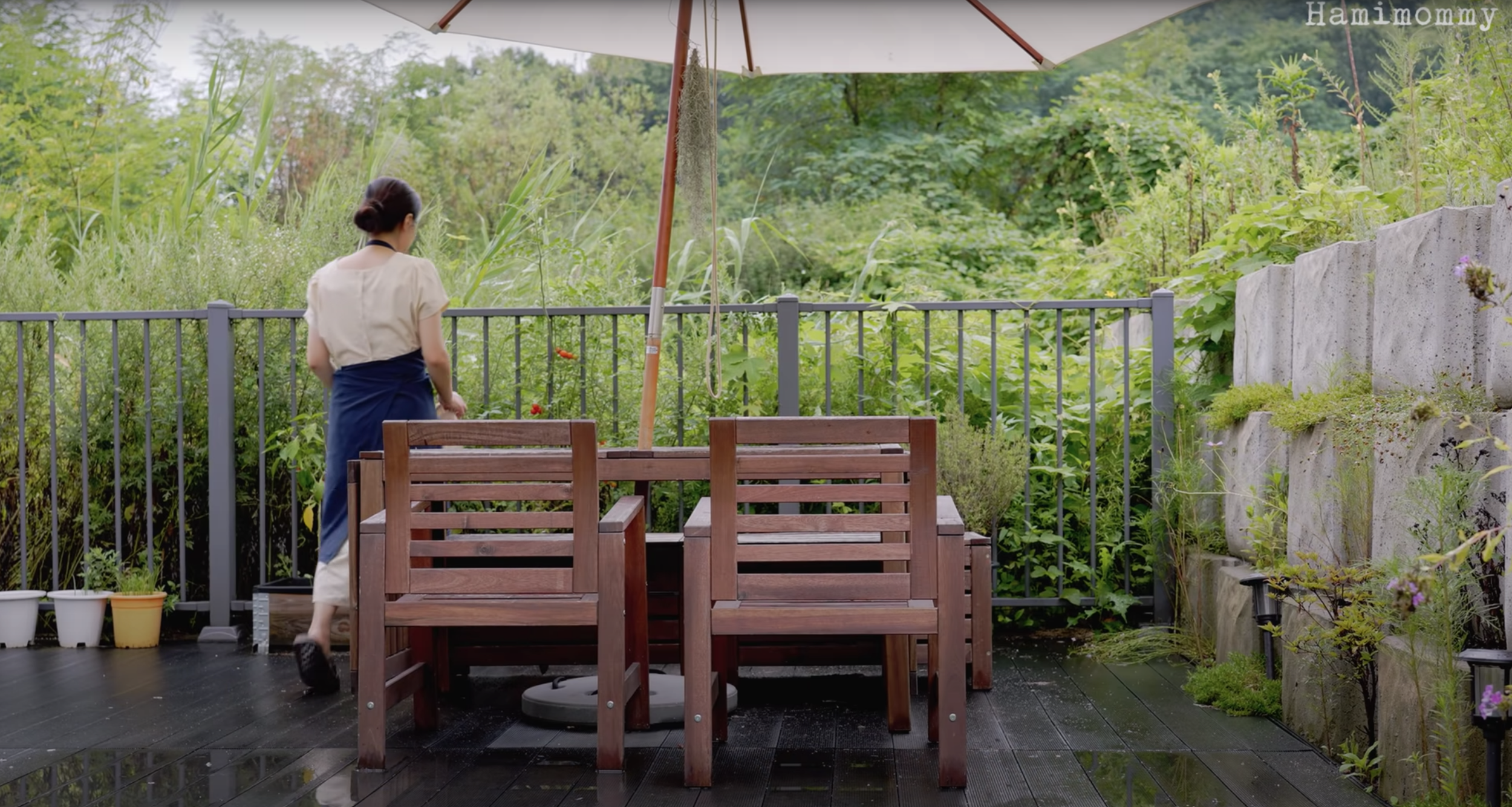
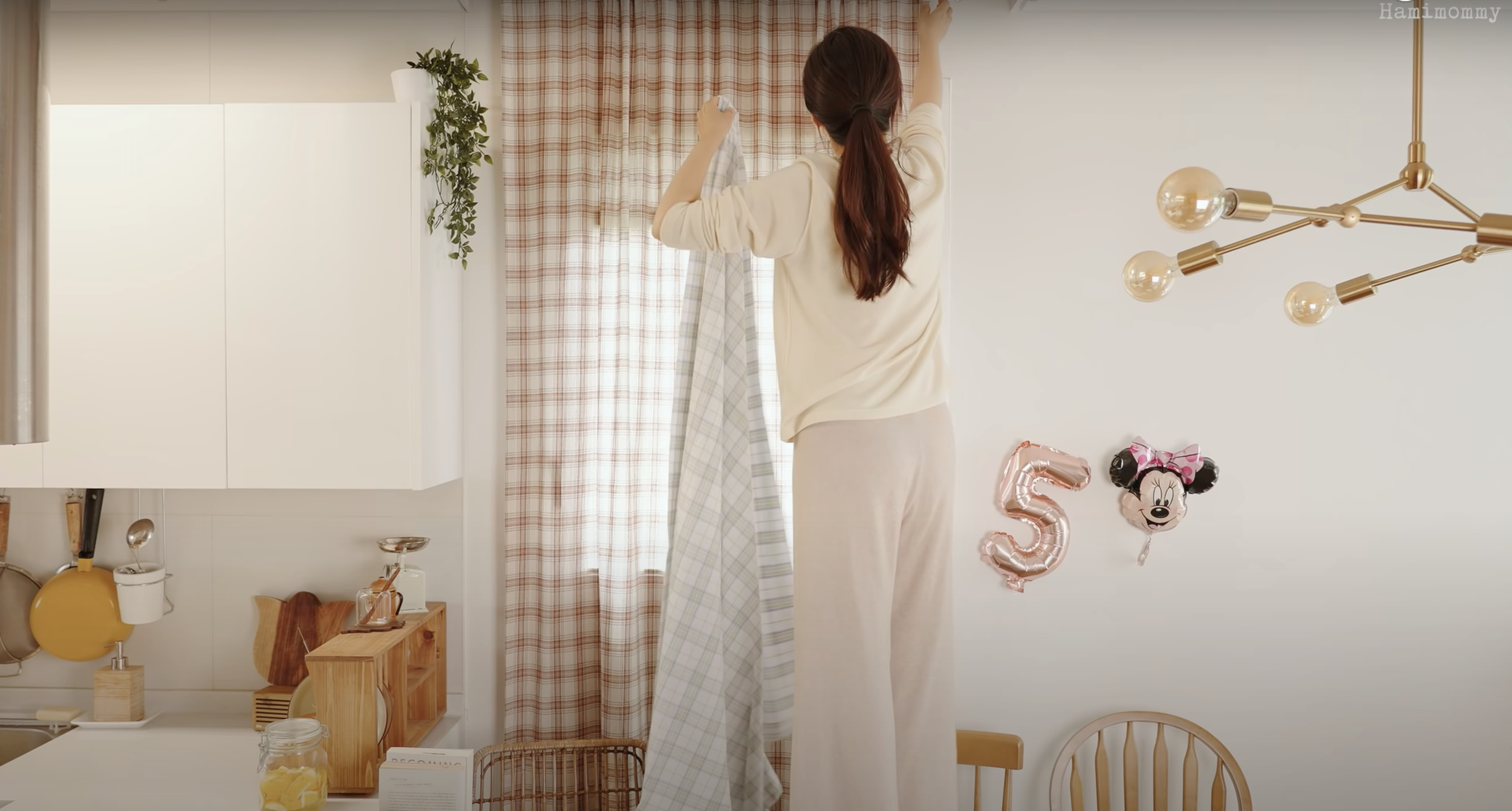
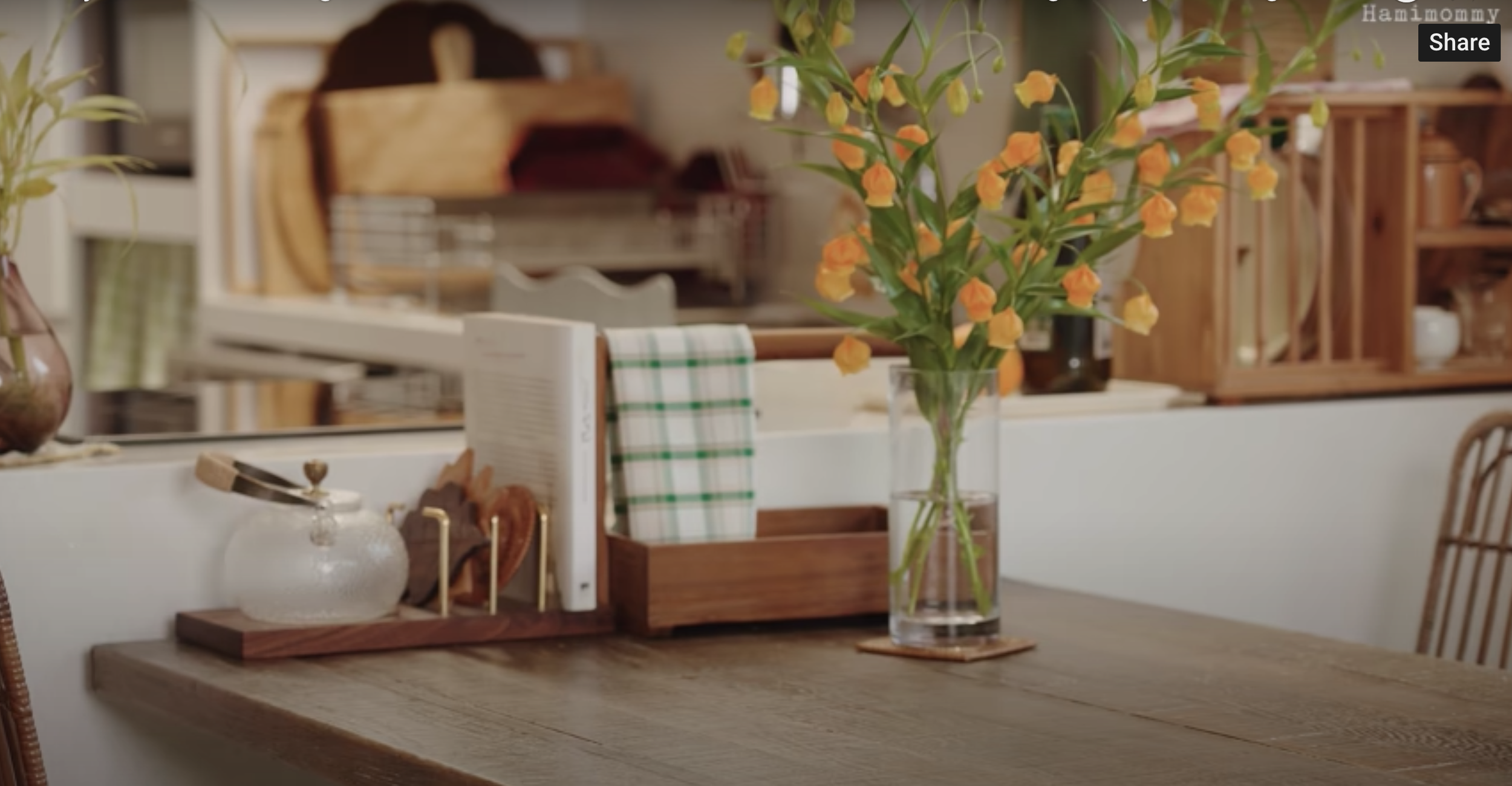
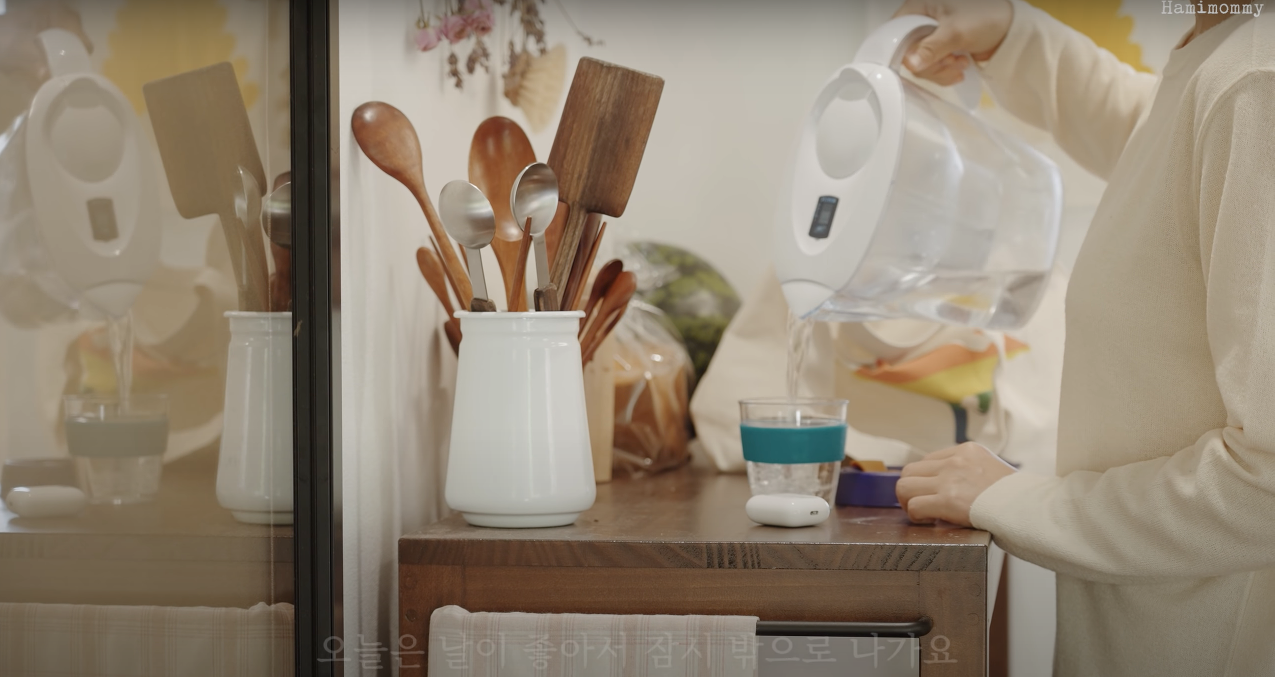
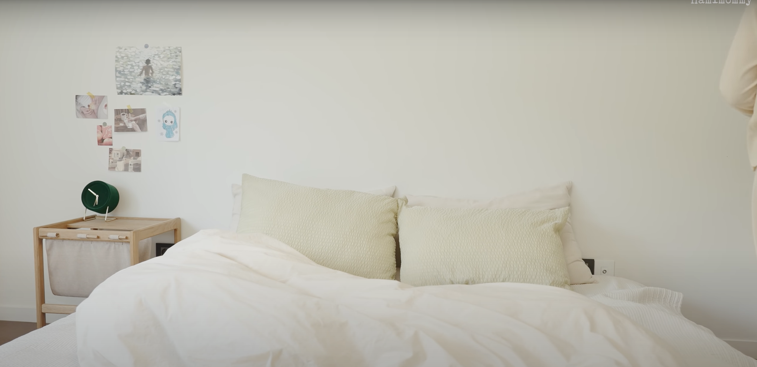
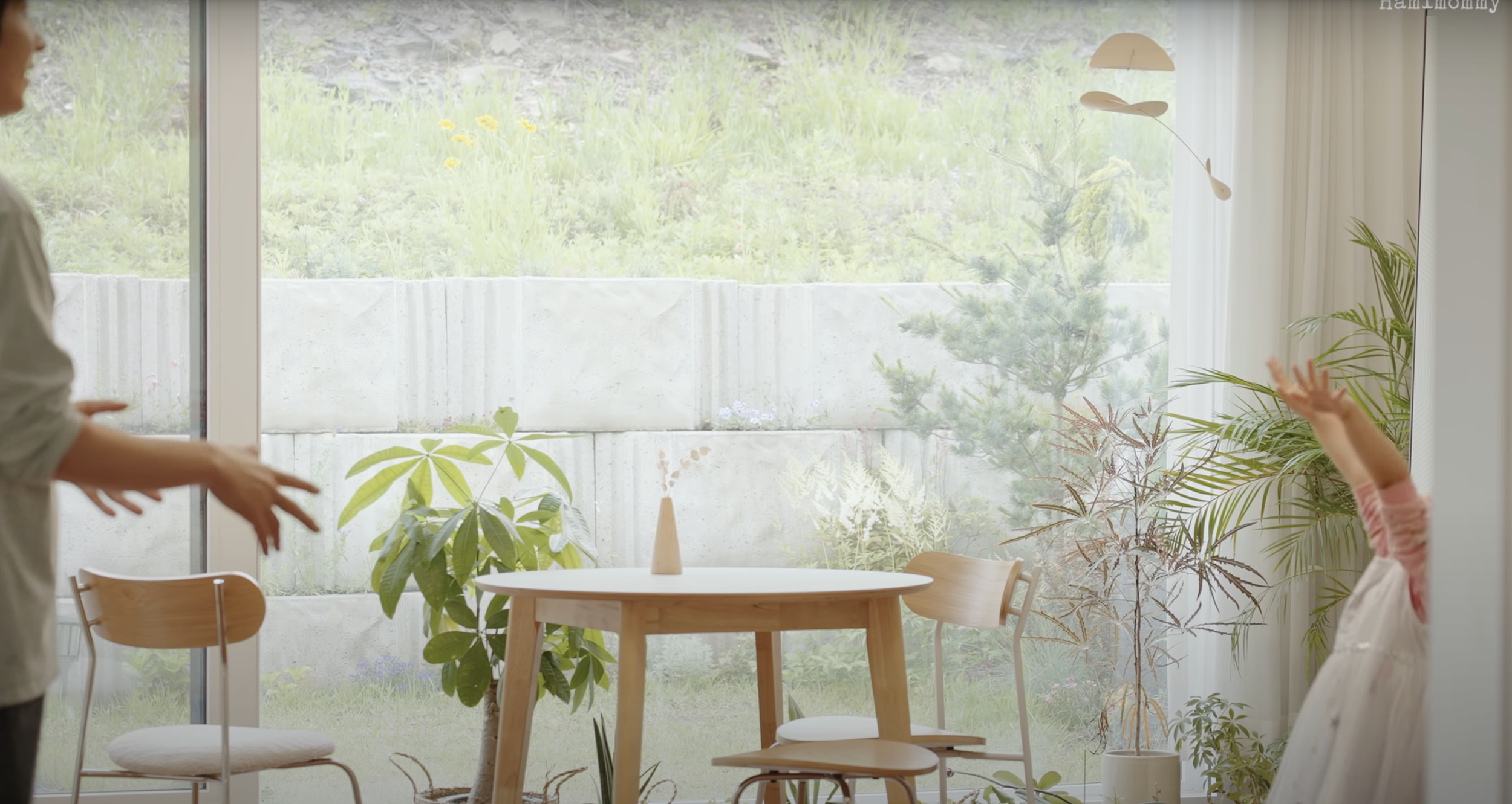
Once in a while I zone out to Korean YouTuber Hamimommy, a 30-something housewife who shares scenes from her home and daily life with 2 million subscribers. She cooks, cleans, organizes, and gardens against the backdrop of her various homes, all of which have been a take on white and wood. She peppers her videos with little clichés like, “Small happinesses add up to create happy life,” and “Life is beautiful anyway!” which, thanks to her meditative style, feel more warm and fuzzy than trite. She recently gave a tour of her newest house in the countryside. I love the five simple bulb pendants in the kitchen and the crisp plant in the bedroom.
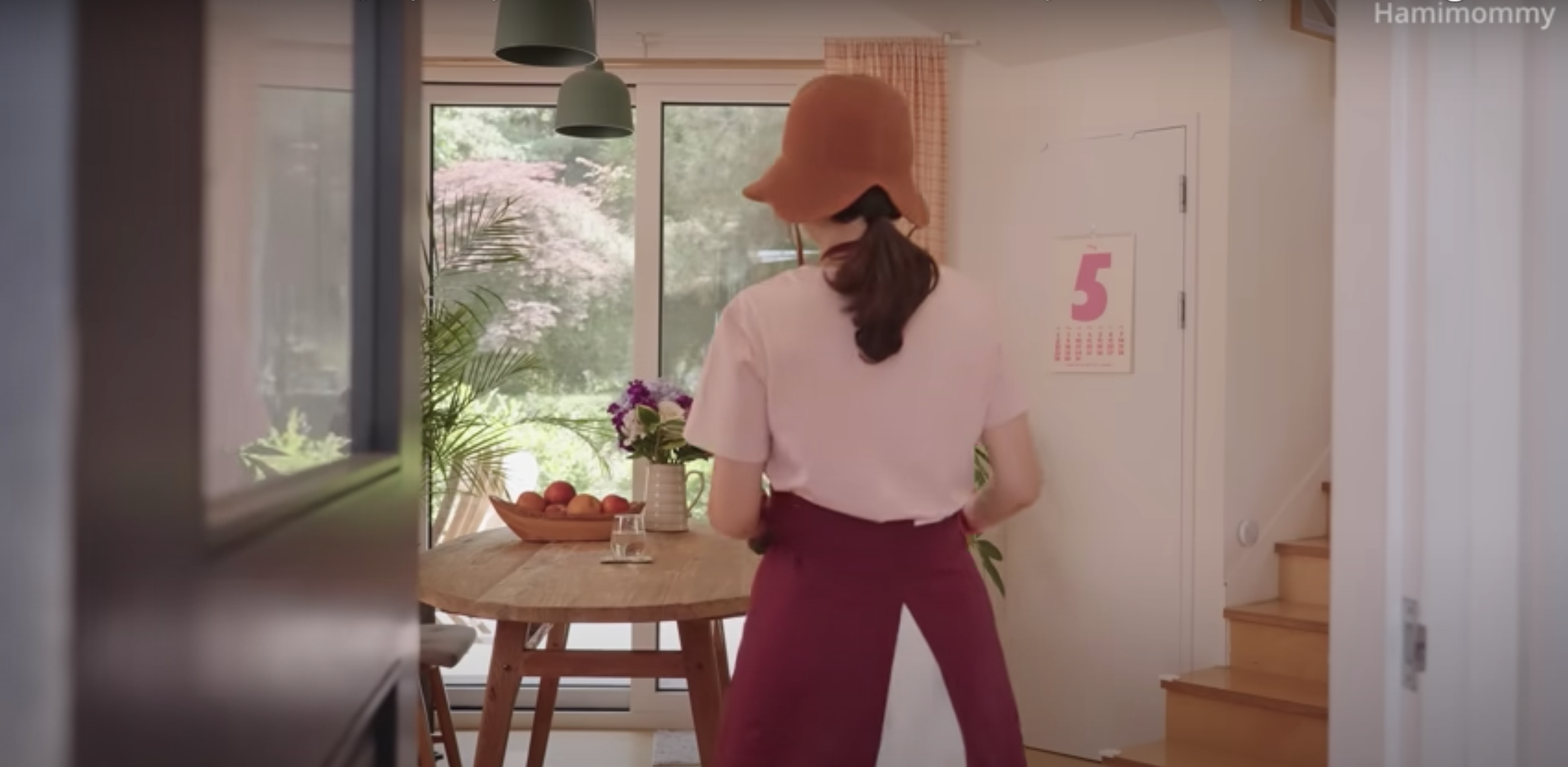
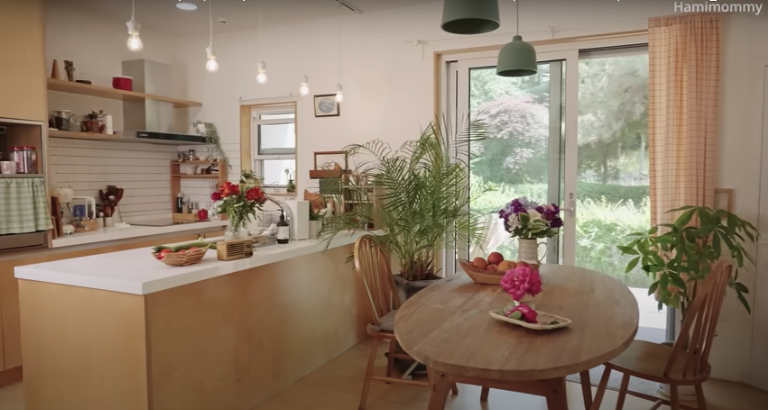
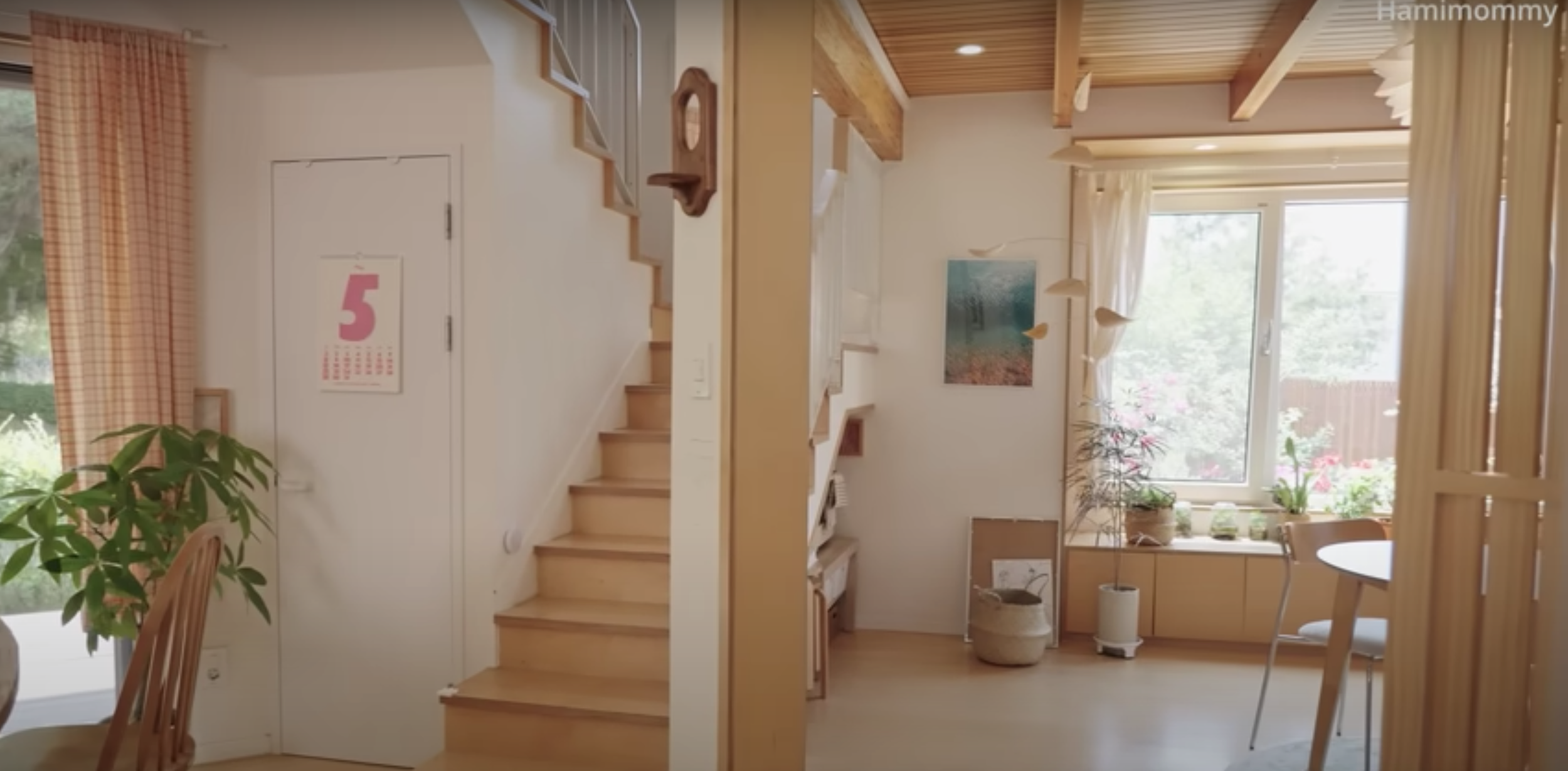
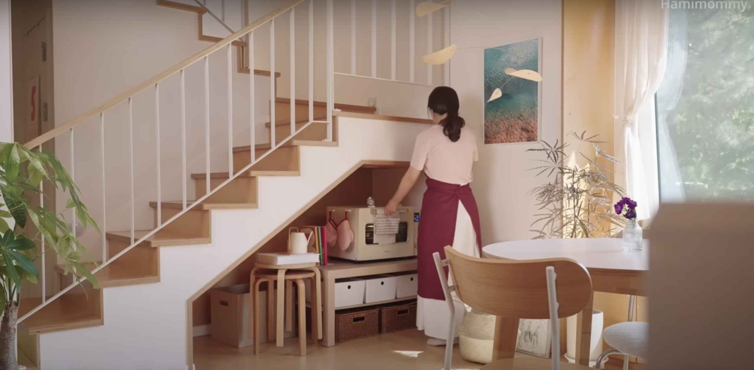
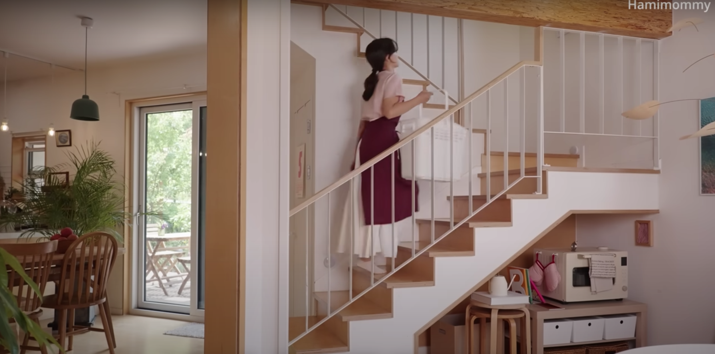

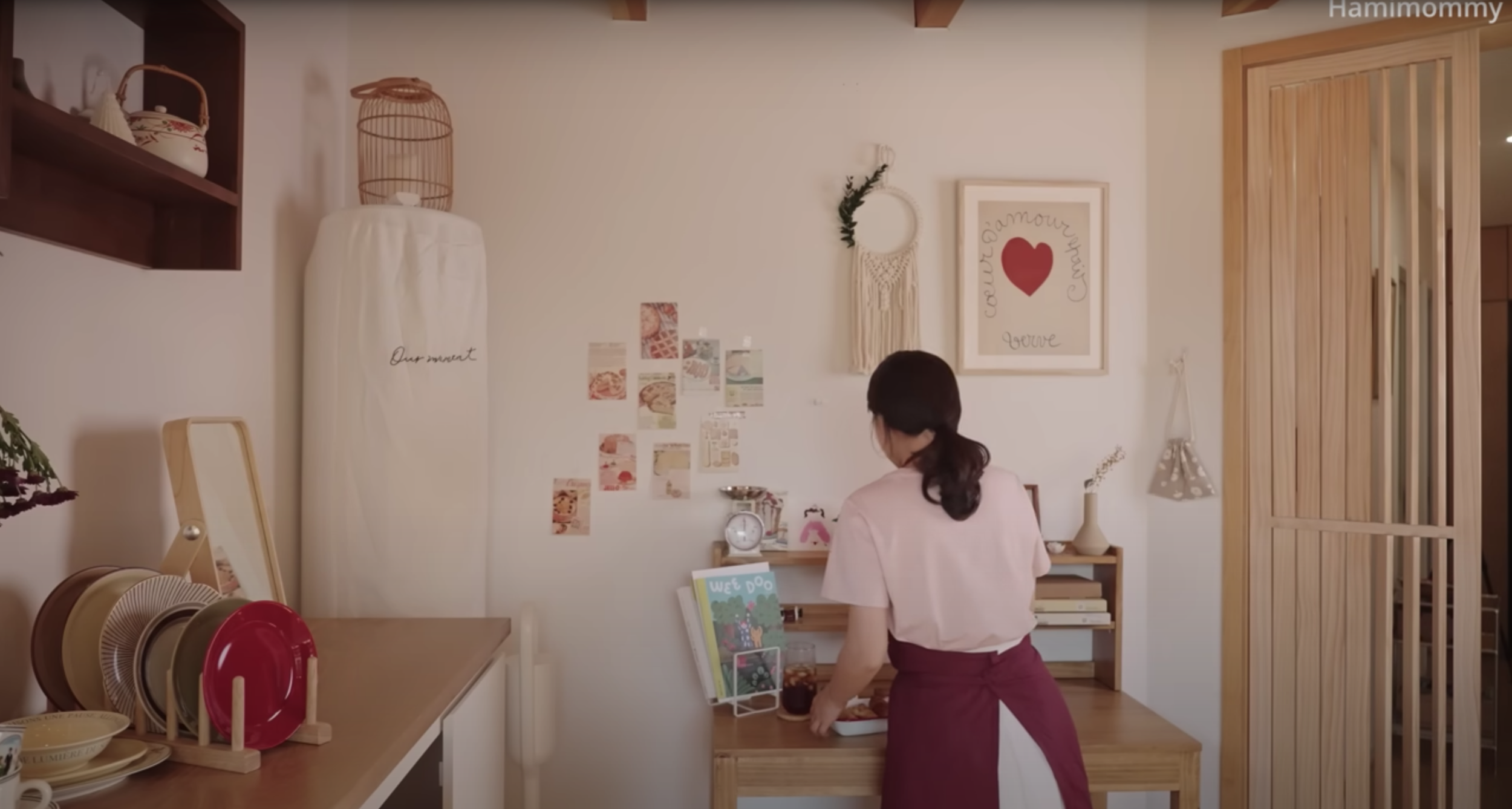
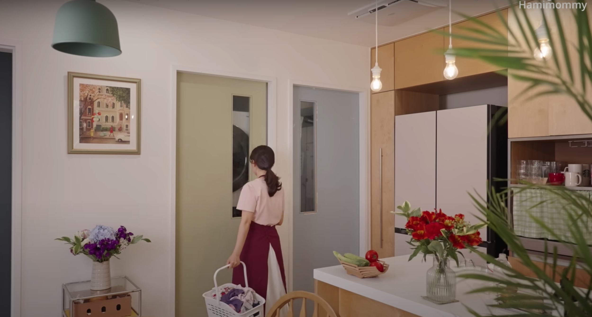
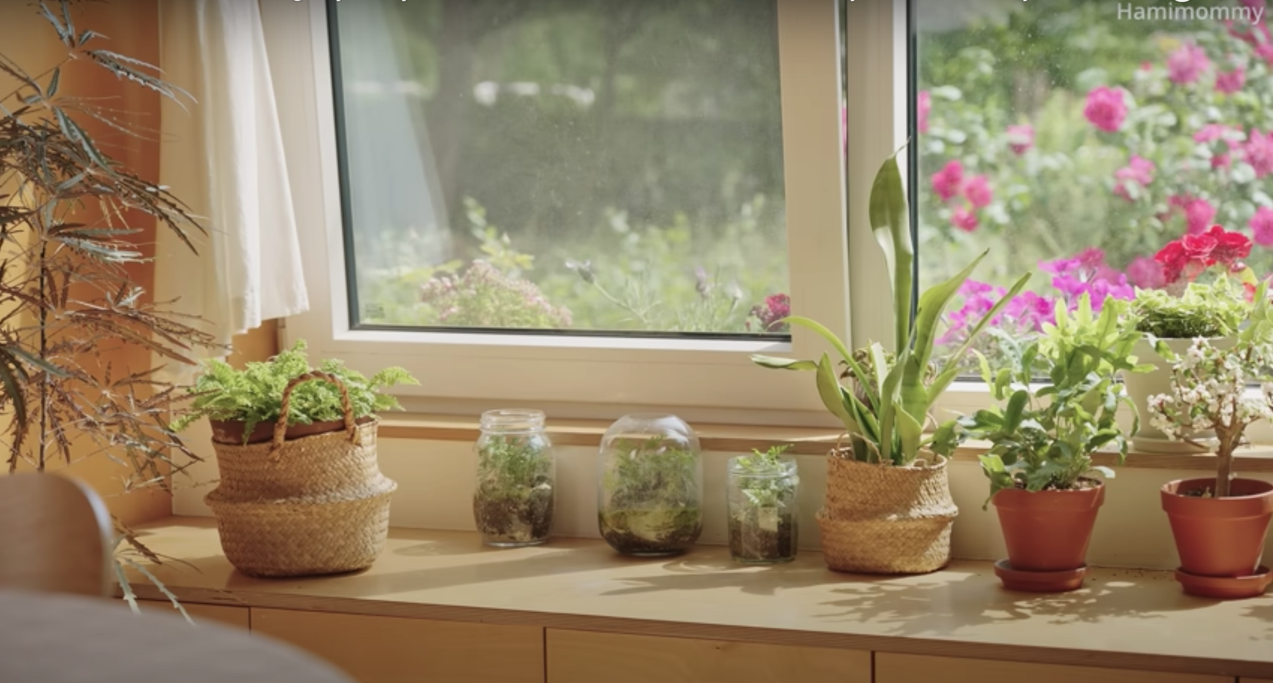
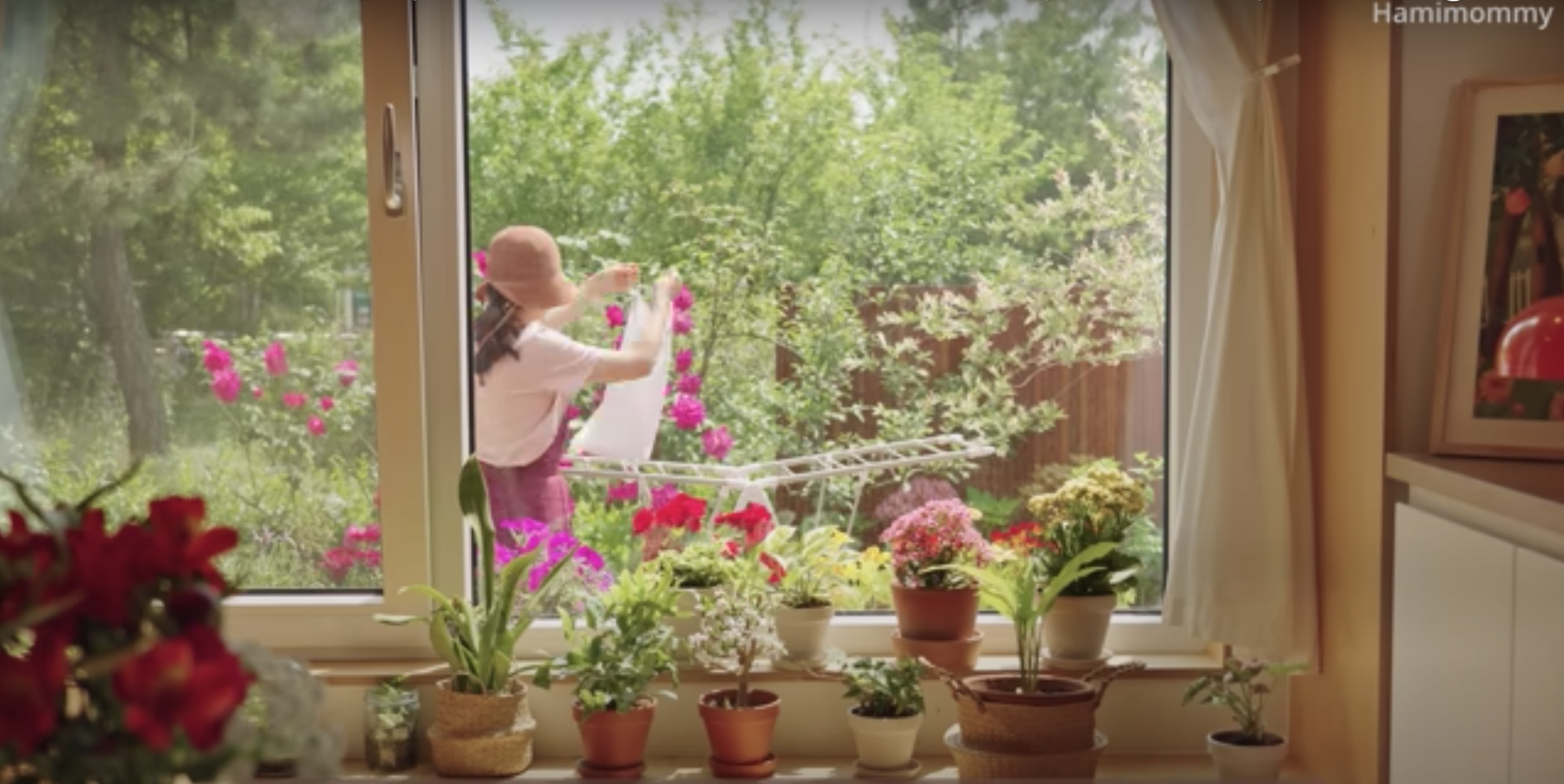
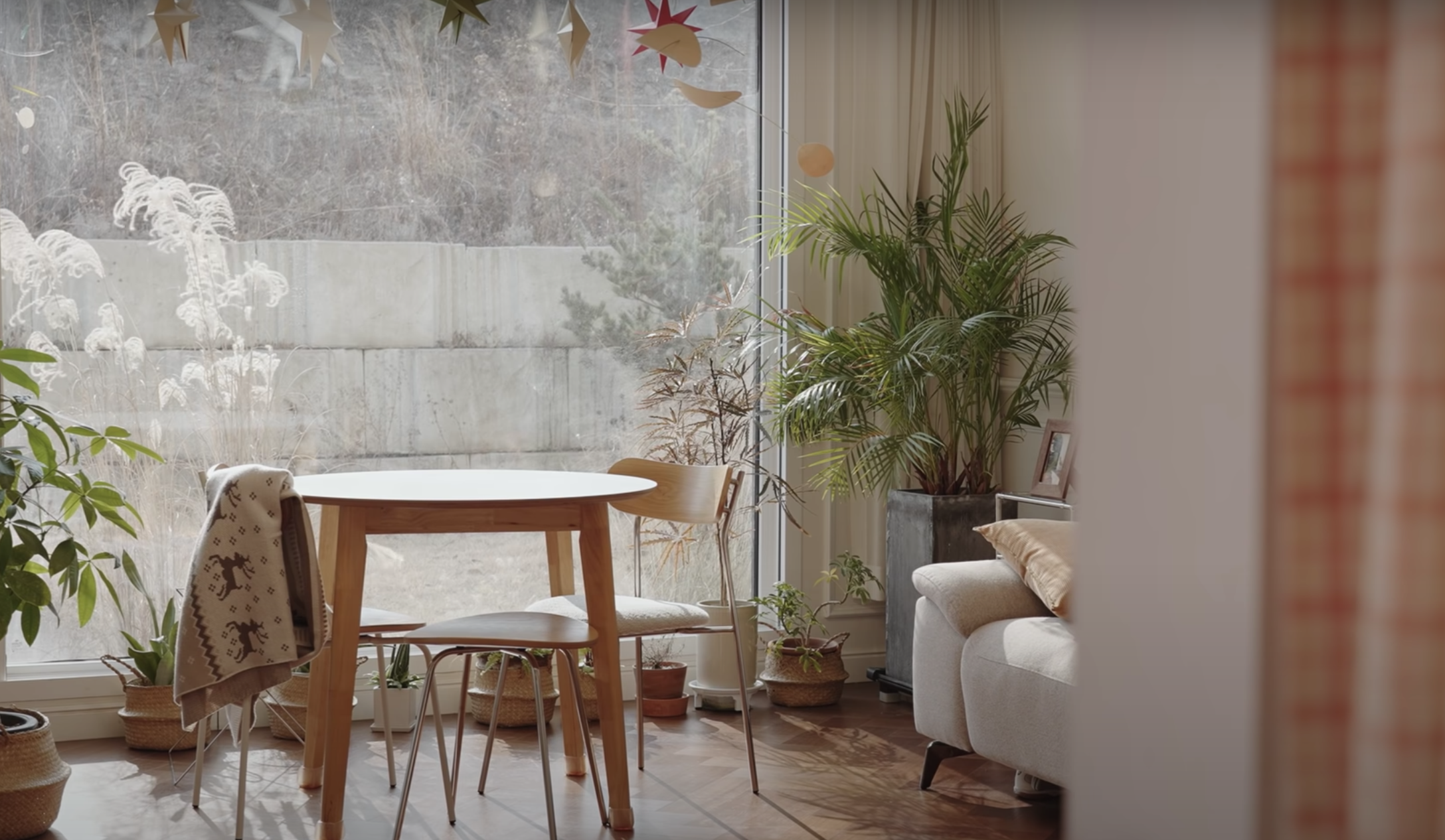
Her previous home was also charming. I can never get enough of the plaid curtains (as I’ve mentioned here before).
A Day in Tel Aviv
During the week of Sukkot while my parents were visiting, Jake and I abandoned the kids and spent a day walking and taste testing Tel Aviv. We started with a coffee and pastry at Dallal Bakery in Neve Tzedek and then walked north to have lunch at Port Said in Lev Hair. After wandering around the Yemenite Quarter we got another coffee at Papua Cafe, sat on a bench for an hour to call friends and people watch, and then got malabi and another coffee at Hamalabiya. From there we headed north on King George St., through Meir Park and around Dizengoff Square. After reaching Old North we took a scooter down the beach to get to Florentin for pizza and beer at Teder.
Best coffee: Papua Cafe
Best bite: Port Said
Neve Tzedek
Michal Flowers
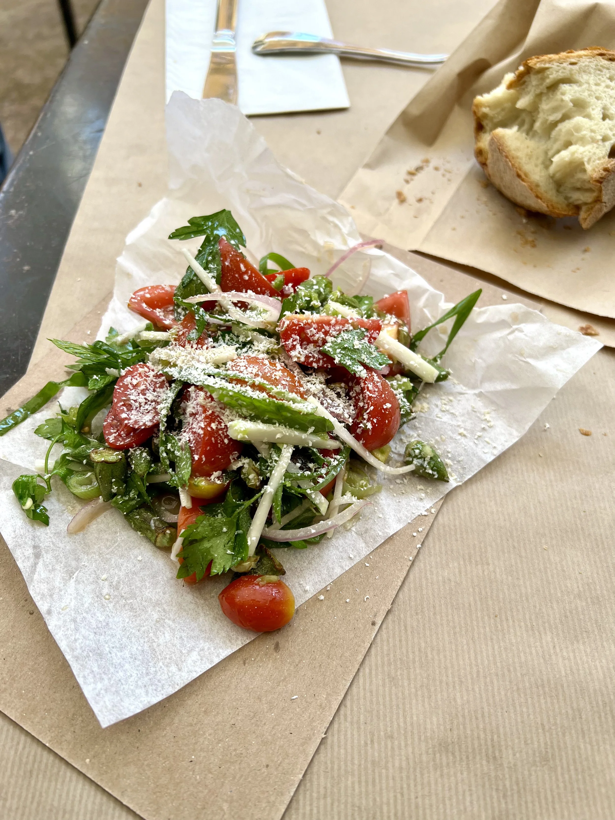
Okra salad @ Port Said
Grilled mackerel @ Port Said
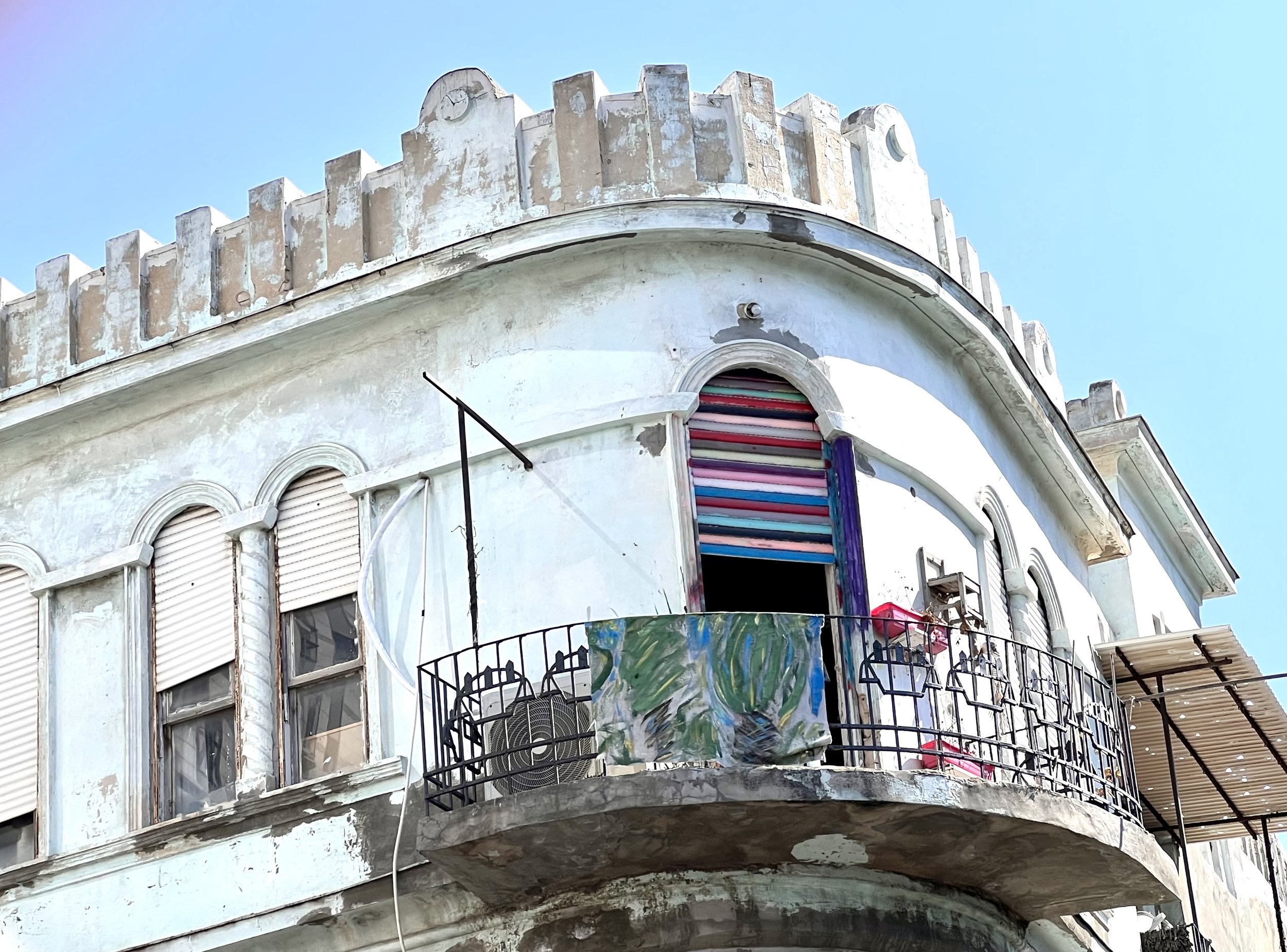
Painted shutters on Allenby St.
Dostoevsky Bookstore
My great grandparents’ former home on Mohiliver St.
Original tiles where my grandfather grew up
Papua Cafe
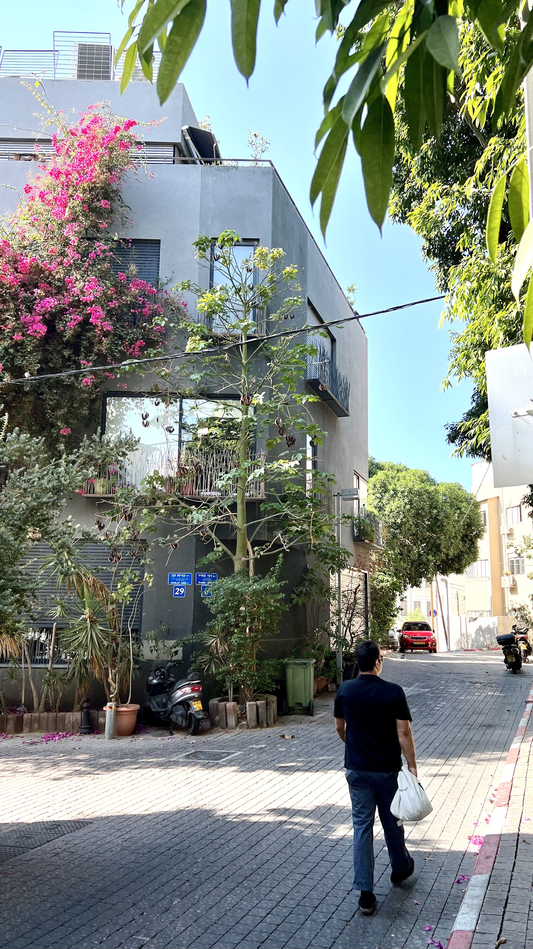
New build in the Yemenite Quarter
Sunset by the beach
Teder.fm
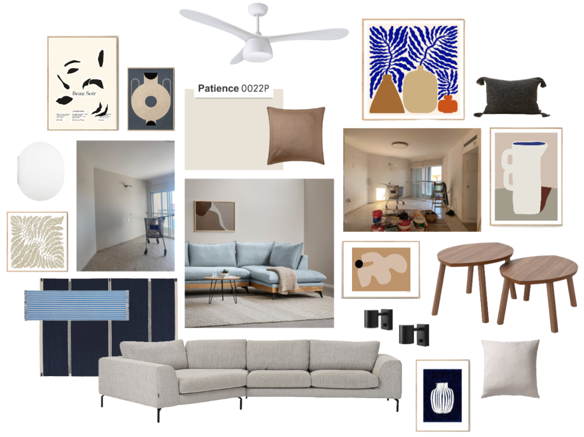
Mood Board: Calm Netanya Living Room
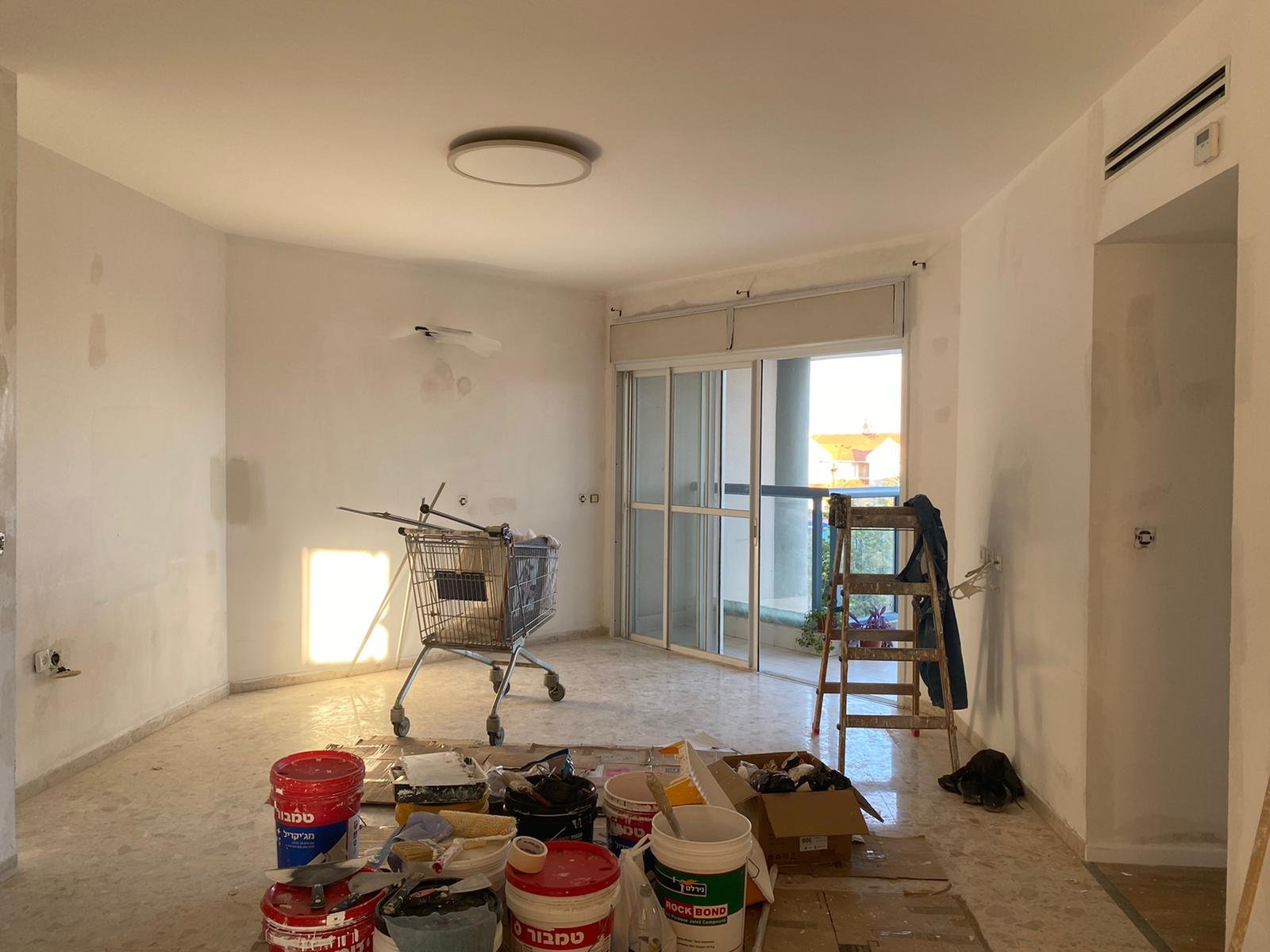
I’m working on a living room in Netanya for which the guiding word is: calm. My clients want modern, clean tranquility in blues and café au lait. The most important feature for them is the sofa — they’re couch people. They want a big, comfortable, enveloping couch that serves as the showpiece of the room. So we decided to invest in the perfect couch and spring for a custom-made one that fits neatly against the unusual angle in their newly purchased apartment.
The sofa will stretch across the back two walls at left and the TV will go on the wall to the right of the balcony. The floors are a cream terrazzo.
Painting in progress
My clients chose Tambour’s Patience for the walls (the left wall will also be painted). And they’re playing around with cardboard to see how the sofa will stretch across the room.
My sense is they’re leaning towards a shade of blue for the couch. Once that’s finalized we’ll have an anchor around which to decorate the rest of the room.
Sources: Art // Fan // Round Wall Light // Black Wall Lights // Coffee Table // Dark Blue Rug // Blue Striped Runner // Light Blue Couch // Beige Couch // Dark Gray Tassel Pillow // Dark Beige Pillow // White-Beige Pillow
